Showing posts with label red. Show all posts
Wednesday, December 17, 2014
WORDLESS WEDNESDAY: Diamine Poppy Red Ink Spatters
I recently reviewed Diamine Poppy Red (spoiler: I loved it) and I've been practicing my spatter techniques with it.
Here's a link to the full-sized image - it's huge.
Monday, December 15, 2014
INK REVIEW: Montblanc Corn Poppy Red
![]() |
| Montblanc Corn Poppy Red Ink Swabs |
BaBam! Biff! Boom! Pow!
Montblanc Corn Poppy Red has arrived on the scene.
My very first impression was that the ink is terribly wet. If flowed from my pen with such ease that I was sure it would take forever to dry. I was wrong and the dry times are perfectly acceptable with no smearing at all at the twenty second mark.
![]() |
| Montblanc Corn Poppy Red Writing Sample |
Here's the scoop . . . delightful saturation, beautiful red color, flow is wonderful, definitely not water-resistant.
There was no ghosting and minimal show through on the HP 32 pound paper I was using. There was also the teeny tiniest bit of spread. Not enough to call it feathering, but definitely some spread. Just a touch. Maybe so little that others wouldn't notice it? Probably not enough that it's a deal breaker for me.
I regularly use HP 32 pound paper. I know it's a good and consistent paper that works well with fountain pens. An then I wondered . . . how would Corn Poppy Red behave on other papers?
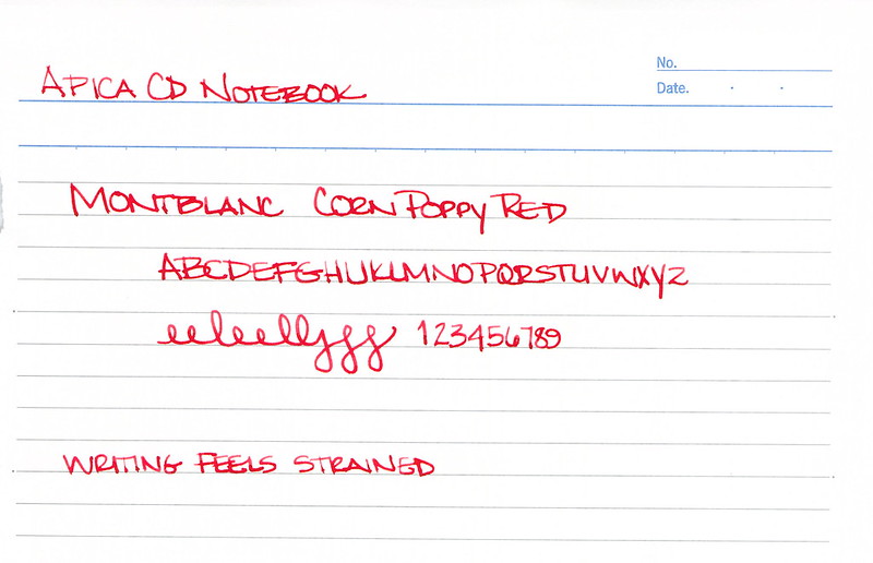
First I tried Apica CD 15 Notebook paper. This is their regular line, not the premium stuff.
It was not a pleasant writing experience. I felt as I needed to press just a bit harder with the pen (the MB Heritage 1912 that I adore so much) and even then, it just didn't feel as nice.
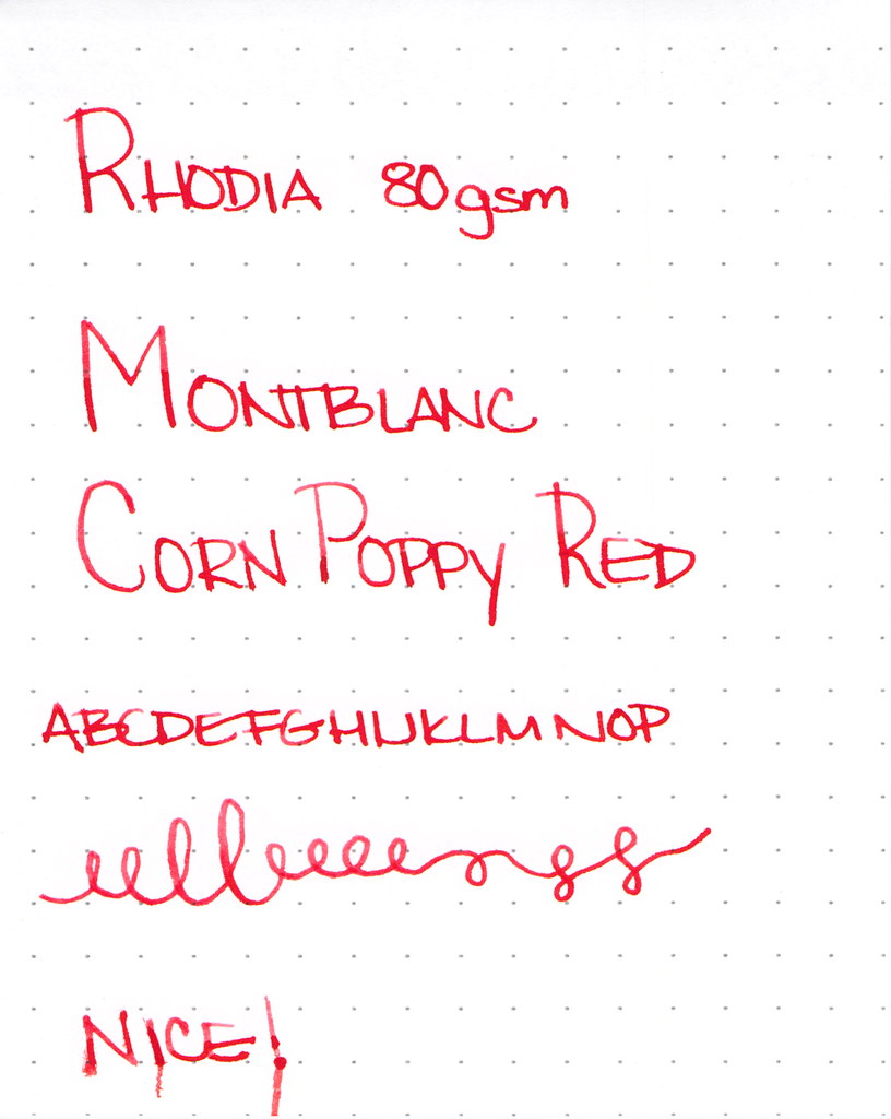
Then, I tried my old favorite Rhodia 80 gsm . . .
And, man, that was some nice writing! Smooth with crisp lines. I approve!
I know you're looking at the bottom line there and wondering what the heck happened. Silly me put the paper in the scanner before it was dry. Anyone know how to clean ink off of a feed scanner's rolly bits? Oops.
Bottom line? I like pen and ink combinations that work on all papers. There's so much fuss in the world that when I pick up a pen, I just want it to go. I like Montblanc Corn Poppy Red, but it's not love.
Whomp Whomp.
Tell me - what are deal breakers for you with inks? Color is the big obvious thing, but are there other things that you simply will not tolerate?
Wednesday, December 10, 2014
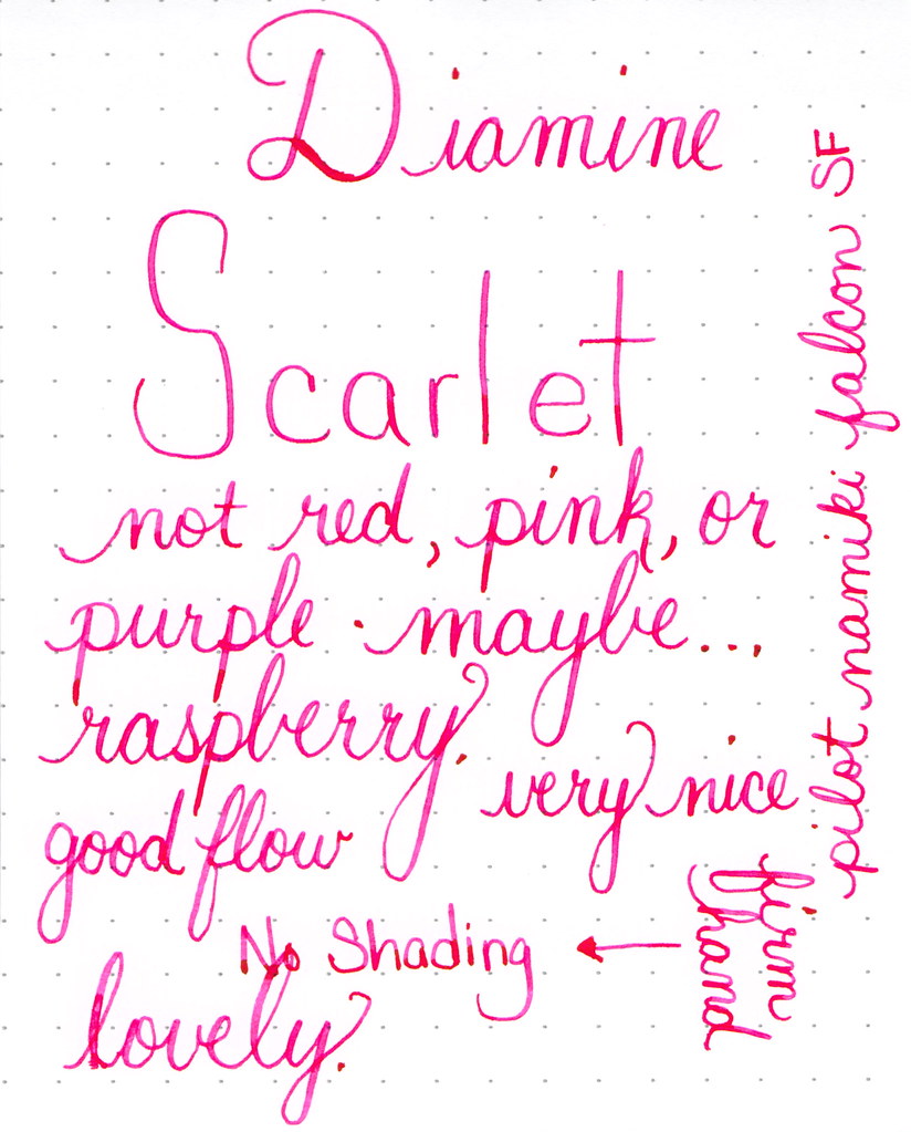
WORDLESS WEDNESDAY: Diamine Scarlet Ink Review
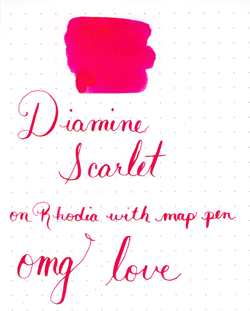
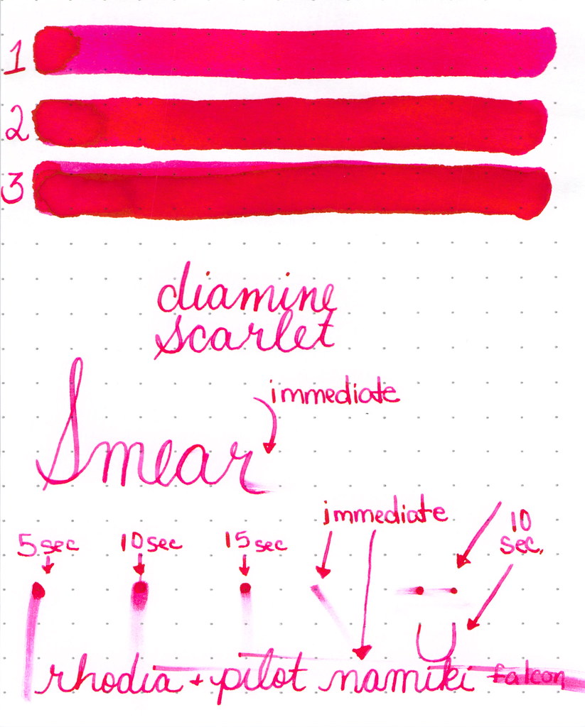
In love with Diamine Scarlet
Amazing pink-red color, great saturation.
Side Note: I'm beginning to think that if I put my words in italics, it's like whispering. And whispering is kind of like wordless, right?
Monday, December 1, 2014
INK REVIEW: Diamine Poppy Red
It feels like it's been awhile since I've been able to say this - I LOVE this ink.
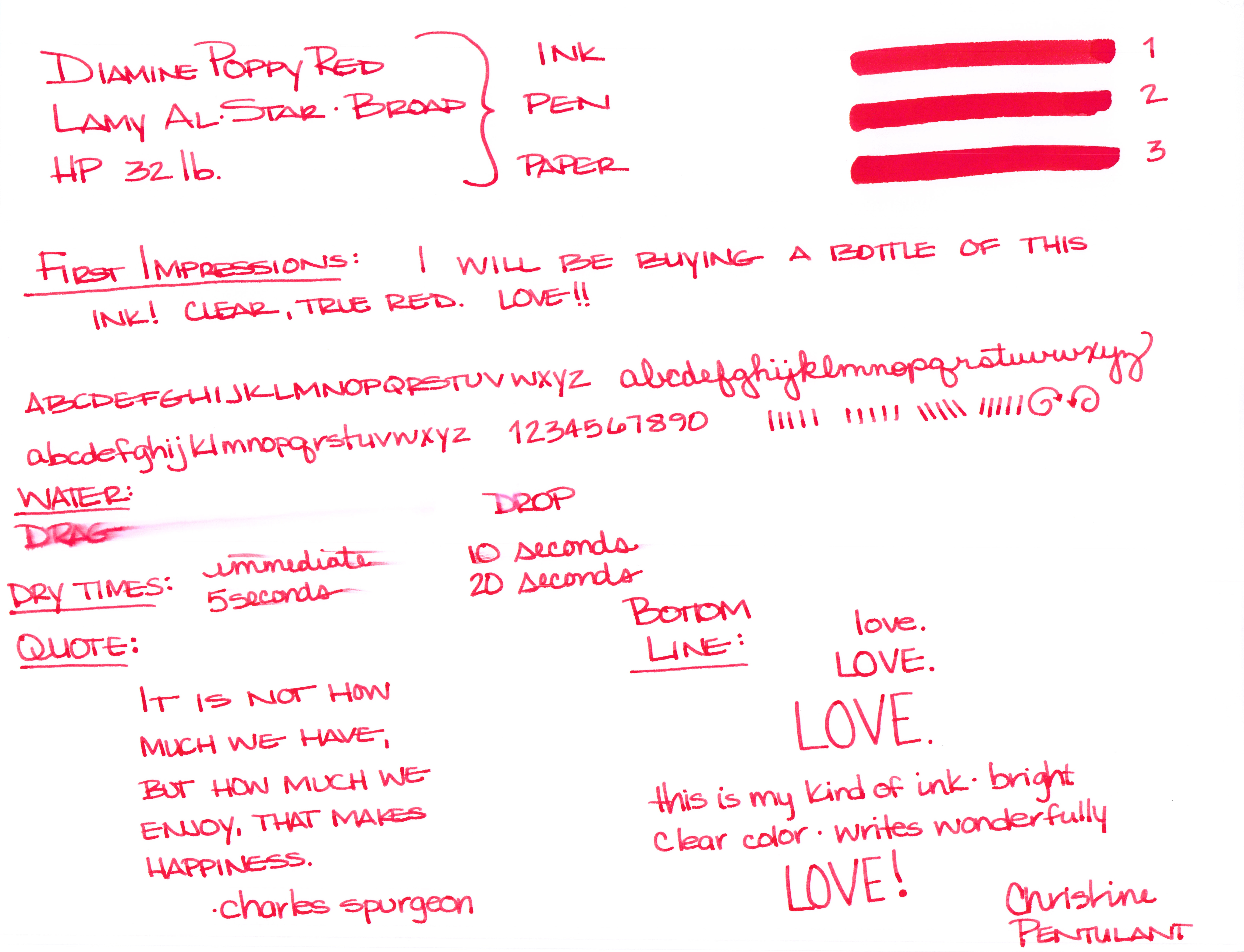
Diamine Poppy Red fountain pen ink is a pure, bright red ink with a teeny tiny bit of potential for shading. The ink dries faster than average on the page and doesn't feel dry (nor too lubricated) in the pen. There is not much water resistance, but I didn't expect there to be. There were no hard starts, no ghosting, no bleeding, no problems. Just plain ole happy red RED saturated ink.
Check it out . . .
The swabs above are 1, 2, and 3 passes with a super-soaked cotton swab.
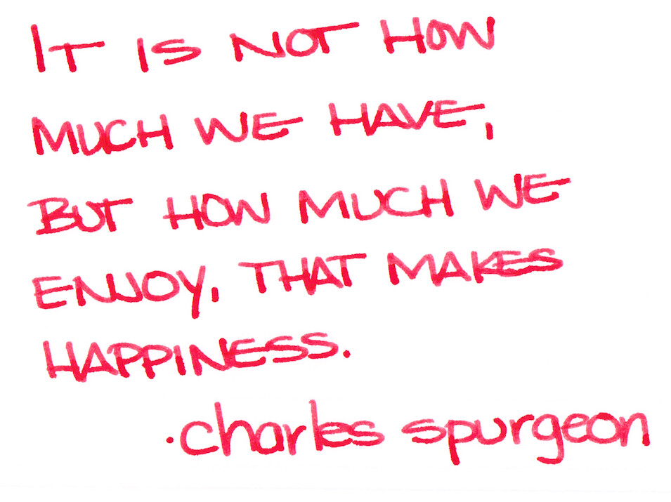
And here's a close-up of some handwriting with it . . .
Seriously, I have nothing but good things to say about Poppy Red from Diamine. This review is from a sample I bought from Goulet Pens. I will have a full bottle of it in the very near future. Love, love, love.
Here's the full review . . .
What do you think? Love it? Maybe you have another go-to favorite red ink?
How was your Thanksgiving? Mr. Pentulant and I were at the beach for the long weekend. We had a great time. So relaxing.
xoxox
Monday, October 28, 2013
INK REVIEW: Private Reserve Vampire Red
Happy Almost Halloween!
This isn't my red - but it is someone's.
Every so often (in fact, regularly) over on FPN, the topic of blood red ink comes up. People really really crave ink that is blood red. Often, I think they are looking for something that is a bit darker than this, but really . . .
| Private Reserve Vampire Red |
Blood red, right?
I like it well enough that I left it in my pen and used it for a week or so . . .
. . . but it's not love.
It's certainly named well - and that always gets bonus points in my book, but I'm more of a bright red kinda girl. I like (most of) my colors bright and bold.
I first tried Vampire Red on Clairefontaine paper and it really is a good ink. No complaints here at all.
And then gave it a go on Tomoe River Paper . . .
I don't see too much difference between the two. Sometimes, Tomoe River Paper will make colors really pop.
What do you think? Bloody enough for your Halloween? Trick or Treat!
Monday, October 21, 2013
INK REVIEW: DIamine Wild Strawberry
![]() |
| Diamine Wild Strawberry Ink Swab |
Ladies and gentlemen, it is safe to say...the losing streak of Monday reviews is OVER! (In case you hadn't noticed, my last three Monday reviews were not inks I fell in love with.)
But this! This is an ink to love! This is Diamine Wild Strawberry. Yum!
![]() |
| Diamine Wild Strawberry Writing Sample |
Because seriously. Look at that color! Wooooo...color like that makes me happy happy! Similar in color, but with more saturation than R&K Morinda. Very different from Noodker's Red.
OK.it's not perfect. There is no shading and I love shading inks. Other than that, though, it's pretty darn perfect.
Dry time is a bit long - even with the fine nib I was using, but I can live with that.
Yep. It's love! Yaaay!!!
Tell me, what ink are you loving on this week? Is it a red?
Wednesday, August 7, 2013
QUICK LOOK WEDNESDAY - Six Pretty Colors
The first step is to write the name of the ink and the name of the pen (see above). I just noticed that each ink is from a different manufacturer - nice.
Apparently, the last resort is to write things that I overhear from the television (see below).
It was actually quite a bit of fun - watching and scribbling, changing pens and writing a bit more. I love the way the entire sheet of paper looks - each color is pretty amazing on its own, yes?
Let's take a closer look . . .
Above - DeAtramentis Alexander Hamilton. I love this purple. It's so rich and deep in color - nice saturation. I don't see this ink discussed much on the various forums, but I think this is a purple that could be used anywhere. (more on that another day)
Below - Private Reserve Spearmint. One of my favorite green inks. It looks a bit dark here to my eye, but it is usually quite cheery.
Do you have a guess as to which show I was watching at the time?
Below - Montblanc Hitchcock. A gorgeous blood red ink if I ever did see one. Some really pretty shading in there, too. I have to confess, I have a quite a lot of this in my cabinet. Shall I keep it forever? Use it as if I'll never run out? Or maybe even sell some?
Below - Noodler's Habanero. A favorite. That shading. The brightness of the color. Need I say more? Mm..wait, I already did right here.
By the way, the above quote is the one that seems like the one that would tell the secret of what I was watching. Have you guessed it yet?
Above - Pilot Iroshizuku Fuyu-syogun. I wonder if I only could have one ink, if this would be it. Check out my big review here. It is crazy CrAzY to think that I, lover of bright and beautiful colors, would be so taken with a gray ink, but there you go.
And, so, there we have it - six pretty colors. All so different from one another and yet all so wonderful.
Which show was I watching? Downton Abbey, of course! Have you seen it? Highly recommended.
Monday, July 29, 2013
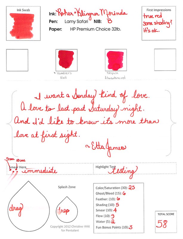
INK REVIEW: Roher & Klingner Morinda
Dear Roher & Klingner Morinda,
I like you. It definitely wasn't love at first sight.
But the more time we spend together, the more I liked you.
You were a bit wet in the Lamy Safari with a broad nib, but who isn't? You were a little smeary, but I can deal with that.
But here's the thing. You wrote great. And the water test? Holy smokes.
And you're pretty. Oh-so-pretty. Just a tiny bit orange to make you softer than other reds. Totally different from Noodler's Red.
The truth is, Morinda, after visiting with you for a week or so, I might be in love with you. We'll see - I'm not quite ready to commit to just one red, but maybe...just maybe.
Love,
Pentulant
P.S. I am just about at the end of the reviews that I scanned before the highlight test - thank goodness. And, yes, I am just lazy enough that I didn't go back and fix the issue. Haha.
Wednesday, July 17, 2013
QUICK LOOK WEDNESDAY: You call that red?
Time for another Quick Look Wednesday!
What do all of these inks have in common? They are all samples from my bag of red inks.
Red?
So, yes, I sort my ink samples by color. I have so many that there has to be a system - I'll take pictures and show you sometime soon.
I first look at the name of the ink and sometimes it's obvious where the ink belongs. Delta Brown? Not a big decision. Frankly, Pelikan Edelstein Ruby didn't seem like a big decision either. Ruby - Red, right? Not so much. Yikes.
When the name doesn't make it obvious, I open the sample, have a peek, and make a best guess. Sailor Jentle Grenade belongs with the purples. Oops.
I'm really liking Private Reserve Vampire Red. Perfect name for this color, yes? Can't wait to write with it!
Maroon from Diamine is ok - nothing special to me. It's one of those colors that isn't really a color. Haha.
What do you think? Do the names of inks get you all bothered, too? Ruby - ha!
Monday, June 17, 2013
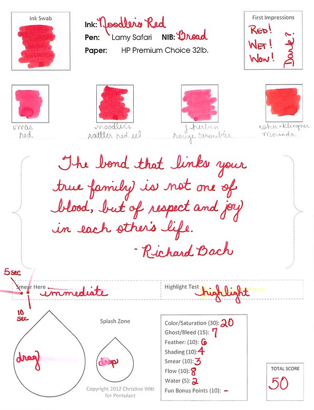
Ink Review: Noodler's Red
Woooo..this is some red! Great color. Terrific saturation.
| love this quote |
It writes well, too. No bleeding or feathering. It's a bit on the wet side, but I was using a broad nib.
It's definitely not water-resistant (not many reds are).
Noodler's Red is a true red. Not too much blue or orange in the mix - just right. Look at the Compare Squares below and you can see what I mean. It's perfectly red.
I don't see a lot out on the Interwebs talking about Noodler's Red. I think it's because so many people are looking for a blood red rather than a true and bright red. Which do you prefer?
Monday, April 29, 2013
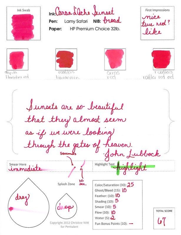
INK REVIEW: Caran d'Ache Sunset
Caran d'Ache Sunset is such a pretty color. Before you fall in love with it, though, you should know something.
It's been discontinued.
In fact, the entire line is being refreshed. Here's a post about it from back in February on Ink Nouveau. The new ink names amuse me. The new price does not. At 40 bucks a bottle, it better be some impressssive ink, right?
But that's not what we're talking about today. This is...
It's a good ink. I liked it a lot. After writing with it for a week, I no longer thought it was true red - too many pink-ish tones for that, but it is a beautiful color.
Have you ever had a favorite ink end up discontinued? I have not - yet.
Subscribe to:
Posts (Atom)