This or That
Orange Ink Edition
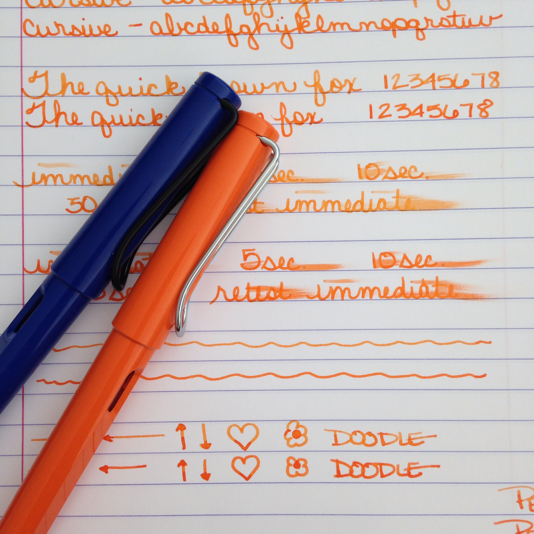
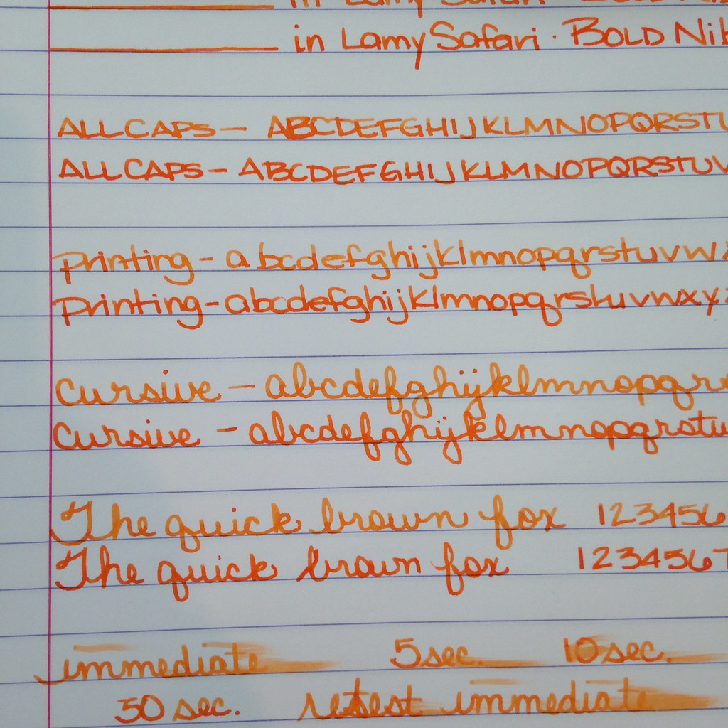
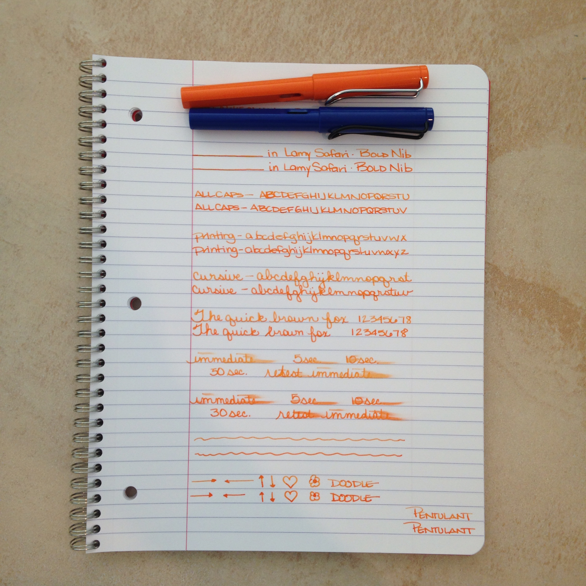
Two orange inks for your consideration today. Both loaded in its own Lamy Safari with a bold nib.

The top ink is a bit lighter - the bottom has more red it in - the top shades a bit better. Each has a fairly serious smear factor and they each wrote just fine with the color on the bottom feeling just a tad bit more lubricated than the top.
Which do you like better?

Circle one. Top with its light orange and shading? Bottom with its richness and saturation?
How do you decide between them? Mr. Pentulant was decisive, "I like the bottom. No doubt."
I'm a little more on the fence. Shading or saturation? It seems to be a trade off between these two inks.
Here's the spoiler ....
Top....Montblanc Gandhi
Bottom....PW Akkerman Oranje Boven
Gandhi is for sale on eBay for around $90 per bottle (it's no longer in production). PW Akkerman is around $24 per bottle (but you may pay lots for shipping if you can't find it in the US).
Tell me which you like better and how you made your decision? Color? Shading? Pricing? Maybe a combination of factors?
This comment has been removed by the author.
ReplyDeleteHaha, sorry about the last comment - I realized I was logged in under my BF's account. Anyway, both fabulous! But both a bit too pricy or hard to come by. Might have to find something a little cheaper... :-) Thanks for the comparison, as always!
ReplyDeleteI like the redder orange, but, I love the shading of the lighter orange. I guess that puts me on the fence.
ReplyDeleteI always enjoy seeing side by side ink comparisons. On color intensity alone, I favor the Oranje Boven. I usually use orange ink with a fine or fine stub nib, so a less saturated ink doesn't fare as well. My current favorite orange is Diamine Pumpkin.
ReplyDeleteHonestly I like the bottom one. Not only is it a bit cheaper than the top one lol, but I like that it appears consistent in shading/ink flow. You don't get some letters that are lighter/darker than others (top one). Thank you for the ink comparison! :)
ReplyDelete