Pages

Showing posts with label j herbin. Show all posts

Monday, October 13, 2014

INK REVIEW: J Herbin Stormy Grey

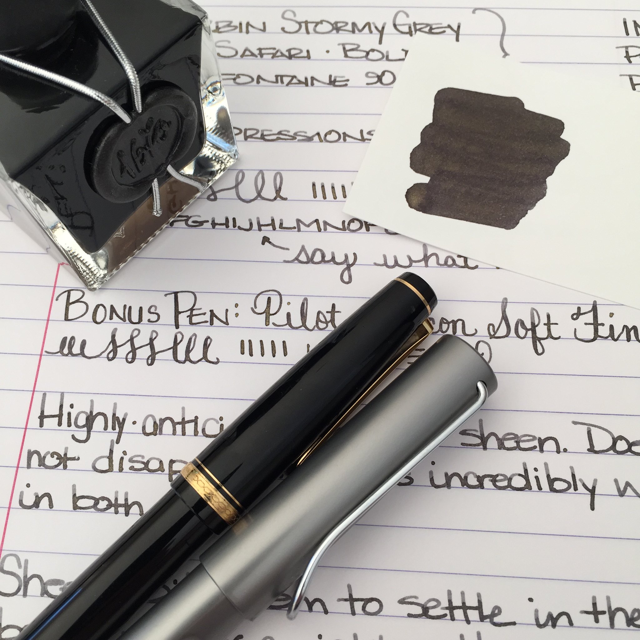
Handwritten Review: J Herbin - Stormy Grey

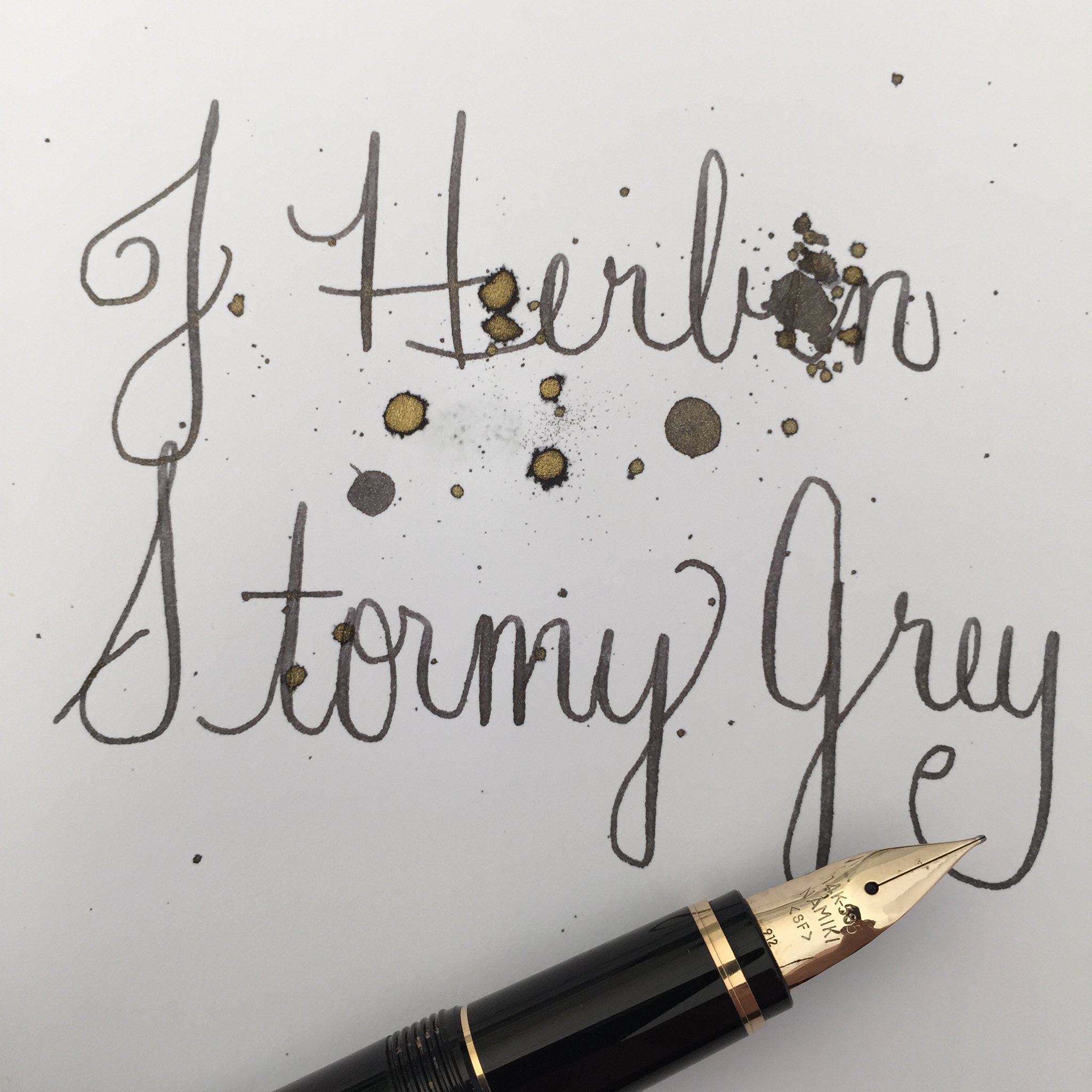
There has been so much chatter in the fountain pen community about J Herbin's Stormy Grey ink. So much anticipation. It's all about that gold sheen, baby.

When Goulet Pens finally announced that they had it in stock, it was sold out in under an hour - and I missed it. Arrrrgh.

I hurried over to Amazon to see if I could find it there - score! It's the same price at both places -  $26 for 50 ml.
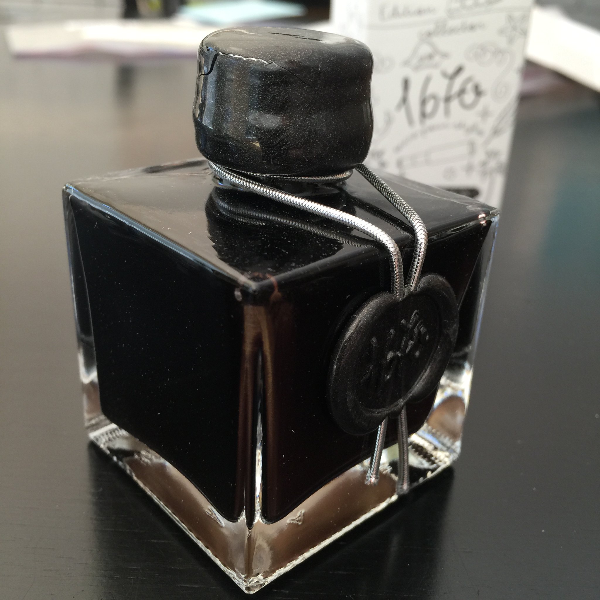


Above: Like the other J Herbin special editions, this bottle is extra special, sealed with wax, and quite lovely. Except that only the smallest pens could fit into the opening of the bottle. And my wax on the screw top is already cracked - whomp whomp.

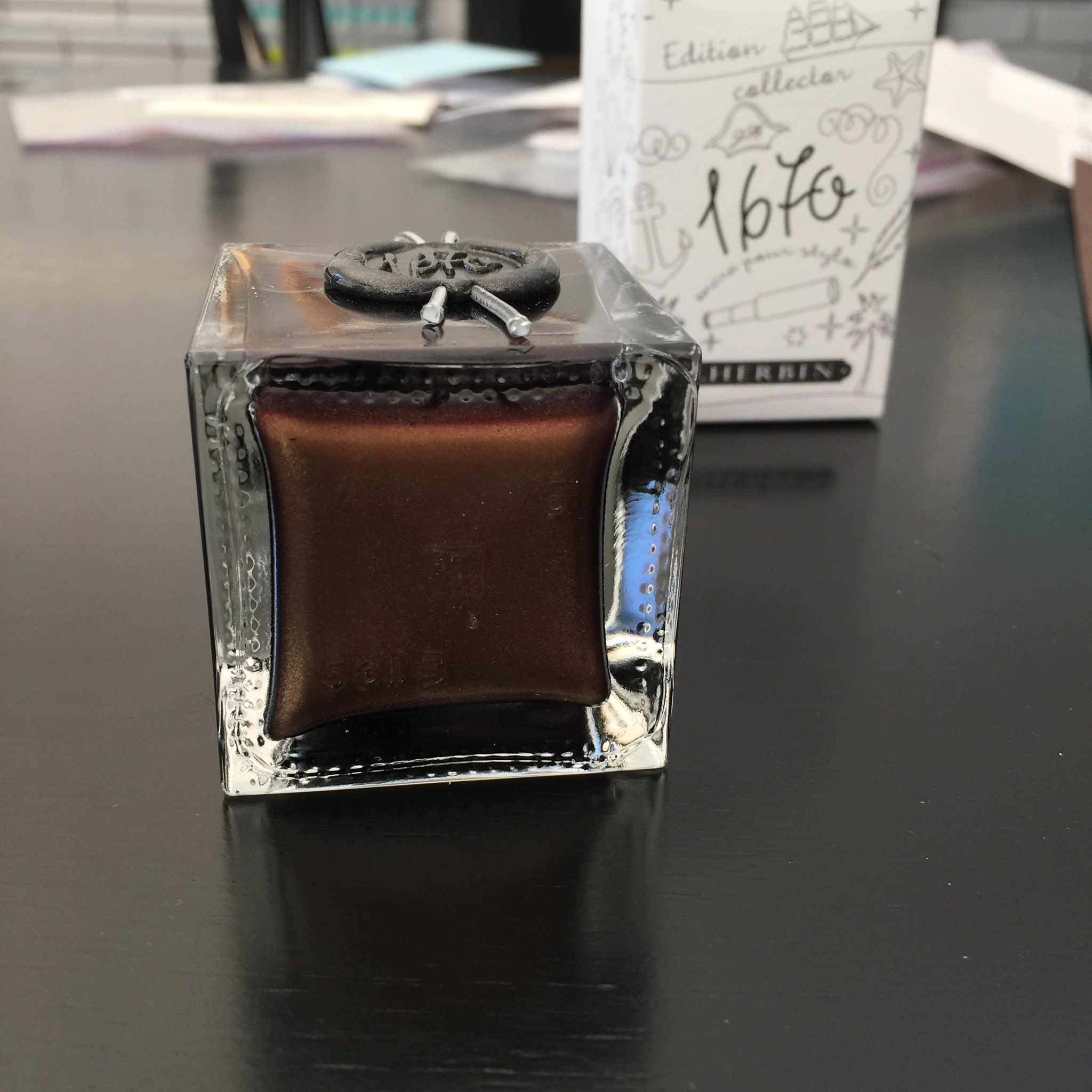
Below: The sheeny bits came to a rest at the bottom of the bottle.  You'll want to shake well before using this ink.


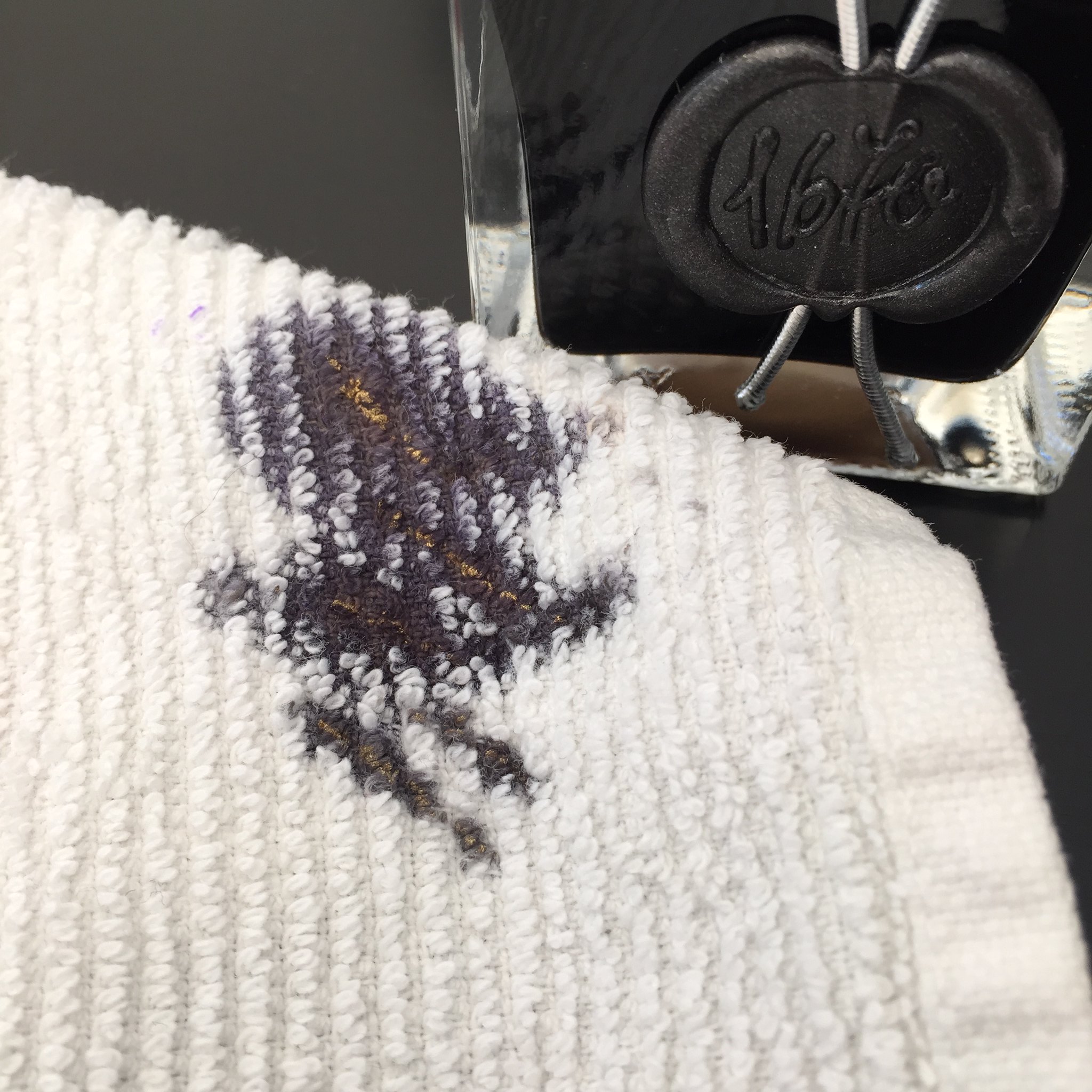
Below: Sheen on the towel that I used to wipe my nib. Crazy, right?


All of that Stormy Grey sheen is just fine, but how does it write?


Quite wonderfully! 

The ink has terrific flow out of the pen (leans toward the wet side, but I like that). There's some great shading and I really like the darkness of the gray (grey?) color with or without the added fun of the sheen.

Something I noticed that could be a concern - in the bottle, the sheeny bits settled so quickly. I shook the bottle like mad and then quickly pulled the ink into a syringe to fill my pens. If the sheeny bits settle that quickly, what happens in the pen when filled? Will all of the sheeny bits fall to the writing end of the pen and you will get the most sheen from the first few pages - and no sheen at all for the last few? 

The only other downside I can see with this ink is that because of the sheen, it's not an ink that could be used in every situation. Thankfully, we live in a world that allows us some whimsy now and then.  ;)


Below: My scanned writing sample doesn't show much sheen, but it's definitely there in the right light.


Looking for the sheeniest sheeny picture of them all?  Check out my friend rubengamez's feed on Instagram. It's crazy good sheen!


Monday, August 25, 2014

SAN FRANCISCO PEN SHOW 2014: Review and Haul


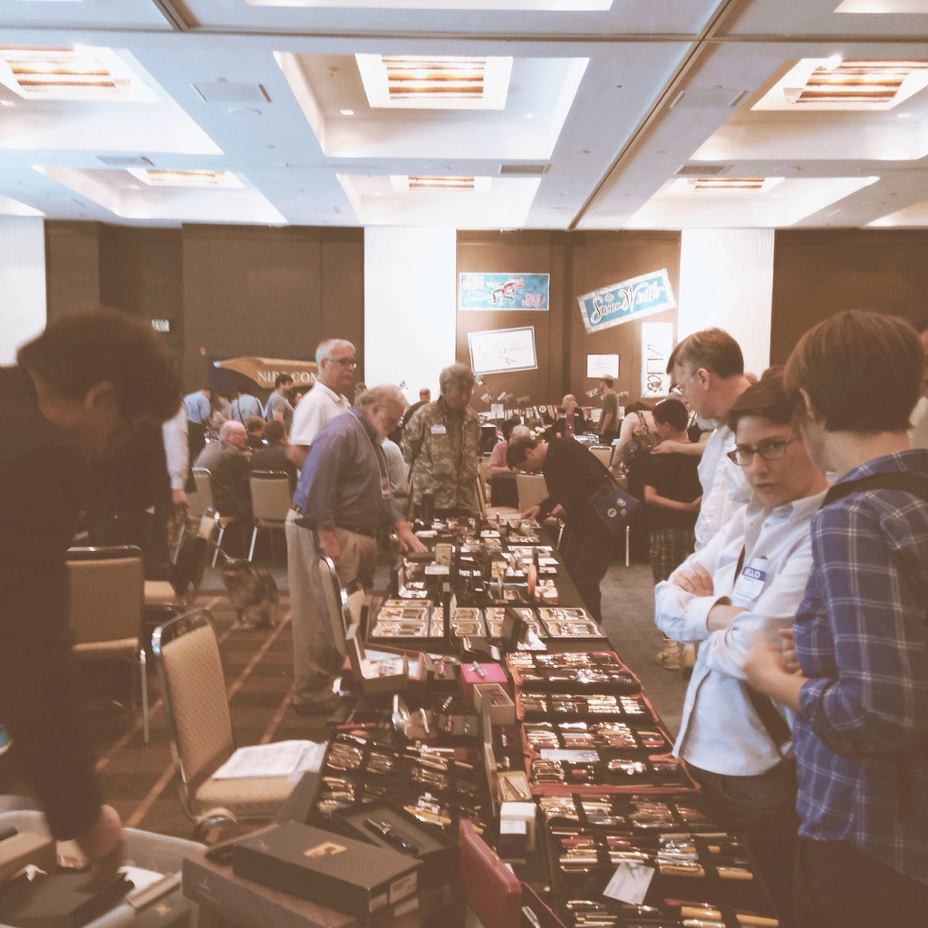
Mr. Pentulant and I decided to head down to the SF Pen Show over the weekend (Saturday) and I thought you'd like to hear all about it.

The show was held at the Sofitel Hotel in Redwood City. It was a bit south of SFO, but easy enough to find - just look for the Oracle campus and take a right on Twin Dolphin Drive.


There were probably 50-60 vendors. I'm wondering if some who were expected didn't show up? There was a large empty area to the right as soon as we entered - as in about 10-15% of the floor space.

I wasn't too surprised at the small size of the show. The DC Pen Show was just two weeks ago, after all. The crowd was decent Saturday morning (we arrived around 11:00) and it looked like money was changing hands - all good news.

The SF Pen Show is a on/off thing - meaning that some years there isn't a show.   I'm so glad it was on this year and definitely wanted to support the vendors who showed up to sell.

There were many familiar names and faces. Susan Wirth was there, Franklin-Christoph, Nibs.com, Mike it Work, Wahl-Eversharp, Bittner, Arizona Pens, Carmen Rivera, Steve Curnow, and many familiar faces even though I don't know all of the names.

Here's what I ended up with . . .


I'm a huge fan of my friend Steve Curnow, what he does, and how he does it. These handy notebooks (think Field Notes, but better) are filled with Tomoe River Paper.  Three notebooks for ten bucks, yo.

Steve also had a sample of ink waiting for me. It seems he found a GALLON of vintage Skrip Washable Blue.

1. How does someone "find" a gallon of ink? (Maybe he wasn't being literal?)
2. Do I trust this old old ink in one of my fancy pens?


Mr. Pentulant scored this sweet Sailor Pro Gear Mini. He loves a cap that screws to post and this one has been on his wish list for quite awhile.


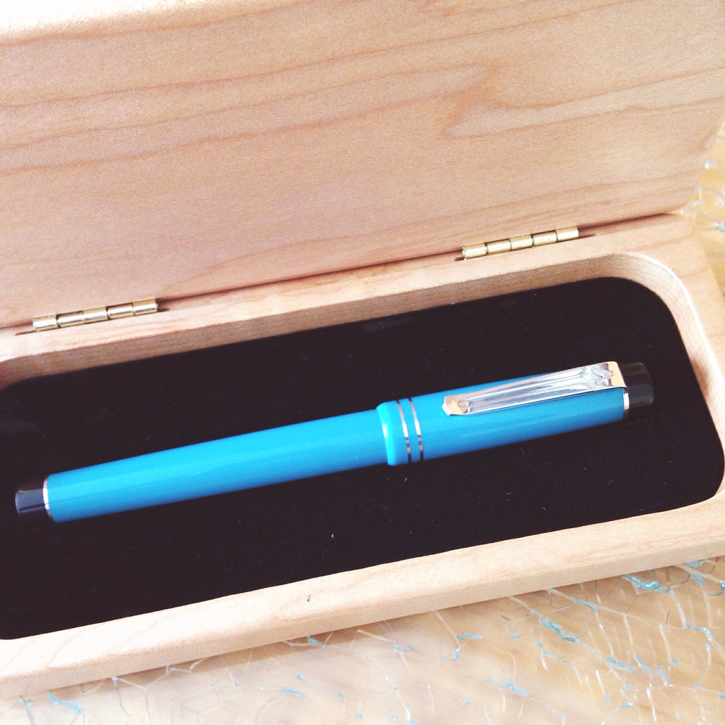
At the LA Pen Show earlier this year, I was so tempted by George Butcher's Arizona Pens, but ultimately decided to pass.  I didn't pass this time!

I want to tell you all about George and his pens, but will save that for when I review the pen. I can't wait.


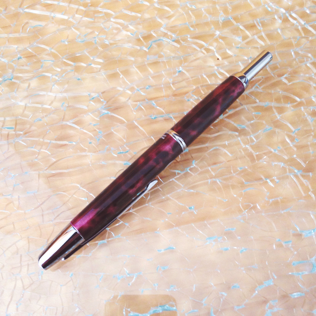
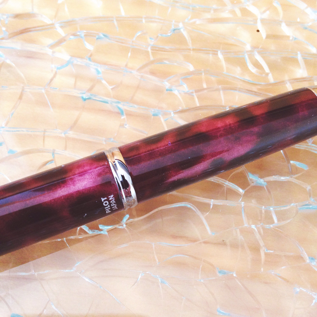
Carmen Rivera has very good taste in pens. This is the smaller and slimmer version of the Pilot Vanishing Point - called the Sesenta.

I don't know much about this pen, but I'm definitely willing to learn. I love the pattern - it almost reminds me of a leopard print, but not nearly as tacky as that could be on a pen ;)


Wahl-Eversharp has an interesting history and it was difficult to choose just one.  I'm really excited about this pen - and so many others in line.  Can't wait to talk more about them and Syd Saperstein.

I ultimately decided on the clear demonstrator (look at that packaging!).


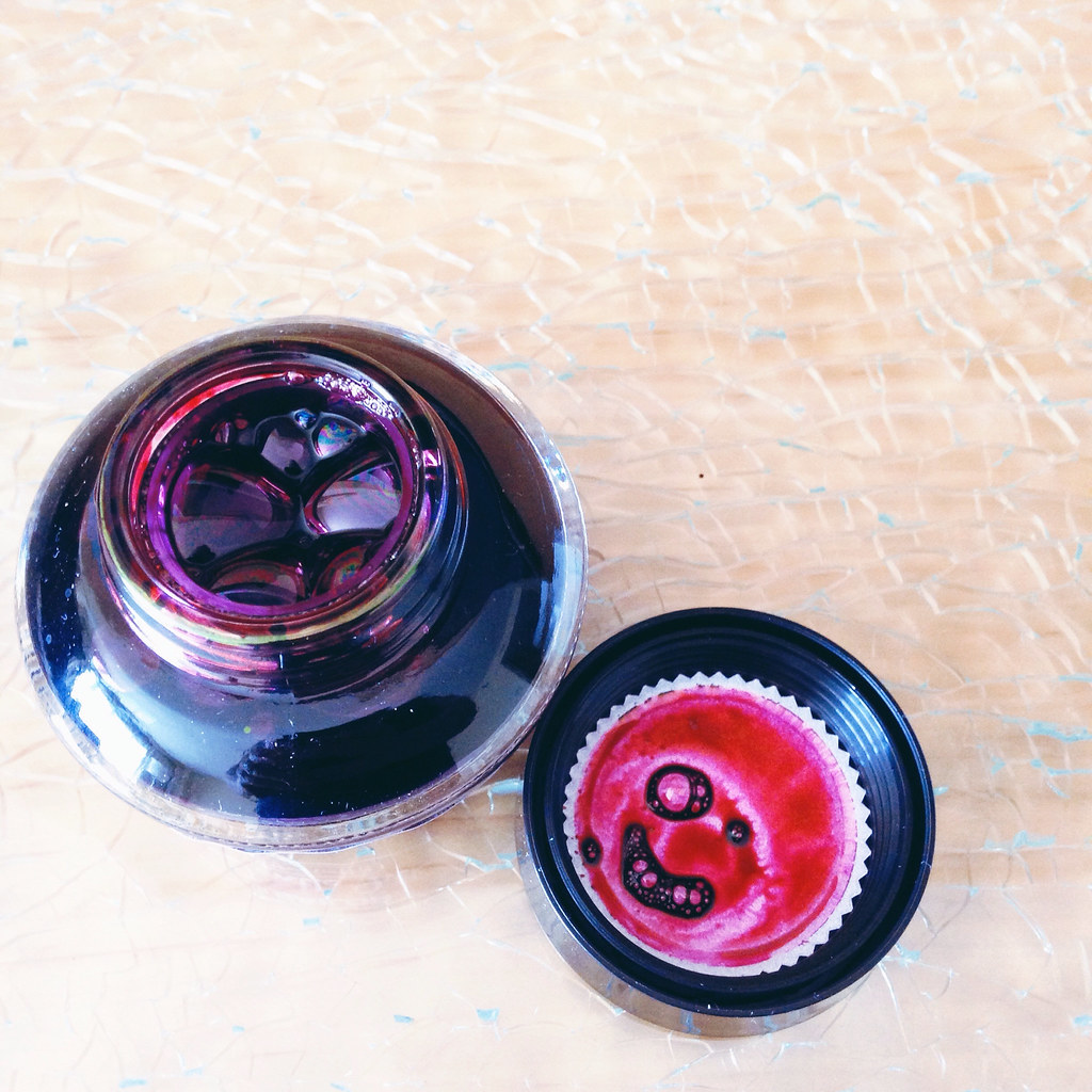
I picked up two bottles of ink.  Above - Sailor Jentle Grenade

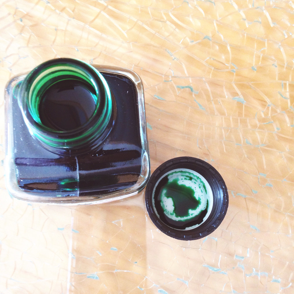
Below - J. Herbin Lierre Sauvage


Lierre Sauvage (and Lily Tomlin) is responsible for one of my most popular Instagram posts ever. At the time of that writing, I only had a sample. Excited about writing a complete review of this one for you.


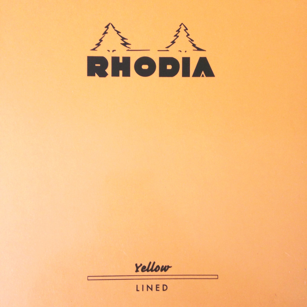
Rhodia makes yellow paper! I'm oddly excited about this because I've never seen it available.

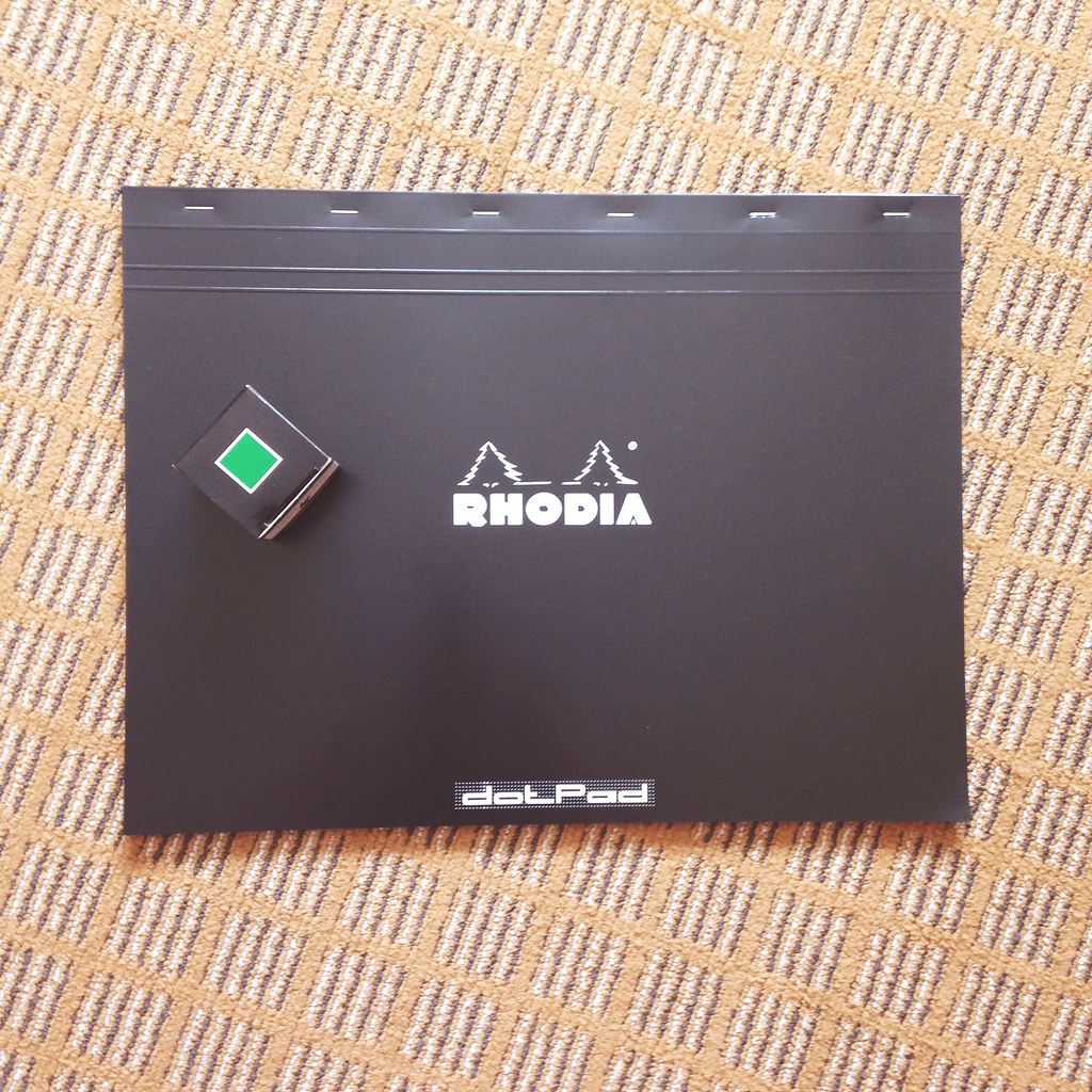
Annnnd....I have no idea what I'm going to do with the paper below, but I had to have it. It's huuuuuge - that's a box of J Herbin ink sitting on top of the paper.


So! That's it.

Bottom Line:  It was a good time, lots of super-friendly people selling some really beautiful items. I only wish the show was bigger.

Were you there?

Monday, December 2, 2013

INK REVIEW: J Herbin Ocean Blue 1670

Ink Review:  J Herbin Ocean Blue 

A (mostly) wordless post for this first Monday after Thanksgiving.


Good, clean color.


Starting issues in my TWSBI 540 (B)


Final Thoughts:  It's ok.  I wish it had some gorgeous, special sheen like the Rouge Hematite. I wish even more that I didn't have so many flow issues - even with a broad nib.  I like it enough to give it another go another day.

Have you tried J Herbin's Ocean Blue?

Monday, April 1, 2013

PEN REVIEW: Waterman 52


On Friday, I shared some recent purchases including this little gem I acquired from VintagePen.

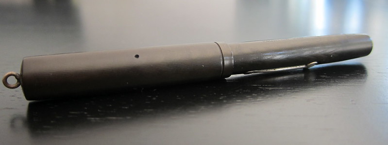
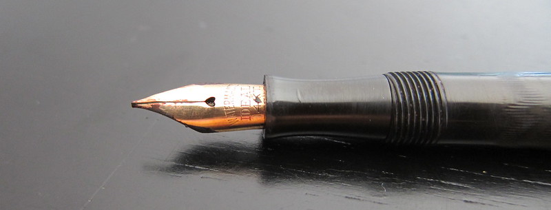
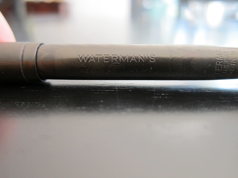
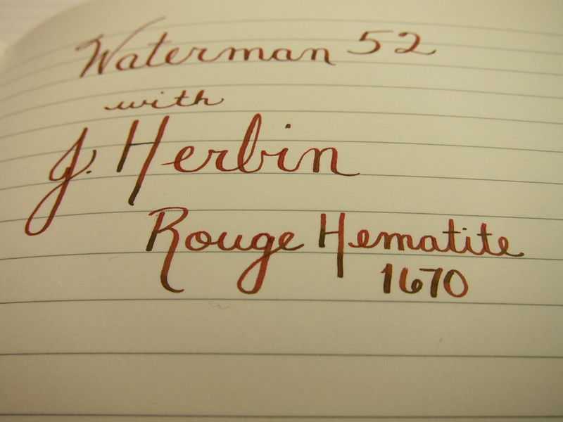
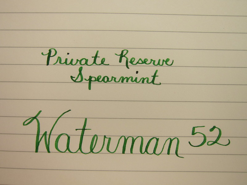
Going to (mostly) let the pictures do the talking here . . .

That's a little nib creep - not rust or anything icky like that


love the gentle chevron - so subtle


And now . . .


Sammy is one of our three (!!) dogs.


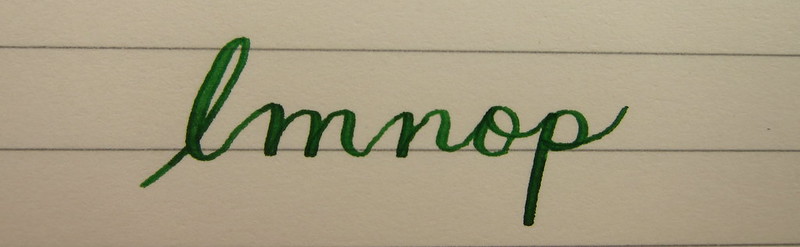
My handwriting needs a bit of work, but man-oh-man, I am digging this pen. So much so that some of my other favorite pens have been sitting around unused in the short time I've had the Waterman 52.

It's a little skinny, a little short - neither of those things are a bother to me. It writes wonderfully - perfectly smooth, easy to flex. It's not even a little scratchy and it doesn't skate uncontrollably across the paper.

The lever-fill is easy to manage - perhaps a pain to clean and ink capacity seems a bit low, but I can live with those things.

I love everything about the pen except there's no clip on the cap - making the pen very likely to roll around. I hope so much that I never inadvertently set it down and have it roll onto the floor. Yikes.

This is a pen that will stay in the house because I really would be heartbroken if something happened to it.

It's love! True love.

Monday, March 18, 2013

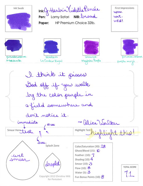
INK REVIEW: J Herbin Violette Pensee


Boom! Take that, boring winter colors! Pow! In yo face!


See it huge.


I really like this color. It's maybe a little milky looking, but in this case, I really really like it. Boom!


Totally saturated, fun color that doesn't hold up well to water. (So what?)

LOVE that the drop spatter is visible in this image.
It's the little things.

My bottom line? Same as my top line!


Perfect getting ready for spring color. Agree? Disagree? Discuss in the comments!

(Oh yeah..and Private Reserve Tanzanite? I'm coming for you, Ms. Thang.)


Monday, March 11, 2013

INK REVIEW: J Herbin Vert Empire

We're going to dive right into this quick review . . .


Click for the full-size image


This was a stop on the way to finding a deep dark green for Mr. Pentulant.


A fast stop. I couldn't tell if this was green or gray (grey). With a name like Vert, I'd expect something rather obvious.

Bottom Line: This is not the perfect ink for Mr. Pentulant, but mostly because of the color. If you liek the color, it's actually a very well-behaved ink.  

Tell me, do you like this color? 

Friday, January 11, 2013

INK PREVIEW: Oops.


Pffft.

I'd completed the review of Montblanc's Winter Glow and then went to my stash - grabbed four red inks out of my red inks sample bag - and above is the result.

Dude. Those aren't red. Maybeeeeeee Rouge Caroubier is close - but even it is more of a pinky color.

Heaven only knows why I didn't stop after the first - or the second - OR THE THIRD - but I kept right on going.

So..what you have here is a mess. But at least you can see the swab of Winter Glow and a bit of writing. It's darker than I thought it would be coming out of the pen.

I'll get a proper review of Winter Glow done soon.

After I try sorting my samples by color one more time ;)

Monday, November 26, 2012

INK REVIEW: J Herbin - Gris Nuage


Here's a quickie review of one of my favorite inks to get us back into the groove this week. (More on Thanksgiving another time.)

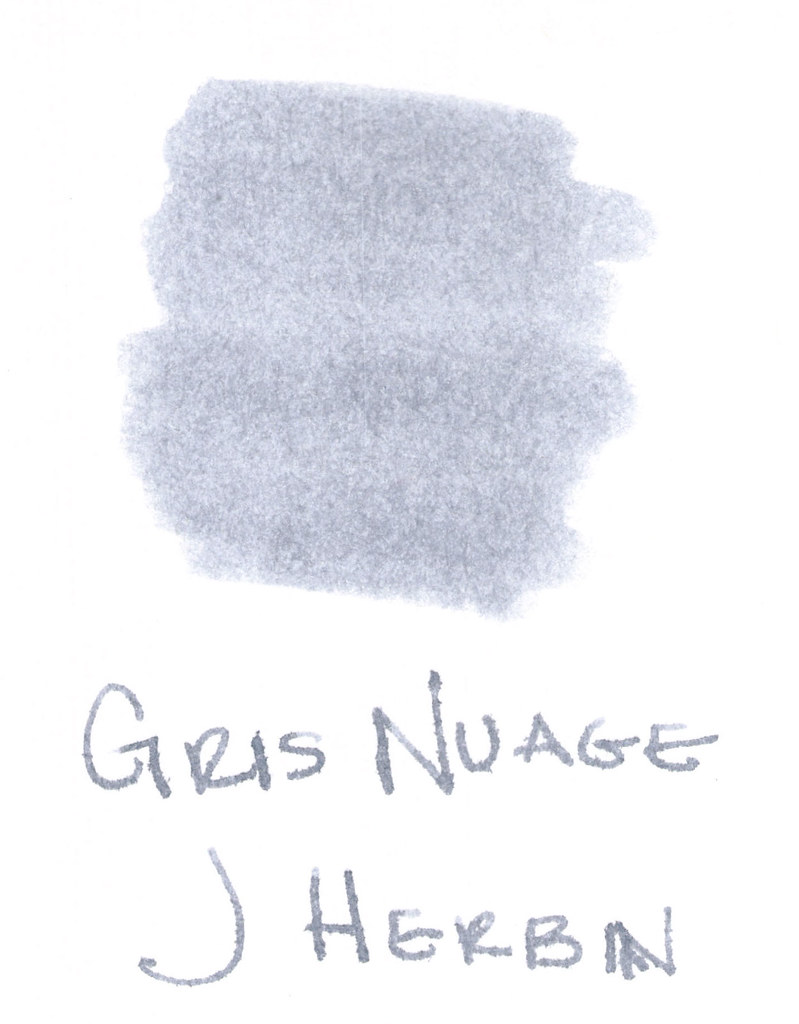
The above swab was done with a q-tip and then the name of the ink written with a glass pen. In my experience, there's a lot of feathering with glass pens and this was no exception. (It also doesn't help things that it's written on a cheap-o index card.) (Again, I ask, are there are any nice index cards out there? Starting to think there aren't.)

Anyway....Gris Nuage (Gray Cloud - how pretty!) is one of my very most favorite gray (grey, if you insist) inks.

It's light - just like a cloud. It's prettttttty. Leans more toward blue than red, but is definitely one of those pure colors that I adore.  

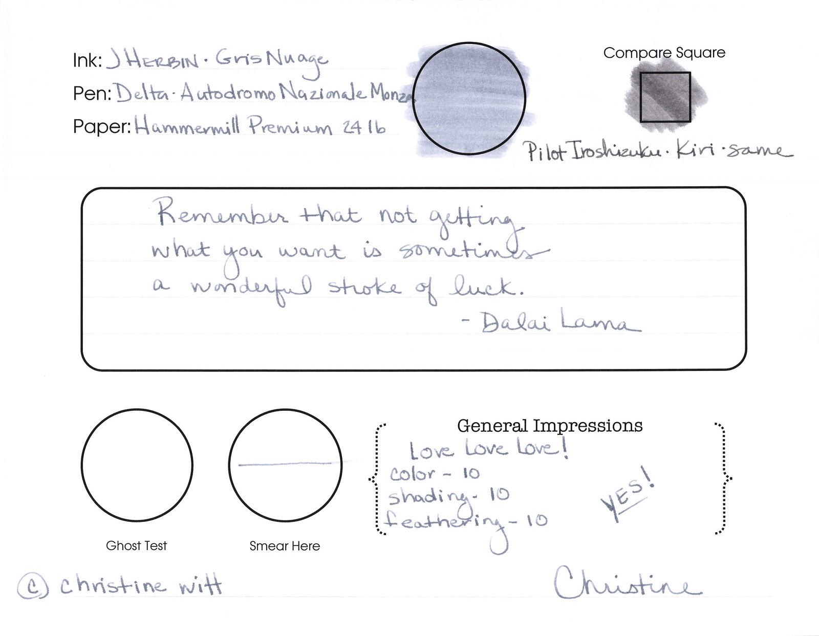
And, holy crappoli (it's a word), it writes like a dream. Check it out....


Pretty, yes?  Some lovely shading going on there, too. And no smearing, no feathering, no ghosting, or bleeding. What more could a girl want in a gray ink?
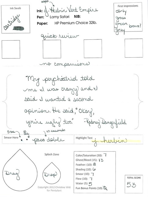


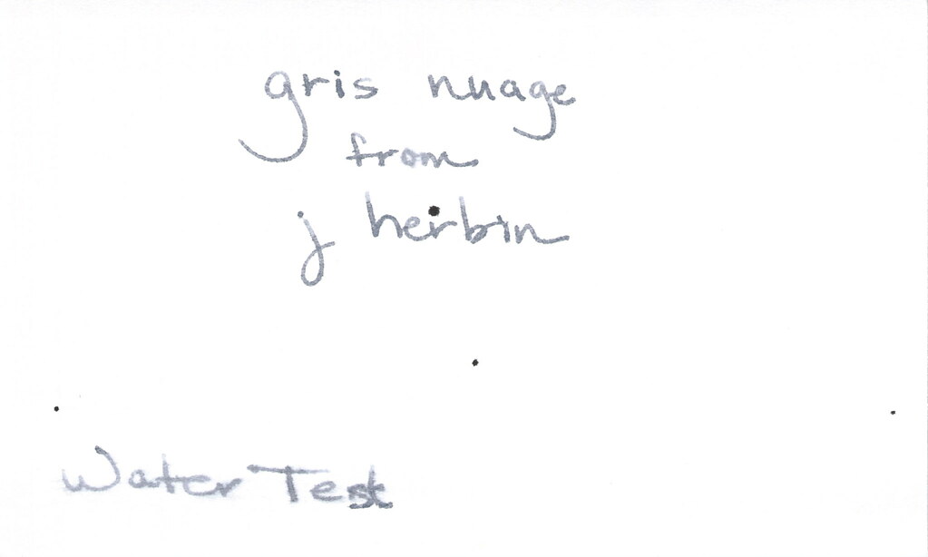
Oh, yes, it does well with water!  Nice!!!  This is totally one of my gray inks. It makes me swoon!

OK..so see those black specks on the water test?  No, it's not Gris Nuage gone crazy - that's collateral damage from my Invincible Black spatter. Haha!

Do you have a favorite gray? Mr. Pentulant was using Montblanc Oyster Grey for awhile in his fancy new Boheme, but he wasn't loving it.