Pages

Showing posts with label *. Show all posts

Friday, May 24, 2013

Paradise Pens (Part 2)


This is Part Two (of three) of our honeymoon visit to Paradise Pen in Las Vegas.

In case you missed the news, the shop is closing at the end of the month. When we were there, it looked like they had lots of Montegrappa fountain pens left, some Montblanc, and a few Cross and assorted other brands. For inks, there was primarily Private Reserve and Pilot Iroshizuku. Other than paper in porfolios and Filofax, the only notebooks I saw were from Rhodia.

I came away with a stunning Montblanc 145 (its cousin is the piston-fill 146). For a graduation gift a few years ago, I gave Mr. P the Faber-Castell pencil set (because he's a total math nerd)...
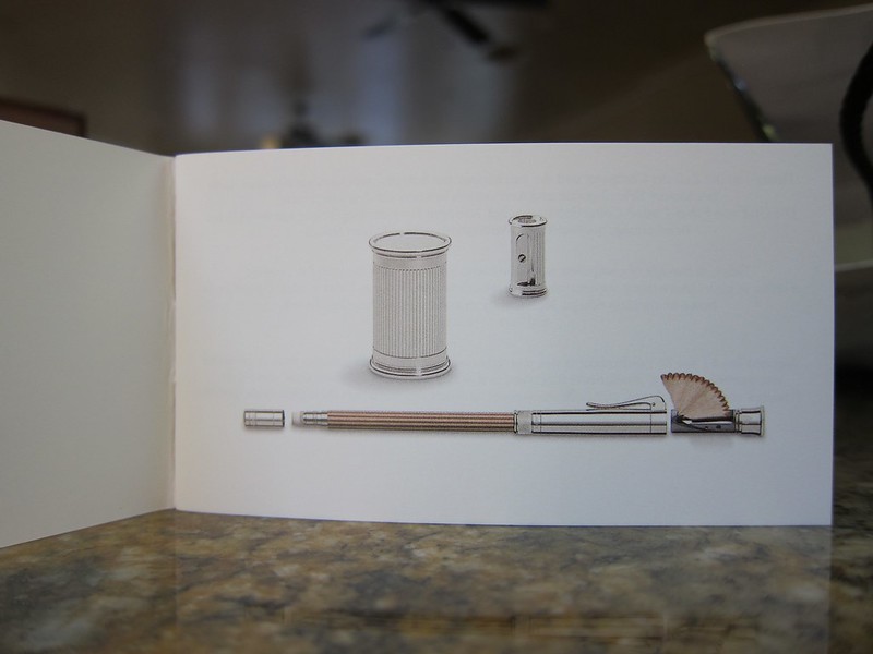


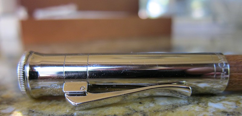
Since then, he's had his eye on this...
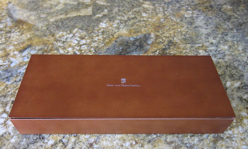


Graf von Faber-Castell


I have to say, Mr. P does have good taste.
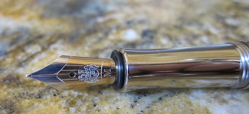


I love all of the details on this pen.  The two-toned nib. The styling of the cap. Mr. P likes the thick threading of the cap (a detail that would have gone missed by me).

We were both a bit concerned about caring for the wood barrel of the pen, but after reading a bunch (after the purchase...haha), it turns out that it requires no special care and will develop a darker color with extended use.

The pen hasn't been inked yet (still taking it easy and enjoying time together after the wedding), but I'll definitely post about it when it is.


Wednesday, May 22, 2013

Paradise Pens (Part 1)


Mr. P and I hit up Paradise Pen in Las Vegas last week. I was so sad to see that they are closing this location effective June 1.  Other than Montblanc in Caesar's Palace, Paradise Pen is the only pen shop that I know in Vegas. It's too bad - but I definitely get that the high cost of rent in big malls doesn't make it easy.

Everything was on sale - up to 25% off all items. The employee on duty didn't seem to have any wiggle room with this. I asked, they are not selling any fixtures or displays.

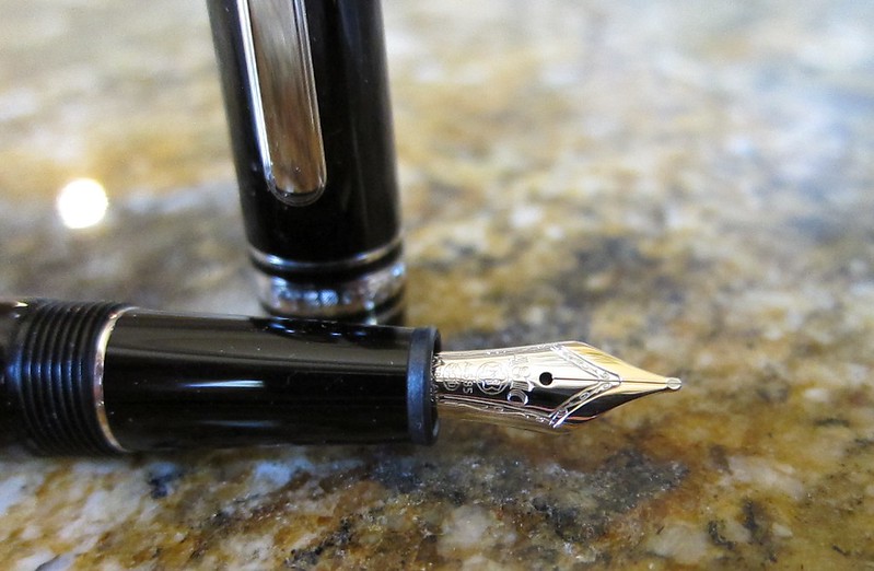
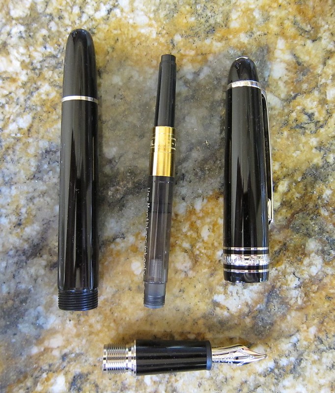
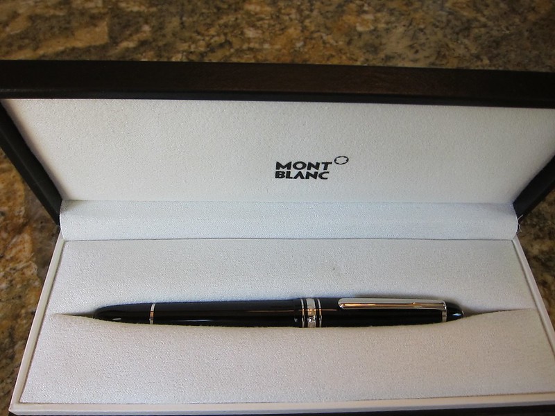
But they were selling this....


Montblanc 145


I've actually been pondering on this very pen for quite some time. Uncle Robert's 149 is a bit too big and heavy for my wee lady hands.  (My hands are not actually wee, but the 149 is definitely on the bulky side for me.)


I've not inked it yet, but will post about it when I do.


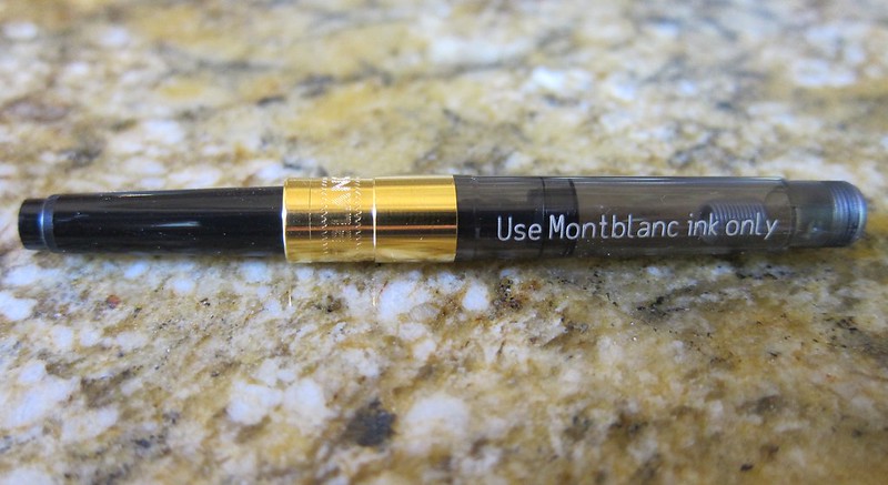
I probably won't use only Montblanc inks in it - I'm just pentulant that way.  I love that the converter has a mixy thing in it. You can see it in the picture above near "ink only."

Mr. P didn't come away empty-handed either. Stay tuned!

Monday, April 15, 2013

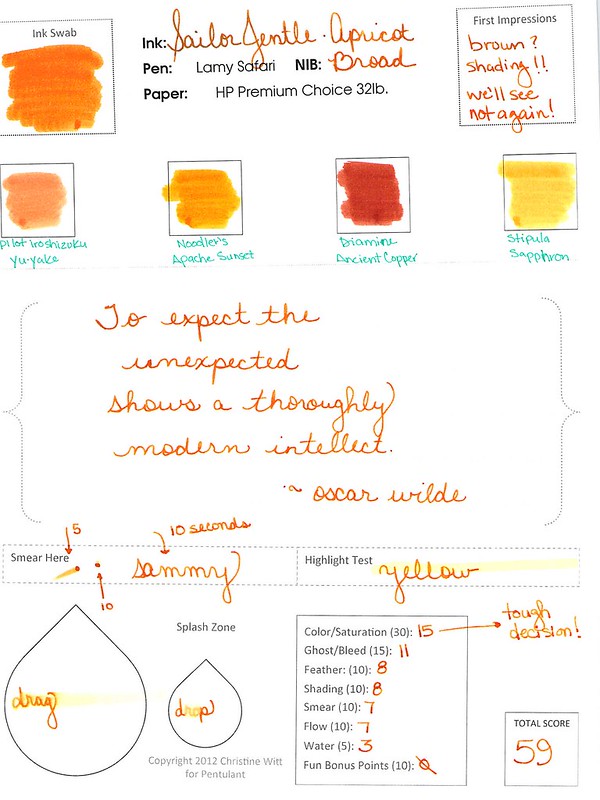
INK REVIEW: Sailor Jentle Apricot


I think I need to admit that I'm into orange inks.

First there was Diamine Pumpkin with its WHOA color. And then there was Noodler's Habanero with its incredible capacity to shade.

And now - Sailor Jentle Apricot.

At first, I thought we were heading toward another Stipula Sapphron situation. But no - this is different. Sailor Jentle Apricot is a special ink.  Nice color - beautiful shading.


I ended up using this ink for a week or so after the review and reading the review now, I don't think I've done it justice here.


In fact, I ended up enjoying it so much that I bought a bottle of it back in March. It's not perfect - those water tests are not going improve with time, are they?

I'm going to come back to this one. Create some writing samples in a variety of pens and come back to talk about it.

Have you ever had a mediocre first reaction to an ink that you later ended up loving?

Thursday, February 21, 2013

INKY REJECTS


Three inks that will never ever ever (well, maybe) make it into any of my pens.


We'll start with Organics Studio Mercury in the middle. Turns out that after sitting for awhile, this ink solidified - well, actually, it gellified (it's a word).  You can actually see the clumps in the third swab of this really pretty color.

Organics Studio Cobalt is guilty by association. I know, I know. I could try it with a glass dip pen, perhaps. It is a really pretty color - especially when it's laid down in three layers, yes?

Noodler's Rochmaninoff. I bought a sample of this from Goulet Pens (love them!) and it's clear this isn't like other inks. I had to shake the vial to mix it all up and even then, it looked - suspicious - like something I wouldn't want to put in a pen. But. When I swabbed it, no problem - perfectly smooth and kinda pretty (in a Pepto kind of way). And look at the glow - pretty, right? I think I'm going to get brave sometime and test this one. Maybe. 

Are there ink brands you just won't use? Have you ever changed your mind and it worked out ok? Or (yikes) didn't work out?

Wednesday, January 30, 2013

INK REVIEW: Stipula Sapphron


Holy cow. 

I hate Stipula Sapphron.

It shades like a son-of-a-gun. Sounds like I should love it, right? Or at least like it. But no, I hate it.

It's not often that I say that. In fact, here are all of my posts with "hate" as a tag.  

In the sample vial, the ink looked like a pretty (though not saturated) orange. When I swabbed, I thought the ink looked a little on the yellow side, but was still pretty enough.  (See my first impressions on the handwritten review.)


Then I started writing with it. I was sure my pen must have been dirty. But at the same time, I knew it was a brand new pen and a brand new converter. No ink had ever touched either and both were cleaned prior to use. I twisted a bit of ink out onto another piece of paper - and it sat there looking like a bubble of yellowish mud!  When I smeared that mud around with a cotton swab - it looked like the Ink Swab in my review.

Ca-razy! I don't get it.


You know what else I don't get? I couldn't find even one other review for this ink. Not on Fountain Pen Network, not on Goulet Pens, and even Google came up empty. It's like I'm in the twilight zone over here.

Hard to believe I'm going pass by shading like this. But I am.


Pretty weird. That's my first impression - and coincidentally - my bottom line for Stipula's Sapphron. (By the way, I have no Stipula aversion - I own and love several of their fabulous pens. This ink is just weird.)

In fact, I wanted this to work badly enough that I tried it again another day. With another kind of paper.


Always looking on the bright side, however, Apache Sunset has been on my list of inks to review forever and I'm excited that it's coming up sometime soon!  And that De Aramentis Gandhi? Isn't that pretty? 

Time to 'fess up! Do you have Sappron? Do you love it? Hate it?


Monday, January 28, 2013

PEN REVIEW: Montegrappa Espressione


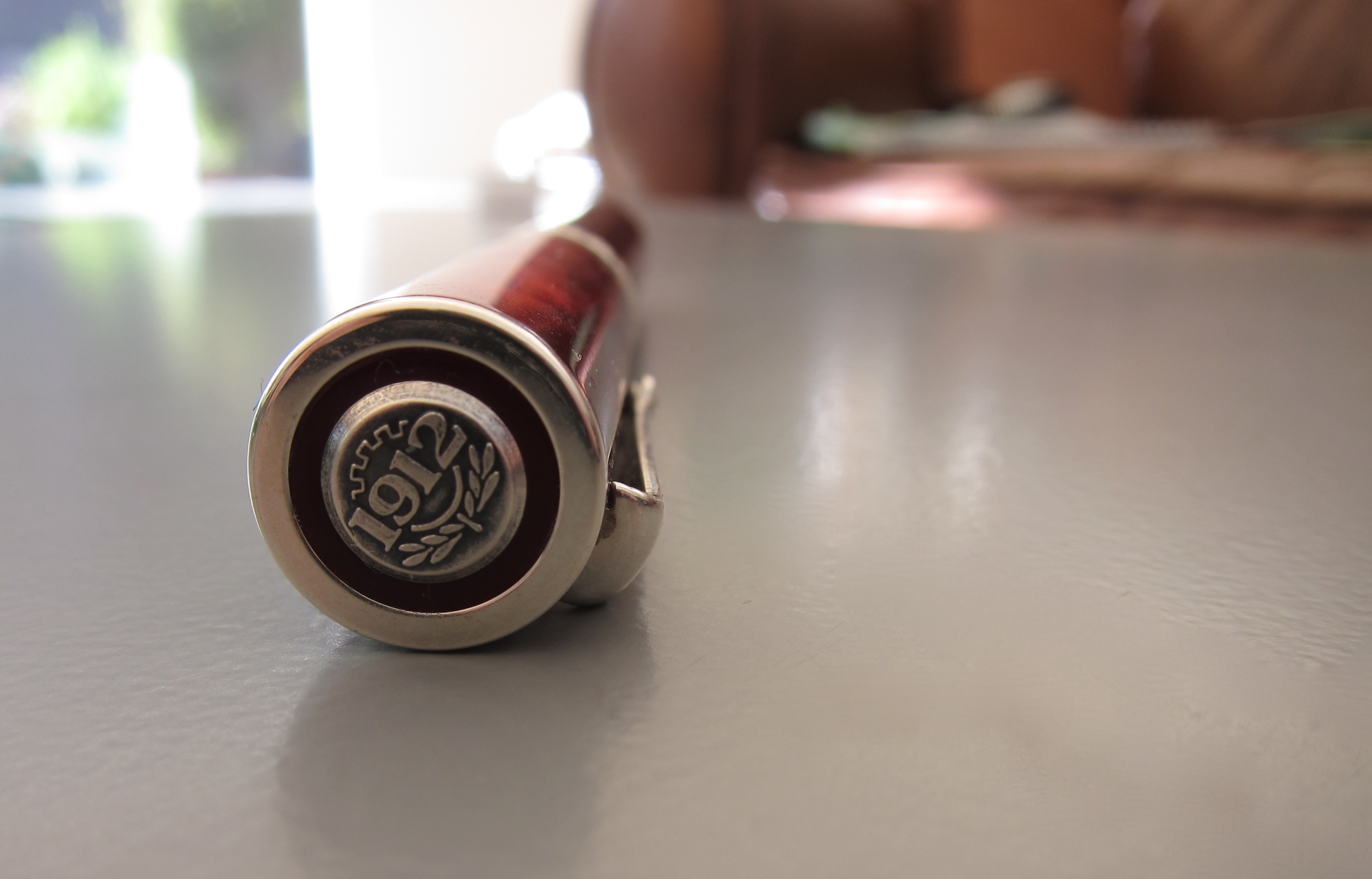
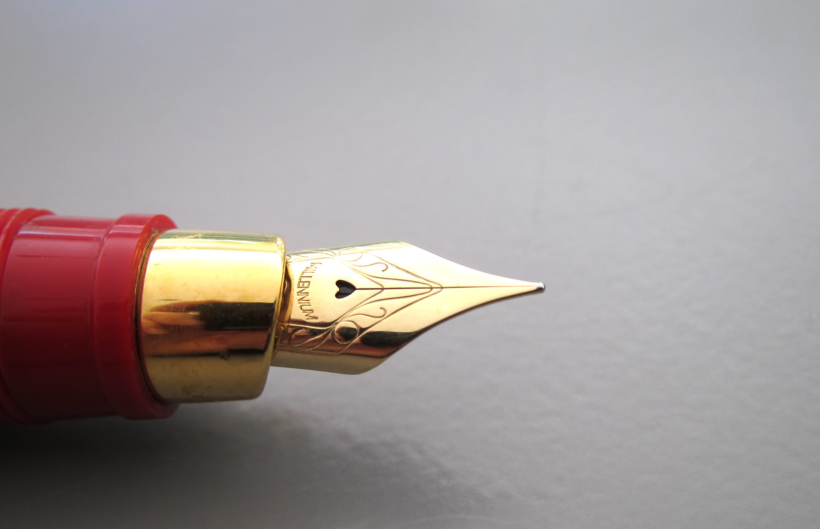
So pretty.  So sleek and modern. A great profile. This Montegrappa Espressione is quite the looker!

And..it has a screw-to-post cap - Mr. Pentulant loves that.

Montegrappa is a well-respected line, many people love their pens. I don't love this. In fact, I pretty much hate it. How is that even possible?


See the metal grippy part? (Grown ups call the the Section or Gripping Section.) It's metal. And it's omg, too short. Which means that my finger is resting on the threading. Which means it hurts. Bad.

And. It's heavy. Too heavy. When posted (as it's clearly meant to be), it's unbalanced and gross.

No likie.


But man, it's pretty.


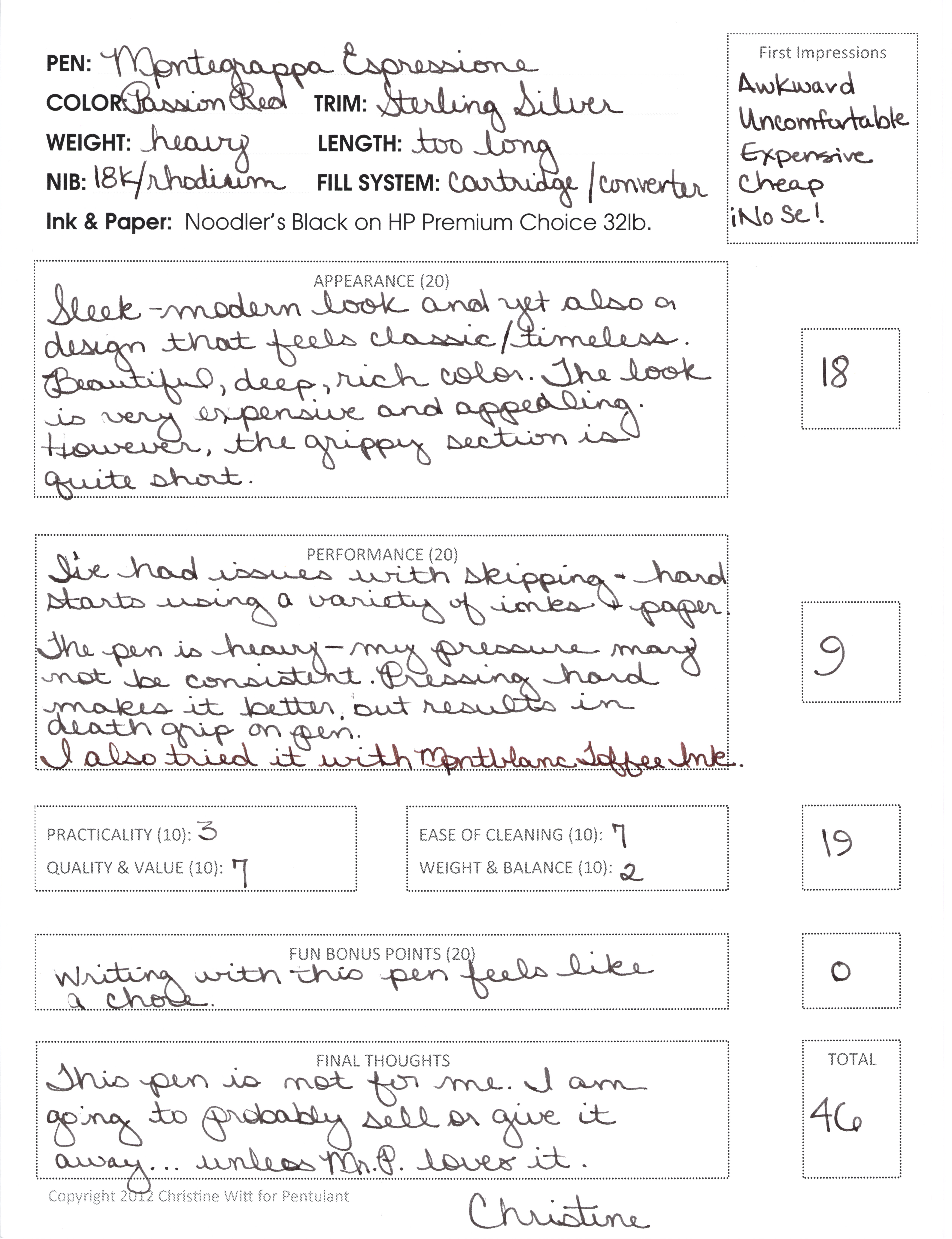
Here is my written review.  Click to make it bigger.


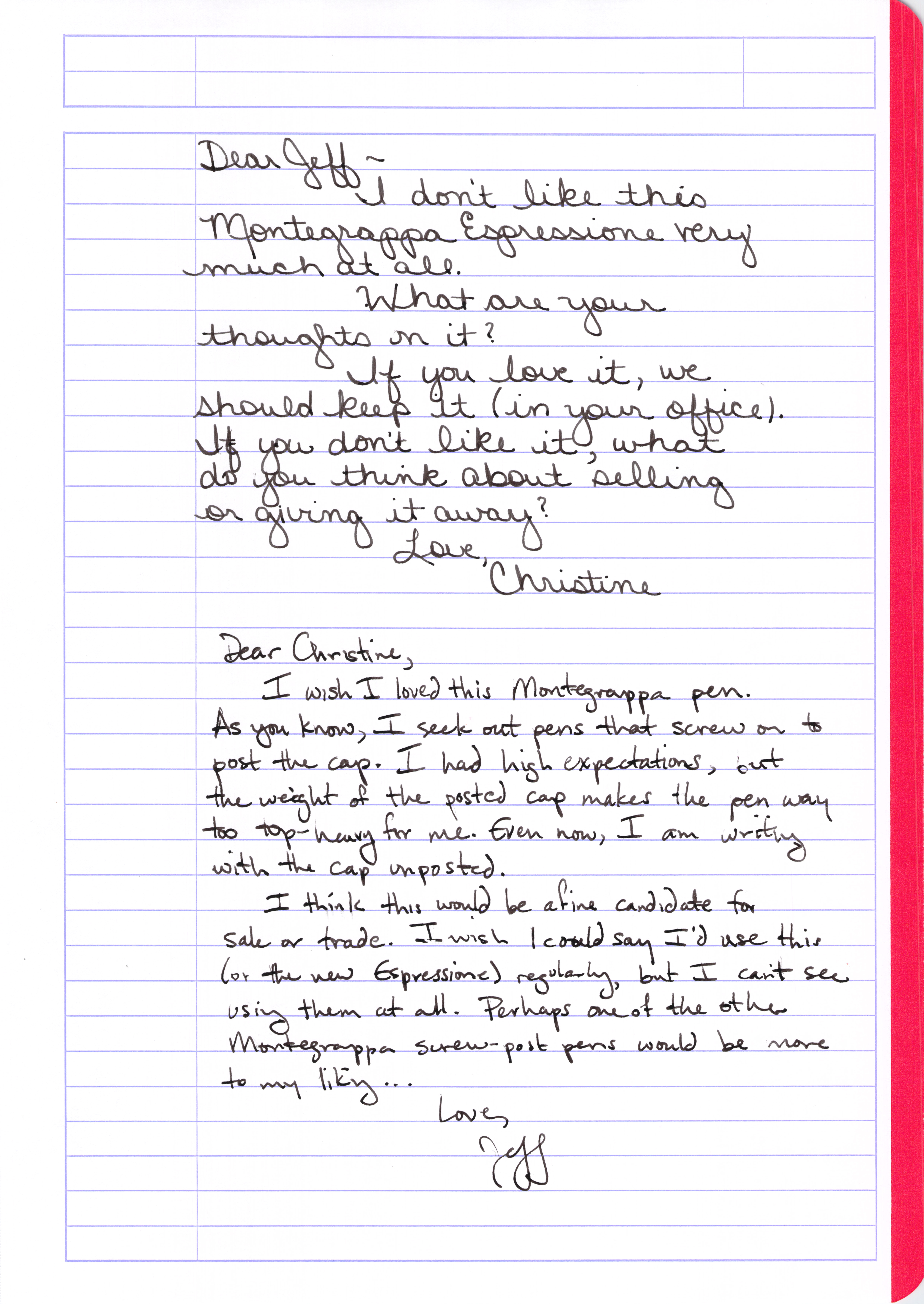
In an act of unselfish love, I offered the pen to Mr. P. And even though he loves him a screw-to-post pen and he agrees the Espressione is gorgeous, he rejected this pen, too!


I'm going to ponder a bit on what to do with this pen. I won't write with it again. Mr. P won't use it either. Seems a shame to let it hang around here with no love when someone else would probably love to have it.

Will keep you posted on how this one plays out!

But tell me your thoughts - have you tried this pen? Have you given away pens you would never use?

Thursday, January 24, 2013

PEN PREVIEW: Stipula Vedo - Stub Nib (?)


Just a quick writing sample today from my Stipula Vedo.

Hint: I didn't love it. So I tried again . . . 


And I still didn't love it. Going to follow-up soon with a proper review!

Do you have one of these? Does it write well?


Tuesday, January 22, 2013

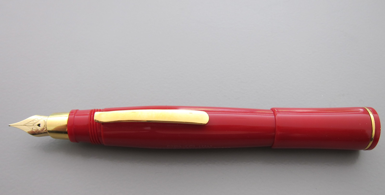
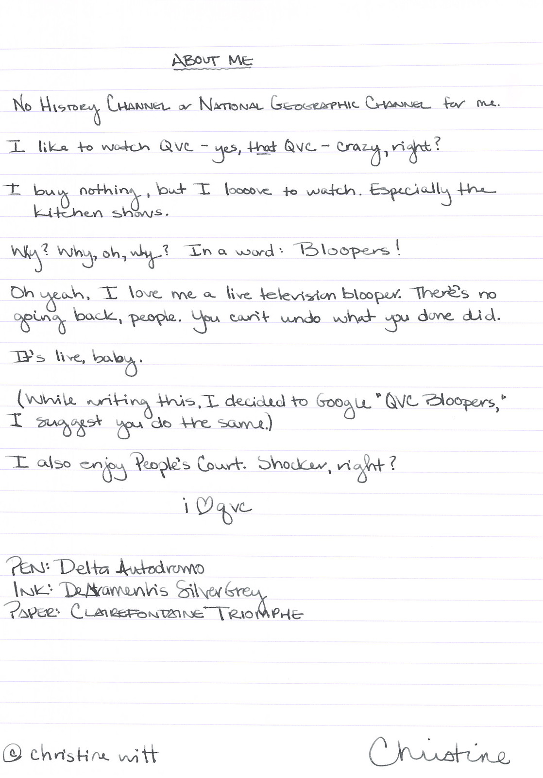
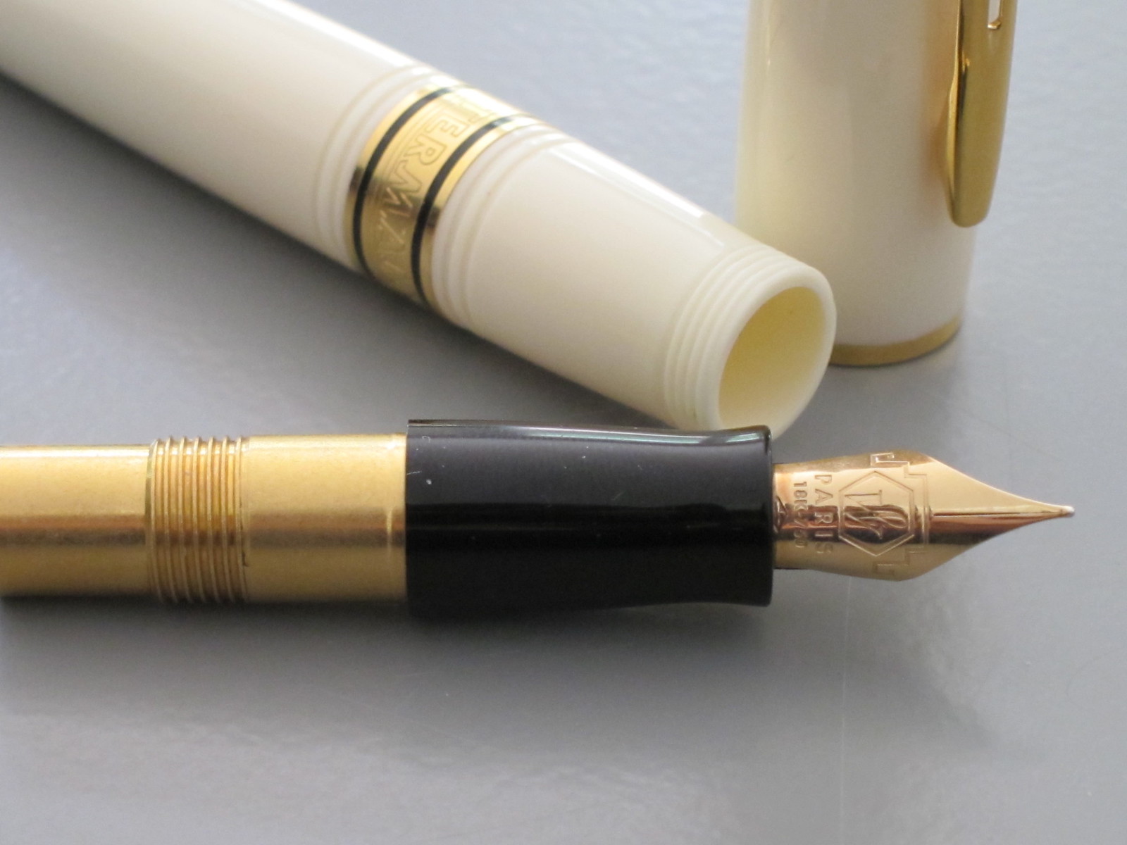
PEN REVIEW: Delta Autodromo Nazionale Monza


So. Pretty.


I don't know much about this pen.
I Goggled and didn't get much help.
I know I bought it from Fountain Pen Hospital.
It was the first $$$$$ pen I bought.

This is the first time I've used this pen.


Pretty, right?


Well. I tried and tried, but it just wouldn't go.

It's flexy - love that.  

I'm going to assume this is a bad ink/paper/pen combination and follow-up.  I sure hope this is a bad ink/paper/pen combination.  Right? Otherwise, I'm going to be so bummed.

Thursday, January 17, 2013

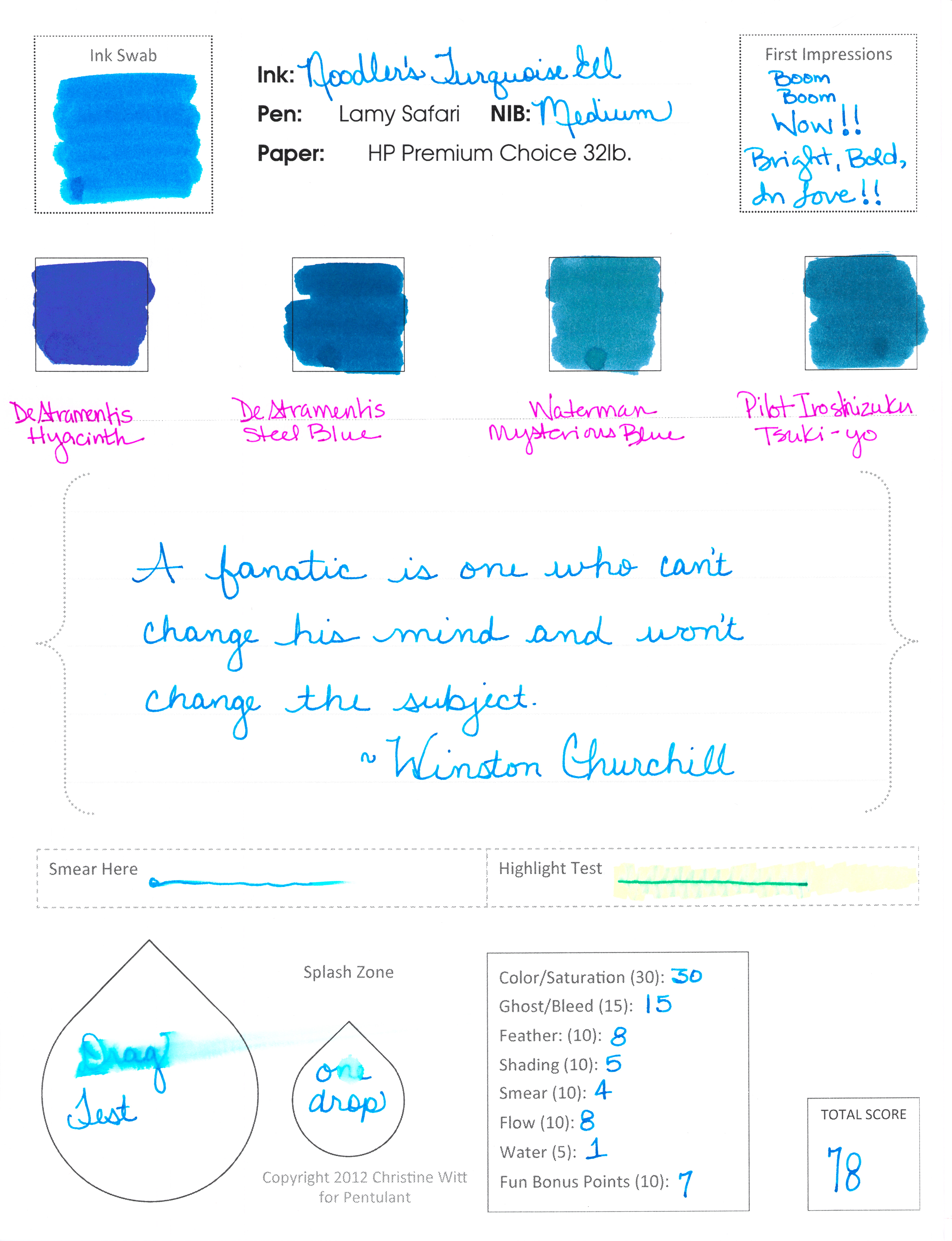
INK REVIEW: Noodler's Turquoise Eel


Noodler's Turquoise Eel


Now. This is what I'm talkin' about!

Some real, in-yo-face, color.

And, bonus! It writes like a dream.


Noodler's Turquoise Eel rivals Pilot Iroshizuku Kon-peki in every way. It has great color and saturation. It writes beautifully - flow from the pen is just right.

Smear factor isn't bad.  Not much shading. Is there a turquoise that shades wonderfully? Guess I'll have to try them all and find out!

Back to the ink . . .


. . . I really don't have anything negative to say - if I don't talk about the water test - ha! It's a great well-behaved ink that I would consider purchasing if I didn't already own a couple of other turquoise inks. (I test from sample vials, but you probably knew that already.)


A bunch of side notes...

...this is my first review with my new form. Totally excited. Let me know what you think?

...my ink reviews all fall into broad color categories (new this year). This one ended up with the blues because it's more blue than green. Maybe I need a turquoise - but then I'd need a teal - and sometimes it's hard to decide. I'll just keep doing the best I can.

...omg, did you notice the first Compare Square? De Atramentis Hyacinth. I'm excited about reviewing that one sometime soon. Pretttttty.

...Waterman Mysterious Blue felt watery compared to the other inks on this page. Wonder how that will translate in a pen when I get around to testing it.


Wednesday, January 16, 2013

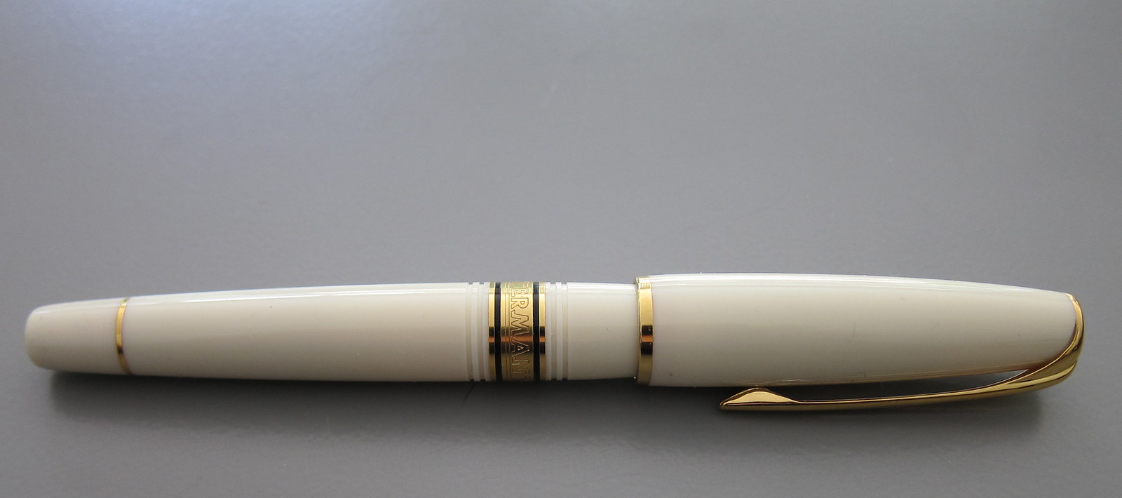
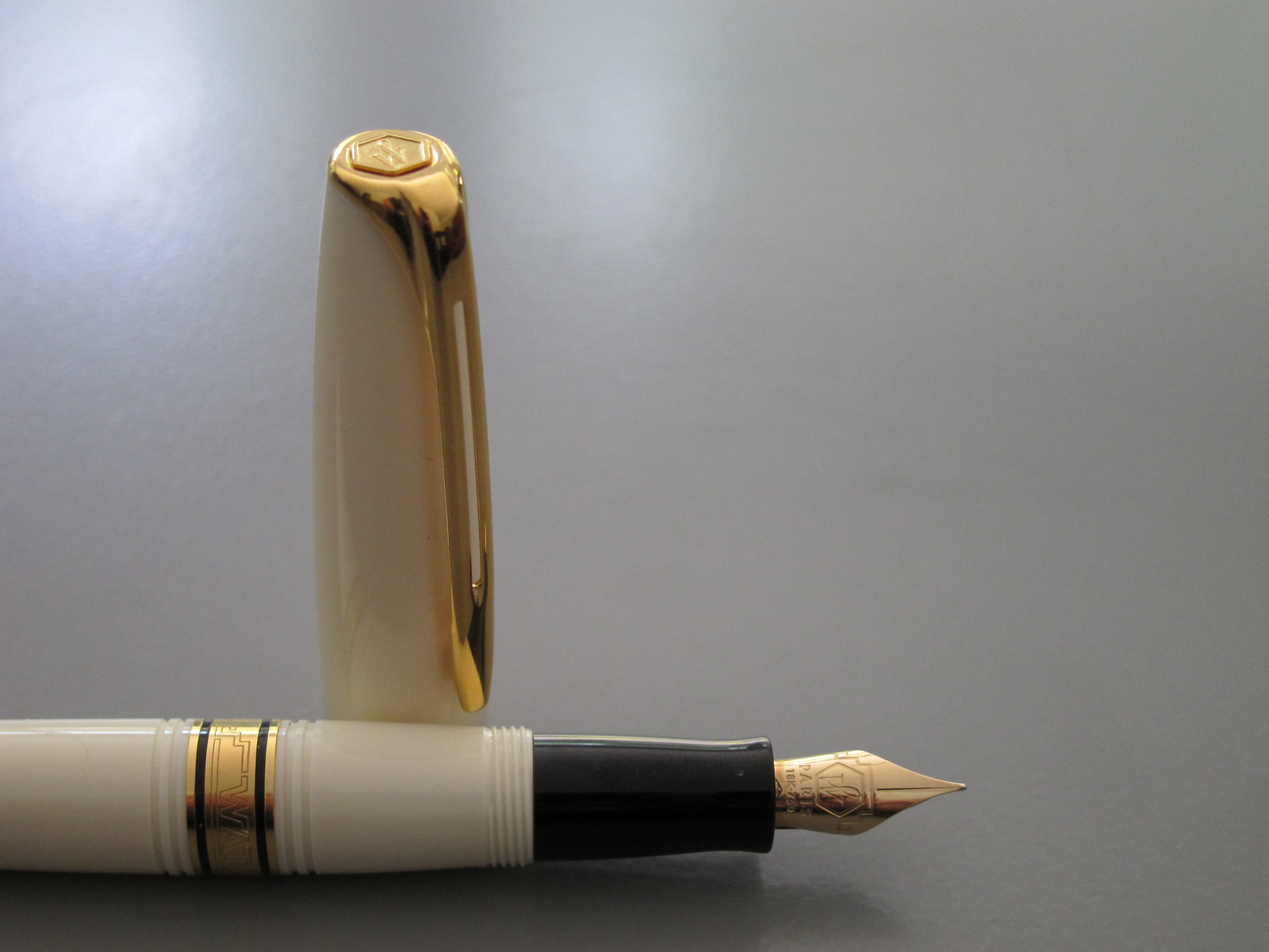
HELP WANTED: Identify This Pen?


Yeah. I don't know what the heck this Waterman is. Maybe one of you can help me out?

Honestly, I don't remember how or where I received this pen. I hope I didn't lift it from someone and now the owner is seeing it here! (Kidding, kidding!)


If you know which Waterman this is, please help a girl out and leave a comment below.

Thank you!


POSTCARD PROJECT: Help Wanted


I received this amazing set of 100 Pantone Postcards for Christmas. It's #7 in this picture.
I've decided that I'm going to try try try to have them all sent out by the end of this year. (Maybe I'll keep one for myself and frame it as an homage to the project?)

Would you like a postcard from me? If yes, contact me privately with your address information (I'd never share it with anyone - big honkin' promise!) and I'll get one right out to you!

You know what's great about these postcards? They are fountain pen friendly! The fronts are coated paper, but the back is not - makes for a pretty good writing surface!

Anyway - help me send you pretty colors and complete my project!

So exciting!

Friday, January 4, 2013

MERRY CHRISTMAS - Part 2


Right before Christmas, I posted a similar picture of some of the things Santa brought.

Here's some more. Yikes. Talk about an embarrassment of riches!

In coming weeks, we'll take a look at everything more closely. How many of the items can you name?

Monday, December 24, 2012

MERRY CHRISTMAS!


So!  Santa dropped some things off early here this year!  (There's even more that arrived after this!)

And since it's so close to Christmas and things are so crAzY BUsY, I'm going to let this picture speak at least one thousand words.  We'll have a closer look at everything soon.

Merry Christmas!!

Monday, November 26, 2012

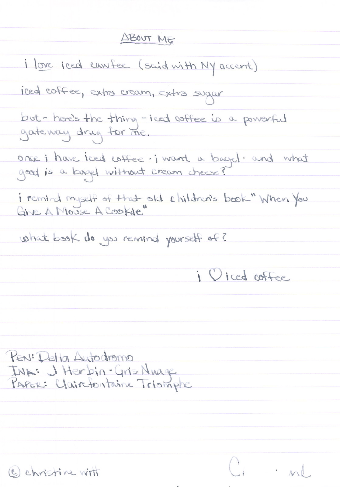
INK REVIEW: J Herbin - Gris Nuage


Here's a quickie review of one of my favorite inks to get us back into the groove this week. (More on Thanksgiving another time.)

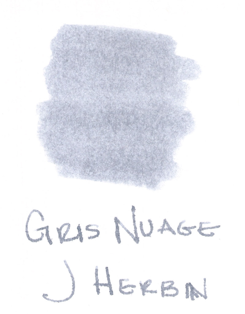
The above swab was done with a q-tip and then the name of the ink written with a glass pen. In my experience, there's a lot of feathering with glass pens and this was no exception. (It also doesn't help things that it's written on a cheap-o index card.) (Again, I ask, are there are any nice index cards out there? Starting to think there aren't.)

Anyway....Gris Nuage (Gray Cloud - how pretty!) is one of my very most favorite gray (grey, if you insist) inks.

It's light - just like a cloud. It's prettttttty. Leans more toward blue than red, but is definitely one of those pure colors that I adore.  

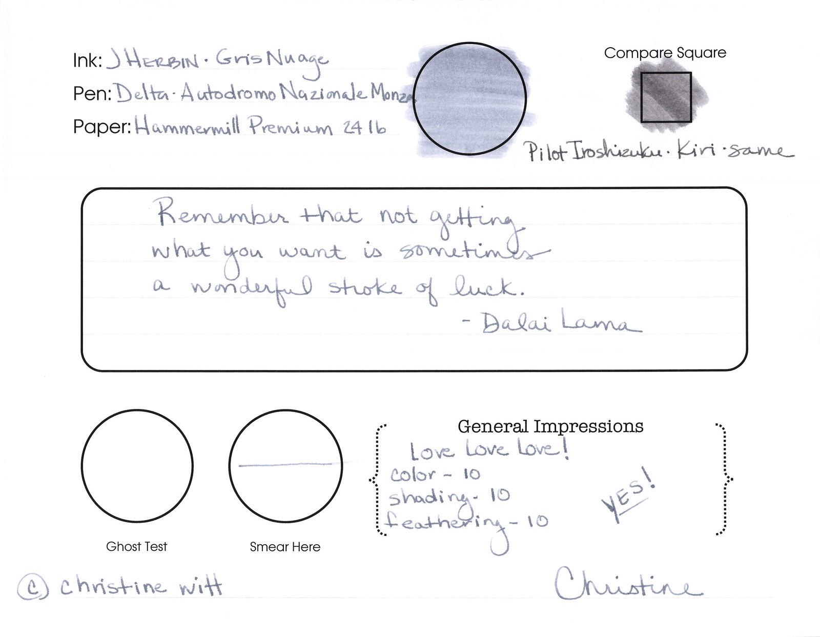
And, holy crappoli (it's a word), it writes like a dream. Check it out....


Pretty, yes?  Some lovely shading going on there, too. And no smearing, no feathering, no ghosting, or bleeding. What more could a girl want in a gray ink?


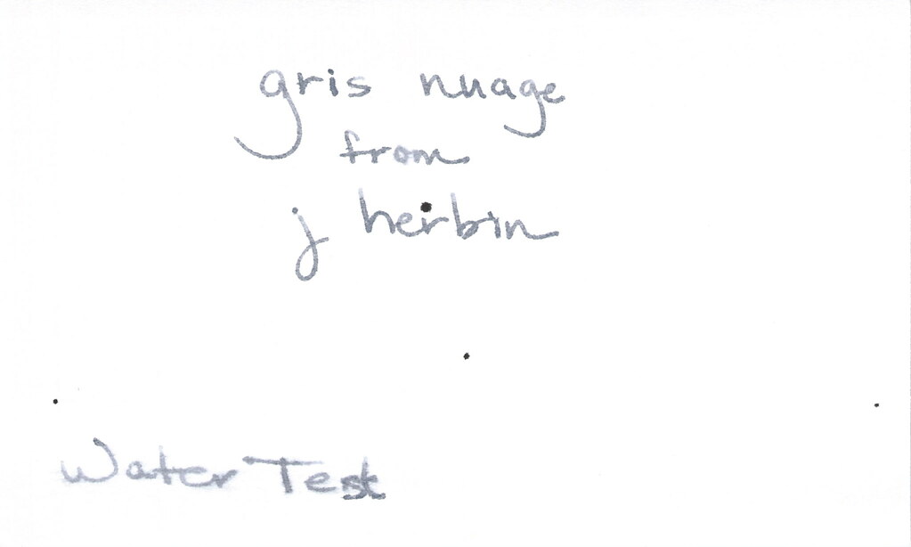
Oh, yes, it does well with water!  Nice!!!  This is totally one of my gray inks. It makes me swoon!

OK..so see those black specks on the water test?  No, it's not Gris Nuage gone crazy - that's collateral damage from my Invincible Black spatter. Haha!

Do you have a favorite gray? Mr. Pentulant was using Montblanc Oyster Grey for awhile in his fancy new Boheme, but he wasn't loving it.