Pages

Showing posts with label montblanc. Show all posts

Monday, December 15, 2014

INK REVIEW: Montblanc Corn Poppy Red

Montblanc Corn Poppy Red Ink Swabs


 BaBam!  Biff! Boom! Pow!

Montblanc Corn Poppy Red has arrived on the scene.

My very first impression was that the ink is terribly wet. If flowed from my pen with such ease that I was sure it would take forever to dry.  I was wrong and the dry times are perfectly acceptable with no smearing at all at the twenty second mark.

Montblanc Corn Poppy Red Writing Sample


Here's the scoop . . . delightful saturation, beautiful red color, flow is wonderful, definitely not water-resistant.

There was no ghosting and minimal show through on the HP 32 pound paper I was using. There was also the teeny tiniest bit of spread. Not enough to call it feathering, but definitely some spread. Just a touch. Maybe so little that others wouldn't notice it? Probably not enough that it's a deal breaker for me.


I regularly use HP 32 pound paper. I know it's a good and consistent paper that works well with fountain pens. An then I wondered . . . how would Corn Poppy Red behave on other papers?

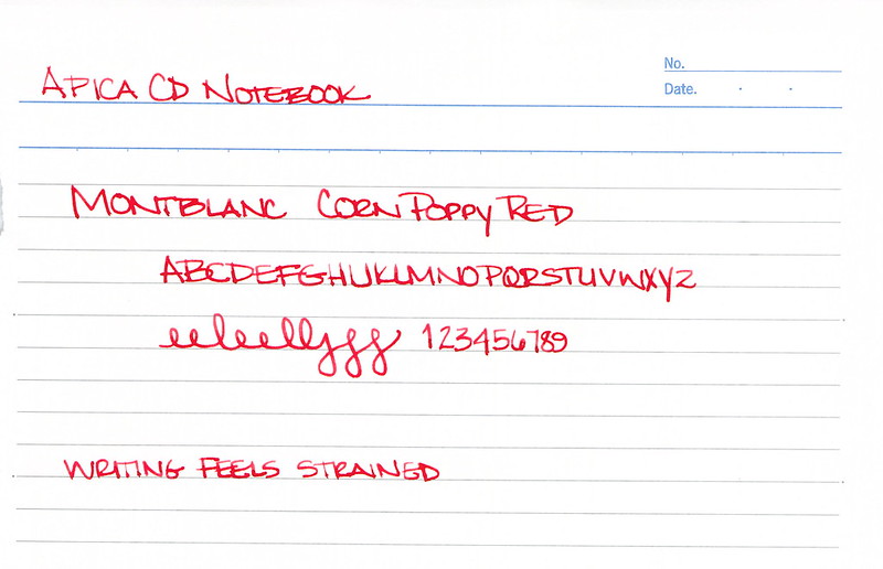
First I tried Apica CD 15 Notebook paper. This is their regular line, not the premium stuff.


It was not a pleasant writing experience. I felt as I needed to press just a bit harder with the pen (the MB Heritage 1912 that I adore so much) and even then, it just didn't feel as nice.

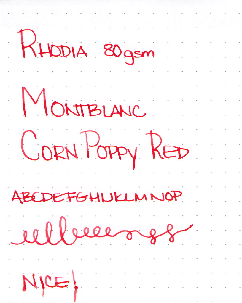
Then, I tried my old favorite Rhodia 80 gsm . . .


And, man, that was some nice writing! Smooth with crisp lines. I approve!

I know you're looking at the bottom line there and wondering what the heck happened. Silly me put the paper in the scanner before it was dry.  Anyone know how to clean ink off of a feed scanner's rolly bits? Oops.

Bottom line? I like pen and ink combinations that work on all papers. There's so much fuss in the world that when I pick up a pen, I just want it to go. I like Montblanc Corn Poppy Red, but it's not love.

Whomp Whomp.

Tell me - what are deal breakers for you with inks? Color is the big obvious thing, but are there other things that you simply will not tolerate?

Monday, November 10, 2014

Seven Orange Inks

A photo posted by Christine Darling (@pentulant) on

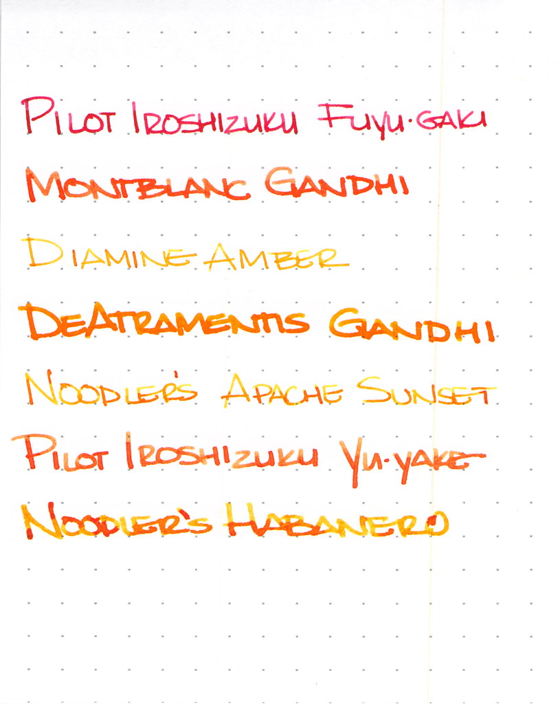
I've been on an orange kick. It all started innocently enough back in May, and then over the last few days, I've inked seven pens with seven different orange inks.  CrAzY!


I won't have room to go into great detail on each ink here, but let's explore a little, shall we?

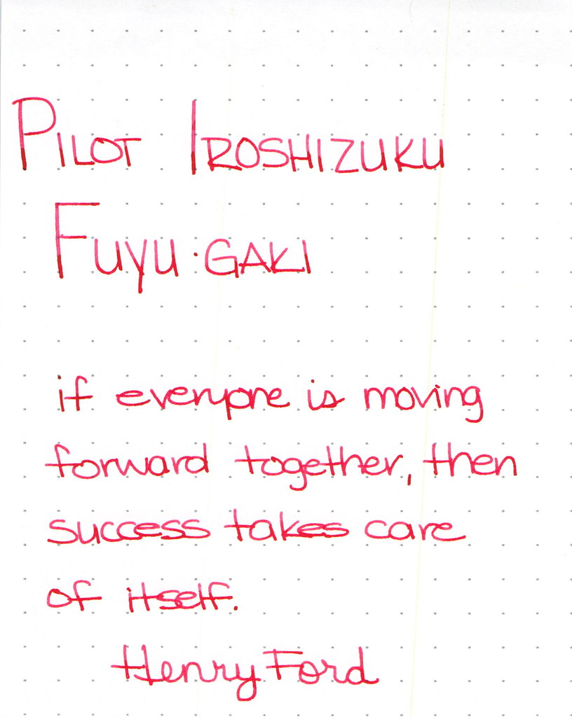
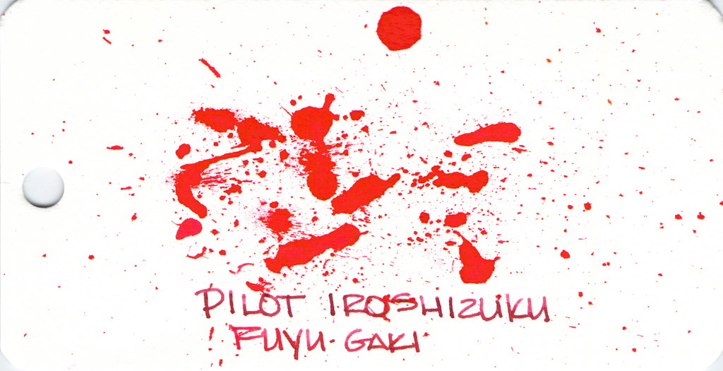
Pilot Iroshizuku Fuyu-gaki Writing Sample

Pilot Iroshizuku's Fuyu-gaki runs a bit toward the red side of orange. It writes wonderfully, doesn't display much shading, and is an all-around nice ink.


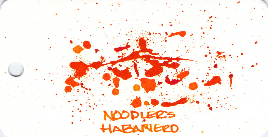
Fun with ink splatters. I did these on Word Cards that I got from Jet Pens. The paper is more like a thin watercolor paper than writing paper.

Moving on . . .


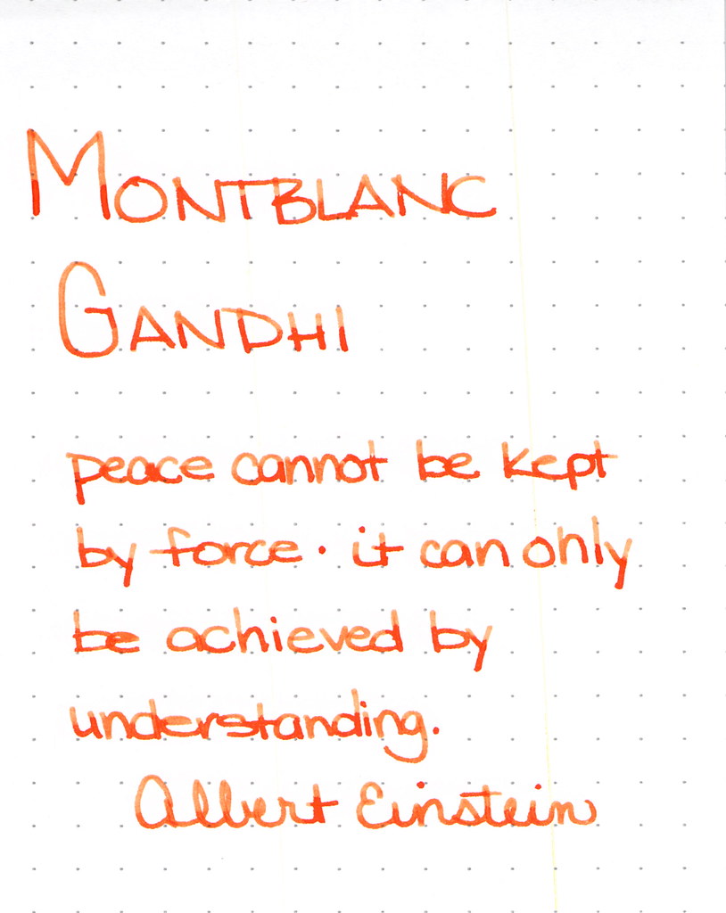
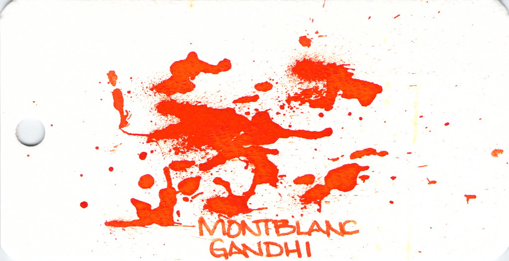
Montblanc Gandhi Writing Sample

Montblanc Gandhi fountain pen ink is no longer available. It can be found on eBay (I've been thinking about selling my spare bottle, but I'm not sure I want to let it go, you know?)

The ink is such a pretty pretty orange, lots of good shading, and is definitely one to try if you can find it.

Spatters, anyone?


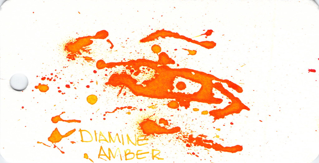
Diamine Amber is next on our hit list . . .

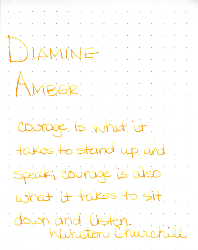
Diamine Amber Writing Sample

Diamine Amber is just so light and feels a bit dry. This ink is in a Lamy with extra-fine nib and that may be part of the issue, but I've had other orange inks in the same pen and they've not been this light. I like inks that work in all of my pens (makes life easier, you know?) and with so many orange options available, I'm not so keen on this one. Others seem to like it.

And look at the spatters - good saturation there, friends.


Montblanc Gandhi isn't the only game in town . . .

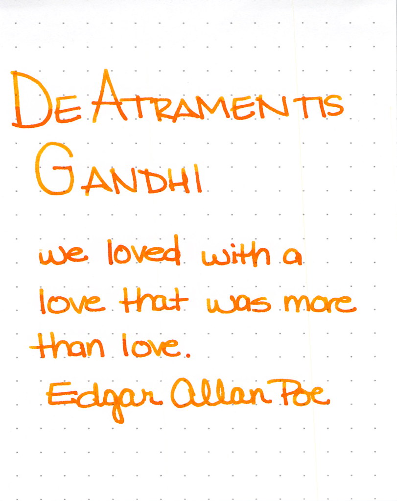
De Atramentis Gandhi Writing Sample

This was my first time using this ink and for some strange reason, I didn't have high expectations. Silly me - it's a perfectly fine ink. Some shading, writes quite well. No reason to be concerned. It's really not like Montblanc Gandhi - not that it matters, I think it would be a little silly to compare the two just because they share a name.  I like it.

I also think I did a pretty good job on the spatters here . . .


Next up . . .

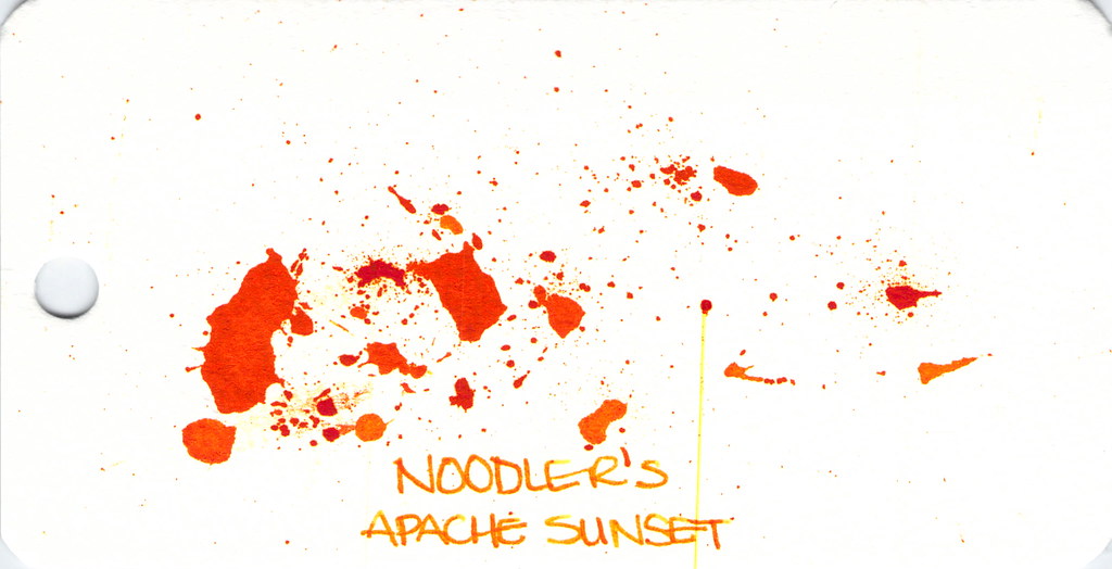
Noodler's Apache Sunset Writing Sample

People are generally coco-crazy for Noodler's Apache Sunset.  Even using an extra-fine nib, I can see the potential here. Absolutely insane shading. The color is very orange. People who don't like this ink seem to say that there is no practical application for it - I'm not sure I understand. Maybe they feel that way about all orange inks?

So . . . check out the spatter. See the streak? Please know that I waited a full 24 hours after creating the spatters before scanning. THE INK WAS STILL WET!  Insanity.  (Even more insane - you can see this streak on other images, too...arrrgh. I need to figure out how to clean my scanner.)


Anyway . . .

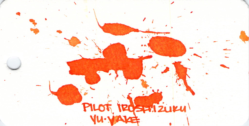
Dude. Check out Pilot Iroshizuku Yu-yake . . .


Pilot Iroshizuku Yu-yake Writing Sample


Shading, saturation, great orange color - maybe a little red in there. Yu-yake is bright and cheerful. Writes like a dream. A new favorite of mine.

I've had good experiences with all Pilot Iroshizuku inks. They are a bit more expensive than other brands, but they are incomparable in terms of overall brand quality.


Last, and certainly not least:  Noodler's Habanero.


Noodler's Hanbaero Writing Sample

It's been awhile since I've had Noodler's Habanero in a pen. I'm not sure why. I fall in love with it every time. The beautiful shading, the gorgeous orange that reminds me of autumn.  Yum.

The only issue is that it seems to stay wet forever. Though, apparently, not as long as Noodler's Apache Sunset.


That's it!


Which are your favorites?

xoxo

Monday, September 15, 2014

INK REVIEW: Montblanc Daniel Defoe - Palm Green

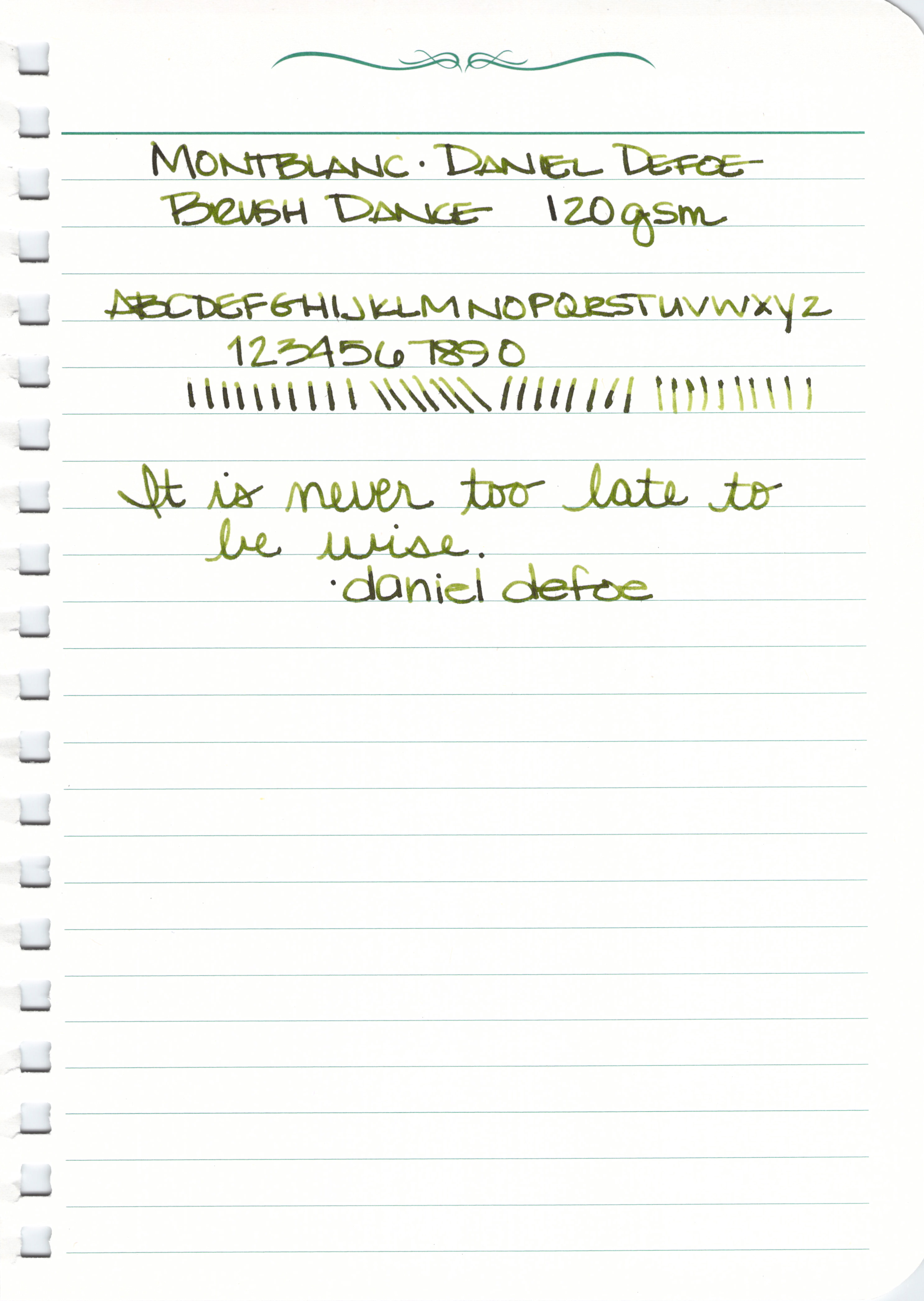
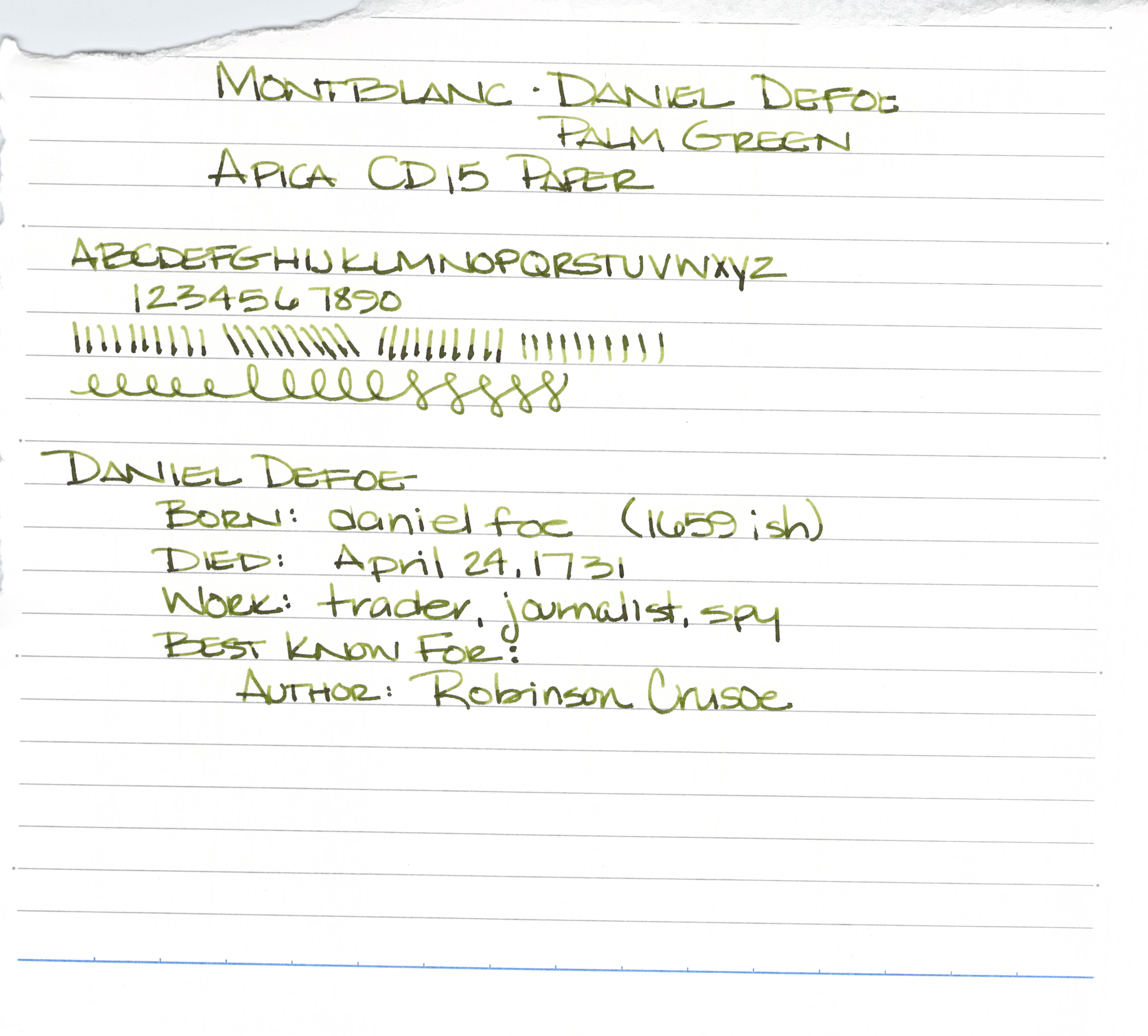
Handwritten Ink Review - Montblanc Palm Green


Montblanc recently released their newest ink: Daniel Defoe - Palm Green.


It's a darkish yellow-green. 


It's not super-saturated and it writes great - no problems at all out of the pen.

Amazing shading? Yes!


Daniel Defoe - loving the shading.


At first glance, I was concerned that this ink would be too much like DeAtramentis's Saraha Grey, but it really is much more dark with more depth of color than that. And then I thought it might be a bit like Sailor Jentle Epinard (now discontinued), but it really is much more pretty than that, with less blue in the ink.


I'm not 100% convinced that the color is for me. I'm generally a fan of clean green colors. For example, Noodler's Gruene Cactus Eel is appealing to me.

Having said that, though, I will also say that Daniel Defoe and his Palm Green ink is growing on me a quite bit in the week or so that I've had it.

I'm going to check in soon with an update after I've used it a bit more.  What do you think?  Love it, have to have it?


Wednesday, May 14, 2014

THIS OR THAT - Orange Ink Edition


This or That
Orange Ink Edition


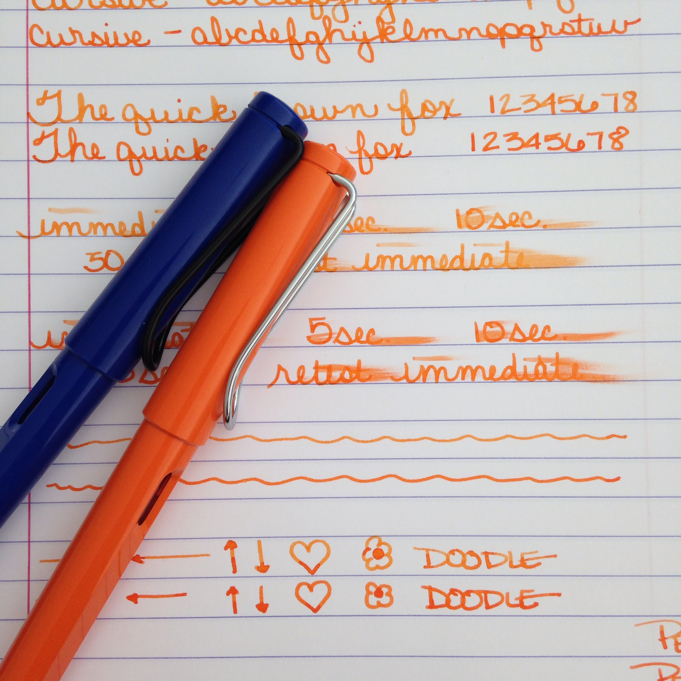
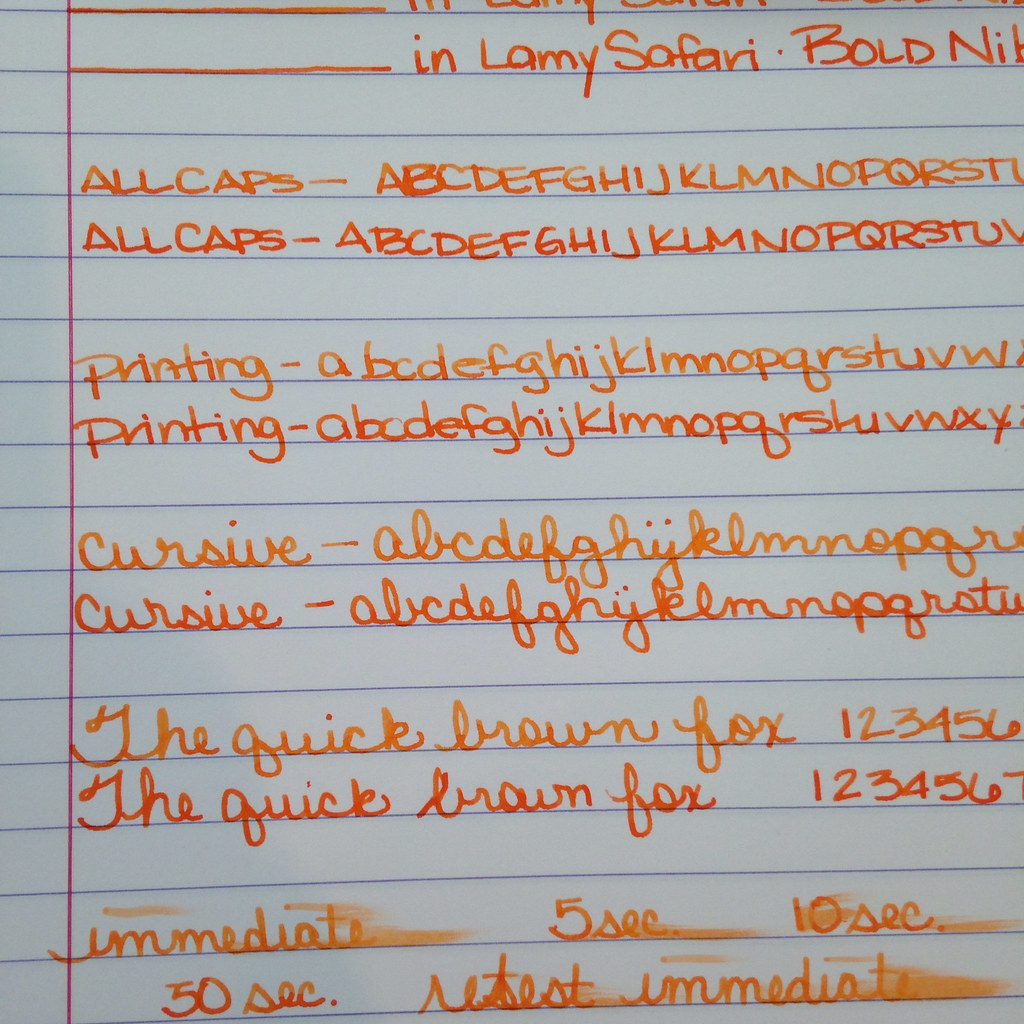
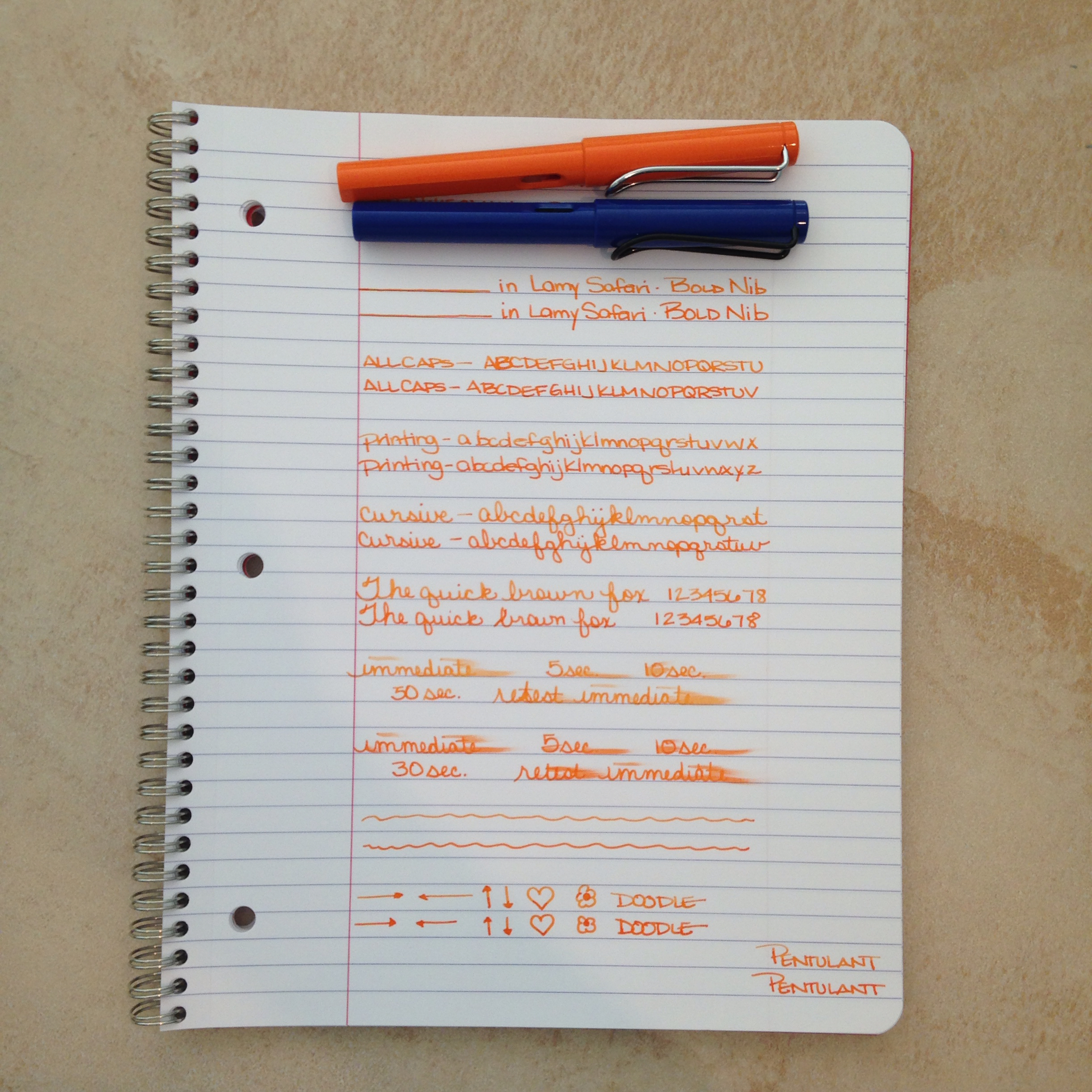
Two orange inks for your consideration today. Both loaded in its own Lamy Safari with a bold nib.


The top ink is a bit lighter - the bottom has more red it in - the top shades a bit better. Each has a fairly serious smear factor and they each wrote just fine with the color on the bottom feeling just a tad bit more lubricated than the top.

Which do you like better? 


Circle one. Top with its light orange and shading? Bottom with its richness and saturation?

How do you decide between them? Mr. Pentulant was decisive, "I like the bottom. No doubt."

I'm a little more on the fence. Shading or saturation? It seems to be a trade off between these two inks.


Here's the spoiler ....

Top....Montblanc Gandhi
Bottom....PW Akkerman Oranje Boven

Gandhi is for sale on eBay for around $90 per bottle (it's no longer in production). PW Akkerman is around $24 per bottle (but you may pay lots for shipping if you can't find it in the US).

Tell me which you like better and how you made your decision? Color? Shading? Pricing? Maybe a combination of factors?


Monday, May 5, 2014

THIS OR THAT? Montblanc Heritage 1912 or Boheme


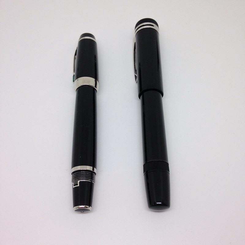
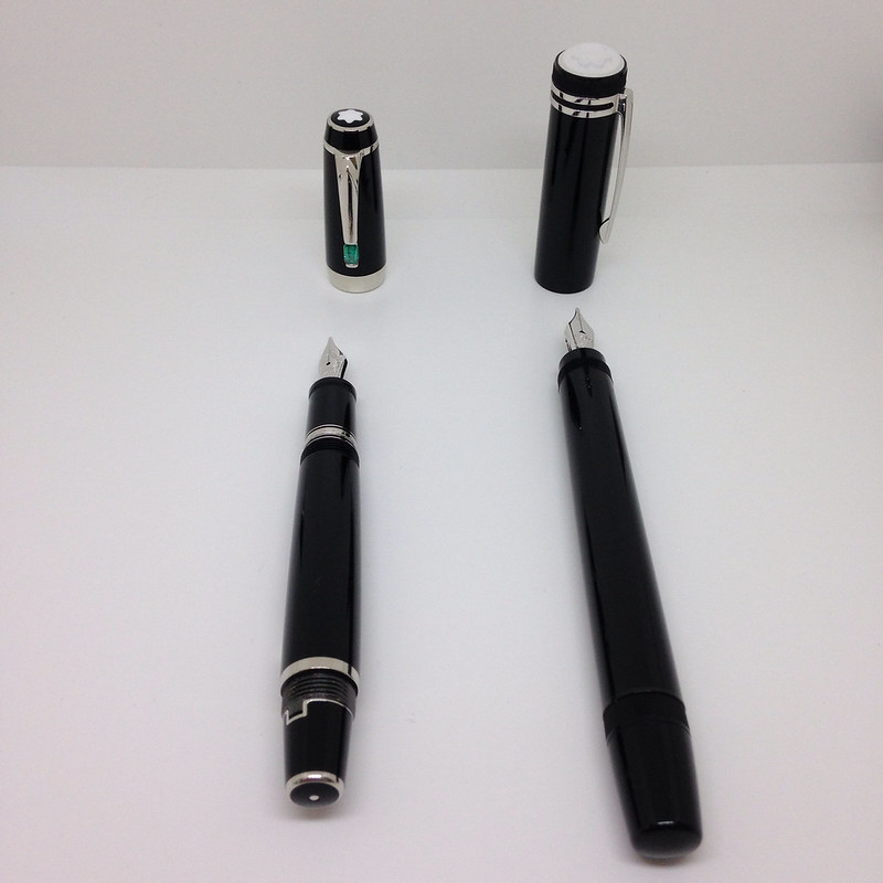
A super-quick (ha!) version of This or That - two Montblanc Fountain Pens - the fancy newish Heritage 1912 versus the classic and much-loved retractable nib Boheme.

But first - did you see that I'm giving away the new Lamy Safari in Neon Coral? Enter here.

On to This or That . . .

These are each great pens that write really well. I had the Heritage inked with Pilot Iroshizuku Fuyu-syogun from this review and inked the Boheme with Montblanc Oyster Grey in anticipation of writing this post. I'm not showing any writing samples today - suffice it say that the writing experience is pretty terrific with both pens.


Other than the great brand, precious resin, and amazing writing, the greatest similarity between the two pens is the retractable nib. 


The biggest differences are . . . 

Fill System The Boheme will only accept cartridges (standard short). The Heritage has a unique piston filling system.  Cartridges are convenient, for sure - just pop one in and go (well, after waiting a few minutes or more for the ink to work its way through the pen's capillary system). There are approximately a zillion more colors of bottled ink available than cartridges. Also, fill with a piston and you're ready to start writing immediately.  

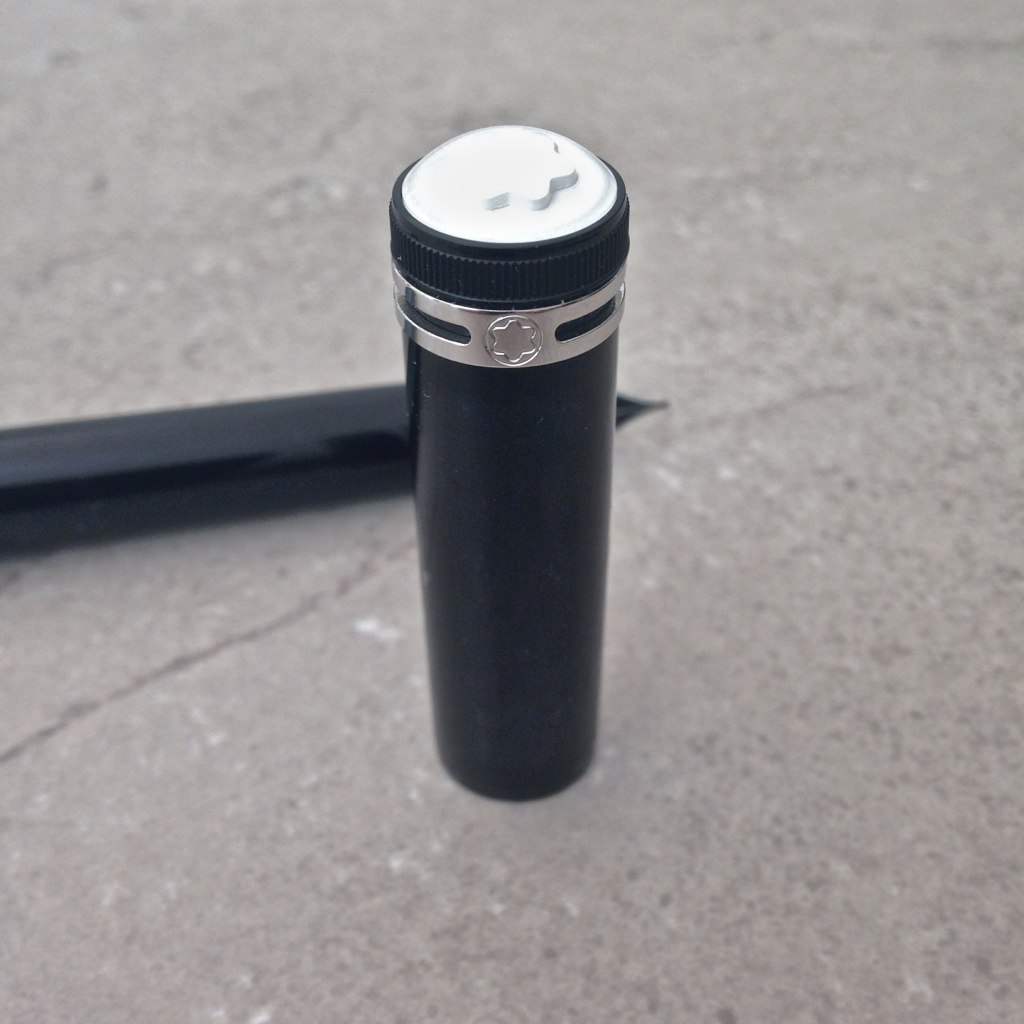
Posting the Cap The Boheme is designed to be posted - to advance the nib, simply screw the cap on to the end of the pen - it's perfect, really. There is no way for the cap to work its way loose with normal use.  The Heritage, on the other hand, is not meant to be posted - annnnnd despite the pictures on the MB website (this kills me, in case you're wondering), it cannot be properly posted. This could be a deal-breaker for some people.


Size Capped, the Boheme is smaller - practically pocket-sized. Uncapped, the Boheme is still smaller. However, posted, the sizes are comparable. With each pen in the ready-to-write position, the Boheme is around 1/2 inch longer than the Heritage.


Grip The Boheme (shown above) features a very slightly flared grip. I find it very comfortable to hold. The Heritage (below) is quite smooth. I also find it very comfortable. I can see that some people would have an issue with the Heritage. For example, if you have especially (ahem) moist hands, maybe your grip would be too slippery to be an enjoyable writing experience?

Clean-Up The Boheme can be a bit of a pain to clean. Do you want to run water through the pen and over the working parts of the retractable nib? I didn't think so. Given that, your options are to set up an elaborate cleaning scheme which involves a cleaned-out cartridge (long) and needle/syringe or find some cleaning cartridges (I'm not even sure these are still around?).  (Maybe there's another option?) 

While I've not yet cleaned the Heritage (not even before I inked it because I'm pentulant like that), I imagine it will work like any other piston fill pen.


Let's talk about money . . . Right now on the MB website, Bohemes range from $690 - $1645. The Heritage is $1,110.  Of course, you can probably find a better deal for each on eBay - and the very good news is that the retractable nib pens are (to my knowledge) not counterfeited.

Right now, I'm a huge fan of the Montblanc Heritage 1912.  I've mentioned to more than one person that I think it's my favorite pen - maybe even my grail pen. I love it that much.  Having said that, I also love my Boheme collection.

As each pen is a terrific writer, it's really going to come down to personal preference. I've outlined the things that I think could make or break a decision. Now, you tell me - This or That? Which would you choose?


Monday, April 28, 2014

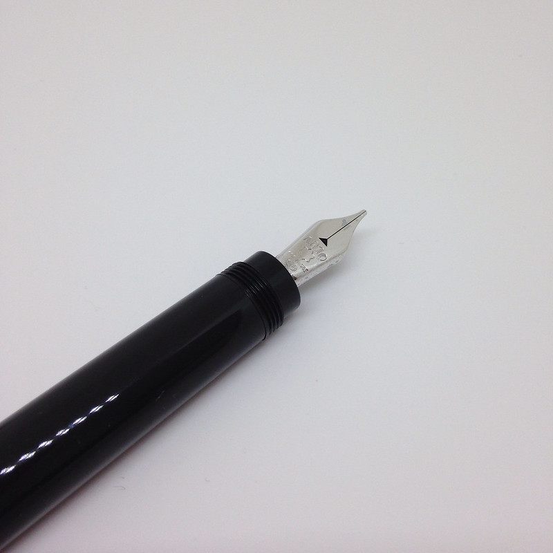
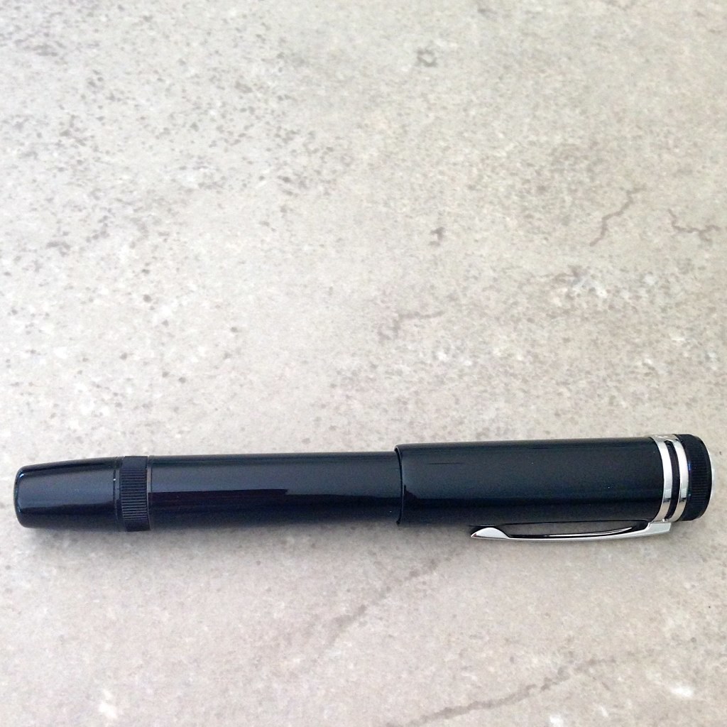
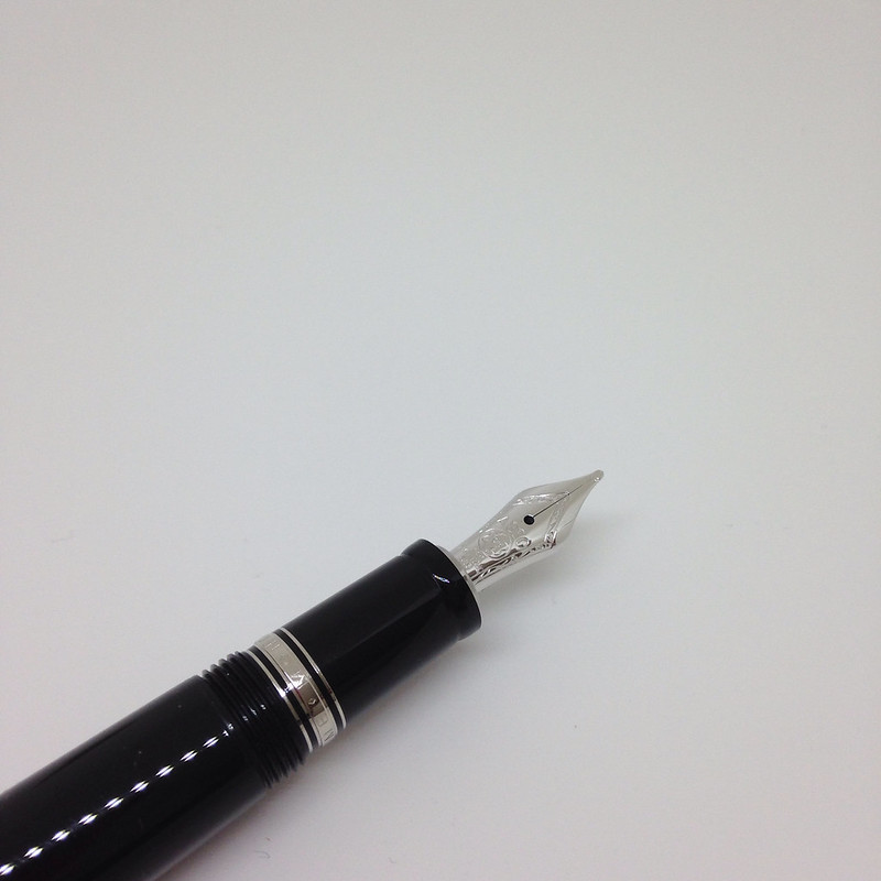
FOUNTAIN PEN REVIEW: Montblanc Heritage 1912


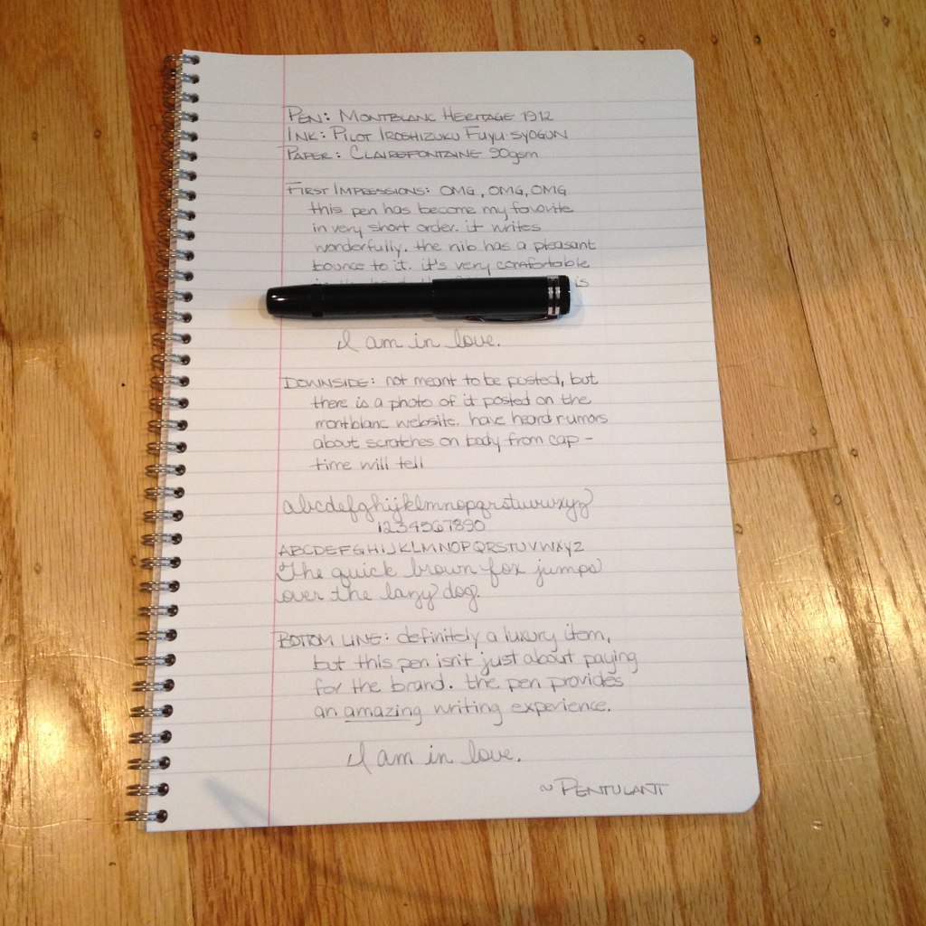
I'm in love.

Like any normal fountain pen lover, there are a great number of pens that I have my eyes on at any given time. When the Montblanc Heritage 1912 pen was released, I knew I was attracted to it and I knew right away that it would find its way to my wish list, but I didn't know I'd end up with it!

I mean, seriously, look at this thing . . .


Yummy goodness, right?  (Side note - all of the pictures except the one directly above are my own. The one above is from the Montblanc website. You can tell because their picture is perfect and mine are not.)


I received this pen as a late Christmas gift from a friend. When I opened the wrapping and saw the box, I'm pretty sure I gasped. Or maybe squealed. Probably both.


About the Heritage 1912 . . . 

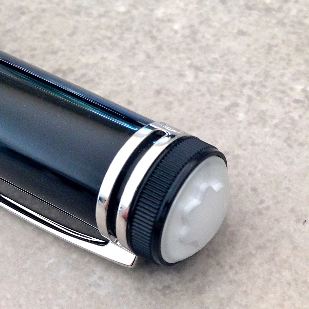
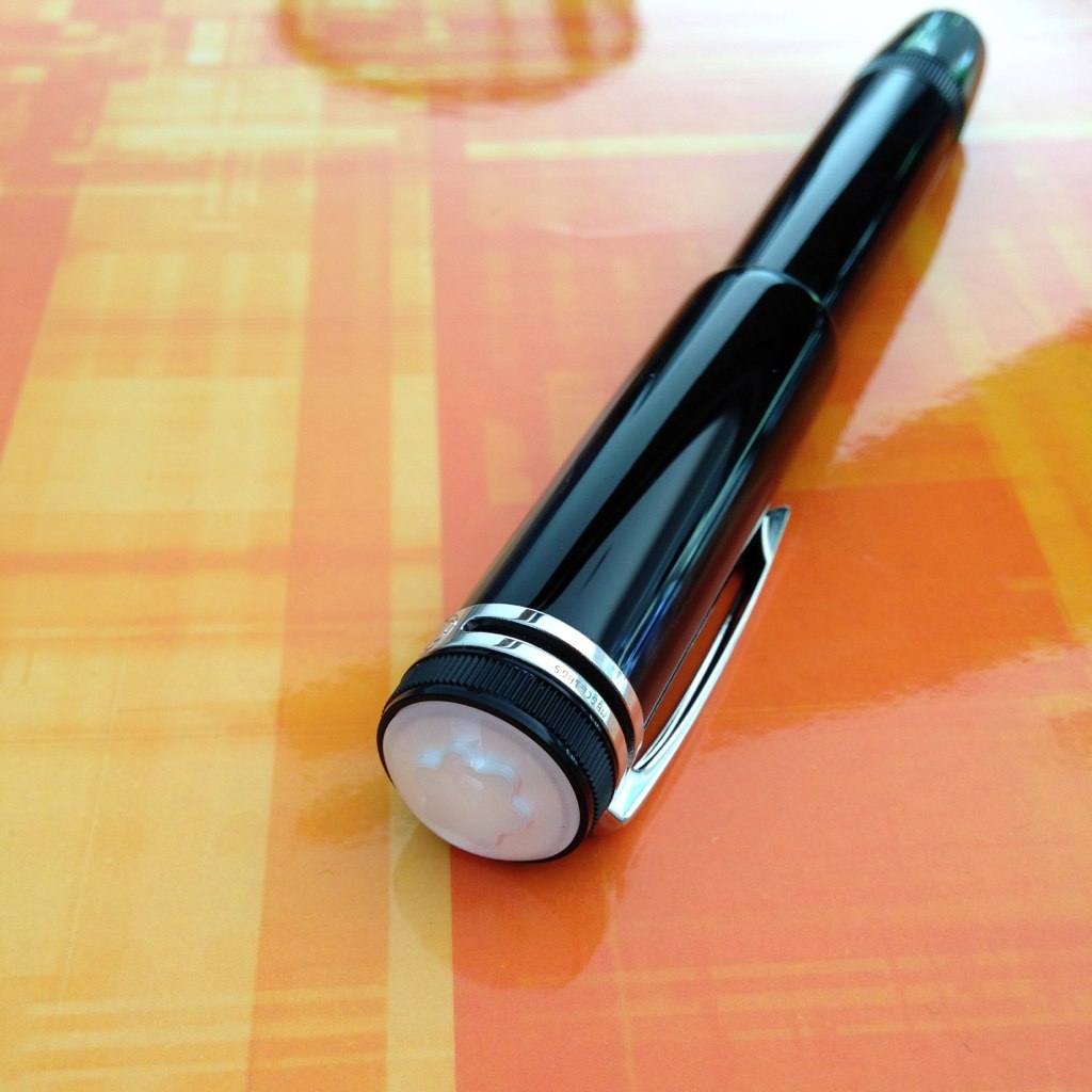
The design is inspired by the Montblanc Simplo Safety Filler - one of the first fountain pens. (Crazy, right?) The Simplo was small in size, had a retractable nib, was made of hard rubber, and had a rounded white-tipped cap. I actually held one of these at a pen show a long time ago.

The original Heritage 1912 was a limited edition of just 333 pieces and was made of titanium. It's gorgeous, but has a scary (for most people) price tag.


This precious black resin version of the pen has similar qualities . . .


It's a beauty. And then I wrote with it . . .


And I was in love. Big love.  (The ink is one of my favorites - Pilot Iroshizuku Fuyu-syogun.)

A Pragmatic Look . . . 

I'll let someone else do all of the weights and measures. I'm more about how it looks, feels, and writes.

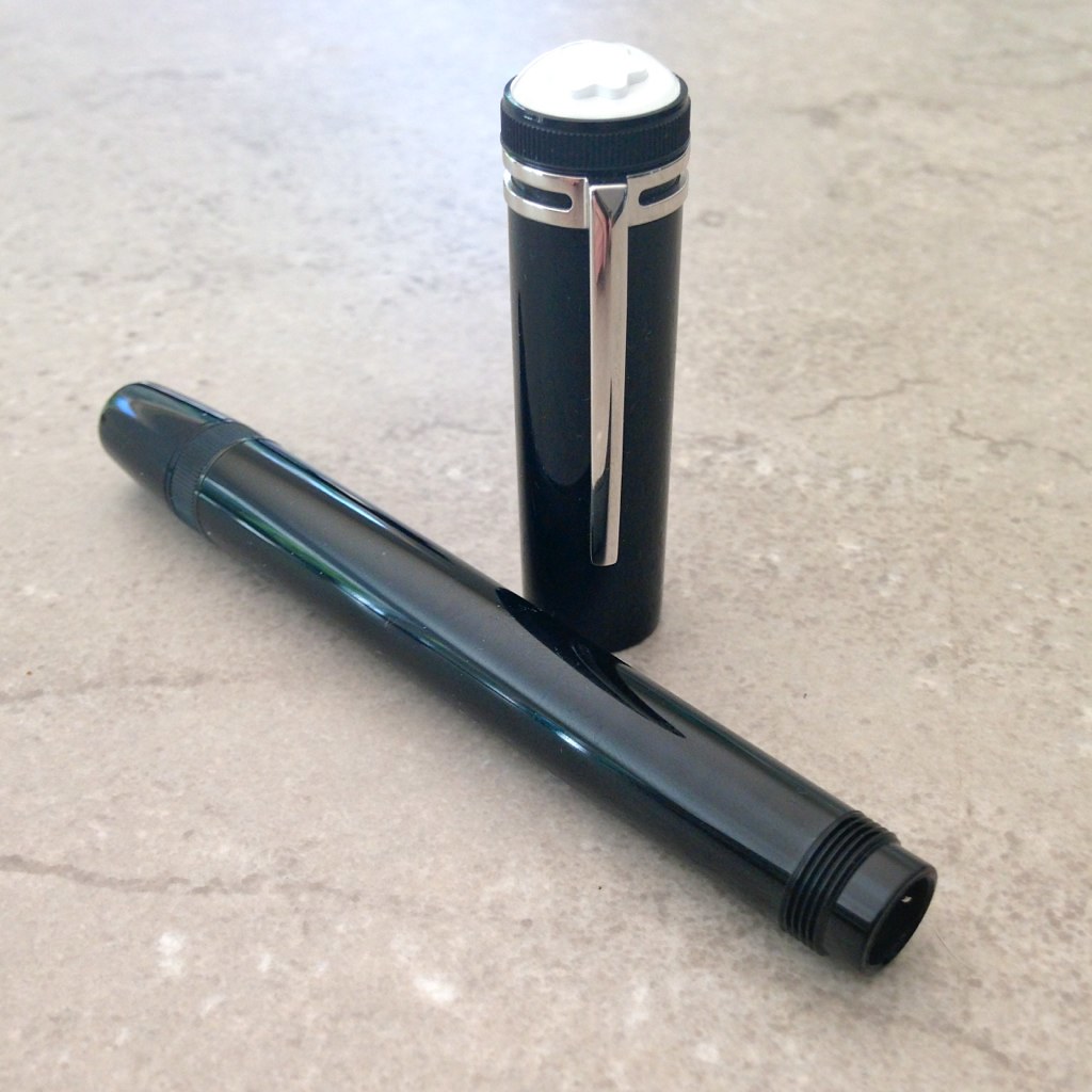
Design - love it. Very stylish, classic. I've always been attracted to retractable nibs. This pen has a sleekness to it that isn't often found. There's a thingy in the cap to prevent the user from ruining the nib if the cap is replaced without first retracting the nib.

Length - appears shorter than average, but is average when the nib is engaged

Weight - very comfortable

Width / Grip - nice - the smooth design makes this a very comfortable pen to hold. I can imagine that someone with sweaty (ok, moist) hands would have an issue because there is no real grip, but this works wonderfully for me

Fill System - unique piston fill

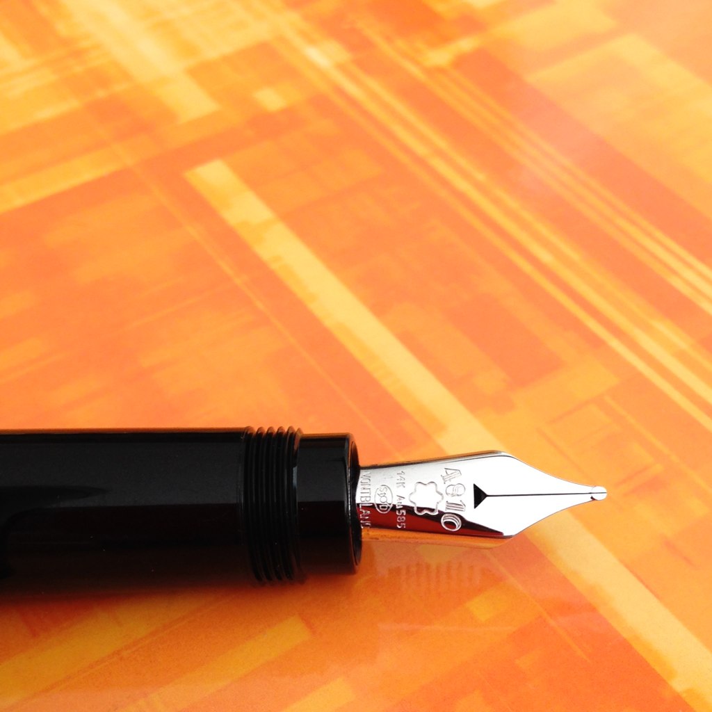
Nib - medium with a bit of bounce. It's not flex, but it's not like any other nib I've ever written with either. It's a wonderful writing experience

Performance - oh my goodness, it writes wonderfully

Well, there is one issue with performance - the pen is not meant to be posted. Ironic given the picture above that I pulled from the Montblanc website, yes? Normally, this would be a deal breaker for me (I always post), but I love the pen and the writing experience so much that this is a complete non-issue.  When attempting to post, the cap is loose and the pen is unbalanced - I do not think anyone could post the cap and be happy with it even if it were possible to do so (which it's not).

Practicality - the Heritage 1912 will be an everyday writer for me. I am not overly careful with my pens and I don't flip out if a scratch appears. If I worked in an office, I probably would not take it with me because it would be too expensive to replace and I'd cry if it became lost/stolen. For me, the pen is very practical.

However, there are some reports that the pen scratches easily and that the cap rubs and causes "rings" to appear on the body of the pen. My guess is that the resin itself isn't anymore likely to scratch than other MB pens, but that there is long expanse of resin and that scratches are more noticeable. If this kind of thing is going to bother you, you may disagree with my assessment on practicality.


Some Bonus Pics . . .


Yummy yum yum!


I also want to toot my own horn a little. I love Instagram and am happy to have so many friends over there - more than 400 now, which isn't a lot to some people, but feels like bunches to me.  A few days before I started posting pictures of the Heritage 1912 fountain pen, this came up on my news feed . . .


Wooo!  Maybe they follow everyone - I don't know, I don't want to know - haha. But Montblanc is following me on Instagram and I feel pretty giddy about it.  I'm pretty sure this means that you should also be following me there.  I'm Pentulant on Instagram.

And, finally, it's clear that I love this pen, but you should read as much about it before you run out and get one of your own. It's not quite the same as buying a Pilot Metropolitan (which I also love!).

I've put together the following resource list.

Have a great week, everyone!

xo

Montblanc Heritage 1912 Resource List

See the Heritage 1912 Limited Edition of 333 pieces

Pictures of the Montblanc Simplo and a comparison

A good write-up from Luxurious Magazine

FPN members discuss scratching

A MB produced video