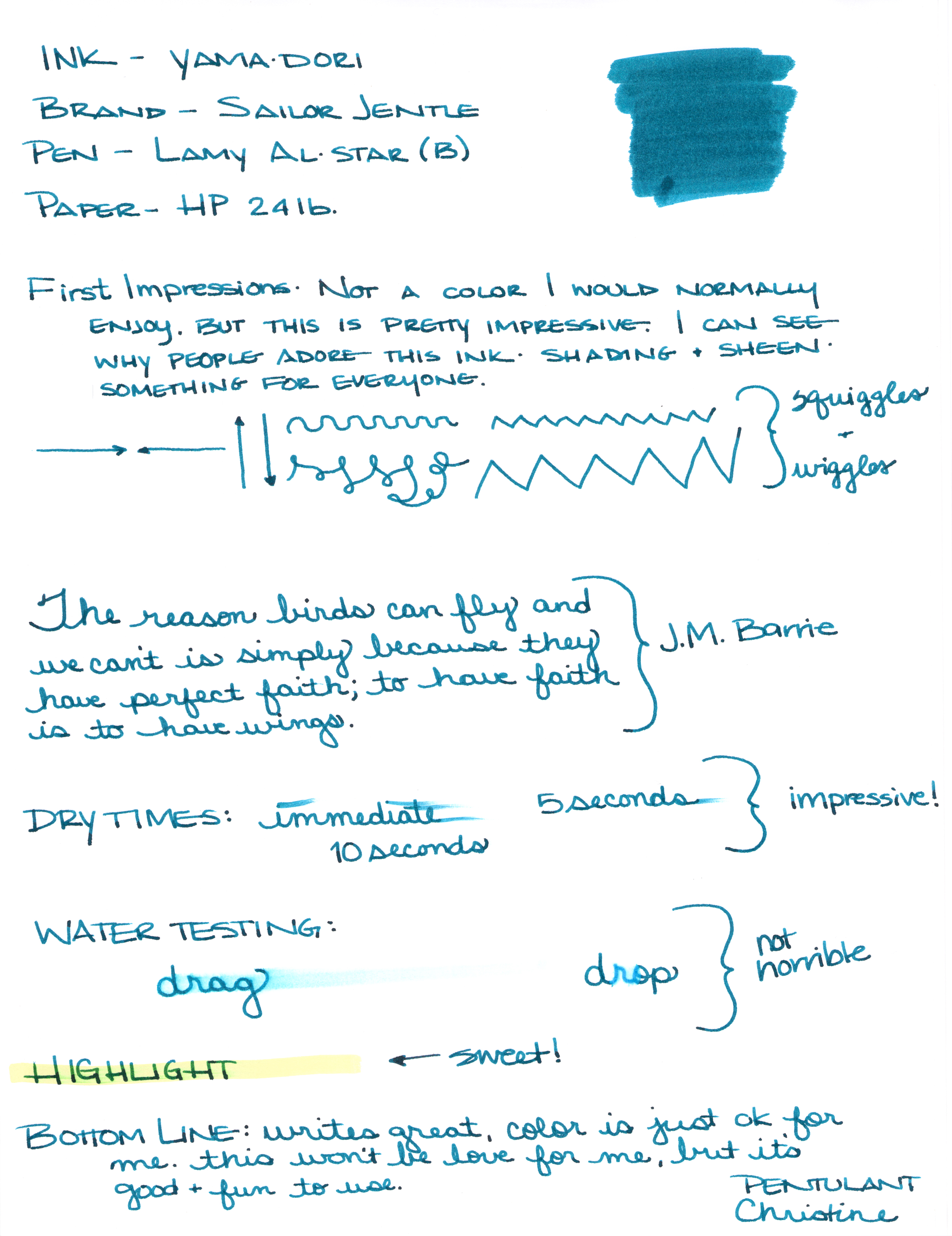
This or that? Top or bottom? Which do you love?
Can you see the differences between these two inks? One color is always on top. The other is always on the bottom.
Let's take a closer look . . .

One of these is Pilot Iroshizuku Ku-jaku. The other is Sailor Jentle Yama-dori.

Color is quite similar.

I see a definite difference here.

Not much difference here.

Which ink is this? Hint: it's both!
Alrighty, which do you like? Both? Neither? They are pretty close, yes? I would choose the top color - but not by much. It's the shading that made the difference for me. I think I could be happy with either (even though teal isn't my most favorite color).
Scroll down for the spoiler . . .
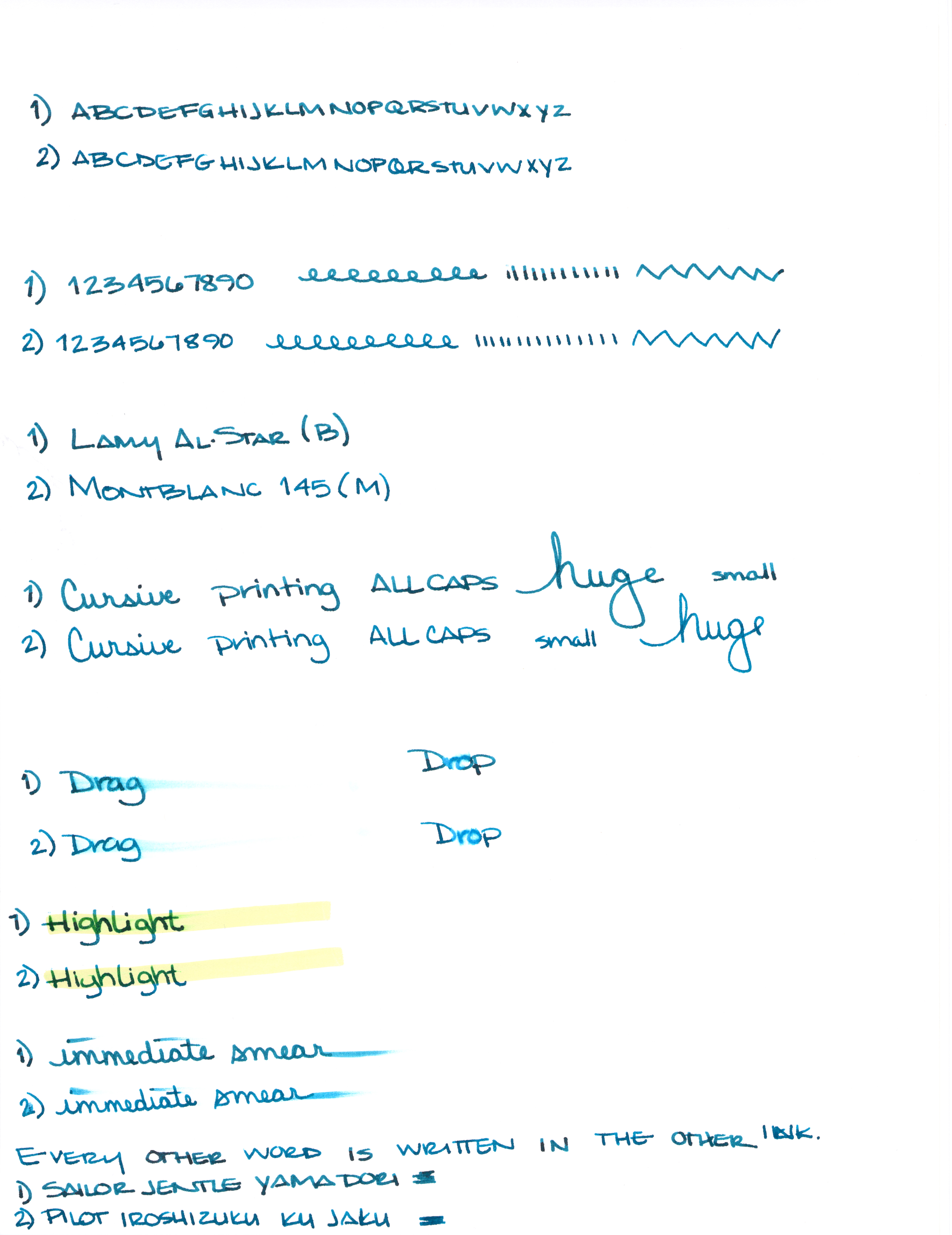
The top shade is Sailor Jentle Yama-dori.
The bottom is Pilot Iroshizuku Ku-jaku.
What is so interesting to me about this is that Yama-dori is legendary. Ku-jaku gets favorable reviews, but it's not a Big Deal. The differences are subtle and if they weren't side-by-side, I wonder if you or I could tell them apart.
Like I said yesterday, Yama-dori is my E.T. ink. You can read all about that right here.
What do you think? Am I crazy and there's a huge difference that I'm not appreciating here?