Pages

Showing posts with label hate. Show all posts

Wednesday, April 23, 2014

GEL PEN REVIEW: Poppin


I hope everyone had a happy Easter.  I was off to New York for a few days - had a great time. I wasn't blogging during my time away, but I was definitely posting over on Instagram.

Today, we're taking a look at Poppin Gel Pens. You may remember that just before Easter, I reviewed their Cahier Journal.

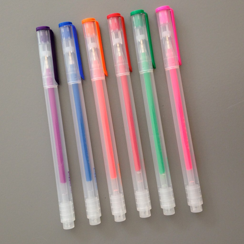
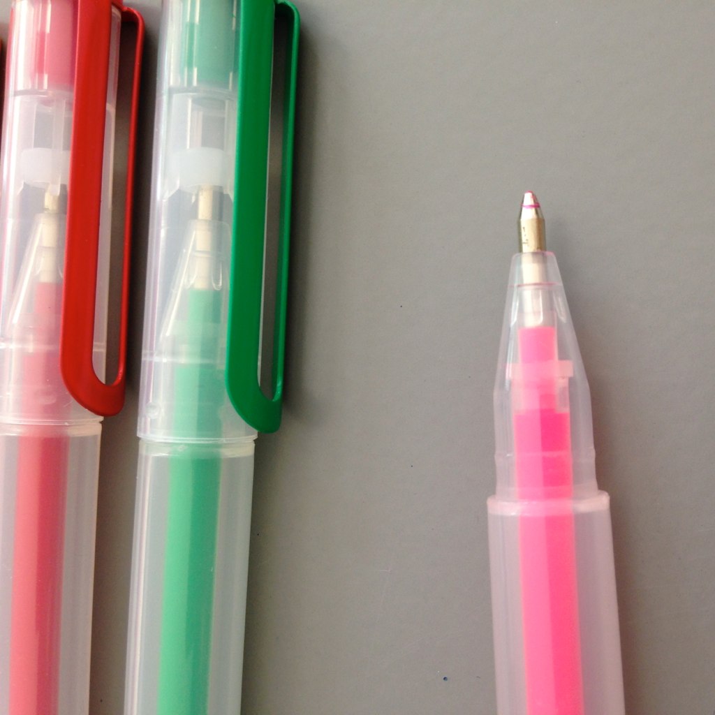
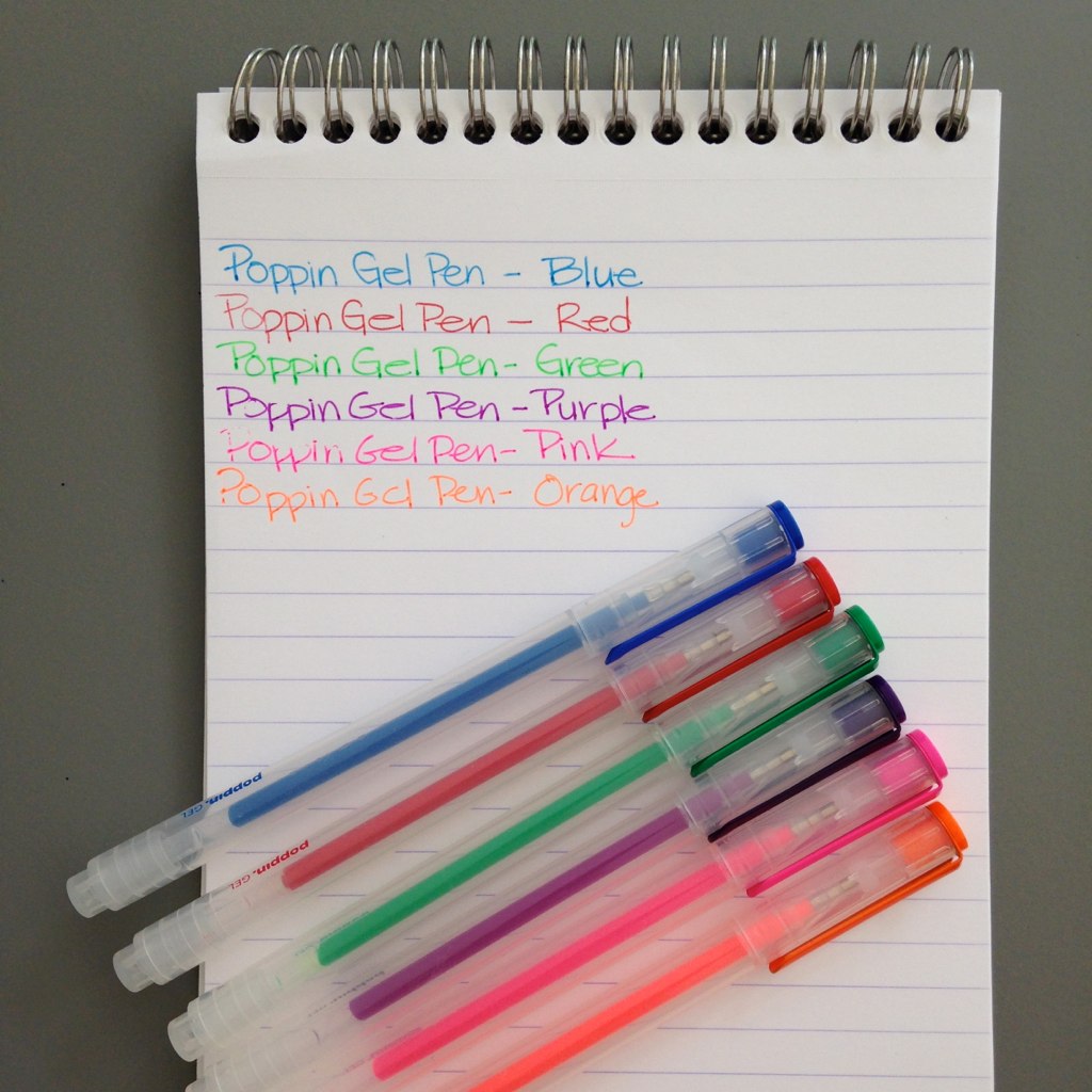
These gel pens are definitely pretty, pretty . . .


Average in size.


Some of the colors are pretty terrific . . .


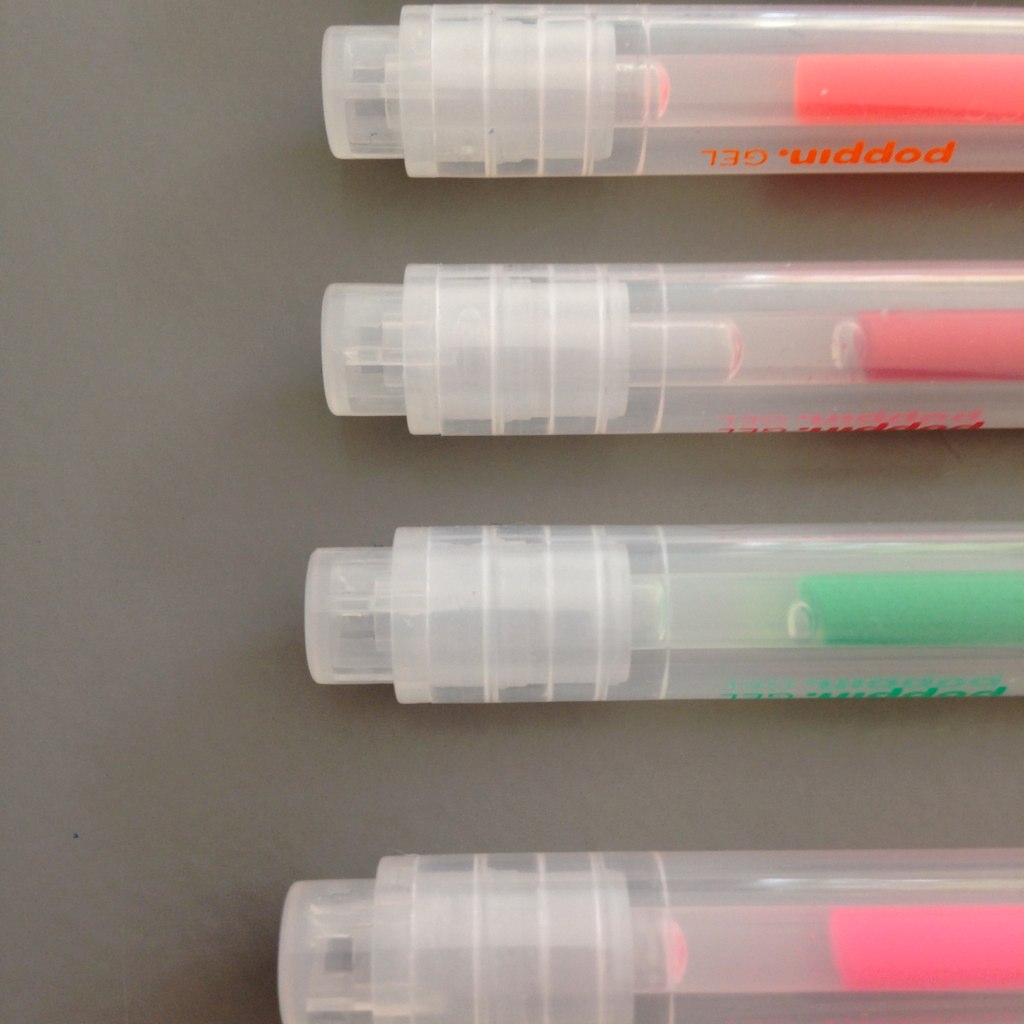
Poppin, even.  (ha.)

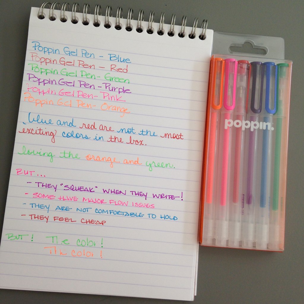
But . . .


There are some issues . . .
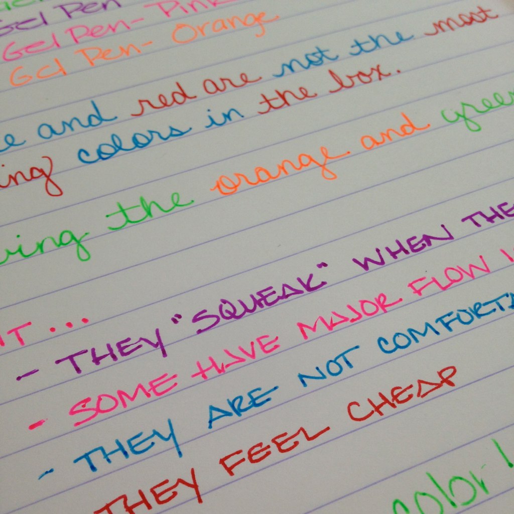
- some of the pens have a terrible squeaky sound to them when they write - I've never heard this sound coming from a pen - crazy
- some of the pens just wouldn't write - even after lots of scribbling
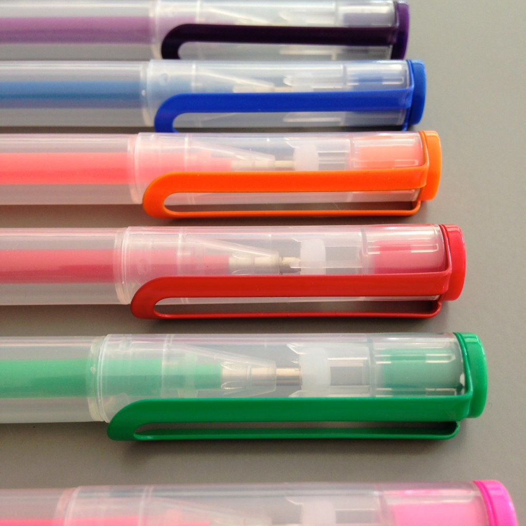
- the grip isn't really a grip - it's more of a steep drop off and it hurts to hold for any length of time


Bottom Line:

Even though some of the colors are wonderful (look at the purple! the orange! that green!), these gel pens from Poppin are not keepers. I could probably live with the squeak and even with the terrible grip - but the flow issues?  No. That's a deal breaker.

The real shame is that this is the second Poppin product that caught my eye and then didn't live up to expectations. It's too bad because the items look great.

Third time's the charm? Stay tuned!

Monday, January 13, 2014

INK REVIEW: Noodler's Baystate Concord Grape


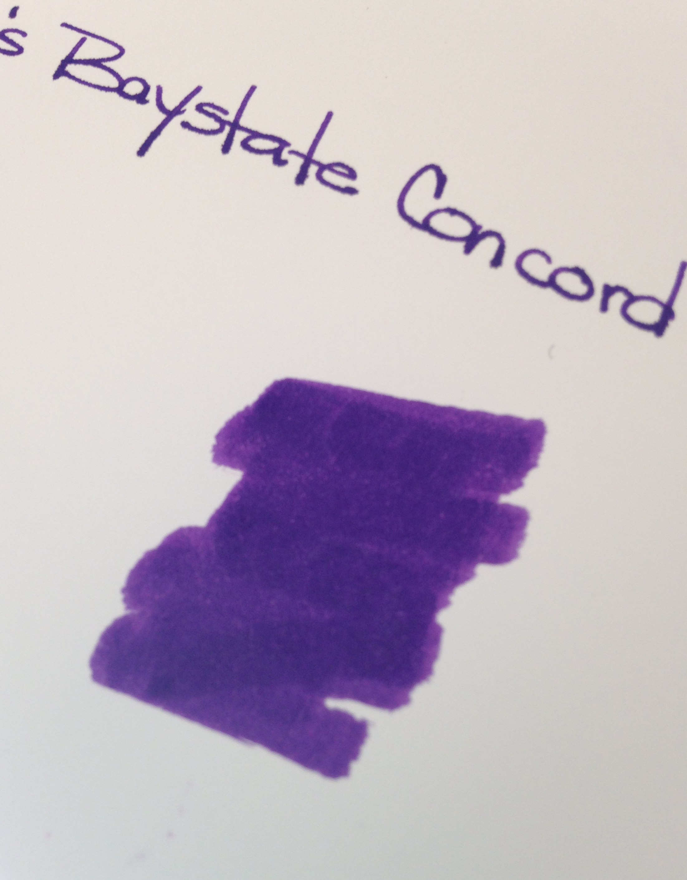
Noodler's Baystate Concord Grape Ink Swab


Disclaimer: While I usually scan the sheets of paper for my ink reviews, these images are coming right out of my iPhone. That explains the inconsistencies in color and quality.

Second Disclaimer: I realize that this post flies in the face of what I said last week about putting up with some other things as long as the color and saturation are there. What can I say? I'm fickle.


If you've been in the fountain pen community for any length of time, you  have probably heard of Noodler's Baystate Blue. Famous for it's amazing color and it's amazing ability to stain (or even ruin?) your most loved pens.

But Blue isn't the only Baystate color from Noodler's. There is Concord Grape and also Cranberry.

Today, we discuss Concord Grape.

No likeie.

The color is what I expected - very saturated, very purple. No complaints there.

But here's the problem....
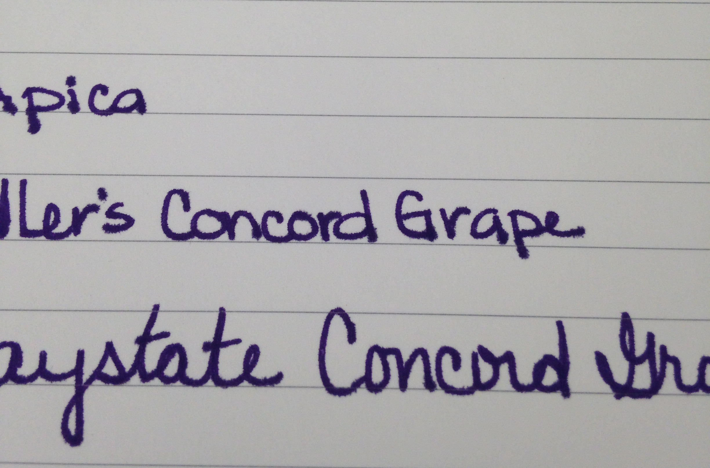
Baystate Concord Grape - Apica Paper Test


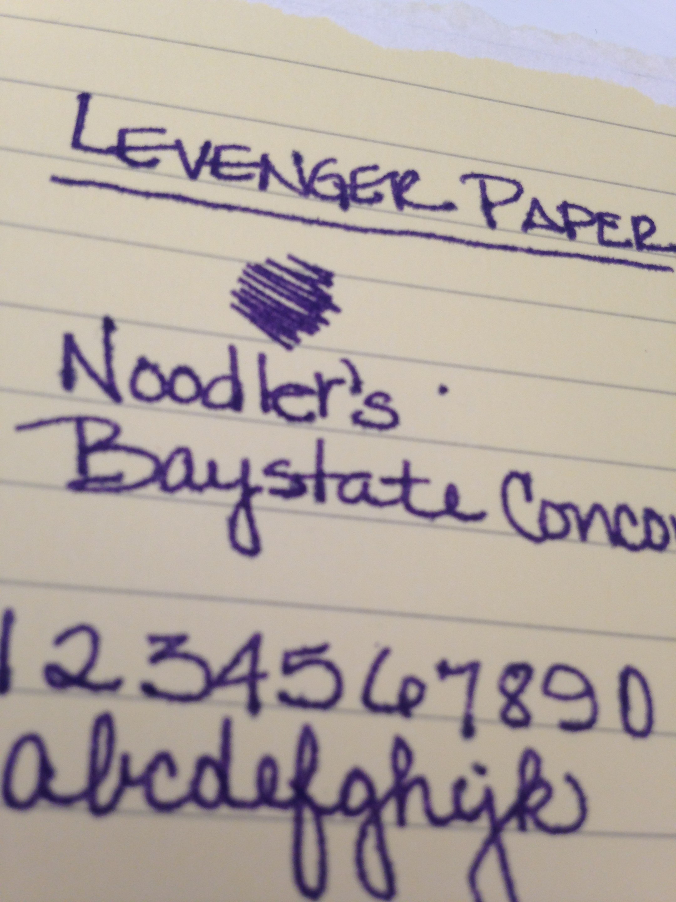
Noodler's Baystate Concord Grape - Levenger Paper Test


Noodler's Baystate Concord Grape - HP 32lb Paper Test

It's the feathering. Click on the images to see the full-size or have a look at these screenshots from the original images.


If it was just one paper (especially the Levenger, which has been questionable with a number of inks), I could let it go. The color is so great that a problem here or there is ok with me, but this ink was a problem on almost every paper I used.

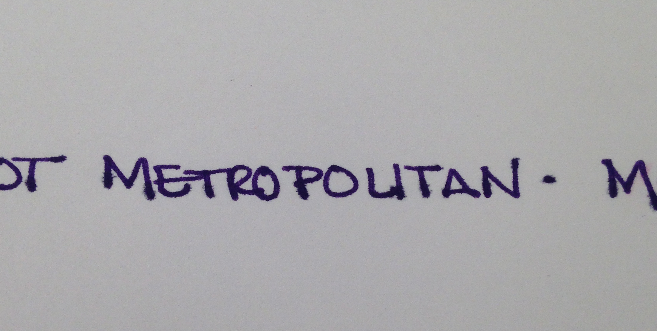
I was using a Pilot Metropolitan (medium nib). It's a pen I'm very familiar with and have had no problems with in the past. After the ink sat in this pen for a day or so, the flow was terrible - I eventually had to open the pen and give the squeezie converter thing a little squeeze to get things flowing again.

With most of my ink reviews, I use the ink regularly for an entire week before posting. I was only a few days into the week before I realized that I wasn't reaching for this ink at all. It was making a mess out of my work notebook (a Rhodia) with all of its ugly feathering.

Now, of course, your mileage may vary and I'm no expert in pens and inks (just love me some pretty colors and shiny things). If you've tried Baystate Concord Grape, I would love to hear about your experiences.

Wednesday, August 21, 2013

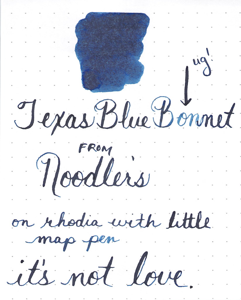
INK PREVIEW: Sailor Jentle Epinard


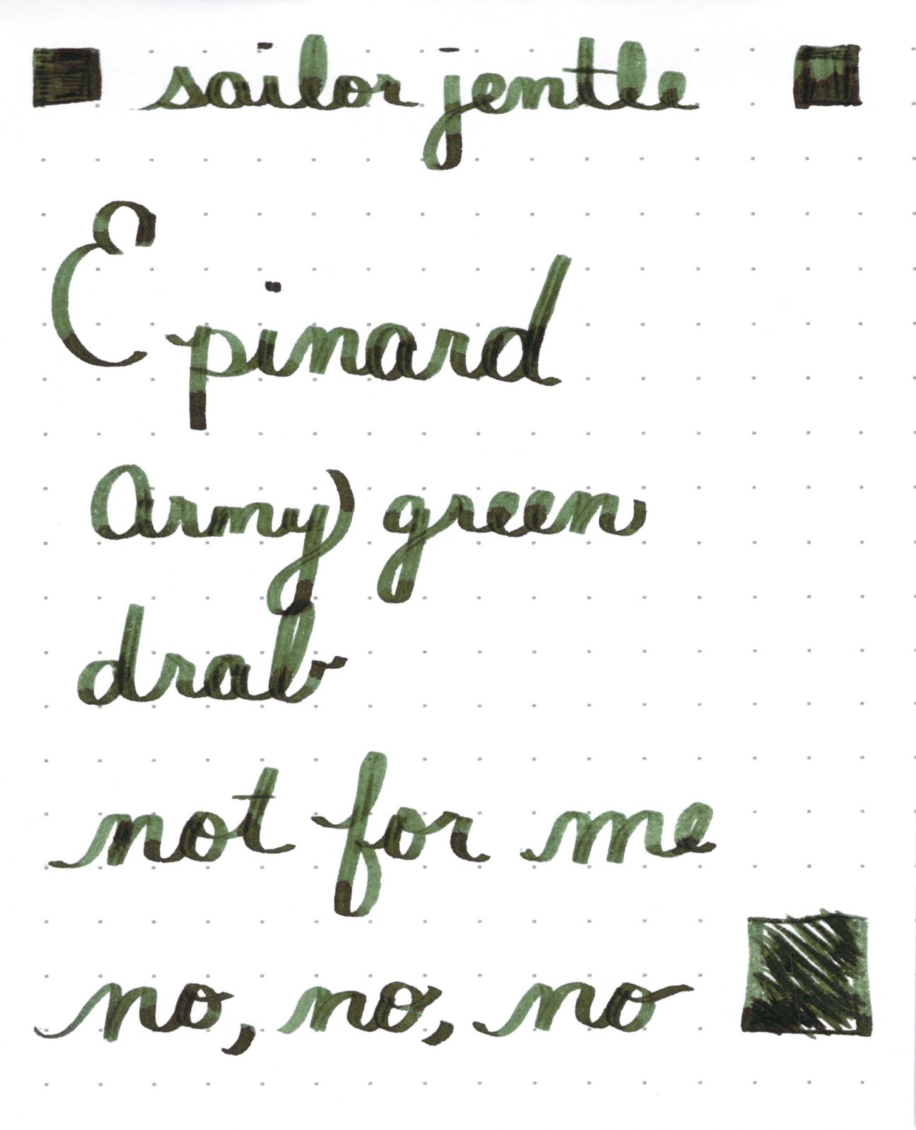
Oh man. I hate this ink. Lots of others love it - and I'll admit that I have nothing against it other than the color.

Sailor Jentle Epinard is just not for me.


It even has some pretty nice shading.

If you can get past the color. Epinard.

But I can't.


I used a TWSBI with a stub nib for this review. I've mentioned before and I'm saying again, I don't think stubs are for me, but that has nothing to do with this ink. I just don't like it.

In fact, I loaded up my pen, wrote a tiny bit with it and immediately rinsed it right out my pen. So glad I only had a sample and not the full bottle.


Love it, hate it?

Sunday, March 24, 2013

INK REVIEW: De Atramentis Sandalwood


Love this ink. Except....

Let me show and tell you about all of the positives first.


I love the color. Green with a touch of blue.  Definitely pretty.

It writes well. A little shading in there.


It scores well with me. I shouldn't have given it Fun Bonus Points, but I was caught up in the moment.

So what's the problem?  It stinks. It's noticeable, but ok at first. Tolerable. Even kind of fun.
But dude. After a week of using DeAtramentis Sandalwood as my green of choice, I was so over it. Gross. I don't mind the scent of sandalwood - Mr. Pentulant would even say that I'm a bit of a hippy who embraces the, ahem, earthy scents. But not this. It was just too much. There was a hint of a petroleum smell in the background - totally ruined it for me. Going on the Hated It list. Bummer.

No.

Darn.

Wednesday, March 13, 2013

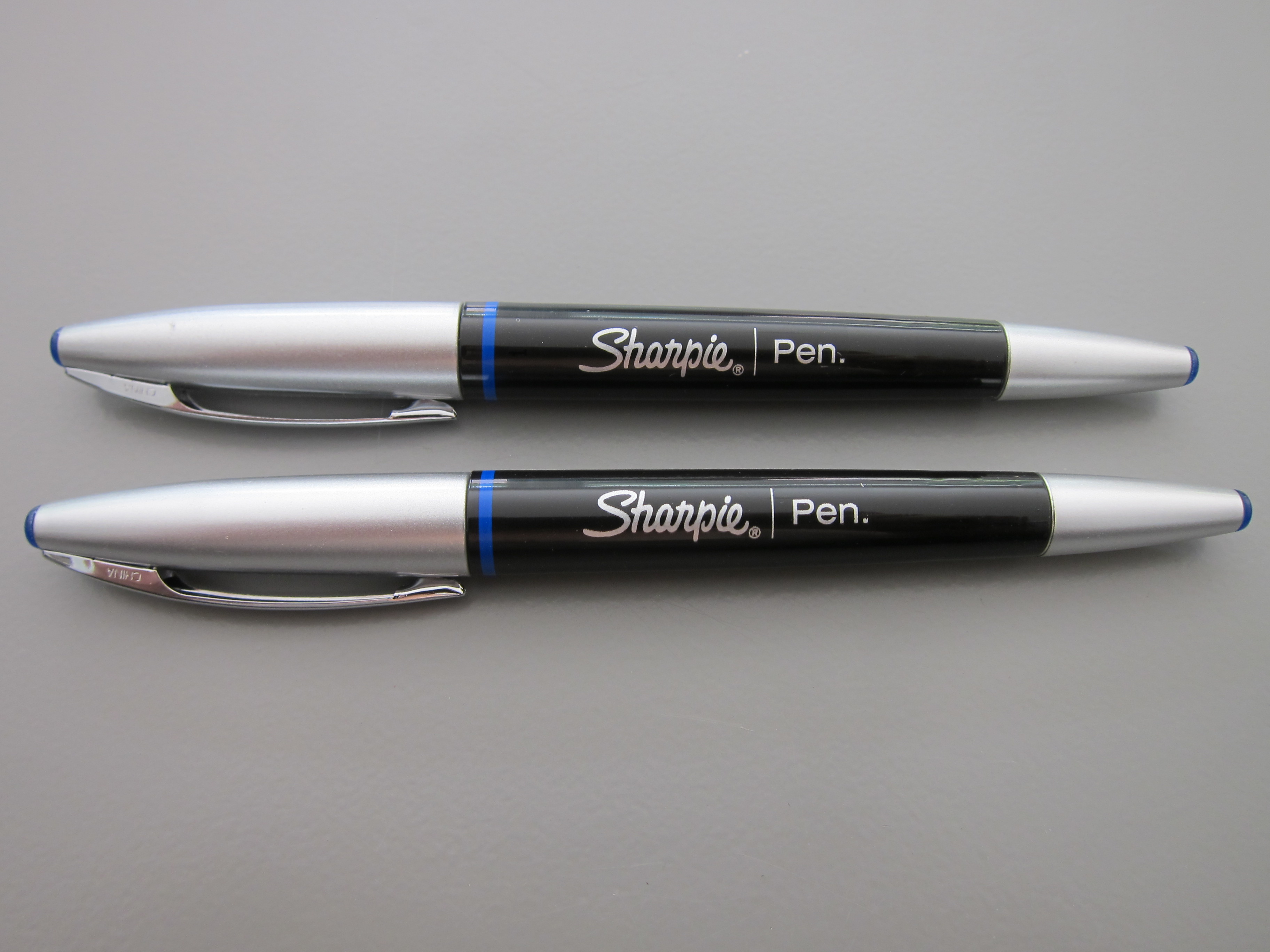
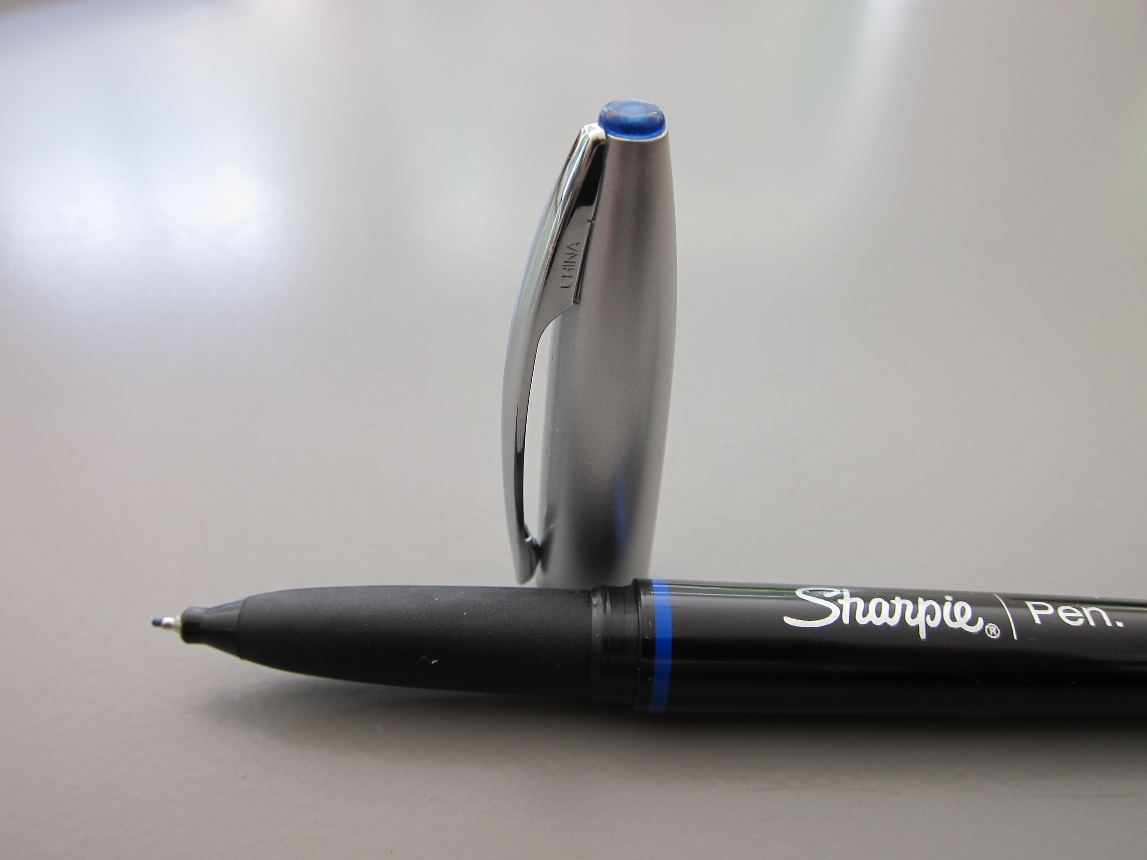
REVIEW: Sharpie Pen Stylo


Apparently, I've been on a Sharpie kick lately!

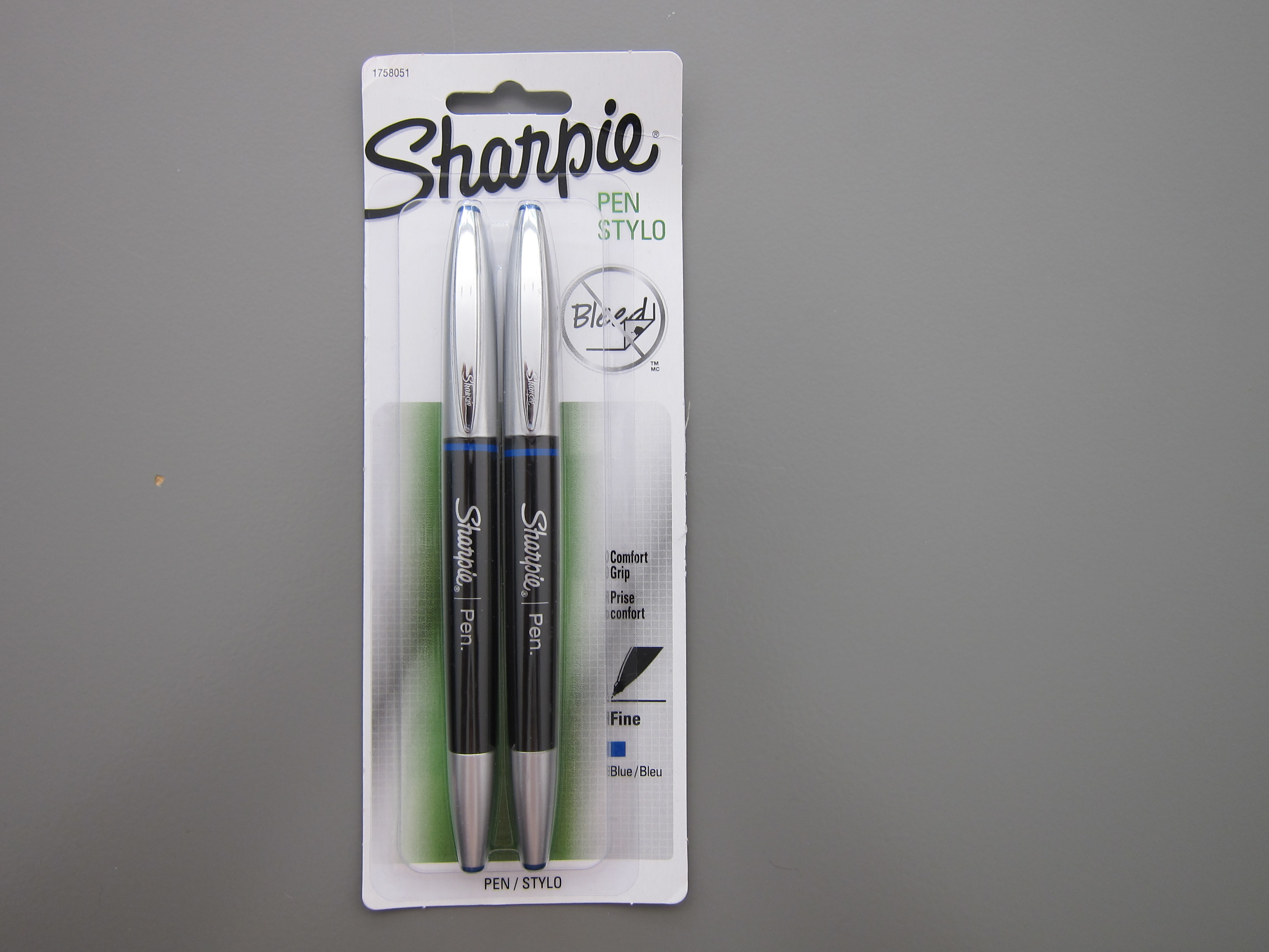
These pens (fineliners, really) are not related to the permanent markers that we all know (and love) from Sharpie.


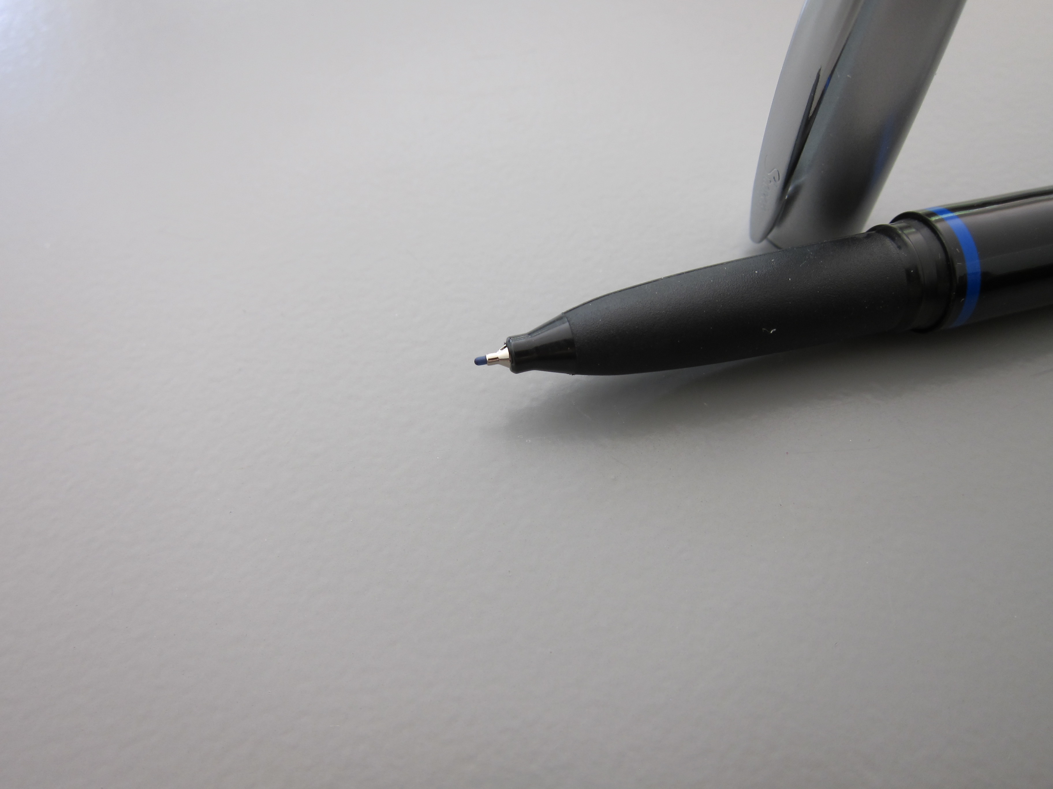
The "comfort grip" is a bit gross. It feels tacky as if it would collect any little particle of dust or fuzz. Know what I mean?


Other than the feel of the grip, it's ok - as long as you don't mind a long dry time. 


I'm not a fan of this item. In fact, I've already "lost" these pens. Ick.


Thursday, February 21, 2013

INKY REJECTS


Three inks that will never ever ever (well, maybe) make it into any of my pens.


We'll start with Organics Studio Mercury in the middle. Turns out that after sitting for awhile, this ink solidified - well, actually, it gellified (it's a word).  You can actually see the clumps in the third swab of this really pretty color.

Organics Studio Cobalt is guilty by association. I know, I know. I could try it with a glass dip pen, perhaps. It is a really pretty color - especially when it's laid down in three layers, yes?

Noodler's Rochmaninoff. I bought a sample of this from Goulet Pens (love them!) and it's clear this isn't like other inks. I had to shake the vial to mix it all up and even then, it looked - suspicious - like something I wouldn't want to put in a pen. But. When I swabbed it, no problem - perfectly smooth and kinda pretty (in a Pepto kind of way). And look at the glow - pretty, right? I think I'm going to get brave sometime and test this one. Maybe. 

Are there ink brands you just won't use? Have you ever changed your mind and it worked out ok? Or (yikes) didn't work out?

Wednesday, January 30, 2013

INK REVIEW: Stipula Sapphron


Holy cow. 

I hate Stipula Sapphron.

It shades like a son-of-a-gun. Sounds like I should love it, right? Or at least like it. But no, I hate it.

It's not often that I say that. In fact, here are all of my posts with "hate" as a tag.  

In the sample vial, the ink looked like a pretty (though not saturated) orange. When I swabbed, I thought the ink looked a little on the yellow side, but was still pretty enough.  (See my first impressions on the handwritten review.)


Then I started writing with it. I was sure my pen must have been dirty. But at the same time, I knew it was a brand new pen and a brand new converter. No ink had ever touched either and both were cleaned prior to use. I twisted a bit of ink out onto another piece of paper - and it sat there looking like a bubble of yellowish mud!  When I smeared that mud around with a cotton swab - it looked like the Ink Swab in my review.

Ca-razy! I don't get it.


You know what else I don't get? I couldn't find even one other review for this ink. Not on Fountain Pen Network, not on Goulet Pens, and even Google came up empty. It's like I'm in the twilight zone over here.

Hard to believe I'm going pass by shading like this. But I am.


Pretty weird. That's my first impression - and coincidentally - my bottom line for Stipula's Sapphron. (By the way, I have no Stipula aversion - I own and love several of their fabulous pens. This ink is just weird.)

In fact, I wanted this to work badly enough that I tried it again another day. With another kind of paper.


Always looking on the bright side, however, Apache Sunset has been on my list of inks to review forever and I'm excited that it's coming up sometime soon!  And that De Aramentis Gandhi? Isn't that pretty? 

Time to 'fess up! Do you have Sappron? Do you love it? Hate it?


Monday, January 28, 2013

PEN REVIEW: Montegrappa Espressione


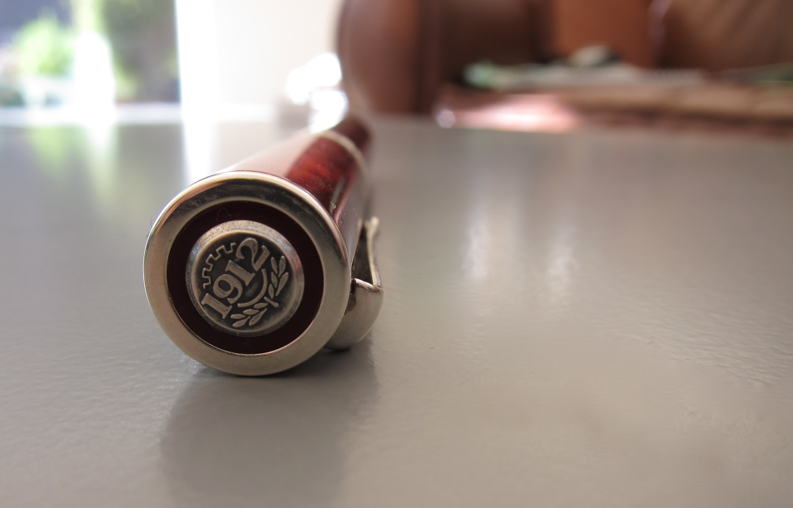
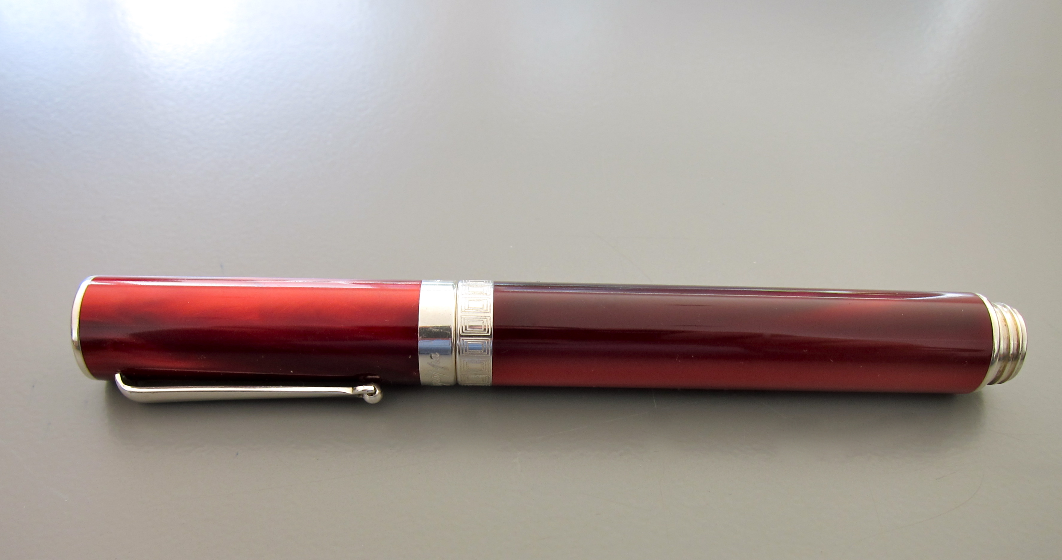
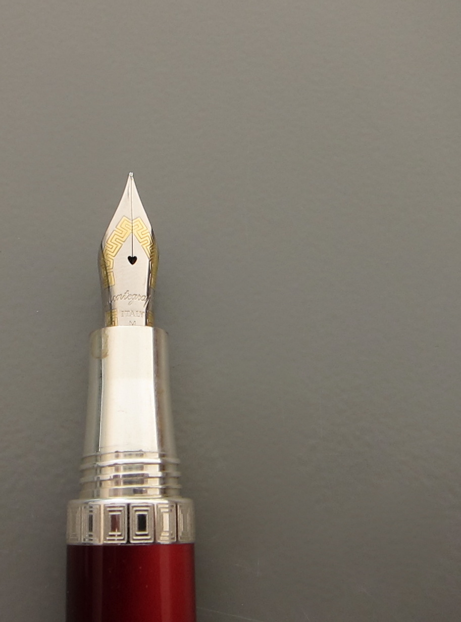
So pretty.  So sleek and modern. A great profile. This Montegrappa Espressione is quite the looker!

And..it has a screw-to-post cap - Mr. Pentulant loves that.

Montegrappa is a well-respected line, many people love their pens. I don't love this. In fact, I pretty much hate it. How is that even possible?


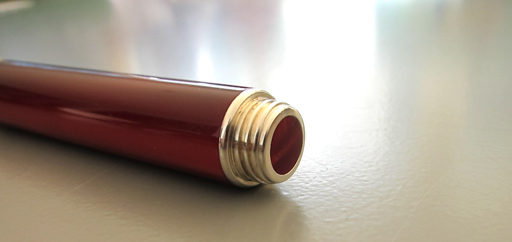
See the metal grippy part? (Grown ups call the the Section or Gripping Section.) It's metal. And it's omg, too short. Which means that my finger is resting on the threading. Which means it hurts. Bad.

And. It's heavy. Too heavy. When posted (as it's clearly meant to be), it's unbalanced and gross.

No likie.


But man, it's pretty.


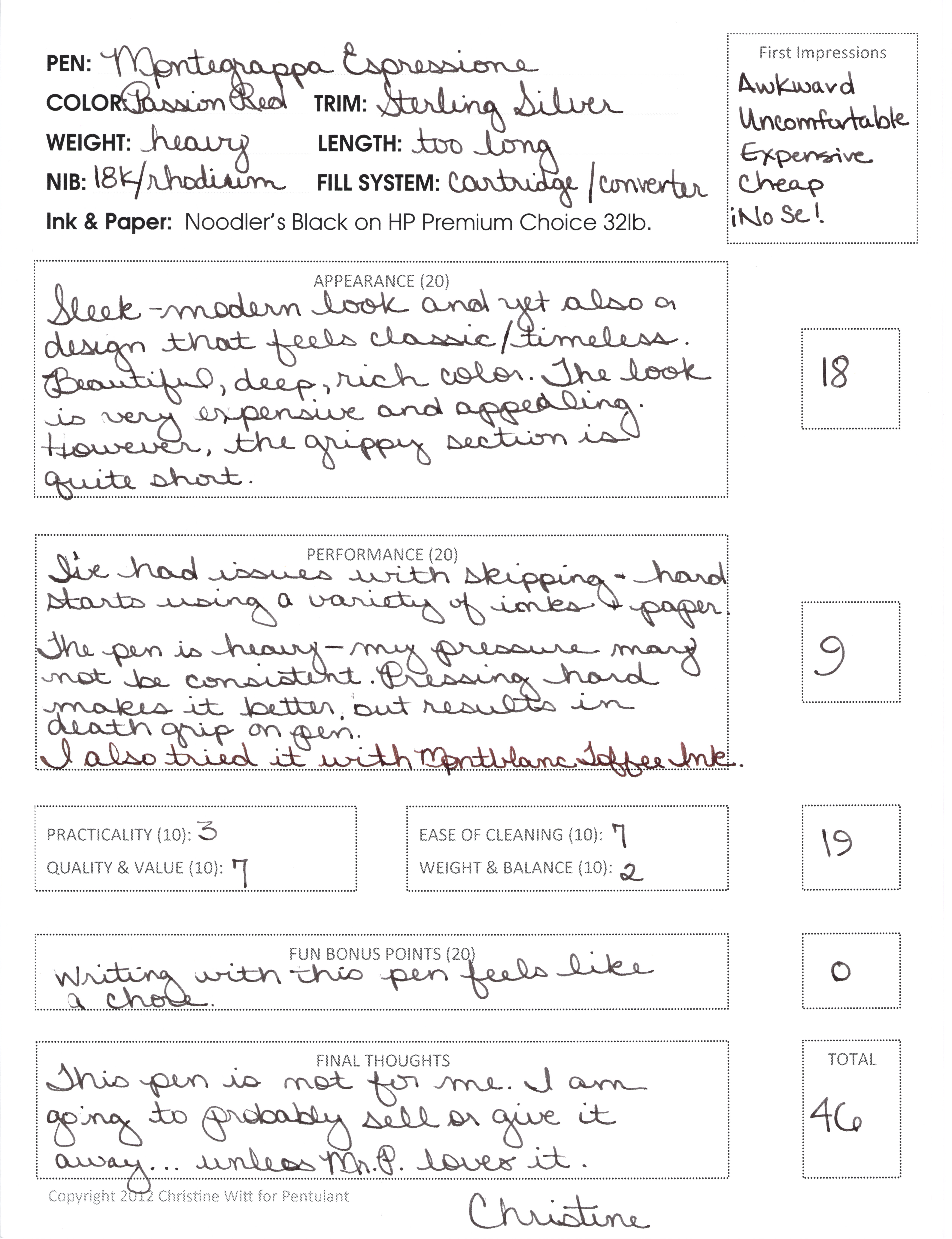
Here is my written review.  Click to make it bigger.


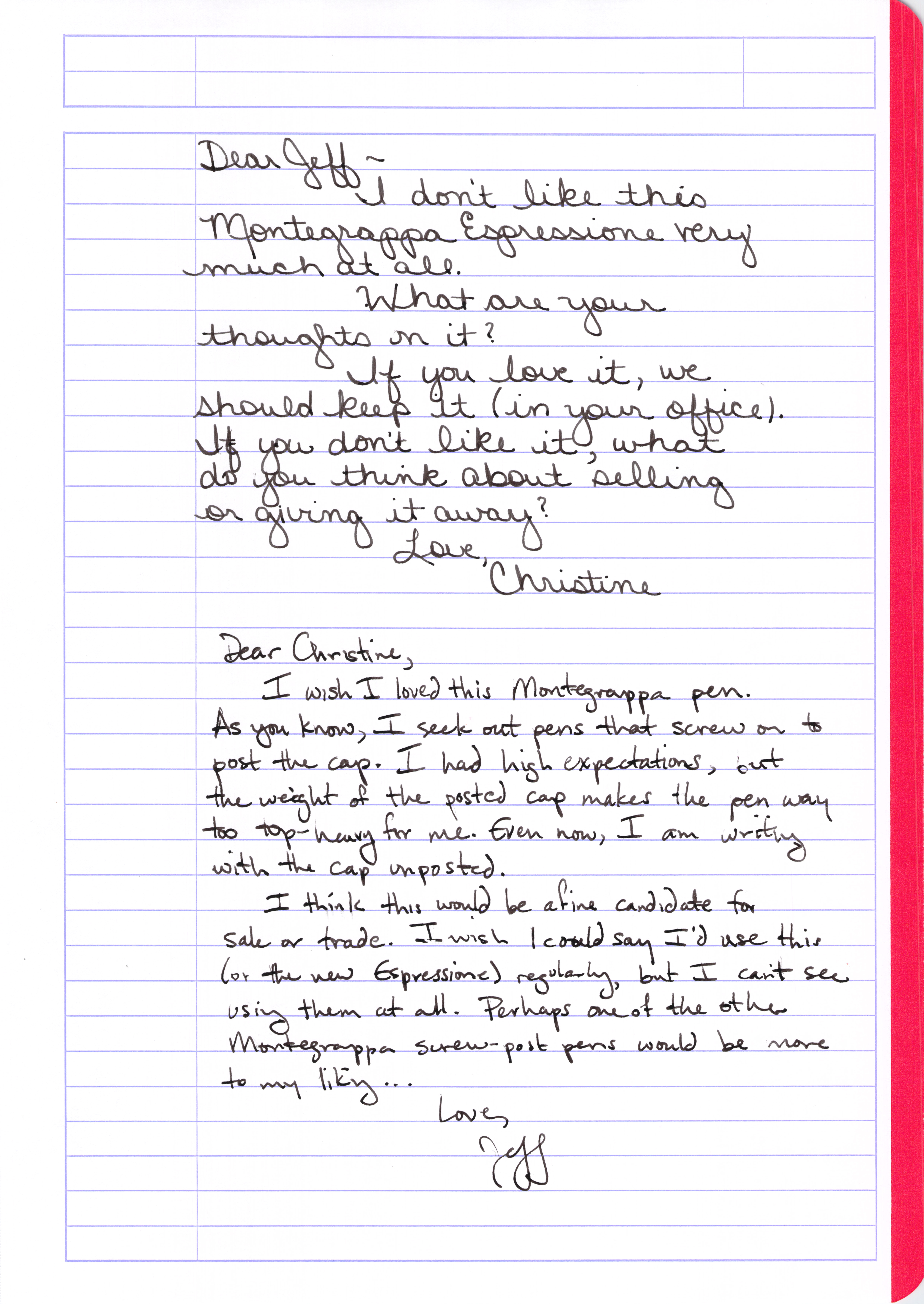
In an act of unselfish love, I offered the pen to Mr. P. And even though he loves him a screw-to-post pen and he agrees the Espressione is gorgeous, he rejected this pen, too!


I'm going to ponder a bit on what to do with this pen. I won't write with it again. Mr. P won't use it either. Seems a shame to let it hang around here with no love when someone else would probably love to have it.

Will keep you posted on how this one plays out!

But tell me your thoughts - have you tried this pen? Have you given away pens you would never use?

Friday, December 28, 2012

INK REVIEW: Diamine - Syrah


Still recovering from the holidays here and wrapping up a few pre-scheduled reviews before diving into new and exciting things!

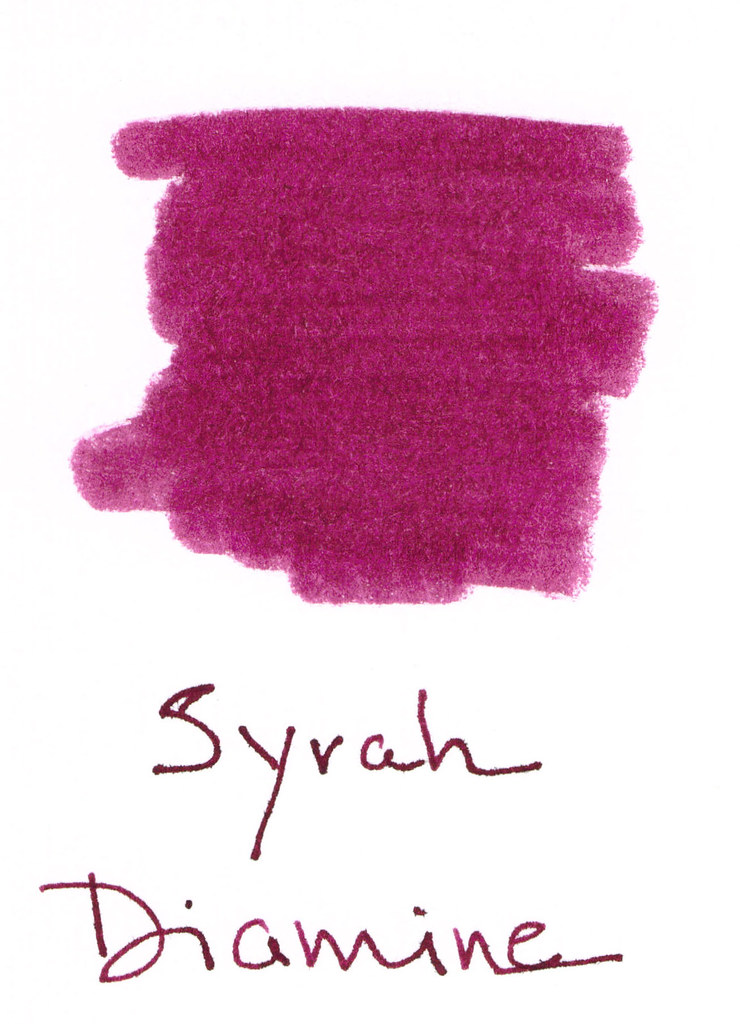
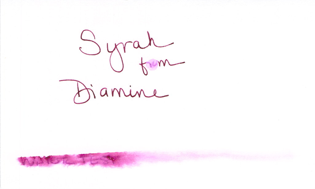
Syrah from Diamine is a berry nice shade. Kinda red-purple. Deep plum. And by now, everyone knows how I feel about "mixed shades" of ink. I'm not a huge fan.

Here's the ugly. Major fail. (Those of you who watch "How I Met Your Mother" may now salute. Those of you who have no clue about which I speak may also salute. Major Fail - get it?)  Anyway, major fail = water test. Even the tiny droplet test (where the "ro" in "from" should be) faded this color into nothingness.


I used a dip pen and Syrah performed well enough. No big complaints, but no big compliments either.

Look at that compare square?  I do think if the writer is looking for something dark, but different, this could work (as long as one never nears the water).

It was a little wet as you can see in the Smear Here - but not intolerable.


Overall, I'd give Syrah from Diamine a good solid C. It would work, but I'm not in love. In looking at other reviews after I wrote this one - this is a popular ink. People love it and its color. Consider me the dissenting reviewer.

Such a contrarian.

What do you think? Love it?