Pages

Showing posts with label blue. Show all posts

Wednesday, December 3, 2014

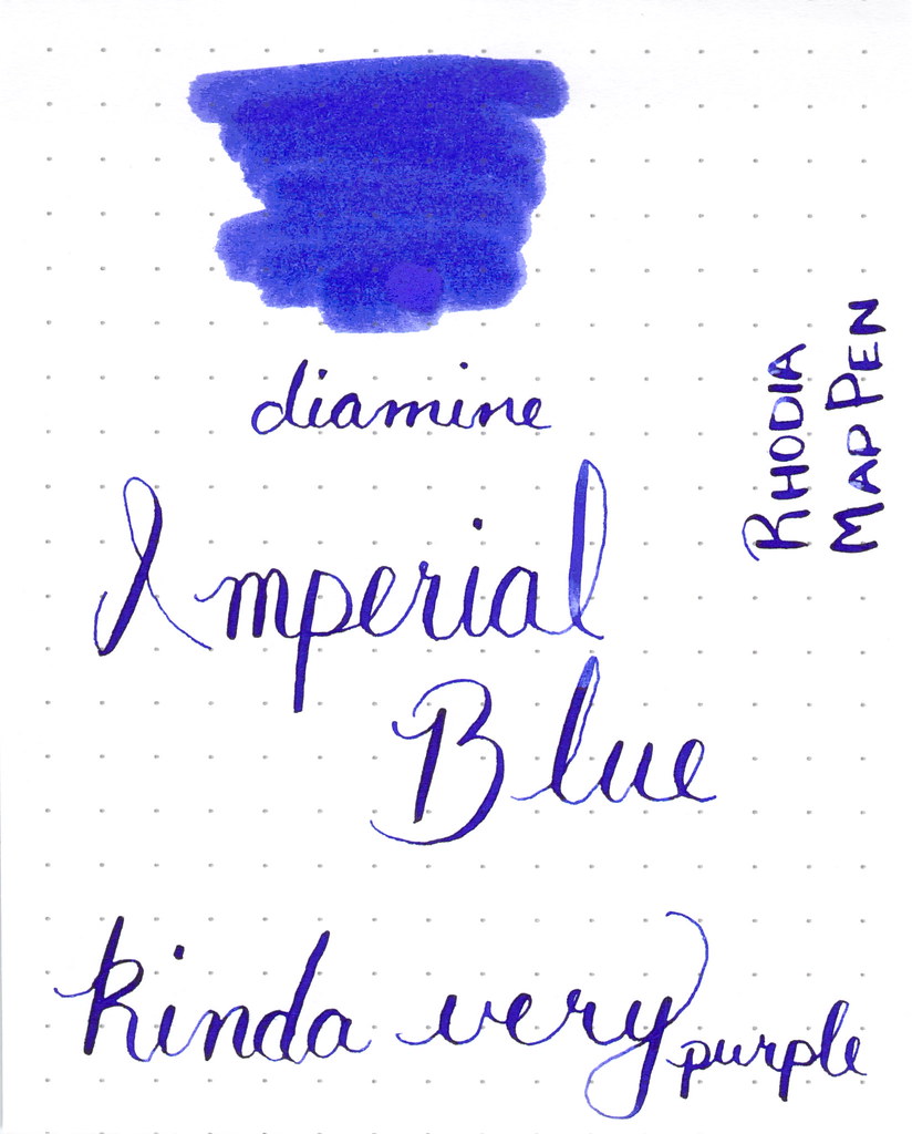
WORDLESS WEDNESDAY: Diamine Imperial Blue Ink Review


I like this one. A blue that leans toward purple.

I'll definitely be back with a full review of this one.


Do you like the way it looks?

Wednesday, October 29, 2014

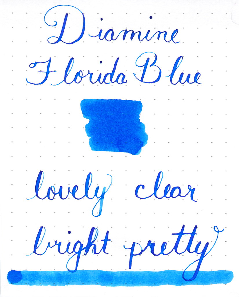
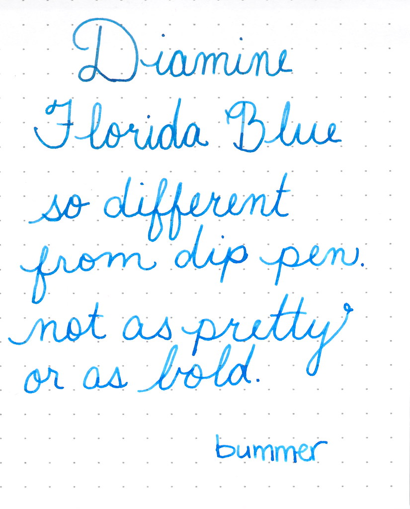
WORDLESS WEDNESDAY: Diamine Florida Blue

Diamine Florida Blue

Almost Wordless Wednesday returns ;)


I wanted to show you this today.  See how pretty Diamine Florida Blue is?


The above is written with a dip pen.  The following is written with a fountain pen . . . 


Swabs and dips cannot give the same color as actually filling a pen with the ink and writing with it. 


Monday, September 22, 2014

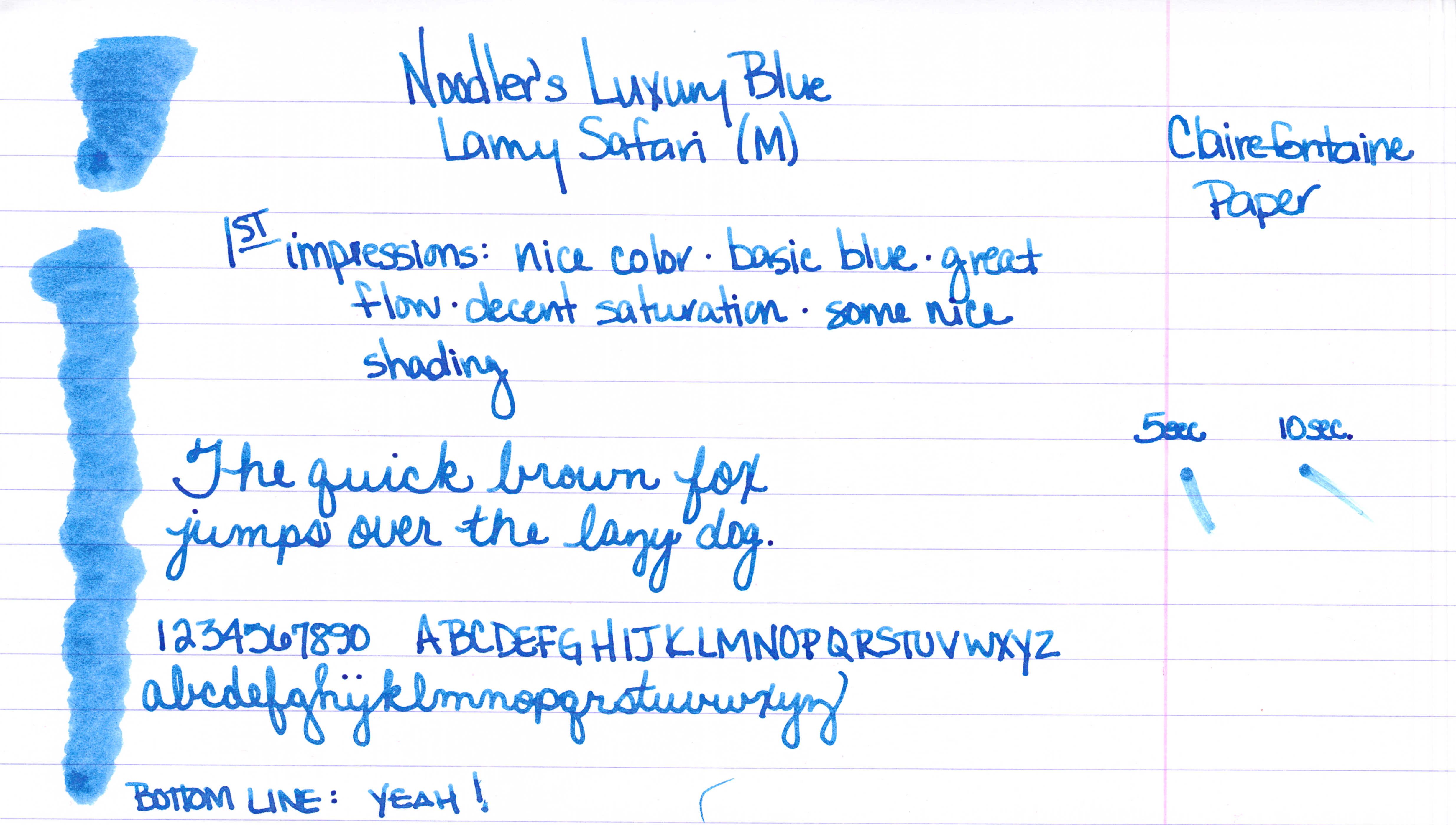
INK REVIEW: Noodler's Luxury Blue


A handwritten review of Noodler's Luxury Blue fountain pen ink.


Noodler's Luxury Blue is from the line of Noodler's Eternal Inks. That is, they are meant to be water, light, and (yes, folks) even bleach-proof. These forever inks are sometimes referred to as bulletproof and fraud-resistant.

While I won't take the time to list them all here, here's a link to the bulletproof inks that Goulet Pens carries.


Let's dive in . . .


A good medium blue with some nice shading.


No flow issue or other complaints from me.


Some reviewers have published pictures and statements that indicate that the ink is more dusky/chalky than I have shown here.  This is a little surprising to me because while the ink is not super-saturated, the color is definitely clear and bright.

Noodler's Luxury Blue is an expensive ink. As of this writing, it is $13.50 for one ounce at Goulet Pens. Meanwhile, another bulletproof ink (Bad Belted Kingfisher) is $12.50 for three ounces.

Bottom line:  I like it, I don't love it.

Have you tried this ink? I'd love to hear your thoughts.


Tuesday, August 12, 2014

THIS OR THAT: Yama-dori or Ku-jaku


This or that? Top or bottom?  Which do you love?

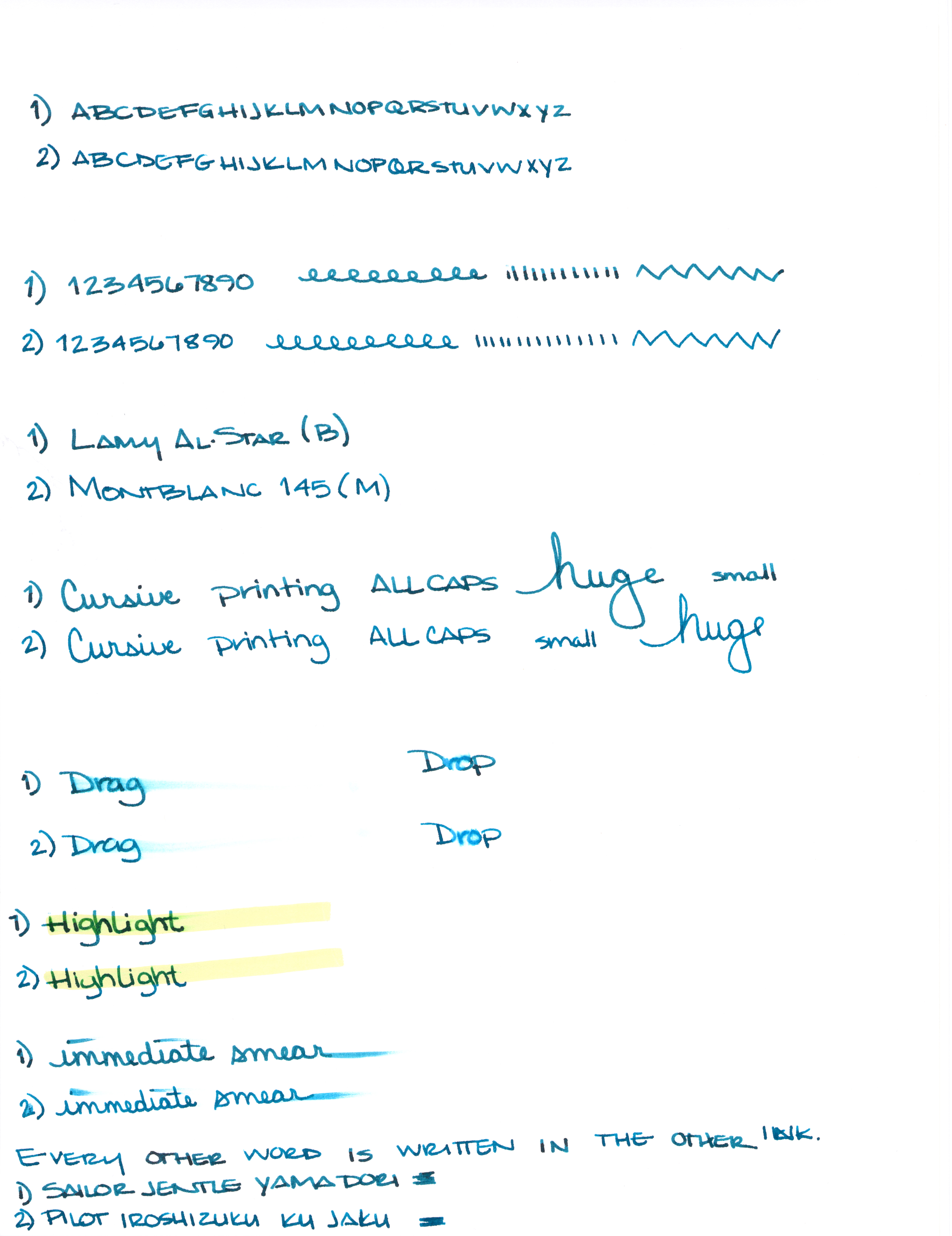
Can you see the differences between these two inks?  One color is always on top. The other is always on the bottom.

Let's take a closer look . . .


One of these is Pilot Iroshizuku Ku-jaku.  The other is Sailor Jentle Yama-dori.


Color is quite similar.


I see a definite difference here.


Not much difference here.


Which ink is this?  Hint:  it's both!


Alrighty, which do you like? Both? Neither?  They are pretty close, yes? I would choose the top color - but not by much. It's the shading that made the difference for me. I think I could be happy with either (even though teal isn't my most favorite color).

Scroll down for the spoiler . . .


The top shade is Sailor Jentle Yama-dori. 
The bottom is Pilot Iroshizuku Ku-jaku.   


What is so interesting to me about this is that Yama-dori is legendary. Ku-jaku gets favorable reviews, but it's not a Big Deal. The differences are subtle and if they weren't side-by-side, I wonder if you or I could tell them apart.

Like I said yesterday, Yama-dori is my E.T. ink. You can read all about that right here.

What do you think? Am I crazy and there's a huge difference that I'm not appreciating here?


Monday, August 11, 2014

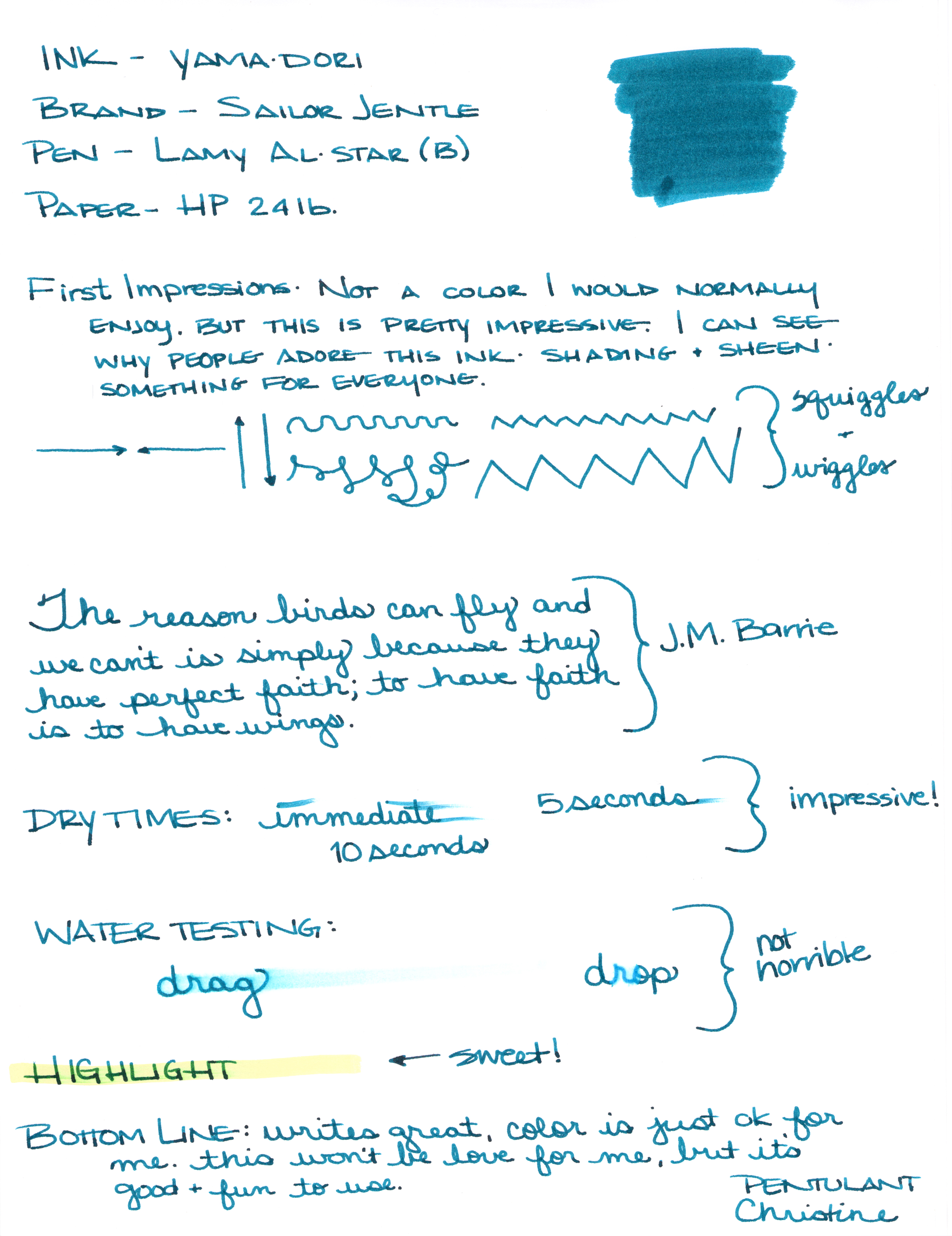
INK REVIEW: Sailor Jentle Yama-dori


Sailor Jentle Yama-dori Fountain Pen Ink Review


I generally try to avoid reading much about inks before I have the opportunity to try them for myself. I want my opinion to definitely be my own and not influenced by others as much as possible.

That was impossible with Yama-dori. This ink has superstar status over on Fountain Pen Network. Even before the ink was re-released, there was chatter about how amazing it is - it sheens, it shades, it's perfect! Gotta get me some of that!


I got mine from JetPens with pennies from my own piggy bank. It's listed at $20 there. Looks like it can be had for a buck or two less at some other online stores.


There are things I really like about Yama-dori. It sheens, it shades, it flows really well. It passed the smear and highlight tests with flying colors.


Yama-dori is my E.T. of inks. Let me explain . . .

Waaaay back when the movie E.T. (you know, the Extra-Terristrial) came out in theaters, it was the Must See movie. OMG, gotta see it. What, you haven't seen it?  You don't know what you're missing!  Best. Movie. Ever.

The build-up was just so much that there was practically no way the E.T. was going to meet my expectations. And it didn't. I mean, it was ok.

And that's kind of where I am with Yama-dori. It's good. It's nice. I like it. But am I coco-crazy-go-nutters for it?  Nah.


I'll be back tomorrow (a rare Tuesday post!) with more show and tell on Yama-dori.  (How is that for a tease?)

In the meantime, check out the full review (click here for the full-size image - it's huge), and tell me what you think.  Do you love Yama-dori?  Do you have an E.T. ink?


Monday, June 30, 2014

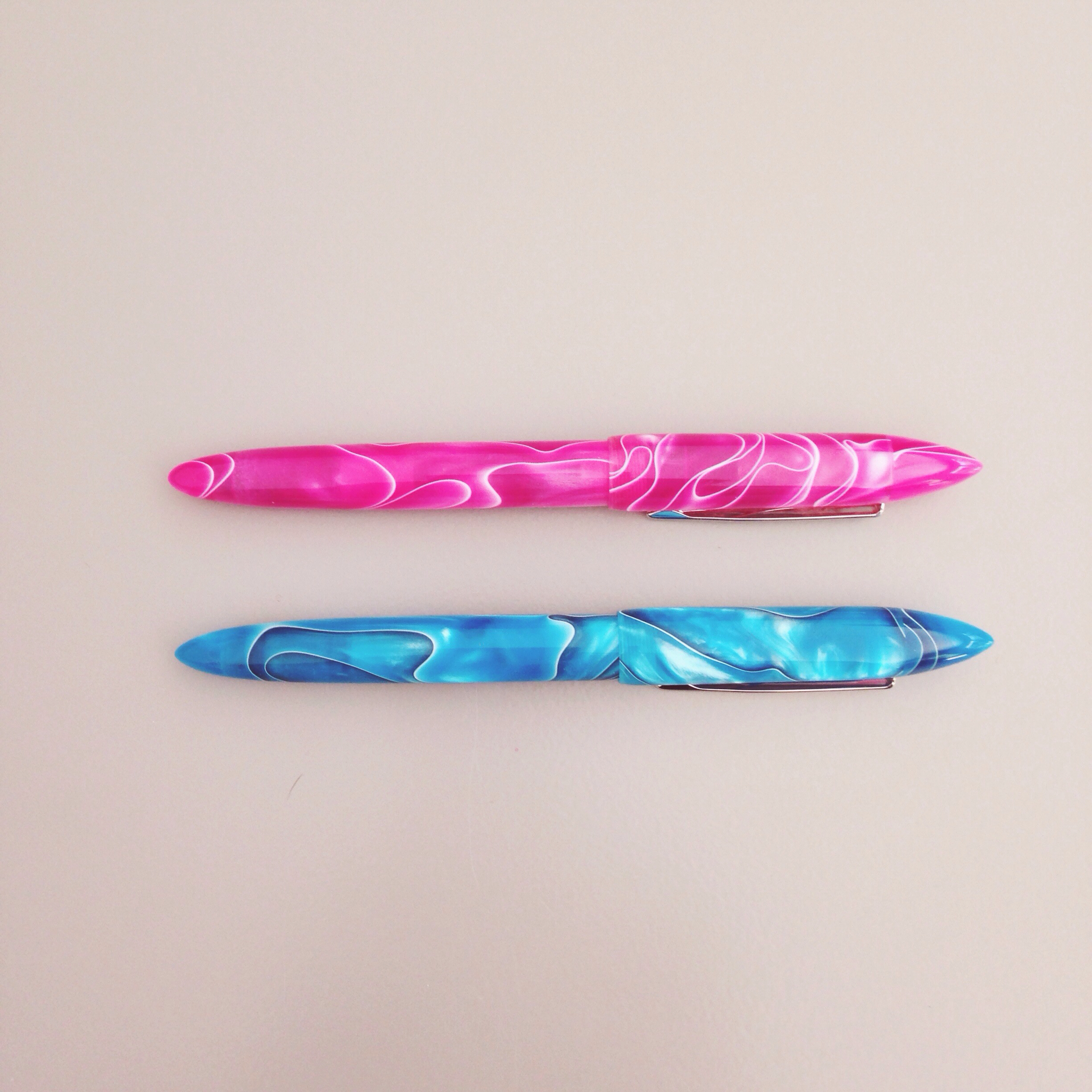
PEN REVIEW: Edison Nouveau Premiere - Summer 2014


As soon as the mail carrier knocked quietly on the door (she doesn't want to disturb the dogs...haha), I jumped up because I knew what was going to be on the porch waiting for me.

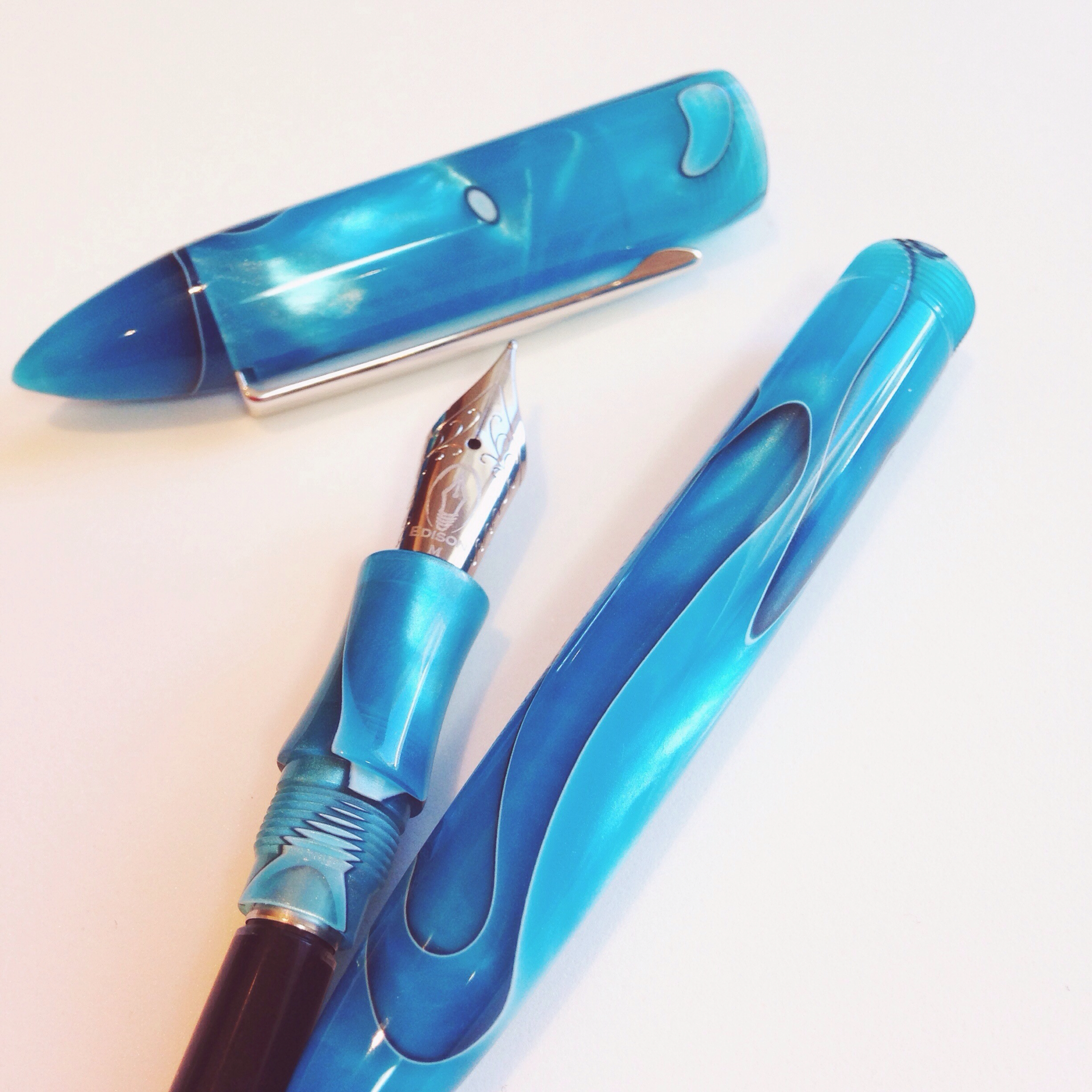
Days before, I'd seen the preview and knew I was going to own this pen - the Edison Nouveau Premiere - Caribbean Sea (Summer Edition 2014).

I have its Cherry Blossom - Spring 2014 sister. And I practically squealed when I saw the color of the Caribbean Sea.


Anyway . . . what I didn't know was that within a few days of learning about this pen (a Goulet Pens exclusive from Edison Pen Co.), I'd have a note from Rachel Goulet - yes, the Rachel Goulet!!! - asking if I'd review some items for them from time to time and in exchange I'd get to keep the items. Are you kidding? Of course I will! I love what they're doing over at Goulet Pens and how they're doing it. I'm a frequent customer and huge fan. I'm seriously honored that they would ask me (just don't tell them that I probably would have bought this pen anyway, ok?)


So..that's the disclaimer, I received this pen at no charge to me and I'm being totally honest about what I think of it.


I love it.

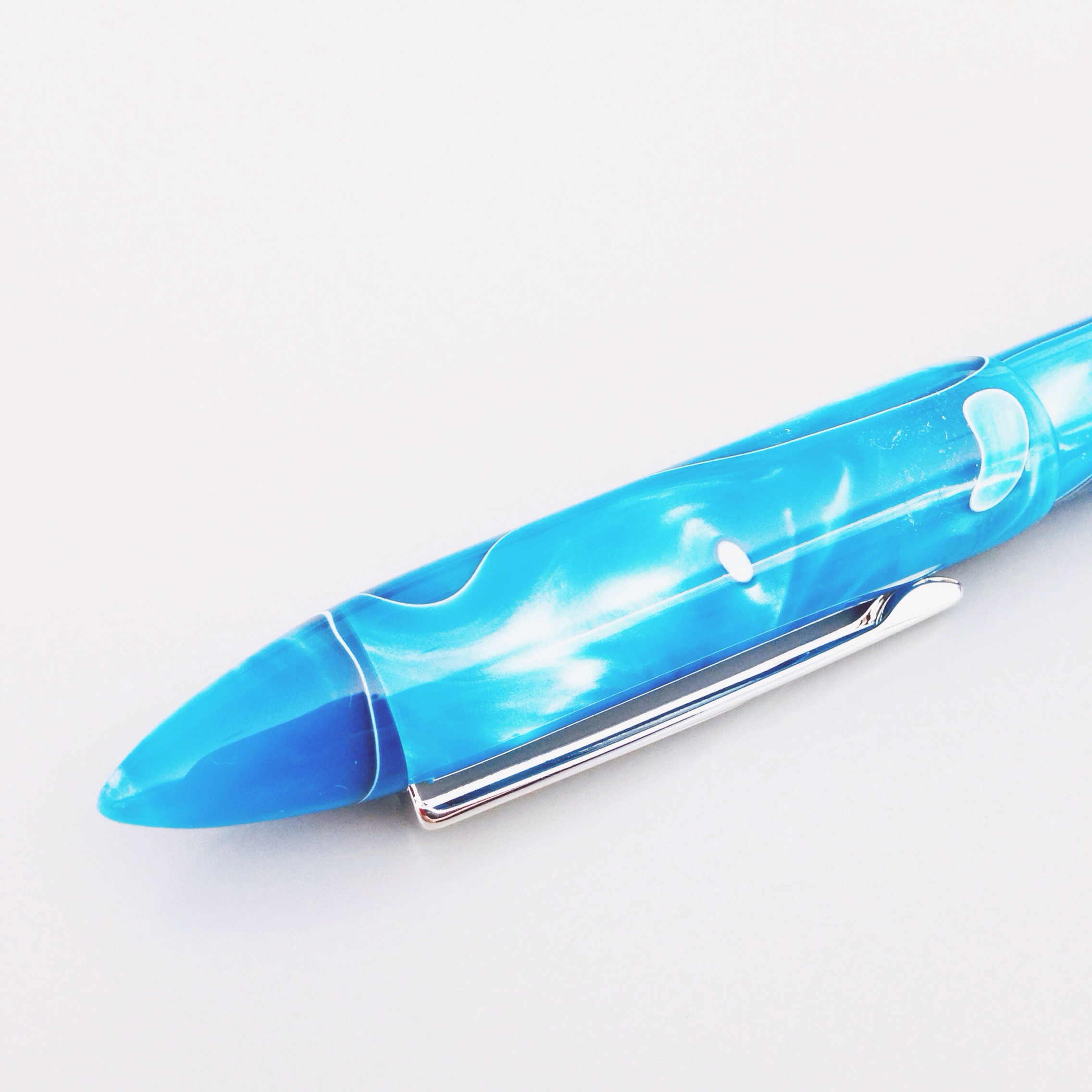
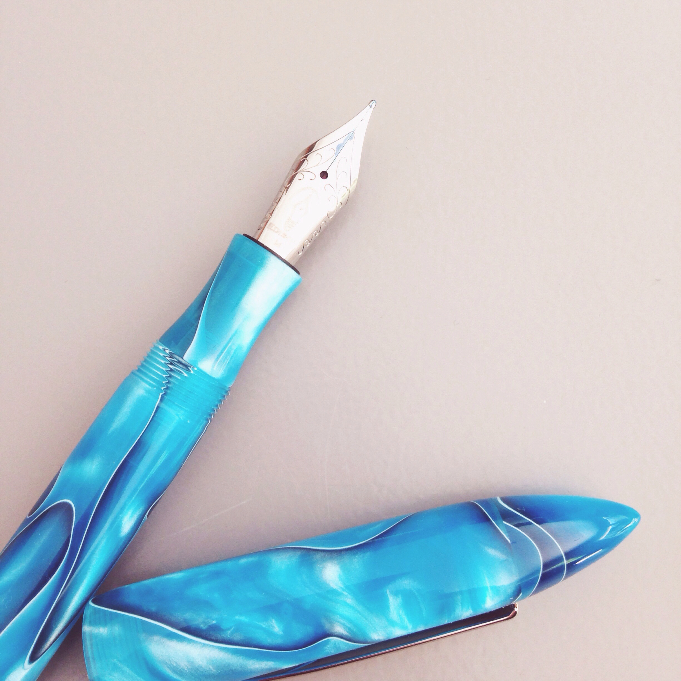
The name of this pen is perfect - Caribbean Sea. The color is a gorgeous blue-green with lots of depth, swirls, and sheens. I couldn't stop taking pictures of it from different angles, in different light, on different surfaces. If you like the way it looks in my (very amateur) pictures, you'll love the way it looks in person - seriously.

The shape of the Premiere is . . . interesting. It has the pointiest cap ever. In fact, I challenge you to find a pen with a more pointy cap.


I love that the section (the part you grip) is contoured and there is no steep drop-off between it and the body of the pen. It's very comfortable in the hand.

The cap can be posted, but I'm finding that I like writing with it unposted better. It's definitely not a weight issue - more that the pen is longer than average when posted and that may take some getting used to.

Of course, looks are only part of the equation when it comes to fountain pens.  How does it write?


I'm going to pat myself on the back for choosing the perfect color to go with this pen: Toucan Bright Blue. (More on Toucan inks coming soon.)

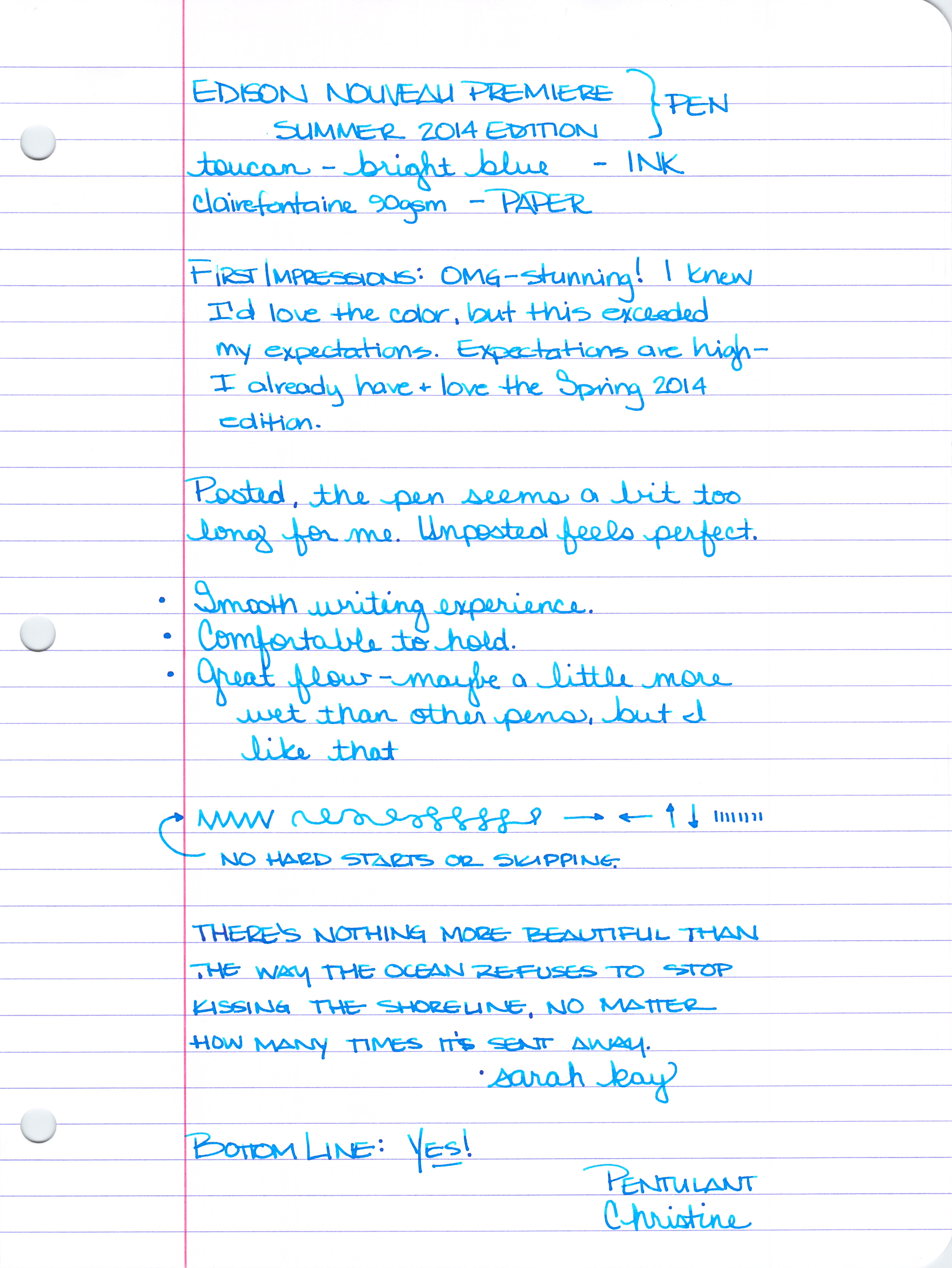
Here are some scanned handwriting samples. Click here to see the full-sized handwritten review.


Someone on Instagram asked me how the nib compared with the nib of a Lamy Safari. My answer is that the Edison Nouveau is more buttery smooth than the Lamy Safari. Some people like a little feedback when writing and others like a super duper smooth experience.


I'd say that the flow is a bit wet - but I like that. This nib is a medium, by the way.


I just checked and the Carribean Sea is sold out.  I'm pretty sure it will be back in stock, though - summer has just begun!

OK, that's that. What do you think?  Did you order this one as soon as it came out? Will you be waiting for it to come back into stock?  And...do you match your ink to your pen colors?

I'll be back later this week with an ink review!

xoxo

Edited to Add:  It's in stock - get it here!

Wednesday, June 11, 2014

IN-DEPTH REVIEW: Four Fabulous Blues


I'm so excited to bring you this super-charged review of four fabulous blue inks:

  • Sailor Bung Box Sapphire
  • Noodler's Liberty's Elysium
  • Akkerman Shocking Blue
  • Parker Penman Sapphire

First, a huge and happy shout-out to my Instagram buddy, @mycoffeepot. Gerald provided me with generous samples of Sailor Bung Box Sapphire and Penman Sapphire. He's a fountain pen nerd (in the best way possible) and if you're not following him on Instagram, you should be.

Second, let me tell you how I worked this thing:  I loaded up four Pilot Metropolitan (medium nib) fountain pens and got to writing on Clairefontaine 90gsm paper. Lots of writing. So much writing. Then, I set everything aside and didn't think about these inks for a couple of days. Finally, I wrote just a little more with each of the inks to see if my initial thoughts changed with a little time and separation.

Third, let me spoil things just a little here. You could, seriously, choose any of these four inks and be pretty happy.  They each write wonderfully, flow is great in the Metropolitan, and the color and saturation are right up there with some of the best inks I've tried.  These are truly four fabulous blue inks.

Let's dive in!


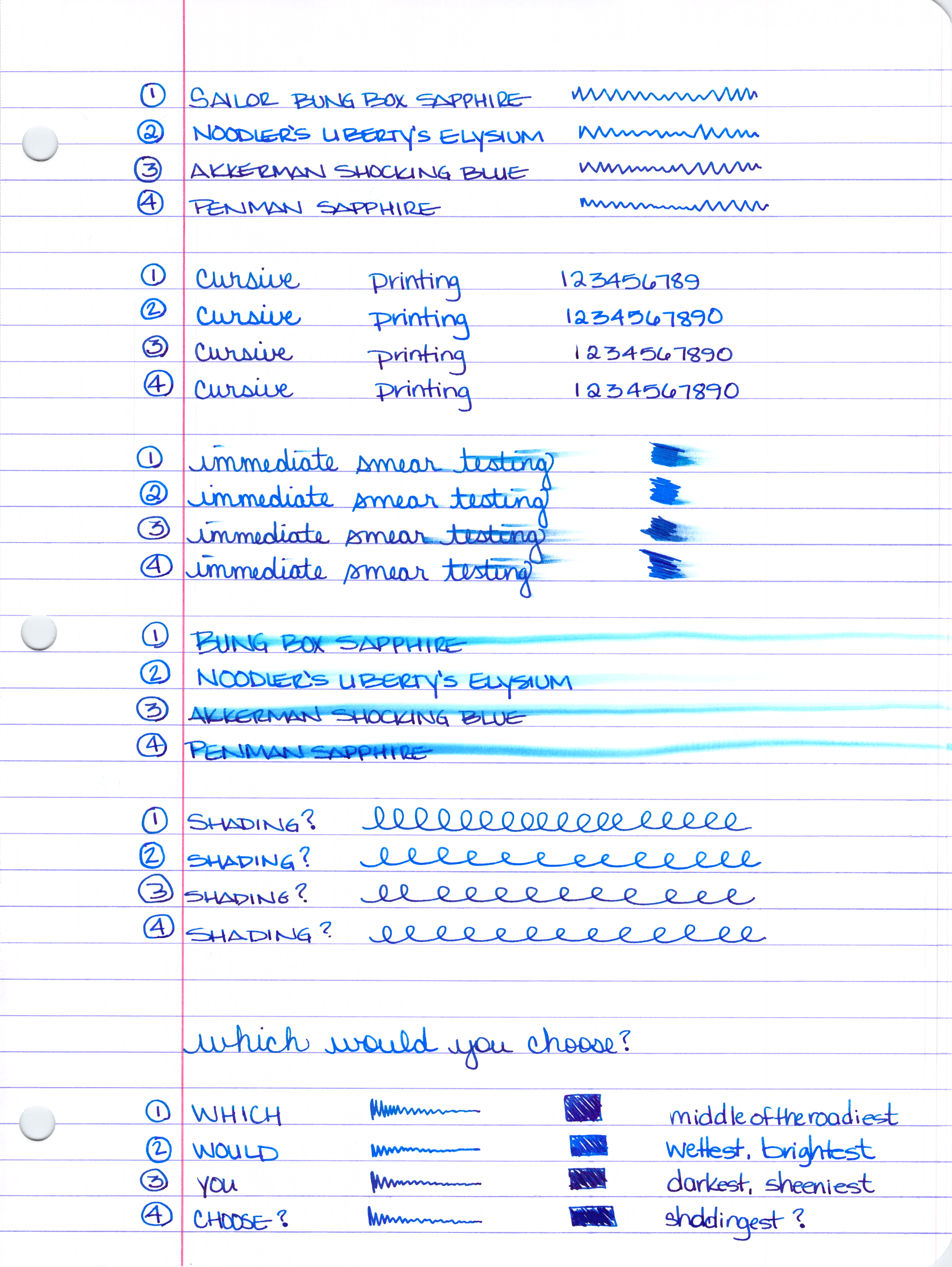
Number 1 above will always be Number 1 (Sailor Bung Box Sapphire) below - same for Number 2, 3, and 4.  I think I could have organized things a little better for you, but you'll figure it out - I'm confident ;)


Smear Testing . . . 

I wrote a little and then smeared across the writing. Noodler's Liberty's Elysium (number 2) and Penman Sapphire look like the winners here. Then, I scribbled back and forth over the same area three times and smeared that - same winners.


Water Smear Testing . . . 

I wrote, let it dry, and then went over my writing with a dampened cotton swab. The clear winner is Noodler's Liberty's Elysium. I'd say that the other three inks are about even in their resistance to water.


So, which would you choose?


Still too hard to decide?  Let's take a closer look.  (Warning: this is where things get really long.)

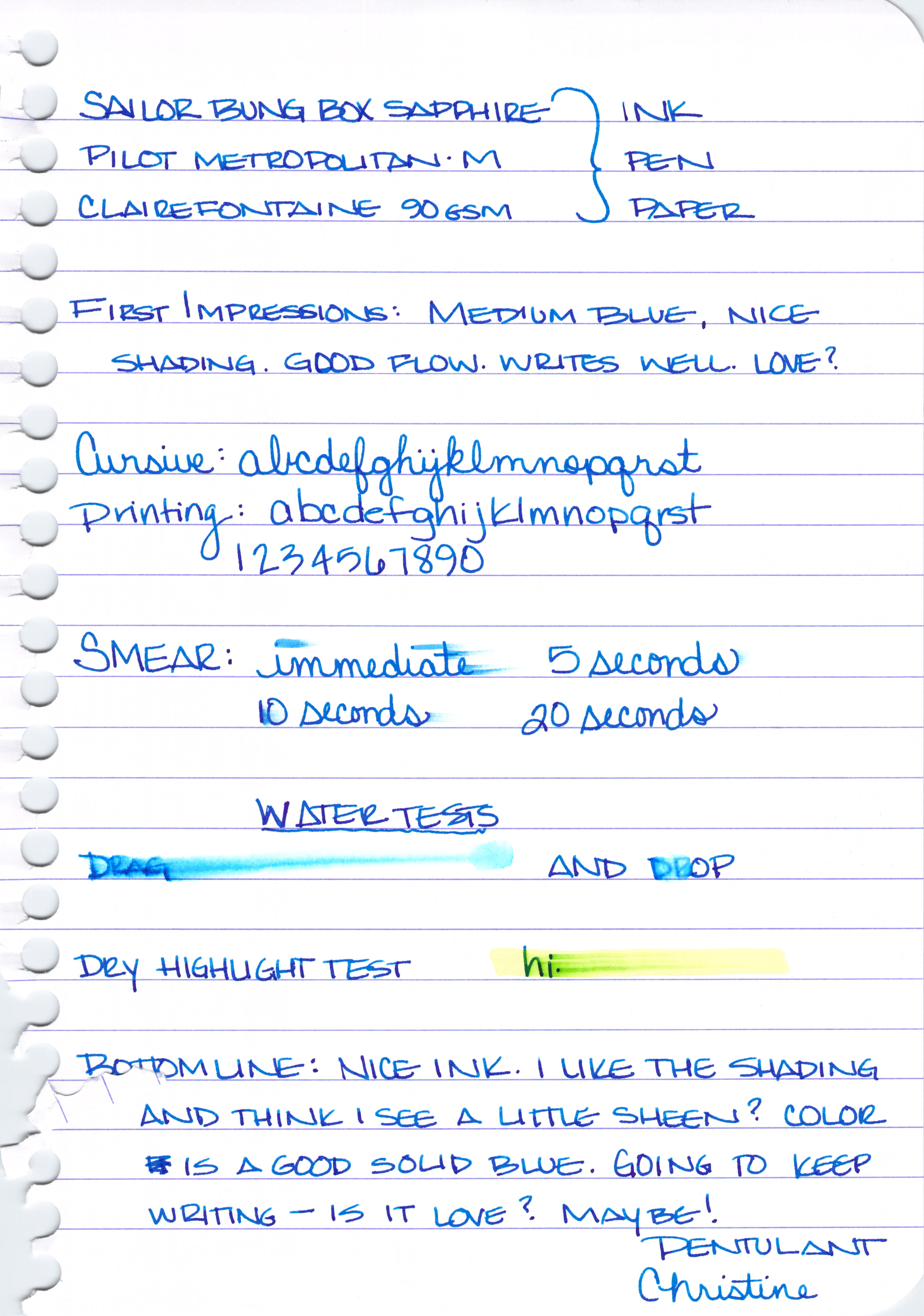
Sailor Bung Box Sapphire Review . . . 


A solid medium blue, maybe not as saturated as the others. Not especially bright, no muddiness to the color. Just straight up blue.


Some nice shading. Would love to give this a go with a super broad nib because I'm seeing some pretty nice red/purple sheen in there, too.


Decent dry times.


 Definitely not water resistant.


And it's pretty smeary when tested with a highlighter.


My thoughts on Sailor Bung Box Sapphire:

  • i love the color and it's suitable for any writing occasion
  • nice shading and some serious potential for sheen
  • this ink can be hard to find
  • once you find it, shipping costs may make the whole thing too expensive


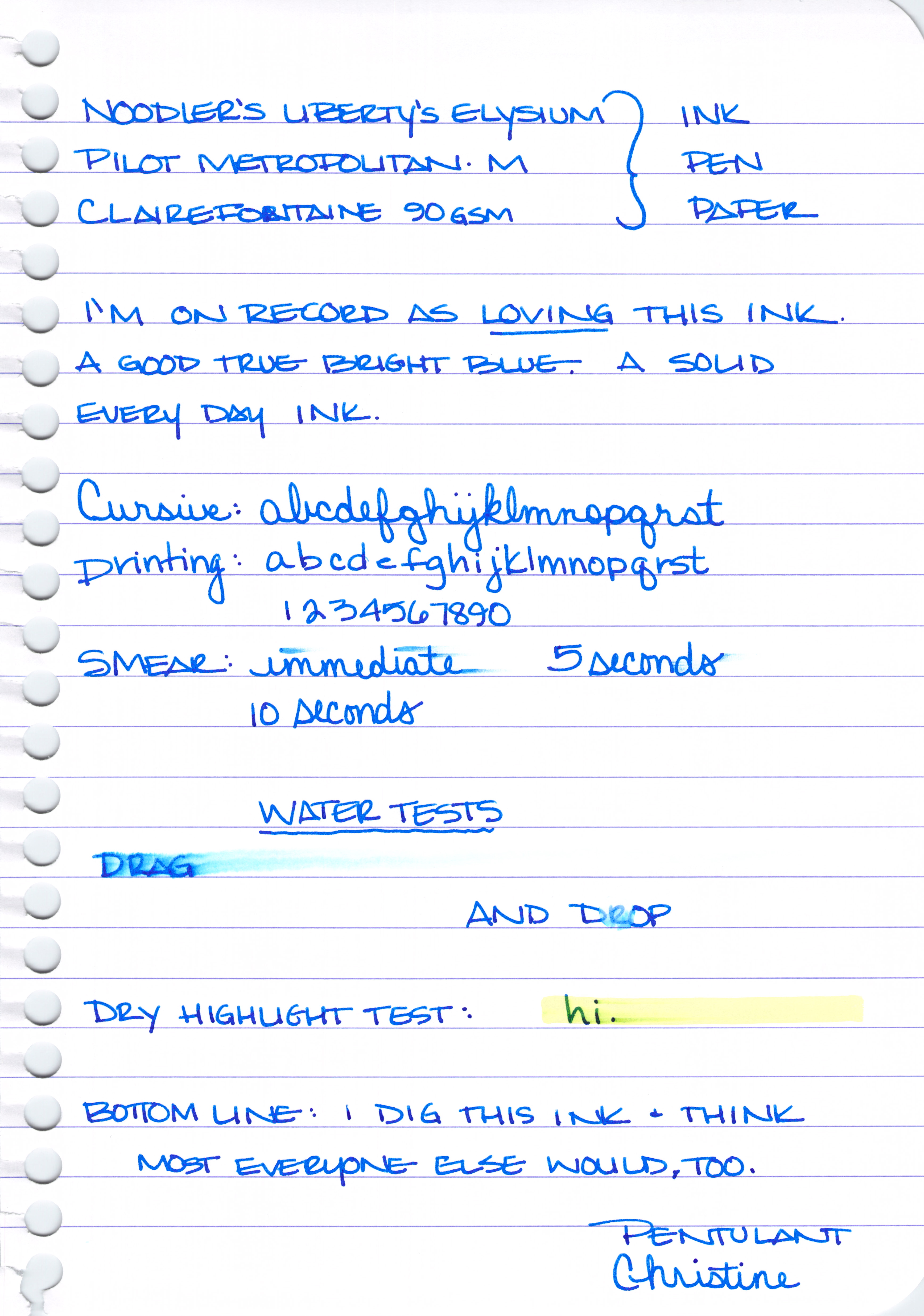
Noodler's Liberty's Elysium Review . . .


Pure bright blueness.  


Not a lot of shading and definitely no sheen.


It's interesting, I wrote in my initial review that this ink is supposed to be water-resistant. I'm positive this writing and the one above had been sitting for at least ten minutes when I dropped the water onto it. Maybe it needs to sit even longer? It's also supposed to be semi-bullet-proof. I'm not sure exactly what that means, but there you go.


My thoughts on Noodler's Liberty's Elysium . . . 
  • this is an ink i own and love
  • the bright color may mean it's not suitable for some professional settings
  • it's only available through Goulet Pens - if you're outside of the US or don't want to order online, you may be out of luck
  • i'm not finding it particularly water-resistant even though it's advertised as such


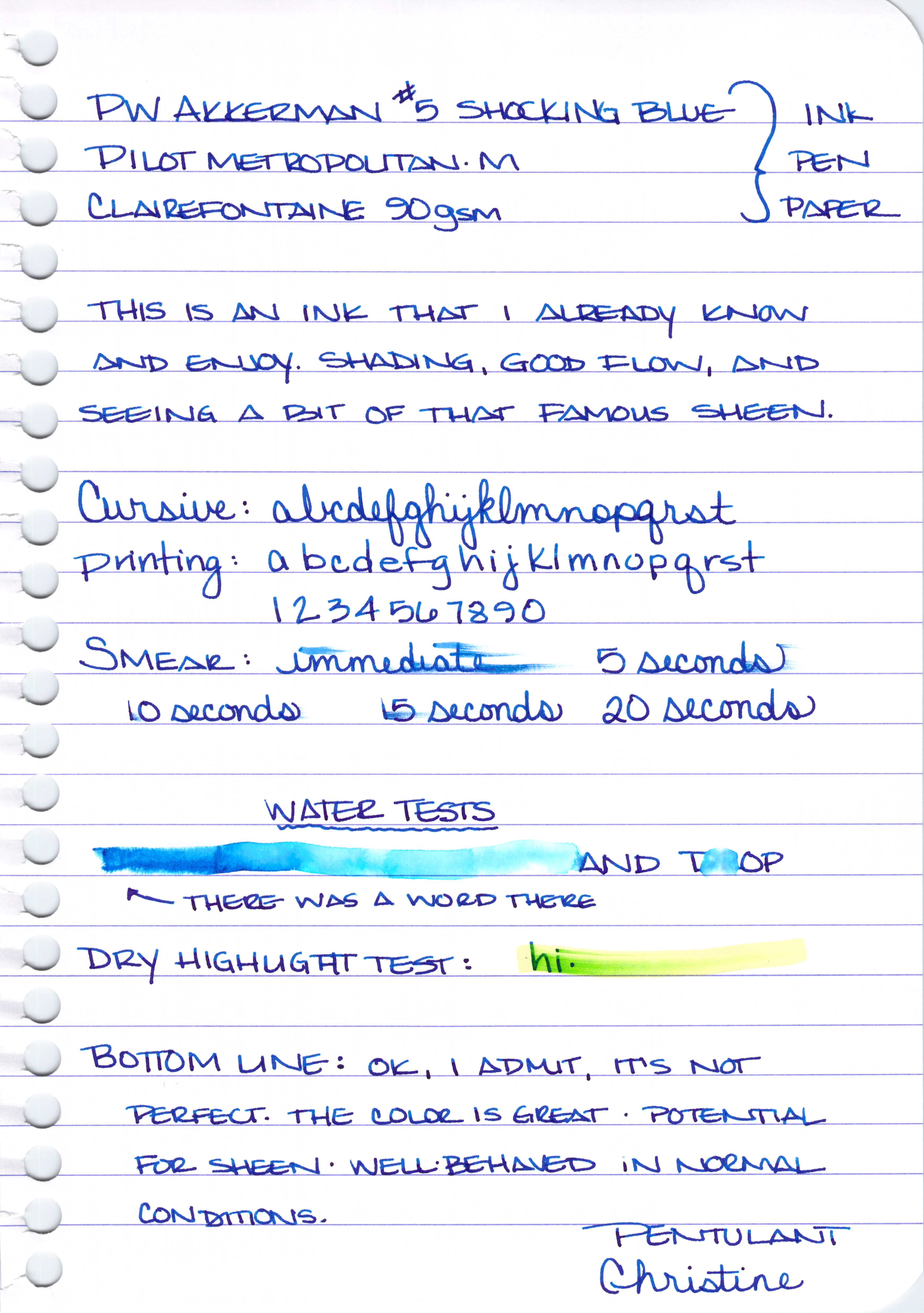
PW Akkerman #5 Shocking Blue Review . . . 


A rich, dark, blue with a reputation for some fantastic red sheen.


Good shading . . .


Nice sheen . . .

It does just ok on the smearing tests . . .


Yikes. I wrote the word "DRAG" and then dragged a wet cotton swab over the writing after the ink had dried. Crazy, right?


And given the above, the below highlight test probably isn't too much of a surprise.


My thoughts on PW Akkerman #5 Shocking Blue . . .


  • crazy sheening potential from this super-saturated ink
  • fun bottles
  • this ink can be hard to find and international shipping can be expensive. Vanness Pen Shop (in the US) carries the Akkerman line
  • zero water resistance


Parker Penman Sapphire Review . . . 


True blue, dark blue, saturated blue.


Lots of shading and color variation . . .


Great dry time . . .


Not so great water-resistance . . .


Just ok on the highlight testing . . . 


My thoughts on Penman Sapphire . . .
  • i love everything about it - the writing experience is different from all of the others - maybe a little bit more lubrication than the others?
  • impossible to get (i didn't know this until i started writing the review, but it was the smallest of the samples that Gerald sent and I knew there must be a reason)


That's it (enough already!) for today.

Just one quick question for you:  which would you choose?


I'll be back next week with more on these inks. Specifically, I'll be looking at suitable substitutes for each.  You know, in case you don't have a time machine so you can pick up a bottle or two of Penman Sapphire ;)

In the meantime, here are links to some full-size images for you (they're big!) . . . 


Ink Swabs (note, these are a bit out of order)