Pages

Showing posts with label this or that. Show all posts

Tuesday, August 12, 2014

THIS OR THAT: Yama-dori or Ku-jaku


This or that? Top or bottom?  Which do you love?

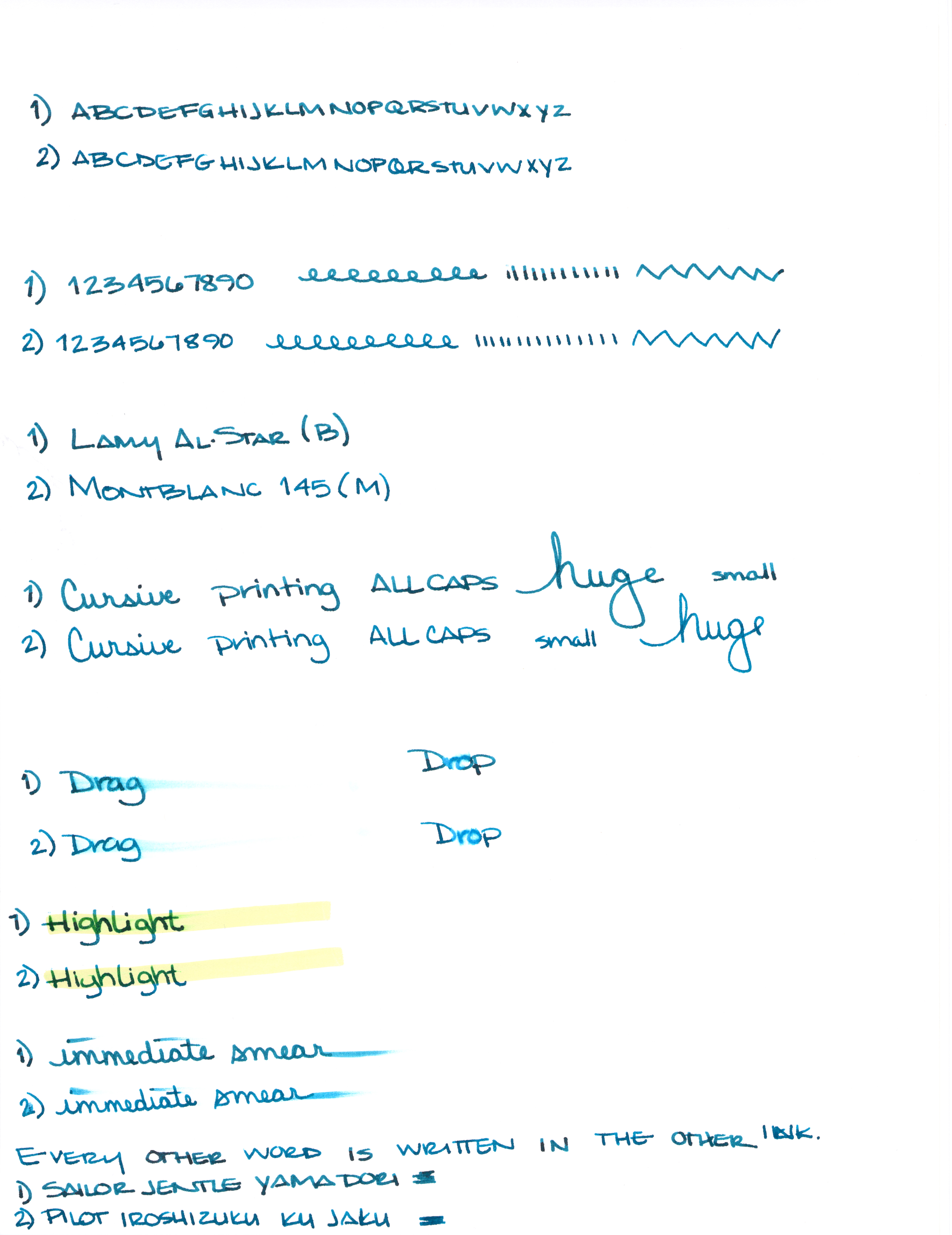
Can you see the differences between these two inks?  One color is always on top. The other is always on the bottom.

Let's take a closer look . . .


One of these is Pilot Iroshizuku Ku-jaku.  The other is Sailor Jentle Yama-dori.


Color is quite similar.


I see a definite difference here.


Not much difference here.


Which ink is this?  Hint:  it's both!


Alrighty, which do you like? Both? Neither?  They are pretty close, yes? I would choose the top color - but not by much. It's the shading that made the difference for me. I think I could be happy with either (even though teal isn't my most favorite color).

Scroll down for the spoiler . . .


The top shade is Sailor Jentle Yama-dori. 
The bottom is Pilot Iroshizuku Ku-jaku.   


What is so interesting to me about this is that Yama-dori is legendary. Ku-jaku gets favorable reviews, but it's not a Big Deal. The differences are subtle and if they weren't side-by-side, I wonder if you or I could tell them apart.

Like I said yesterday, Yama-dori is my E.T. ink. You can read all about that right here.

What do you think? Am I crazy and there's a huge difference that I'm not appreciating here?


Monday, July 7, 2014

PAPER REVIEW and COMPARISONS: Apica Premium C. D. A5 Notebook


Apica Premium C. D. A5 Notebook Review and Comparison to Clairefontaine


There is a plastic protective cover that doesn't seem like it's meant to stay on the book. You could leave it on there with no trouble, but taking it off (to remove the paper insert, for example) and replacing it later could cause the cover to tear because it's super-thin. The book looks better without the plastic, too. 

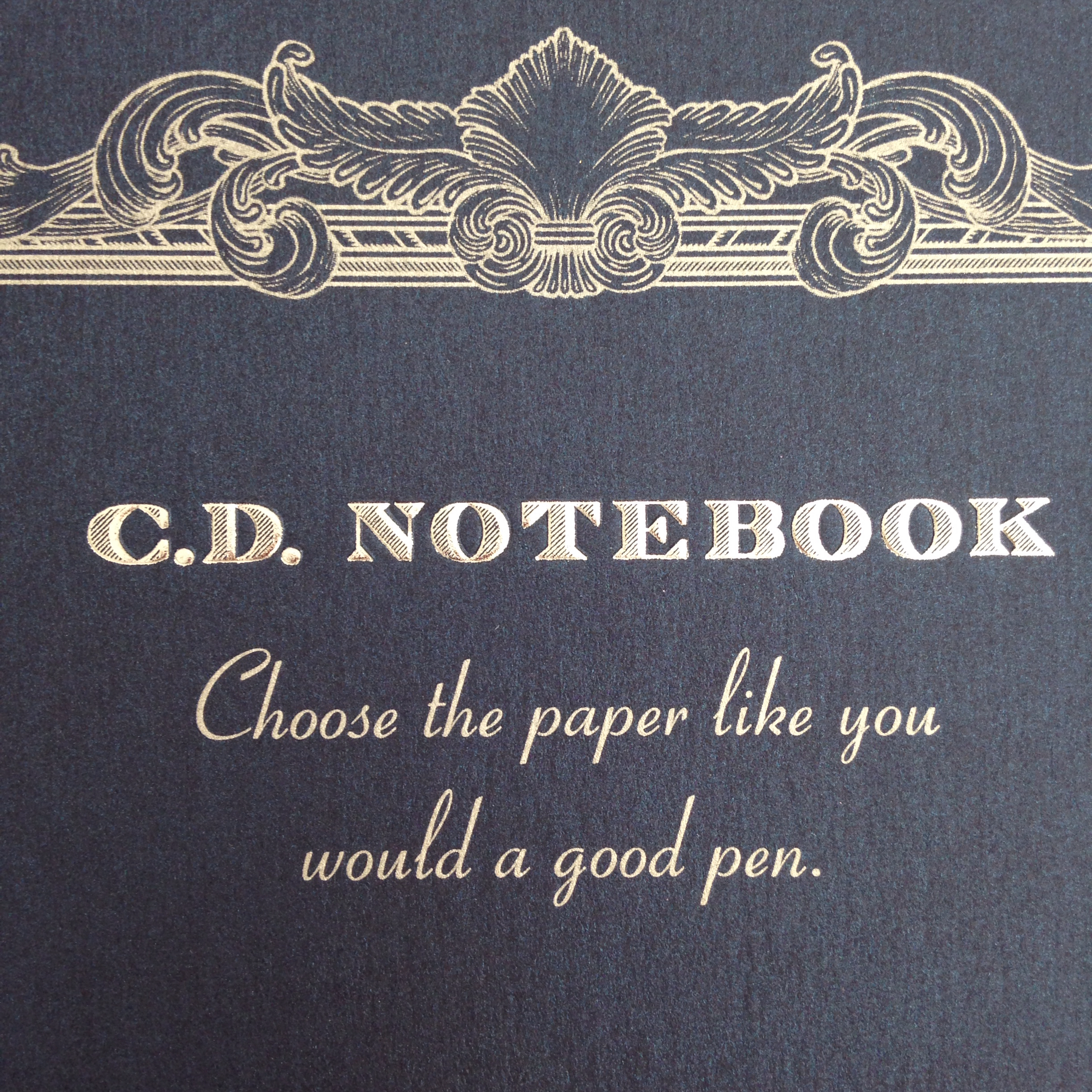
The cover is heavyweight slightly textured paper.  The title is embossed and the word "premium" is stamped in gold foil.  

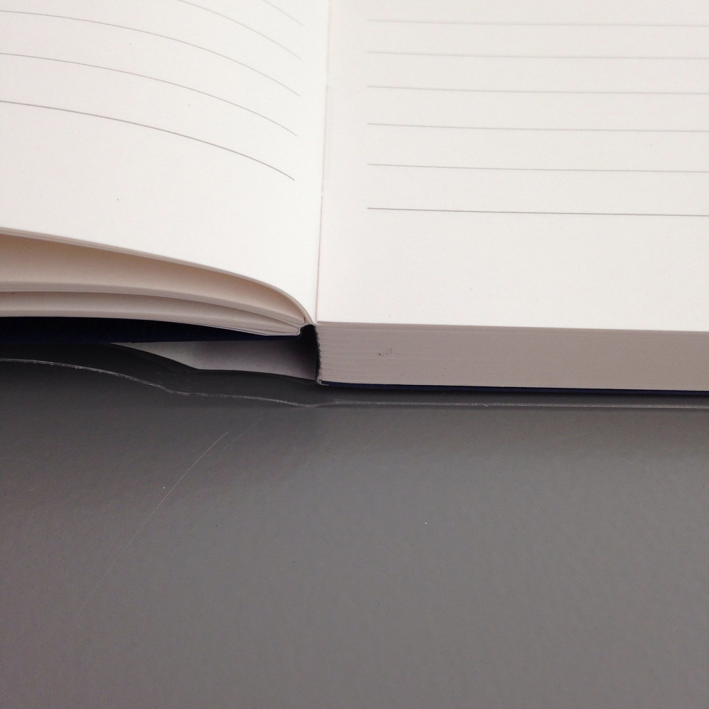
The pages are squared (rather than rounded) and binding is sewn (rather than stapled).  

Some people prefer rounded corners because they may show less wear and tear over time. I like the look of square corners, especially in thicker books. Sewn binding is more expensive to produce than other types of binding - it looks better and it helps the book lay-flat.


Choose the paper like you would a good pen.


This A5 notebook came to me via Goulet Pens.  They sent it to me in exchange for my honest review. Goulet has this notebook listed at $16.20. Apica makes other notebooks, too - they are not all made with the same "A. Silky 865 Premium" paper.

The Apica A5 has 96 sheets of paper. That's 192 pages to write on if you write on the fronts and backs of pages.

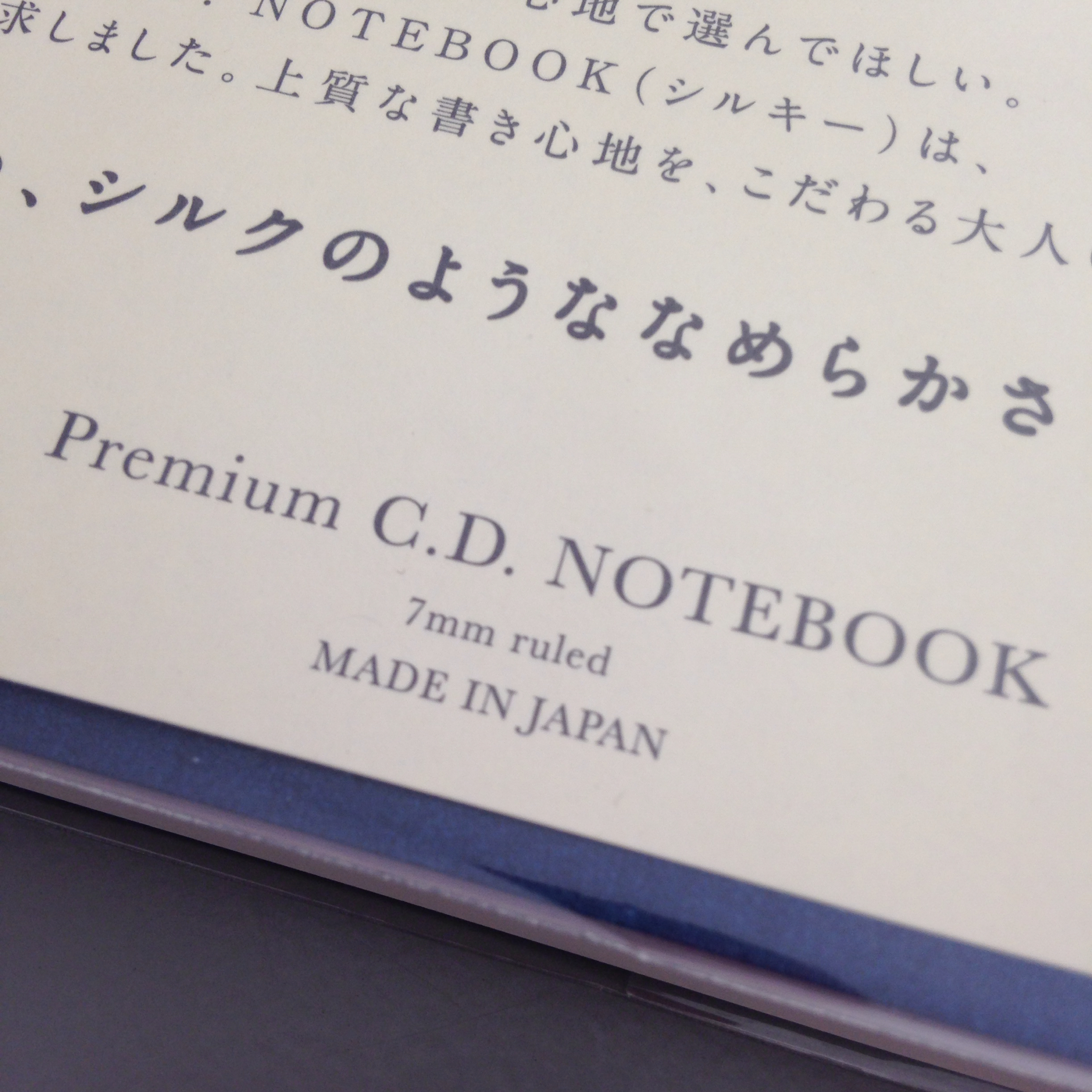
The first page of the book is a gray title/index page. Definitely a premium touch that most other notebooks don't have.


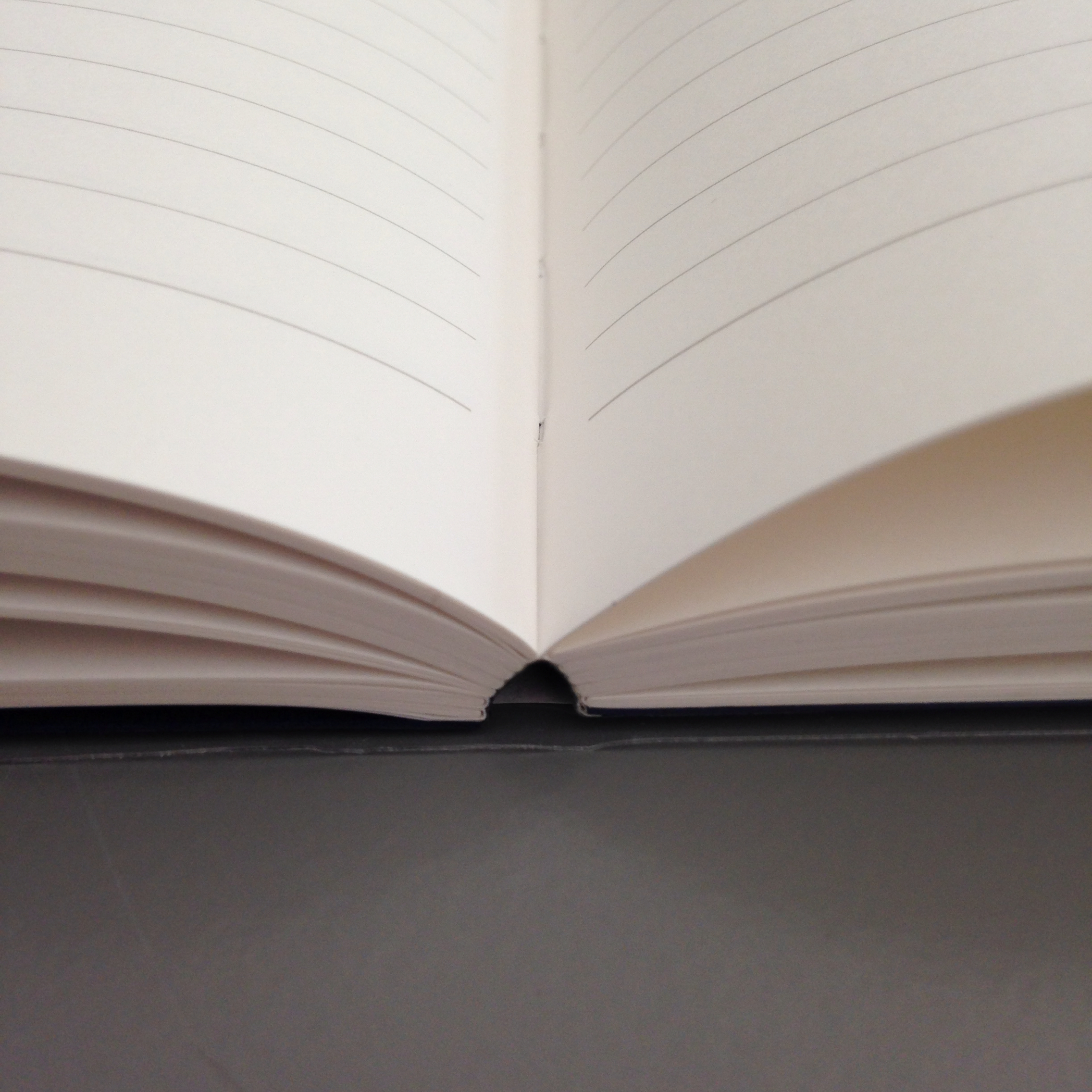
Nearly lay-flat binding.

But what you really want to know about is the paper itself, right?

The paper feels so smooth. It's buttery, luxurious, and definitely, absolutely premium. The color is a very light ivory and the lines are gray. Very easy on the eyes. Ahhhh.

I compare it below to my everyday use paper - Clairefontaine 80gsm.


Apica . . .


Clairefontaine . . .


Apica . . .


Clairefontaine . . .


 Because the paper is so smooth and almost (but not quite) feels glossy, I was concerned that smearing would be a Major Issue. Here's a comparison . . .

Apica . . . 


Clairefontaine . . .


Apica . . .


 Clairefontaine . . .


The Apica paper in this notebook feels better (more silky smoothness) than Clairefontaine and that made the writing experience better than on Clairefontaine. I love it and will definitely use the notebook I received.

Inks look brighter on the white white paper of Clairefontaine, but they look richer on Apica. 

There was very little ghosting and no bleed through with either paper. 

Dry times seem comparable, too.

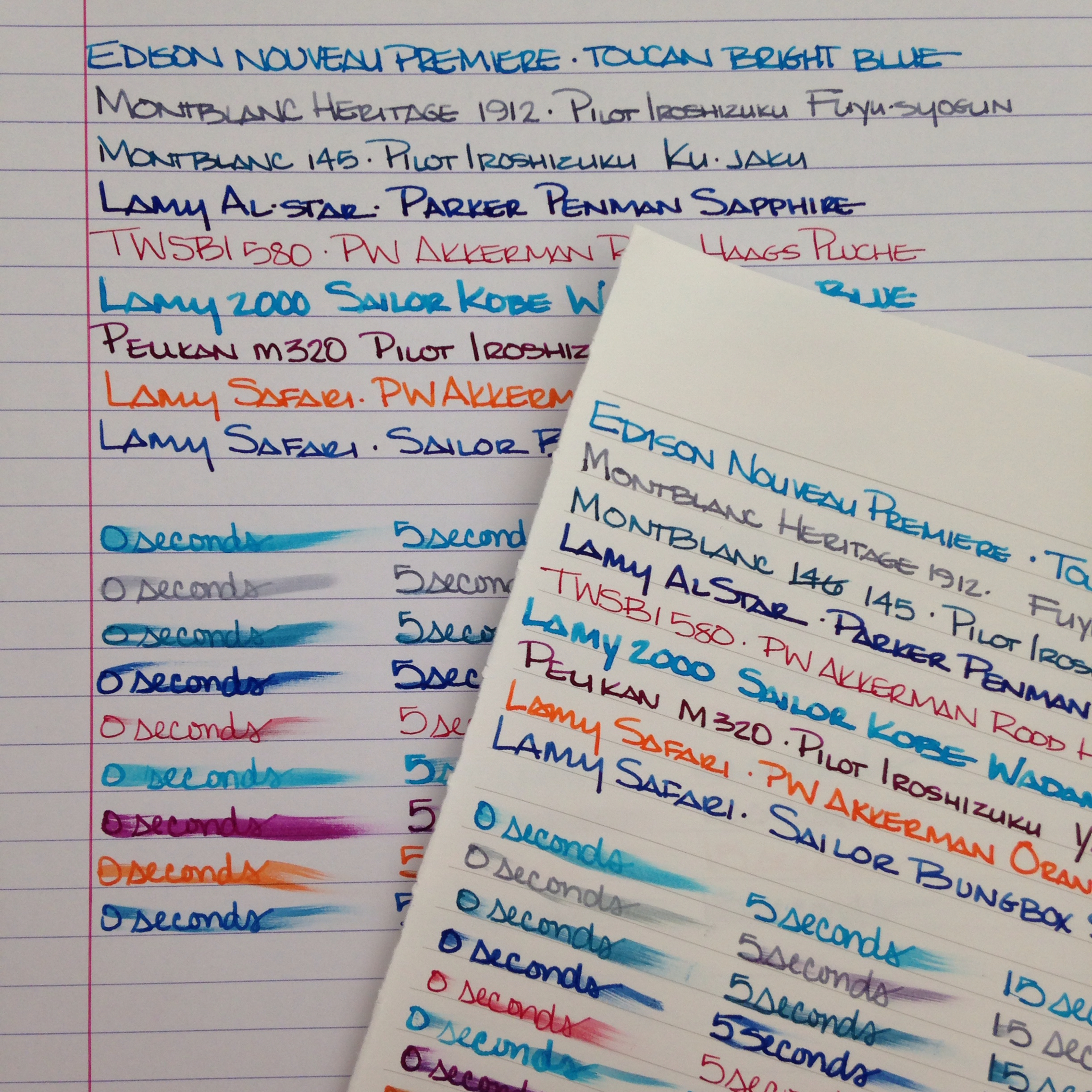
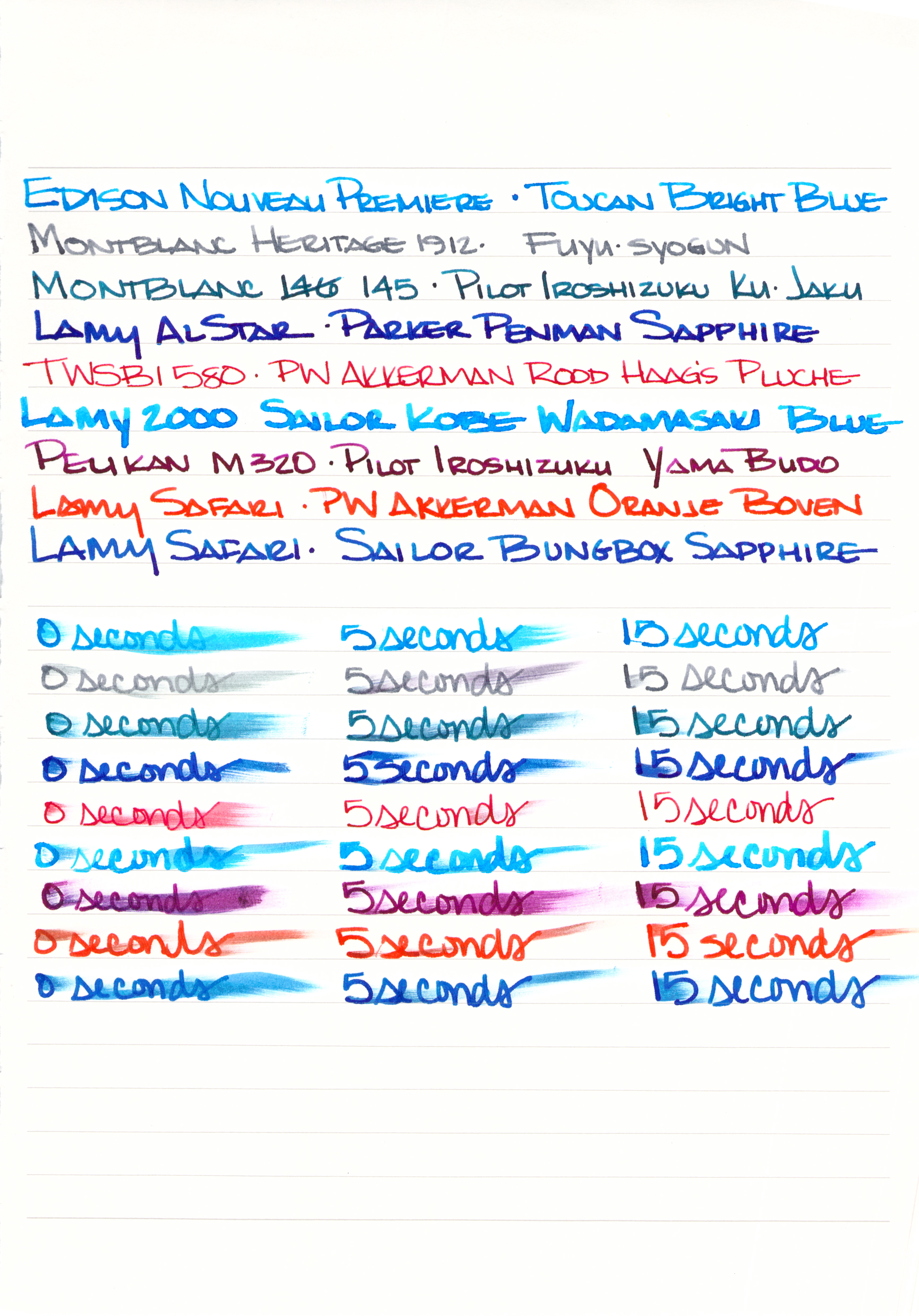
Here's the complete Apica test sheet.  Click here for the huge full-size image . . .


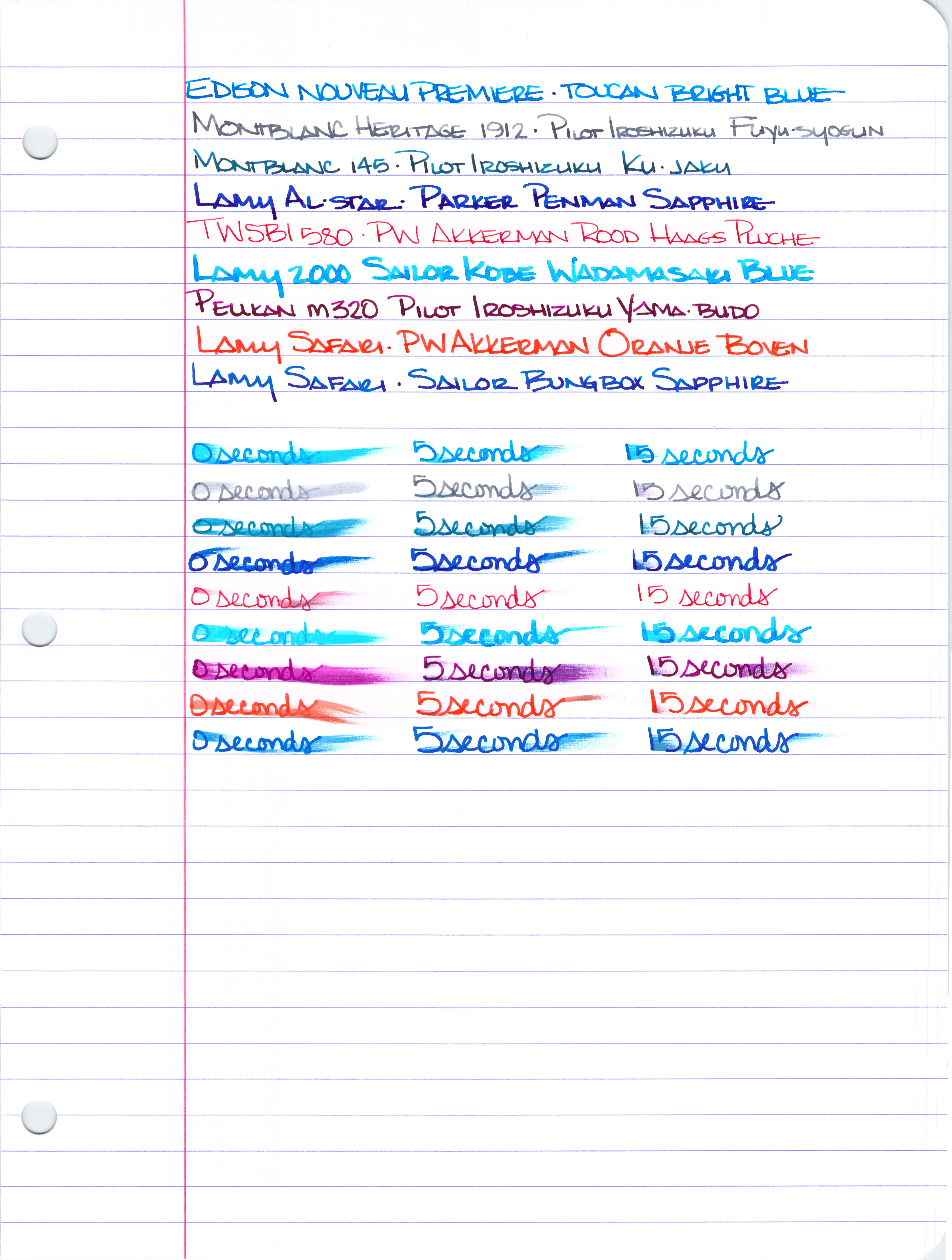
And here is the complete Clairefontaine test sheet.  Click here for the huge full-size image . . . 


Clairefontaine in the A-5 clothbound version comes in at $9.50 for the same number of pages. The cover isn't as fancy, and the paper may not feel quite as smooth, but if you're looking for bang for your buck, I'd tell you to get Clairefontaine.

If you're looking for a very special notebook, though, get the Apica Premium. You really and truly will not be disappointed. The silky paper is like no other paper I've used.

Last week, I asked on Instagram which papers people love - and which they use.  If I've managed to embed this link correctly, you should be able to clicky click and be taken directly to that post to see the responses. (And if I didn't embed it correctly, you'll know that I'm not a perfect person.)


And finally, let me ask you . . . which paper do you most love? which paper do you use most? Do you prefer clothbound or wire binding?

I'll be back on Wednesday with a Giveaway. Stay tuned . . .

xoxo

Wednesday, May 14, 2014

THIS OR THAT - Orange Ink Edition


This or That
Orange Ink Edition


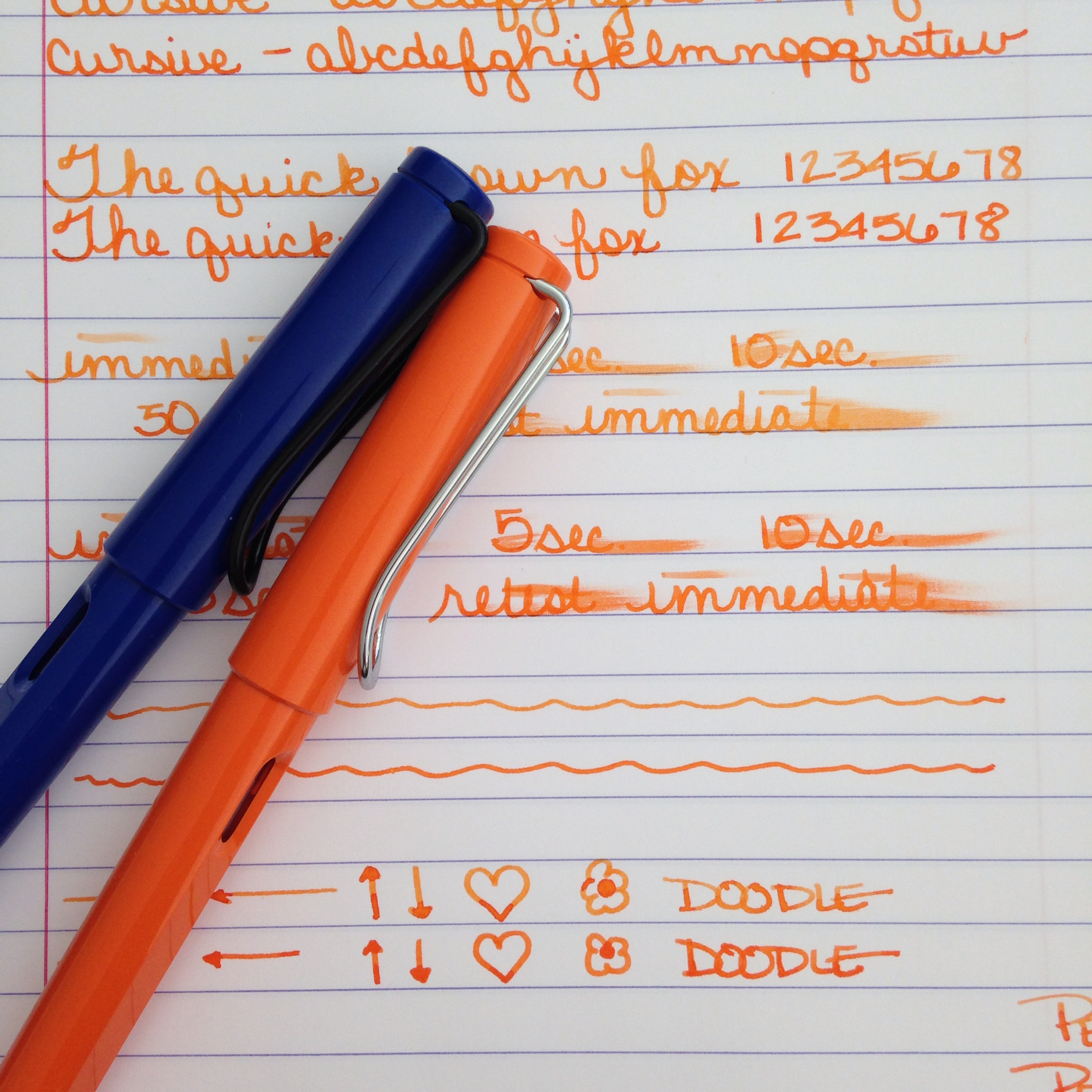
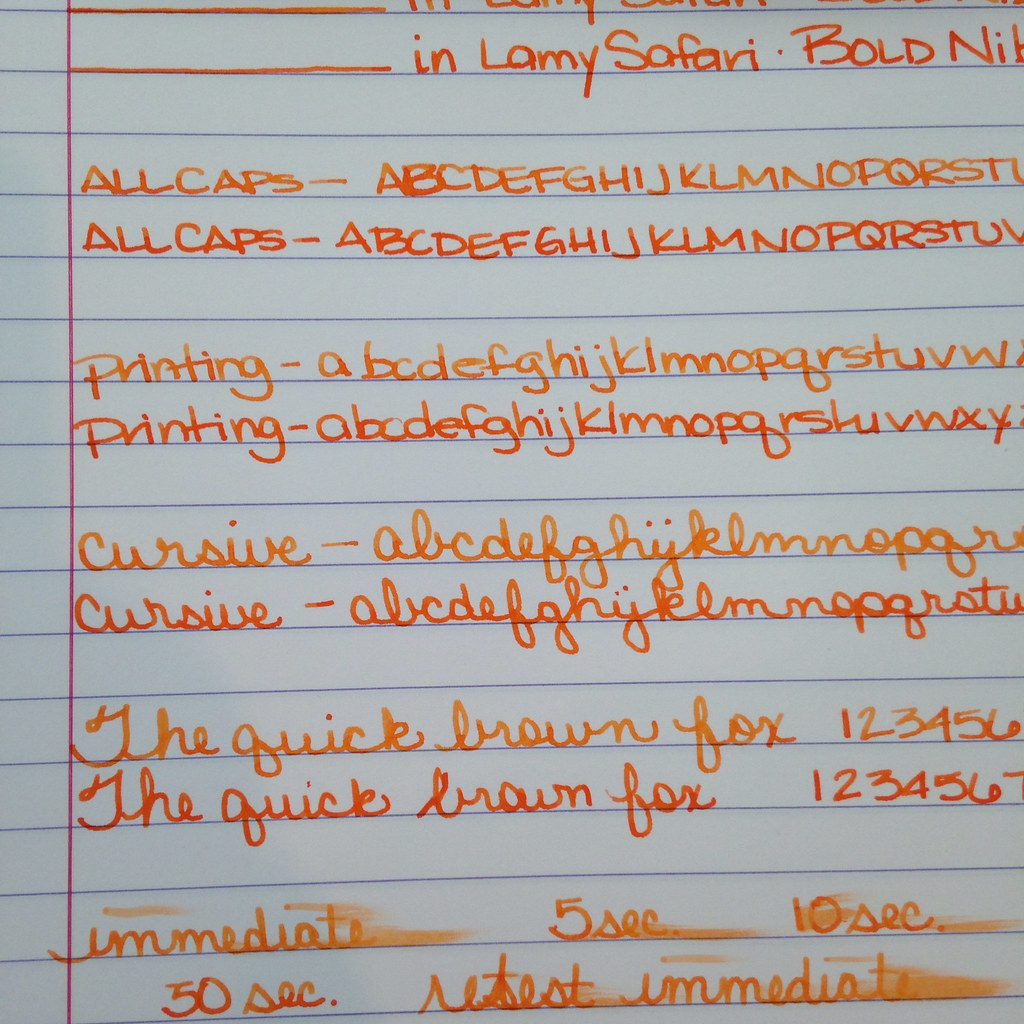
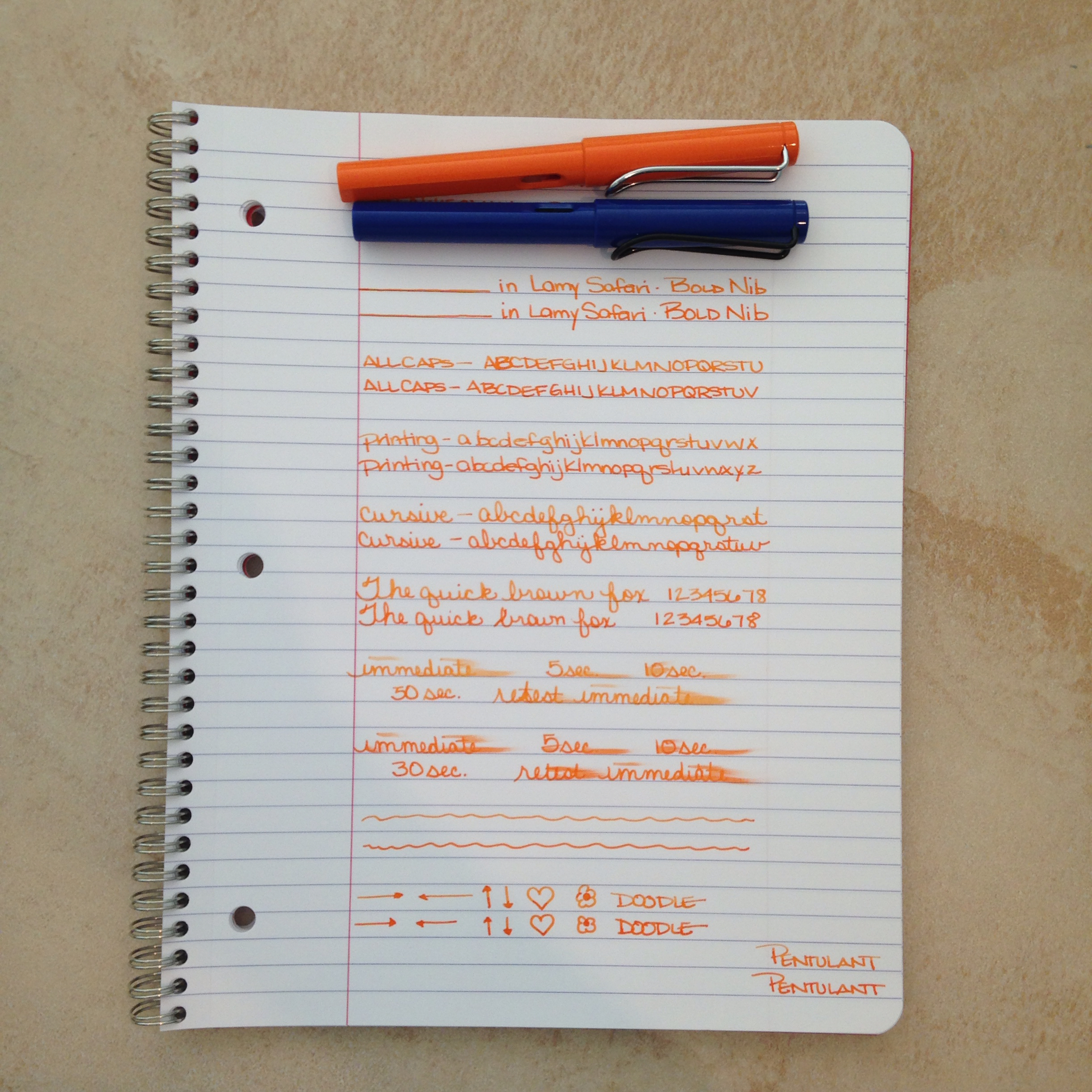
Two orange inks for your consideration today. Both loaded in its own Lamy Safari with a bold nib.


The top ink is a bit lighter - the bottom has more red it in - the top shades a bit better. Each has a fairly serious smear factor and they each wrote just fine with the color on the bottom feeling just a tad bit more lubricated than the top.

Which do you like better? 


Circle one. Top with its light orange and shading? Bottom with its richness and saturation?

How do you decide between them? Mr. Pentulant was decisive, "I like the bottom. No doubt."

I'm a little more on the fence. Shading or saturation? It seems to be a trade off between these two inks.


Here's the spoiler ....

Top....Montblanc Gandhi
Bottom....PW Akkerman Oranje Boven

Gandhi is for sale on eBay for around $90 per bottle (it's no longer in production). PW Akkerman is around $24 per bottle (but you may pay lots for shipping if you can't find it in the US).

Tell me which you like better and how you made your decision? Color? Shading? Pricing? Maybe a combination of factors?


Monday, May 5, 2014

THIS OR THAT? Montblanc Heritage 1912 or Boheme


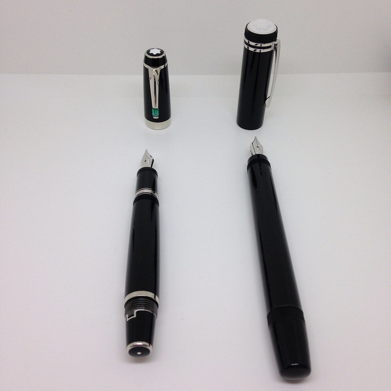
A super-quick (ha!) version of This or That - two Montblanc Fountain Pens - the fancy newish Heritage 1912 versus the classic and much-loved retractable nib Boheme.

But first - did you see that I'm giving away the new Lamy Safari in Neon Coral? Enter here.

On to This or That . . .

These are each great pens that write really well. I had the Heritage inked with Pilot Iroshizuku Fuyu-syogun from this review and inked the Boheme with Montblanc Oyster Grey in anticipation of writing this post. I'm not showing any writing samples today - suffice it say that the writing experience is pretty terrific with both pens.


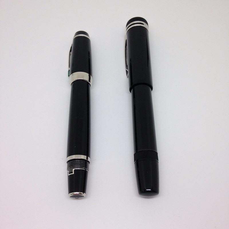
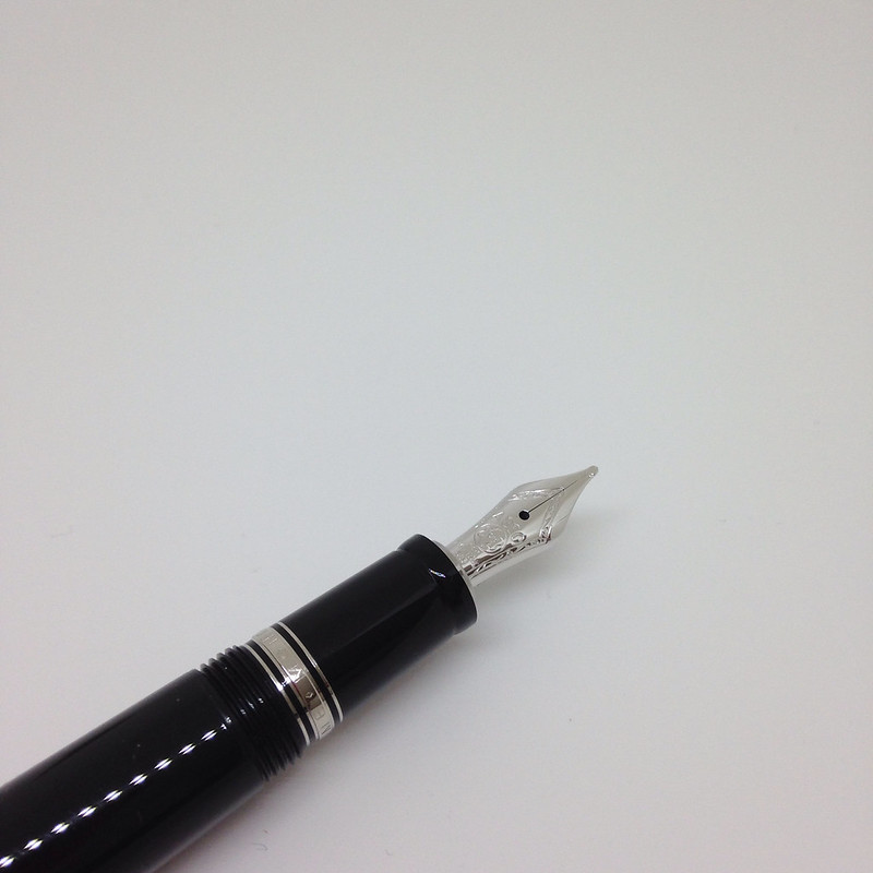
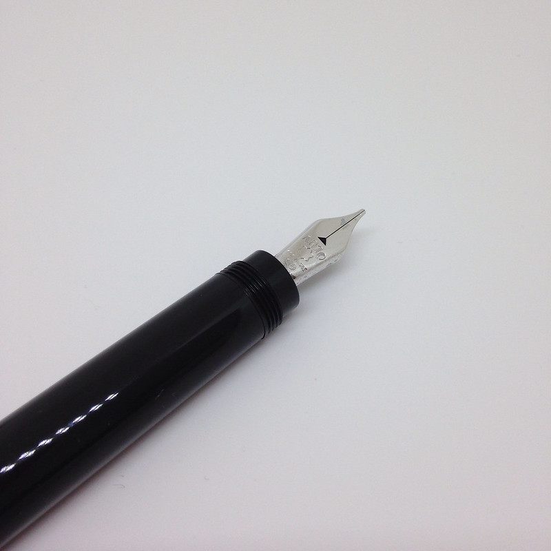
Other than the great brand, precious resin, and amazing writing, the greatest similarity between the two pens is the retractable nib. 


The biggest differences are . . . 

Fill System The Boheme will only accept cartridges (standard short). The Heritage has a unique piston filling system.  Cartridges are convenient, for sure - just pop one in and go (well, after waiting a few minutes or more for the ink to work its way through the pen's capillary system). There are approximately a zillion more colors of bottled ink available than cartridges. Also, fill with a piston and you're ready to start writing immediately.  

Posting the Cap The Boheme is designed to be posted - to advance the nib, simply screw the cap on to the end of the pen - it's perfect, really. There is no way for the cap to work its way loose with normal use.  The Heritage, on the other hand, is not meant to be posted - annnnnd despite the pictures on the MB website (this kills me, in case you're wondering), it cannot be properly posted. This could be a deal-breaker for some people.


Size Capped, the Boheme is smaller - practically pocket-sized. Uncapped, the Boheme is still smaller. However, posted, the sizes are comparable. With each pen in the ready-to-write position, the Boheme is around 1/2 inch longer than the Heritage.


Grip The Boheme (shown above) features a very slightly flared grip. I find it very comfortable to hold. The Heritage (below) is quite smooth. I also find it very comfortable. I can see that some people would have an issue with the Heritage. For example, if you have especially (ahem) moist hands, maybe your grip would be too slippery to be an enjoyable writing experience?

Clean-Up The Boheme can be a bit of a pain to clean. Do you want to run water through the pen and over the working parts of the retractable nib? I didn't think so. Given that, your options are to set up an elaborate cleaning scheme which involves a cleaned-out cartridge (long) and needle/syringe or find some cleaning cartridges (I'm not even sure these are still around?).  (Maybe there's another option?) 

While I've not yet cleaned the Heritage (not even before I inked it because I'm pentulant like that), I imagine it will work like any other piston fill pen.


Let's talk about money . . . Right now on the MB website, Bohemes range from $690 - $1645. The Heritage is $1,110.  Of course, you can probably find a better deal for each on eBay - and the very good news is that the retractable nib pens are (to my knowledge) not counterfeited.

Right now, I'm a huge fan of the Montblanc Heritage 1912.  I've mentioned to more than one person that I think it's my favorite pen - maybe even my grail pen. I love it that much.  Having said that, I also love my Boheme collection.

As each pen is a terrific writer, it's really going to come down to personal preference. I've outlined the things that I think could make or break a decision. Now, you tell me - This or That? Which would you choose?