Pages

Showing posts with label orange. Show all posts

Monday, December 8, 2014

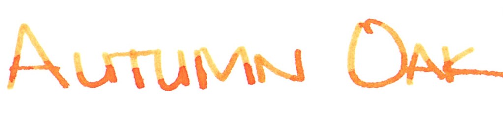
INK REVIEW: Diamine Autumn Oak


Hello, Autumn Oak!


I'd been hearing good things about Autumn Oak from Diamine. Seeing is definitely believing!


With its name, I assumed the ink would be some shade of brown and not very exciting. So glad I finally decided to check it out.


Insane shading.  Writes great.  No ghosting or bleeding. Acceptable dry times. No water resistance. Not incredibly saturated, but definitely not watery.

Here's the full review . . . 


And a link to the original file (it's huge).

I mentioned in the handwritten review that Autumn Oak seems to be comparable to other orange inks.  The color reminds of Pelikan Edelstein Amber - though Autumn Oak definitely has more shading.

I wrote in the review, "I like it!" Based on my usage of it over the last few days, I'm going to revise that to . . . I love it!  There are definitely many orange fountain pen inks out there, but this one is definitely unique in terms of color and shading and it writes great.

Ooh - bonus images - I've been practicing my splash techniques.  Getting better!


Alrighty, your turn.  What do you think of Diamine Autumn Oak? Do you have an orange ink that you love love love? 

xo

Monday, November 10, 2014

Seven Orange Inks

A photo posted by Christine Darling (@pentulant) on

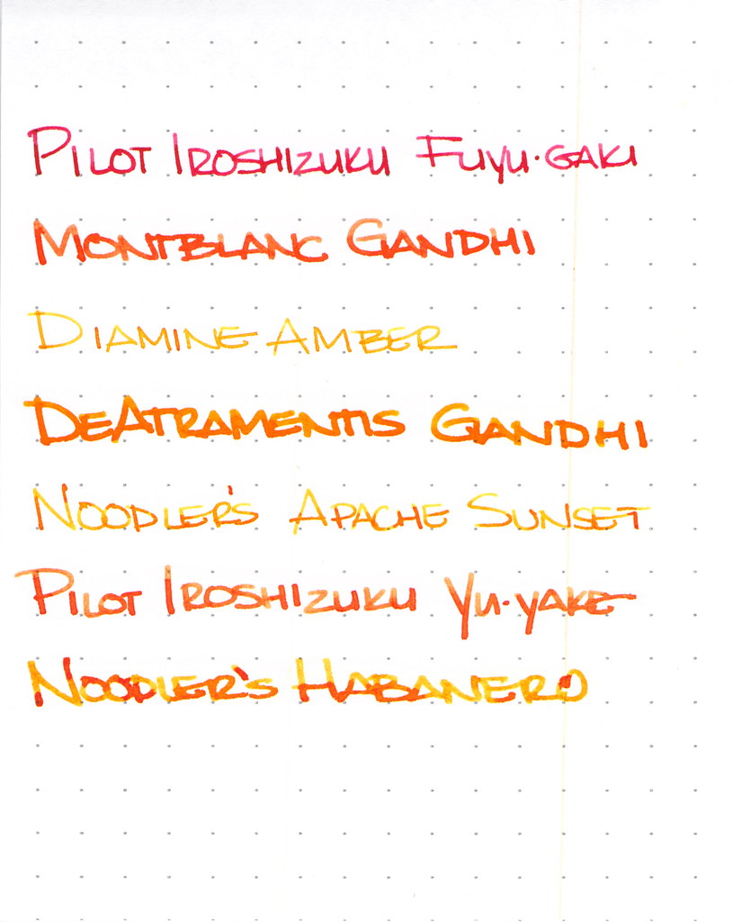
I've been on an orange kick. It all started innocently enough back in May, and then over the last few days, I've inked seven pens with seven different orange inks.  CrAzY!


I won't have room to go into great detail on each ink here, but let's explore a little, shall we?
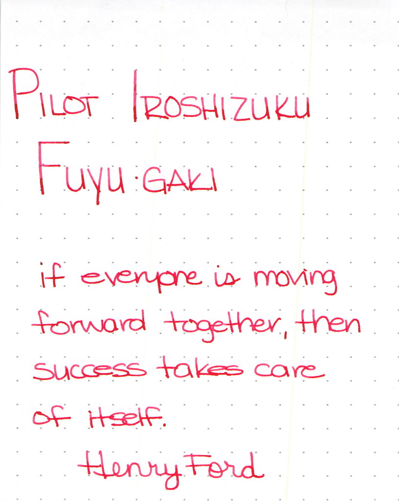
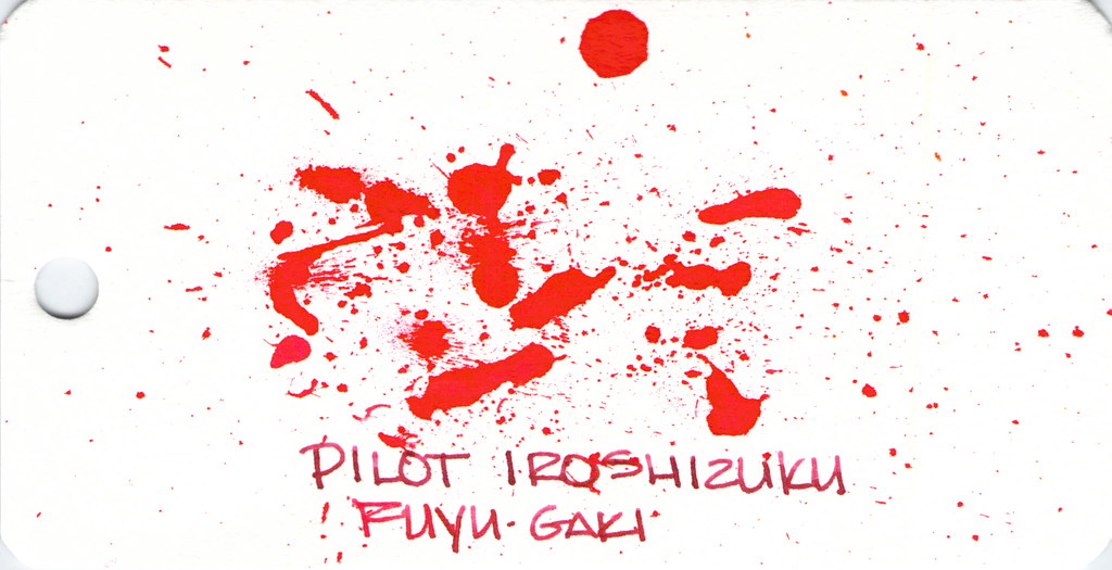
Pilot Iroshizuku Fuyu-gaki Writing Sample

Pilot Iroshizuku's Fuyu-gaki runs a bit toward the red side of orange. It writes wonderfully, doesn't display much shading, and is an all-around nice ink.


Fun with ink splatters. I did these on Word Cards that I got from Jet Pens. The paper is more like a thin watercolor paper than writing paper.

Moving on . . .
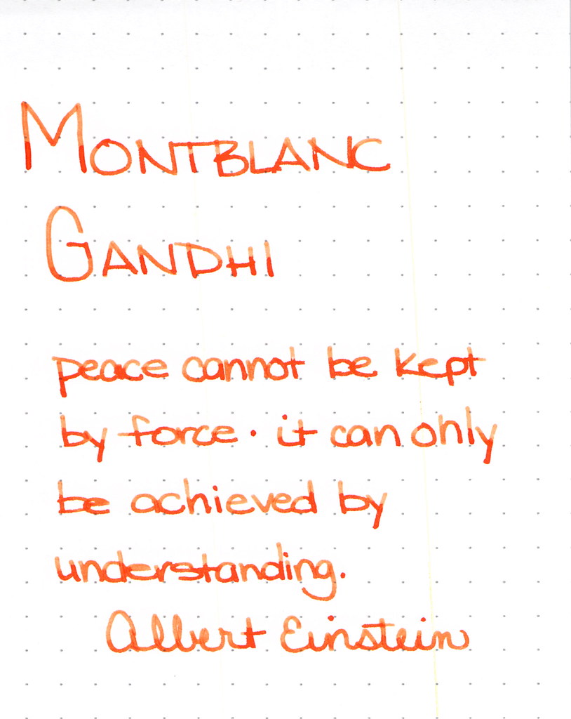

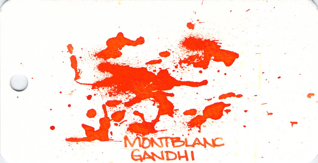
Montblanc Gandhi Writing Sample

Montblanc Gandhi fountain pen ink is no longer available. It can be found on eBay (I've been thinking about selling my spare bottle, but I'm not sure I want to let it go, you know?)

The ink is such a pretty pretty orange, lots of good shading, and is definitely one to try if you can find it.

Spatters, anyone?


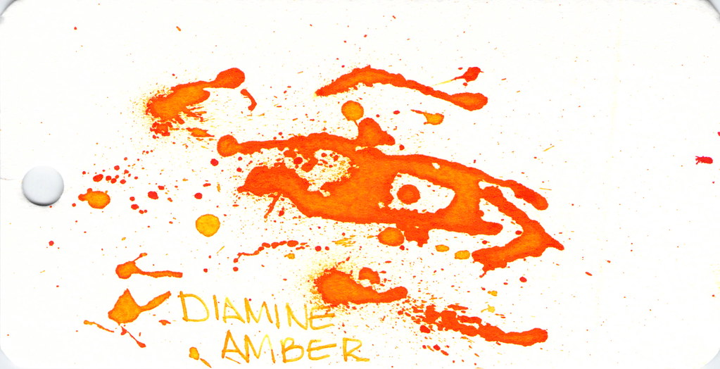
Diamine Amber is next on our hit list . . .
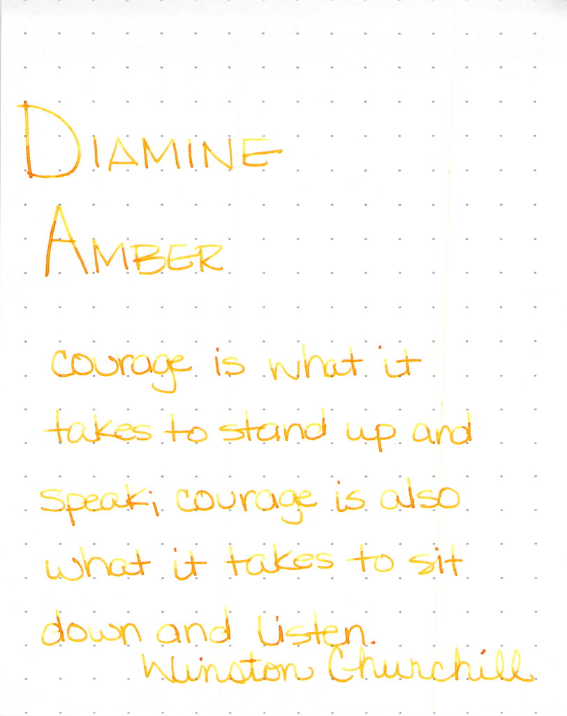
Diamine Amber Writing Sample

Diamine Amber is just so light and feels a bit dry. This ink is in a Lamy with extra-fine nib and that may be part of the issue, but I've had other orange inks in the same pen and they've not been this light. I like inks that work in all of my pens (makes life easier, you know?) and with so many orange options available, I'm not so keen on this one. Others seem to like it.

And look at the spatters - good saturation there, friends.


Montblanc Gandhi isn't the only game in town . . .
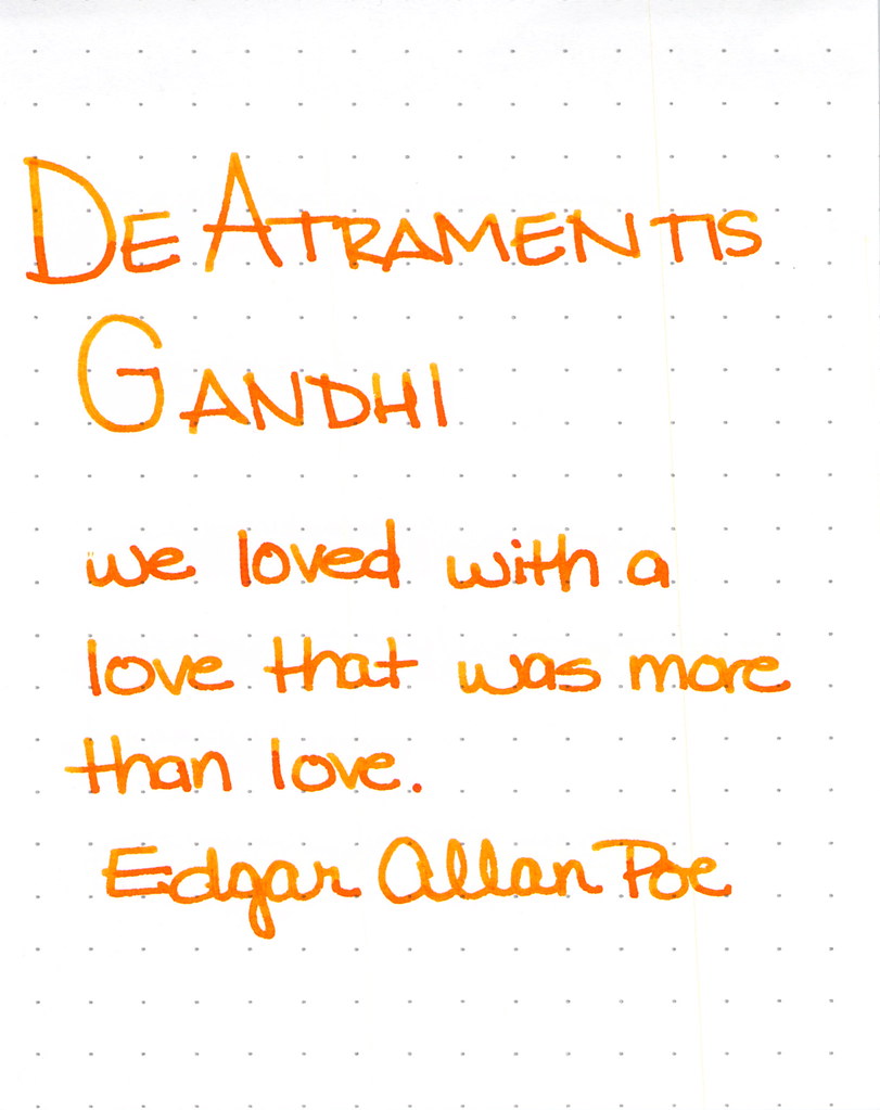
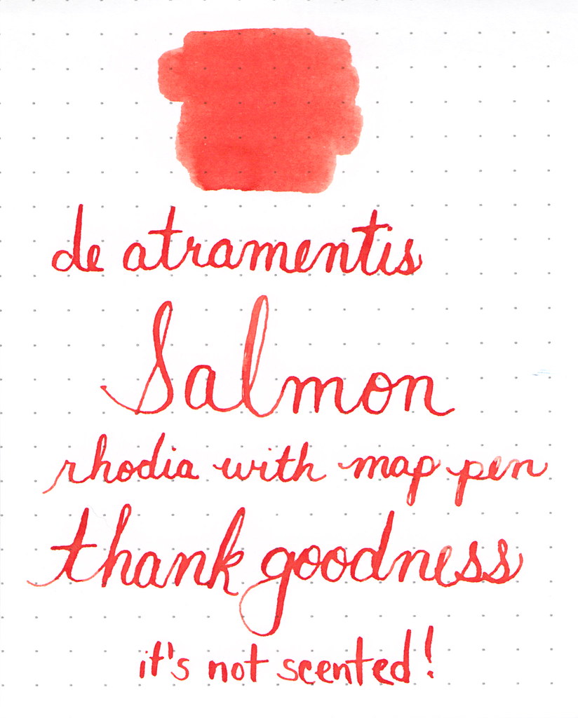
De Atramentis Gandhi Writing Sample

This was my first time using this ink and for some strange reason, I didn't have high expectations. Silly me - it's a perfectly fine ink. Some shading, writes quite well. No reason to be concerned. It's really not like Montblanc Gandhi - not that it matters, I think it would be a little silly to compare the two just because they share a name.  I like it.

I also think I did a pretty good job on the spatters here . . .


Next up . . .

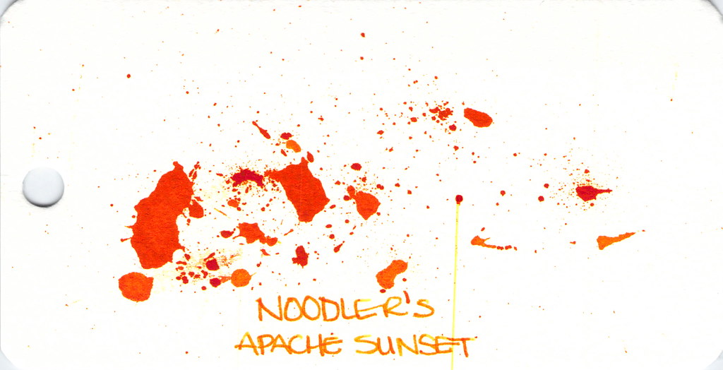
Noodler's Apache Sunset Writing Sample

People are generally coco-crazy for Noodler's Apache Sunset.  Even using an extra-fine nib, I can see the potential here. Absolutely insane shading. The color is very orange. People who don't like this ink seem to say that there is no practical application for it - I'm not sure I understand. Maybe they feel that way about all orange inks?

So . . . check out the spatter. See the streak? Please know that I waited a full 24 hours after creating the spatters before scanning. THE INK WAS STILL WET!  Insanity.  (Even more insane - you can see this streak on other images, too...arrrgh. I need to figure out how to clean my scanner.)


Anyway . . .

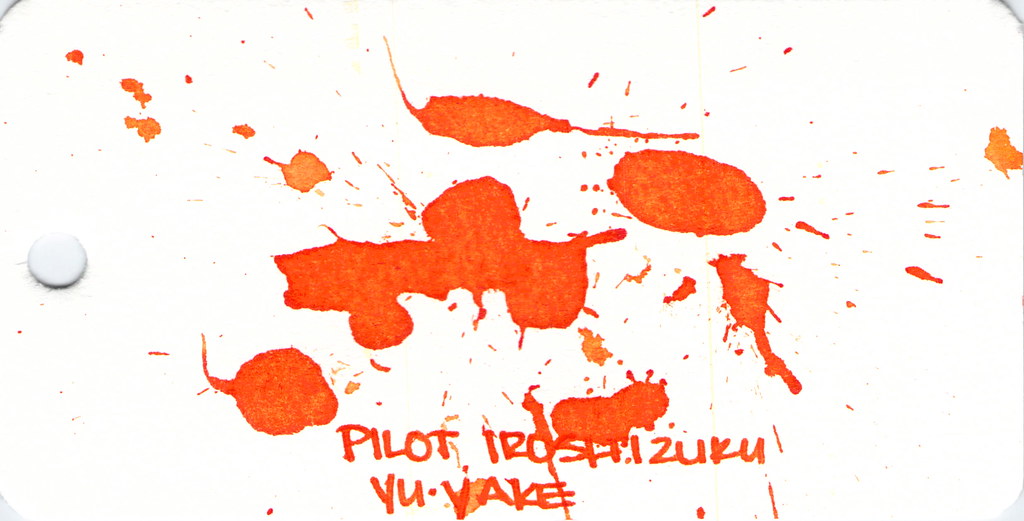
Dude. Check out Pilot Iroshizuku Yu-yake . . .


Pilot Iroshizuku Yu-yake Writing Sample


Shading, saturation, great orange color - maybe a little red in there. Yu-yake is bright and cheerful. Writes like a dream. A new favorite of mine.

I've had good experiences with all Pilot Iroshizuku inks. They are a bit more expensive than other brands, but they are incomparable in terms of overall brand quality.


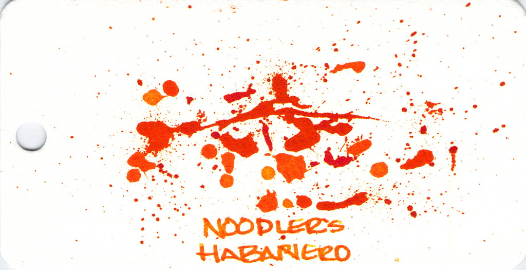
Last, and certainly not least:  Noodler's Habanero.


Noodler's Hanbaero Writing Sample

It's been awhile since I've had Noodler's Habanero in a pen. I'm not sure why. I fall in love with it every time. The beautiful shading, the gorgeous orange that reminds me of autumn.  Yum.

The only issue is that it seems to stay wet forever. Though, apparently, not as long as Noodler's Apache Sunset.


That's it!


Which are your favorites?

xoxo
Wednesday, October 15, 2014

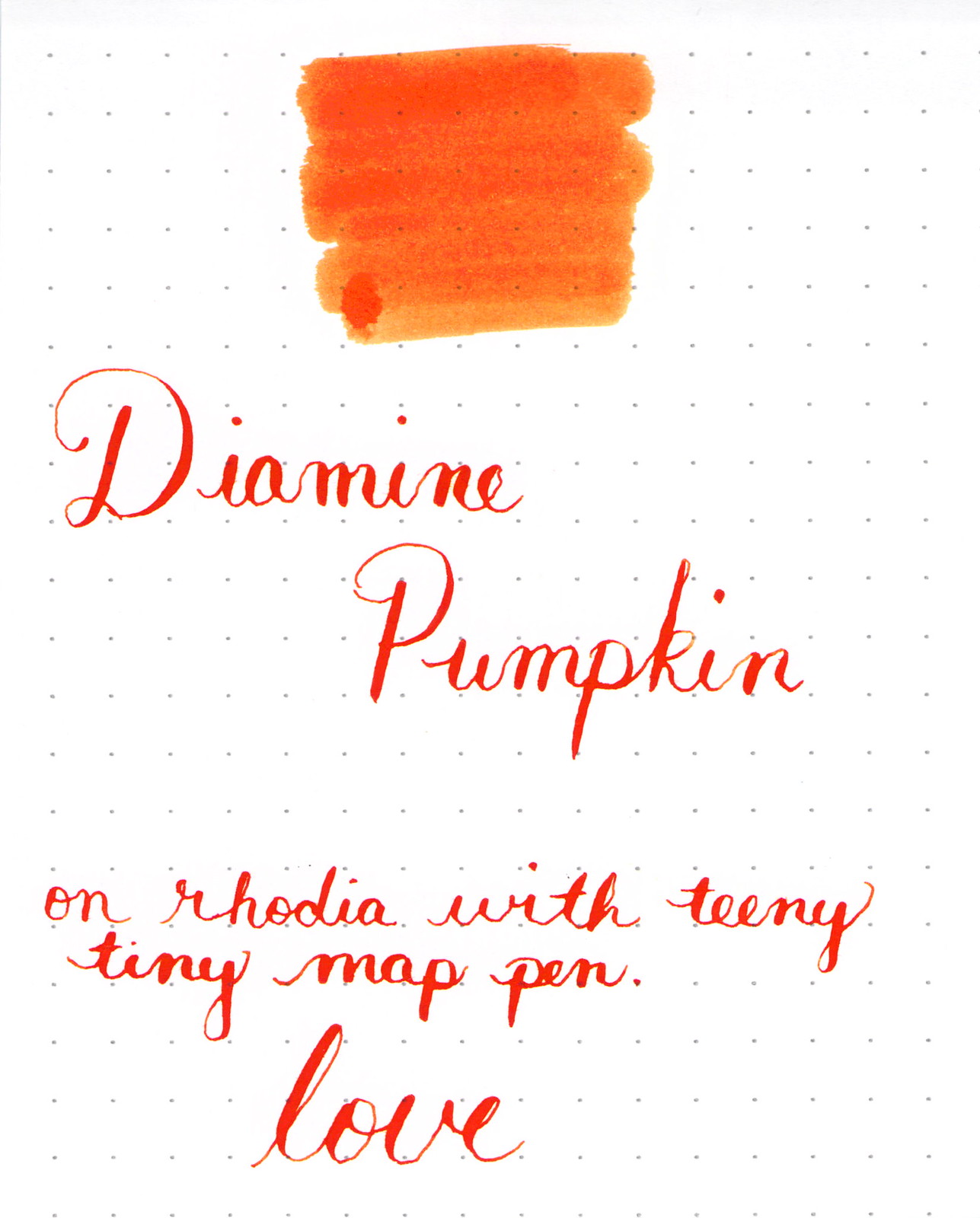
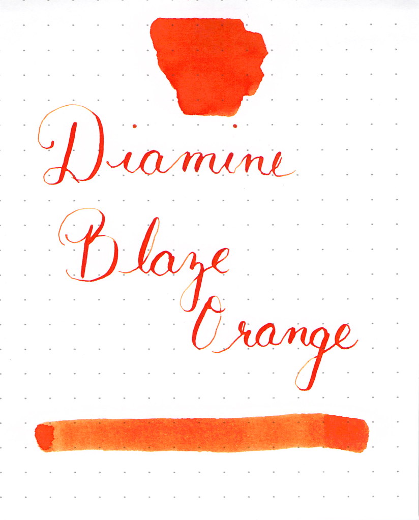
WORDLESS WEDNESDAY: Diamine Pumpkin and Diamine Blaze Orange

Tis the season for Diamine Pumpkin.


And I couldn't be more happy.

See my full (old) review of it right here.


Or maybe you prefer blaze orange?

Wednesday, May 14, 2014

THIS OR THAT - Orange Ink Edition


This or That
Orange Ink Edition


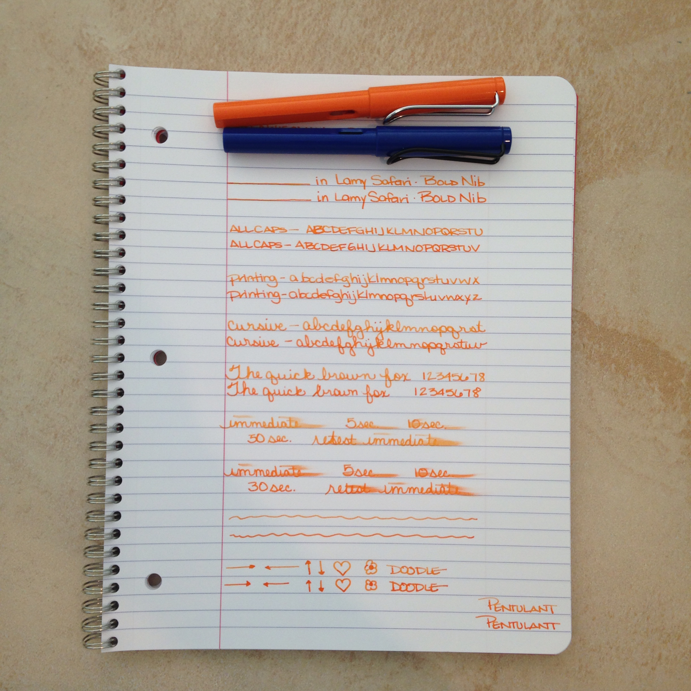
Two orange inks for your consideration today. Both loaded in its own Lamy Safari with a bold nib.


The top ink is a bit lighter - the bottom has more red it in - the top shades a bit better. Each has a fairly serious smear factor and they each wrote just fine with the color on the bottom feeling just a tad bit more lubricated than the top.

Which do you like better? 


Circle one. Top with its light orange and shading? Bottom with its richness and saturation?

How do you decide between them? Mr. Pentulant was decisive, "I like the bottom. No doubt."

I'm a little more on the fence. Shading or saturation? It seems to be a trade off between these two inks.


Here's the spoiler ....

Top....Montblanc Gandhi
Bottom....PW Akkerman Oranje Boven

Gandhi is for sale on eBay for around $90 per bottle (it's no longer in production). PW Akkerman is around $24 per bottle (but you may pay lots for shipping if you can't find it in the US).

Tell me which you like better and how you made your decision? Color? Shading? Pricing? Maybe a combination of factors?


Monday, February 3, 2014

INK REVIEW: Diamine Sunset

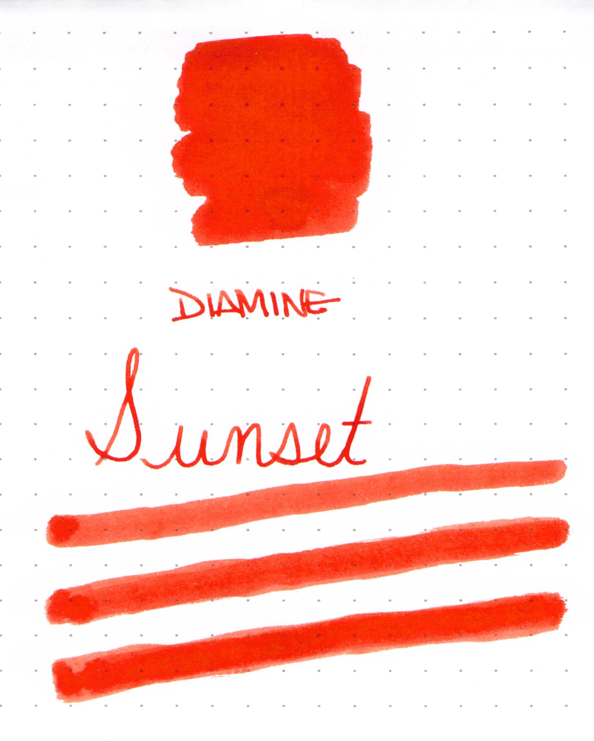
Diamine Sunset Ink Swab

Anyone who has been here for awhile knows how much I love a bold bright ink. Diamine Sunset certainly seems to fit that bill, though the red-orange color isn't quite enough to cover the dots on the Rhodia paper I was using. 

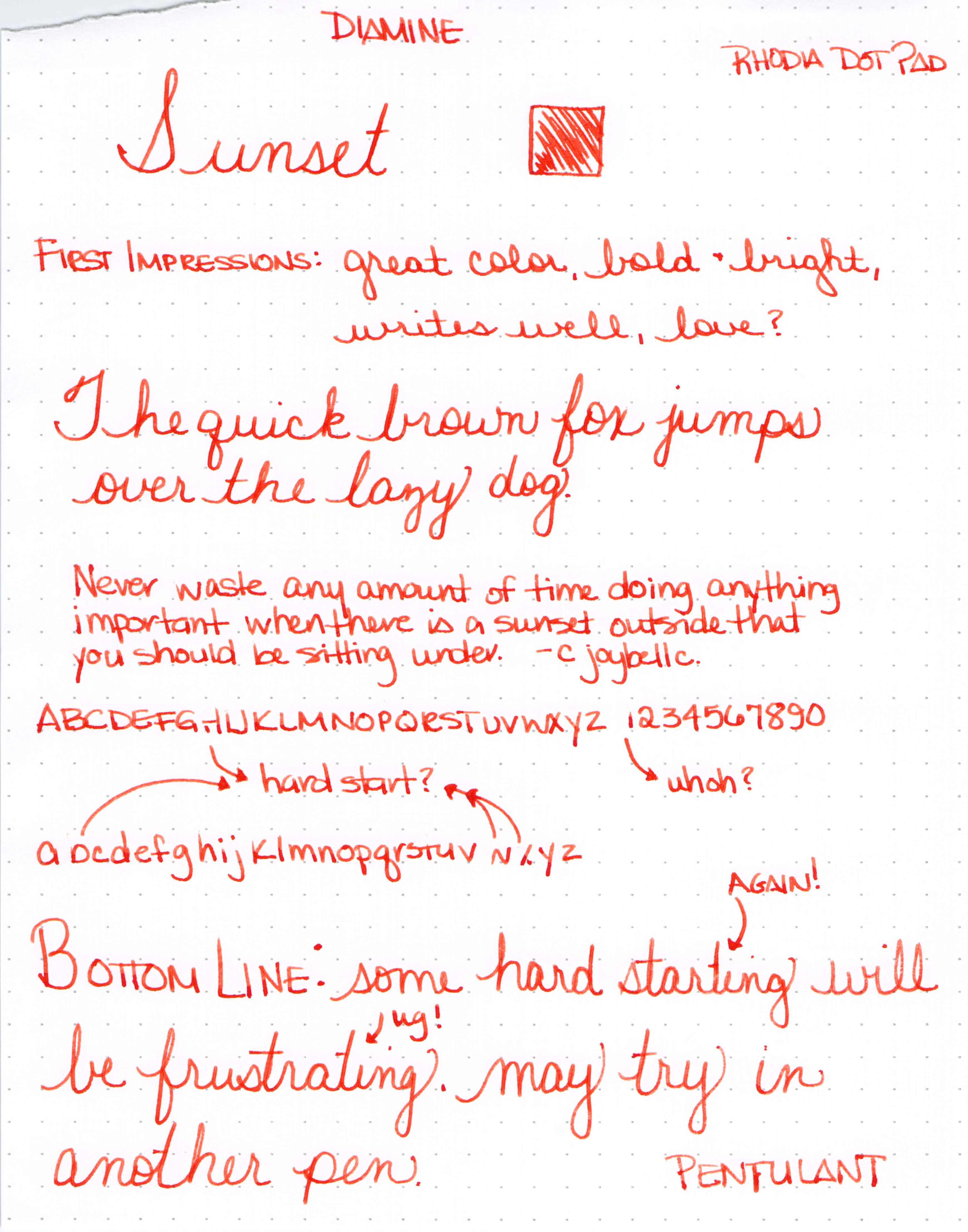
Diamine Sunset Writing Sample with Lamy Safari (B)


Add in a a little bit of shading and it just might be love.


Er.  What is this?  A B C D E F G . . .


I usually use an ink for a week or so before posting the review, but the hard starting continued throughout the first day and I couldn't stand it. 

My initial thought was that the ink must be more dry than others. I was using a Lamy Safari - Broad nib - and rarely have trouble with them. I'm fastidious about cleaning my pens, so I doubt that's the issue.

Here are some other reviews for the same ink...

Fountain Pen Network - "flow for this ink seems high"  (Uh. Oh.)

Fountain Pen Network - "a nice flowing orange"  (Hmm.)

Goulet Pens Reviews - "it is a very dry ink" (Interesting!) and "...made the pen skip quite a bit" (Ah Ha!)


So..what about you? Have you tried Diamine Sunset?  What was your experience?


Click for Full-Size


Click for Full-Size


Thursday, January 30, 2014

Throwback Thursday: Fountain Pen Edition

Noodler's Habanero Ink Swab on Tomoe River Paper


It's another edition of Throwback Thursday!

Just about a year ago, I was going on and on about Noodler's Habanero. I'd heard so much about it and its wonderful shading abilities. I was definitely not disappointed. It was one of the inks I swabbed on to Tomoe River Paper.  Gorgeous! And I wrote about it again in August.

I've not used it for a few months, but seeing it again definitely makes me crave.

What was everyone else talking about last year?

FPN had a review of Pilot Iroshizuku Ku-Jaku.

Notebook, Esq. wasn't talking about a fountain pen.

Foutain Pen Geeks were looking at form and function.

Rocket? Pencil Sharpener?  Take a look.

Inkdependence was sharing some ink love with us.

And, finally, Gourmet Pens had a sweet Wordless Wednesday.


Monday, August 26, 2013

INK REVIEW: Pelikan Edelstein Amber


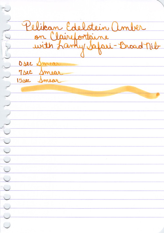
Going to let the pictures do the talking today's review of Pelikan's Ink of the Year Edelstein Amber.


omg - I love it on this paper - omg


The more I used it, the more I liked it - though after this initial fill, I've not been drawn to refill with this color.  So - I like it, but it's not love.


Wednesday, August 7, 2013

QUICK LOOK WEDNESDAY - Six Pretty Colors


Sometimes, I want to play with my pens, inks, and papers, but can think of nothing to write.

The first step is to write the name of the ink and the name of the pen (see above). I just noticed that each ink is from a different manufacturer - nice.

Apparently, the last resort is to write things that I overhear from the television (see below).


It was actually quite a bit of fun - watching and scribbling, changing pens and writing a bit more. I love the way the entire sheet of paper looks - each color is pretty amazing on its own, yes?

Let's take a closer look . . .


Above - DeAtramentis Alexander Hamilton. I love this purple. It's so rich and deep in color - nice saturation. I don't see this ink discussed much on the various forums, but I think this is a purple that could be used anywhere.  (more on that another day)


Below - Private Reserve Spearmint. One of my favorite green inks. It looks a bit dark here to my eye, but it is usually quite cheery.


Do you have a guess as to which show I was watching at the time?

Below - Montblanc Hitchcock. A gorgeous blood red ink if I ever did see one. Some really pretty shading in there, too. I have to confess, I have a quite a lot of this in my cabinet. Shall I keep it forever? Use it as if I'll never run out? Or maybe even sell some?


Below - Noodler's Habanero. A favorite. That shading. The brightness of the color. Need I say more? Mm..wait, I already did right here.
 

By the way, the above quote is the one that seems like the one that would tell the secret of what I was watching. Have you guessed it yet?


Above - Pilot Iroshizuku Fuyu-syogun. I wonder if I only could have one ink, if this would be it. Check out my big review here. It is crazy CrAzY to think that I, lover of bright and beautiful colors, would be so taken with a gray ink, but there you go.


Above - Diamine Majestic Blue.  Easy to see why it's one of my favorites, yes?  So pretty.

And, so, there we have it - six pretty colors. All so different from one another and yet all so wonderful.

Which show was I watching?  Downton Abbey, of course!  Have you seen it? Highly recommended.