Pages

Showing posts with label gray. Show all posts

Monday, October 13, 2014

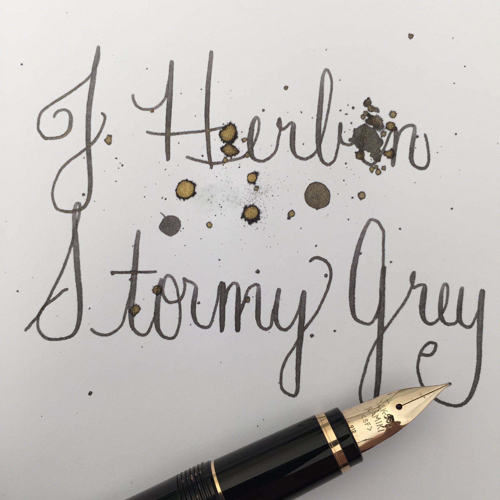
INK REVIEW: J Herbin Stormy Grey

Handwritten Review: J Herbin - Stormy Grey

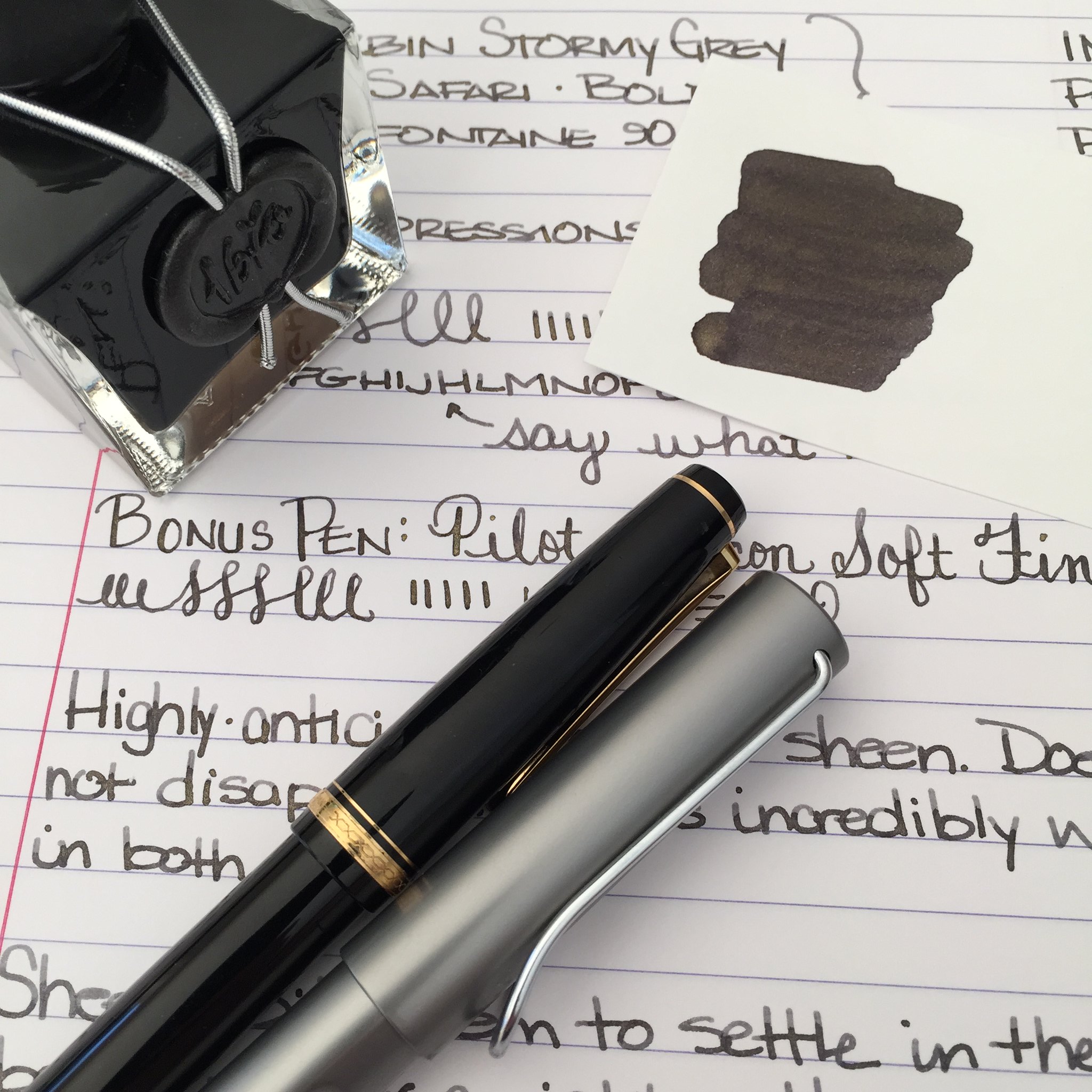
There has been so much chatter in the fountain pen community about J Herbin's Stormy Grey ink. So much anticipation. It's all about that gold sheen, baby.

When Goulet Pens finally announced that they had it in stock, it was sold out in under an hour - and I missed it. Arrrrgh.

I hurried over to Amazon to see if I could find it there - score! It's the same price at both places -  $26 for 50 ml.
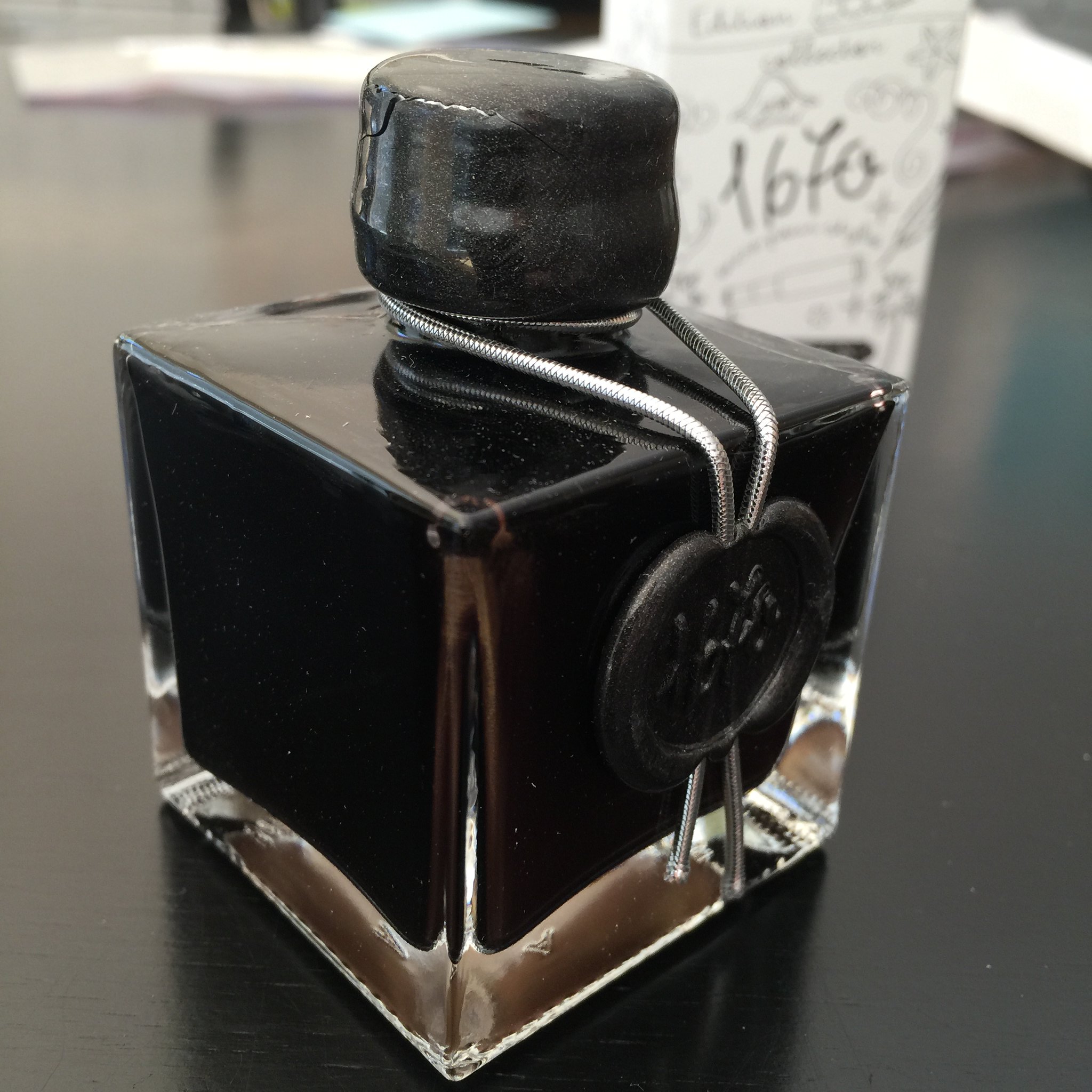


Above: Like the other J Herbin special editions, this bottle is extra special, sealed with wax, and quite lovely. Except that only the smallest pens could fit into the opening of the bottle. And my wax on the screw top is already cracked - whomp whomp.

Below: The sheeny bits came to a rest at the bottom of the bottle.  You'll want to shake well before using this ink.
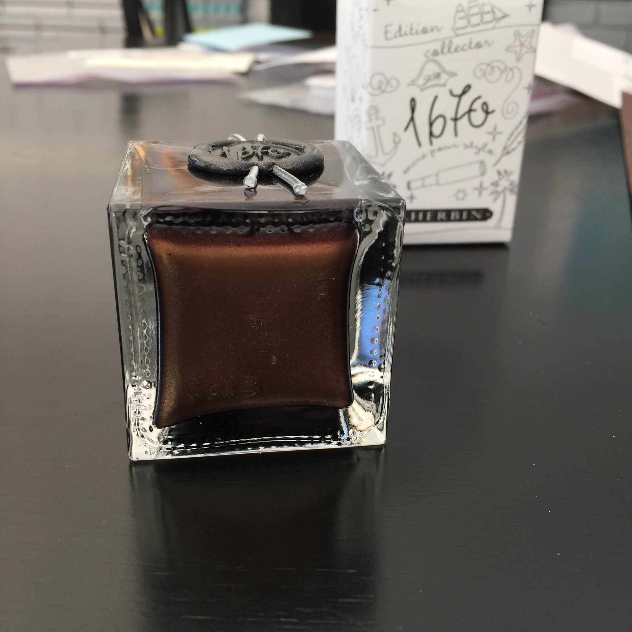


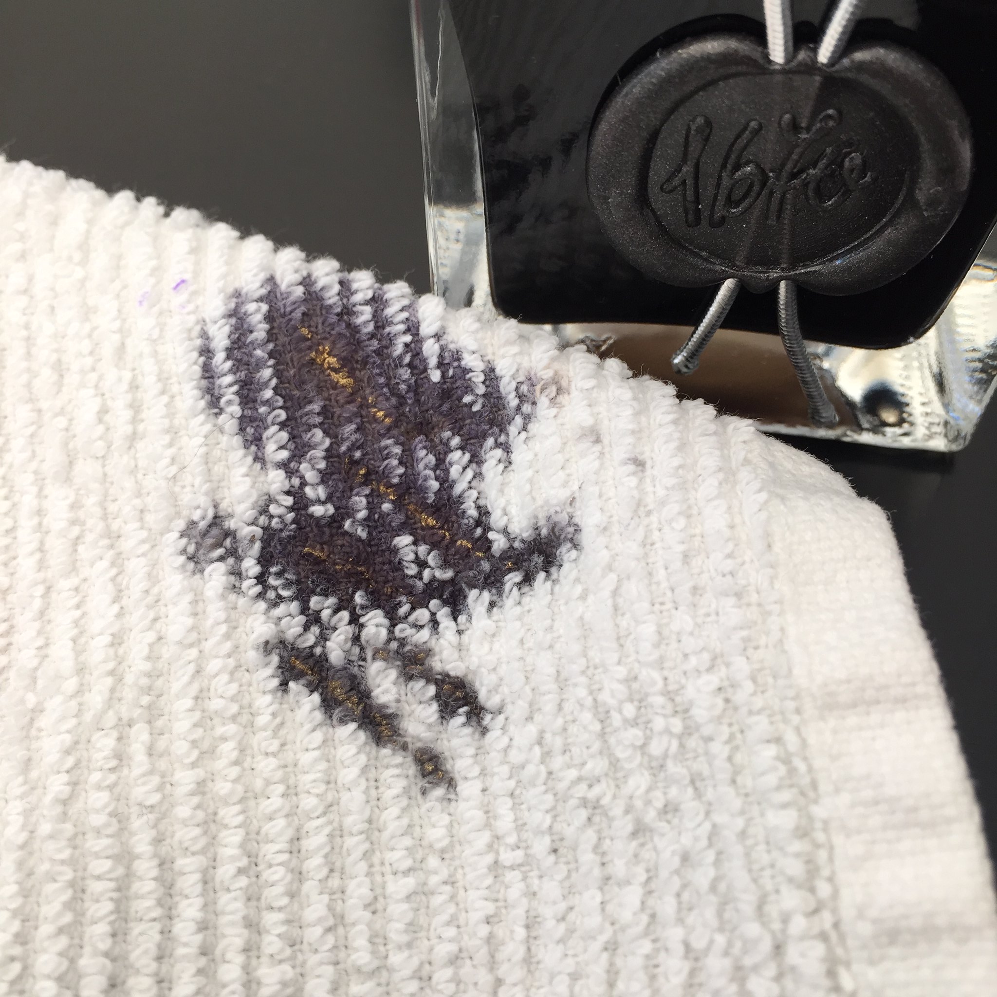
Below: Sheen on the towel that I used to wipe my nib. Crazy, right?


All of that Stormy Grey sheen is just fine, but how does it write?


Quite wonderfully! 

The ink has terrific flow out of the pen (leans toward the wet side, but I like that). There's some great shading and I really like the darkness of the gray (grey?) color with or without the added fun of the sheen.

Something I noticed that could be a concern - in the bottle, the sheeny bits settled so quickly. I shook the bottle like mad and then quickly pulled the ink into a syringe to fill my pens. If the sheeny bits settle that quickly, what happens in the pen when filled? Will all of the sheeny bits fall to the writing end of the pen and you will get the most sheen from the first few pages - and no sheen at all for the last few? 

The only other downside I can see with this ink is that because of the sheen, it's not an ink that could be used in every situation. Thankfully, we live in a world that allows us some whimsy now and then.  ;)


Below: My scanned writing sample doesn't show much sheen, but it's definitely there in the right light.


Looking for the sheeniest sheeny picture of them all?  Check out my friend rubengamez's feed on Instagram. It's crazy good sheen!


Wednesday, August 7, 2013

QUICK LOOK WEDNESDAY - Six Pretty Colors


Sometimes, I want to play with my pens, inks, and papers, but can think of nothing to write.

The first step is to write the name of the ink and the name of the pen (see above). I just noticed that each ink is from a different manufacturer - nice.

Apparently, the last resort is to write things that I overhear from the television (see below).


It was actually quite a bit of fun - watching and scribbling, changing pens and writing a bit more. I love the way the entire sheet of paper looks - each color is pretty amazing on its own, yes?

Let's take a closer look . . .


Above - DeAtramentis Alexander Hamilton. I love this purple. It's so rich and deep in color - nice saturation. I don't see this ink discussed much on the various forums, but I think this is a purple that could be used anywhere.  (more on that another day)


Below - Private Reserve Spearmint. One of my favorite green inks. It looks a bit dark here to my eye, but it is usually quite cheery.


Do you have a guess as to which show I was watching at the time?

Below - Montblanc Hitchcock. A gorgeous blood red ink if I ever did see one. Some really pretty shading in there, too. I have to confess, I have a quite a lot of this in my cabinet. Shall I keep it forever? Use it as if I'll never run out? Or maybe even sell some?


Below - Noodler's Habanero. A favorite. That shading. The brightness of the color. Need I say more? Mm..wait, I already did right here.
 

By the way, the above quote is the one that seems like the one that would tell the secret of what I was watching. Have you guessed it yet?


Above - Pilot Iroshizuku Fuyu-syogun. I wonder if I only could have one ink, if this would be it. Check out my big review here. It is crazy CrAzY to think that I, lover of bright and beautiful colors, would be so taken with a gray ink, but there you go.


Above - Diamine Majestic Blue.  Easy to see why it's one of my favorites, yes?  So pretty.

And, so, there we have it - six pretty colors. All so different from one another and yet all so wonderful.

Which show was I watching?  Downton Abbey, of course!  Have you seen it? Highly recommended.

Monday, August 5, 2013

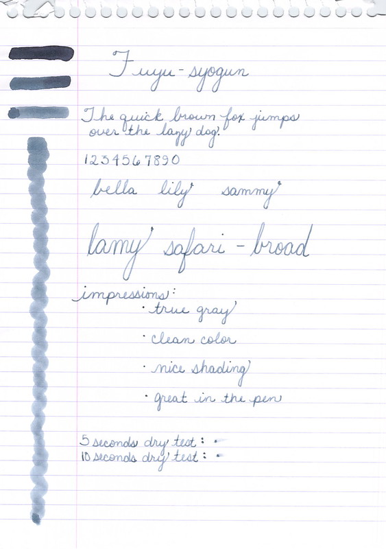
INK REVIEW: Pilot Iroshizuku Fuyu-syogun


Oh. Goodness.

Gracious. Me.

Oh. My.

Pilot Iroshizuku Fuyu-syogun Swabs (3, 2, 1)


Have mercy.


Fuyu-syogun Shading

Not too light.

Not too dark.

Nothing but gray. No icky red or green undertones.

Gorgeous shading. 

Decent dry time.

Writes beautifully.

I'm in love.  In love. Head over heels.

If this ink isn't in your collection, it certainly should be. Certainly.


Have a look at my other grey/gray ink reviews and then run out and get this one.

Seriously, I have nothing negative to say about this ink.


Monday, July 22, 2013

INK REVIEW: Omas New Gray


It's been awhile since I've added any new gray/grey inks to my Fifty Shades of Grey collection!

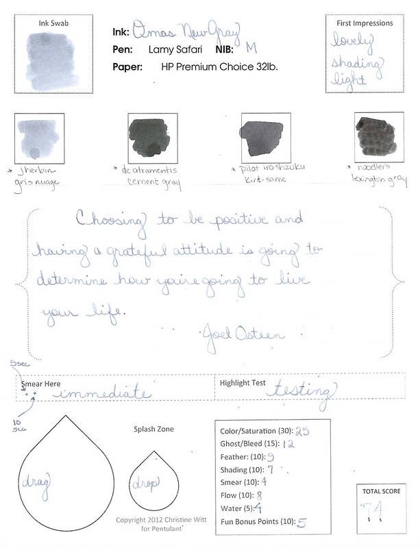
New Gray from Omas is a lovely shade of gray with a bit of blue in it. It's probably too light to use in a business setting and definitely lighter than the other shades of gray that I've reviewed.

It writes great. No smearing. Maybe a little dry, but not bad. Some nice shading.


You'll have to believe me when I say that it handles highlighting very well.  (What is up with me and all of the failed highlighting tests?)

The water test is pretty amazing. Even on the original, I have to squint to see where I dragged the web cotton swab across my writing.

Overall, this is a gray I dig and I could see using it on a regular basis. That is, if I hadn't already fallen in love with another gray.  Stay tuned . . .


Wednesday, June 26, 2013

QUICK LOOK WEDNESDAY: Three Inks I Love


All so different and I'm in love with each!


 Pilot Iroshizuku Fuyu-syogun A perfect gray. Lovely shading. Great color.

 Diamine Flamingo Boom-Boom Wow color!

 Diamine Majestic Blue True blue!


Which inks are you loving on lately?


Wednesday, May 8, 2013

INK REVIEW: De Atramentis Cement Gray


I like gray inks. Always looking for that perfect shade. It's been a long time since I've added an ink to my Fifty Shades of Grey line-up or talked about the spelling of gray -vs- grey. Too long if you ask me!

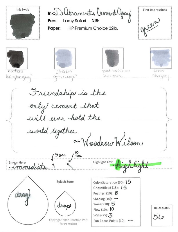
Unfortunately, I'm not wild about Cement Gray from De Atramentis. (Thank goodness it doesn't stink like cement, though!)

The problem seems to be that there's a lot of green in the ink.


Admittedly, it's difficult to see the green with my scans, but it's there. It's there so much that I pointed out to Mr. Pentulant that he might want to consider this ink as his dark-nearly-black-but-still-green choice. He tried it for a short while, but didn't love it.

The green is most apparent when looked at along side other inks...


As usual, I wrote with this ink for about a week after the review. It wrote fine - a little hard-starting at times even in a medium nib Lamy Safari.

The problem (for me) was the color.  What do you think? See the green? Like it? Hate it?

Monday, February 25, 2013

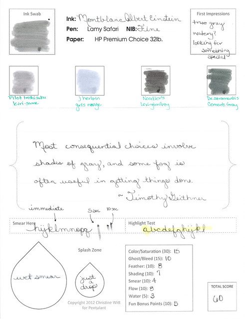
INK REVIEW: Montblanc Albert Einstein


Seems like gray inks are a love 'em or hate 'em kind of thing. Me? I find that I'm picky about my grays (or greys, if you prefer). I like either true gray - or perhaps a bit blue leaning like J Herbin's Gris Nuage or Pilot Iroshizuku's Fuyu syogun (Old Man Winter).

Before we dive into the review of Montblanc's Albert Einstein ink, you have seen the pen, yes?  It's the cap that does me in, makes me swoon, gives me heart palpitations. Love, love, love.


But it's this part that turns me off . . .


The metal. The sharp drop-off between the barrel and the grip. Bleh.

I had the opportunity to hold one of these at the Montblanc Boutique in San Francisco when they were first available. I just didn't love it. I mean, I'd take one if someone wanted to gift it to me (duh), but I'm not buying one for myself.

Anyway...the ink review..


Clicky here for the biggy big version of the review.


And a closer look . . .


I like it. It's ok. It's not amazingly wonderful. I have a couple of full bottles of it, but I'm not hurrying to fill all of my pens with it. I think Mr. P would like this more than I. It's a little dark with no special characteristics, but it gets the job done. It's a serious gray from a serious pen company - I imagine Montblanc is quite happy with it.

Bottom Line:  It's ok.


Tuesday, January 15, 2013

INK REVIEW: Noodler's Lexington Gray


A Wordless review of Noodler's Lexington Gray.

This is also the very last of my old ink reviews.  
Next ink review will be the new fancy pants edition!
Look out!


I dig it. I also dig Gris Nuage in the Compare Square. 

Oops..this was supposed to be wordless!

Monday, November 26, 2012

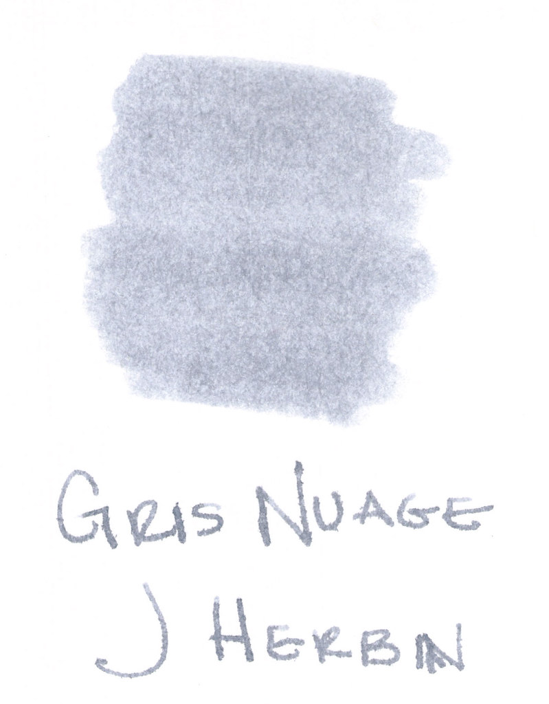
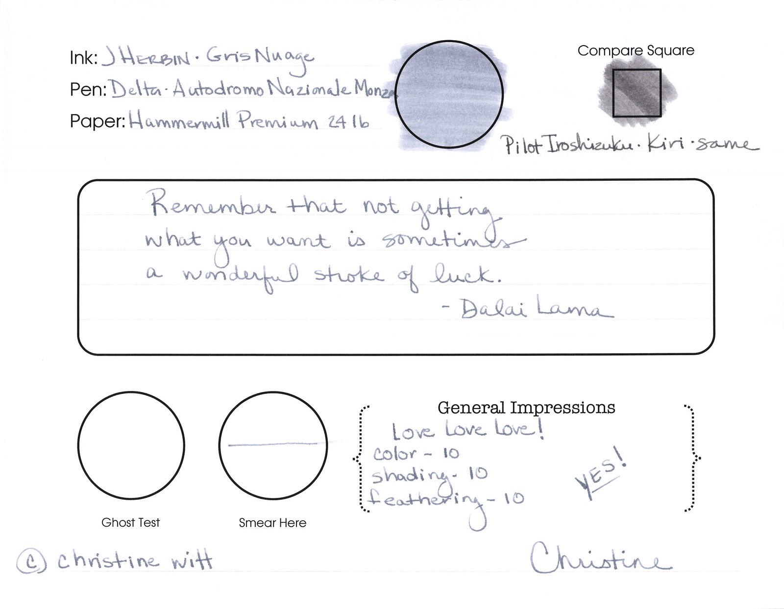
INK REVIEW: J Herbin - Gris Nuage


Here's a quickie review of one of my favorite inks to get us back into the groove this week. (More on Thanksgiving another time.)

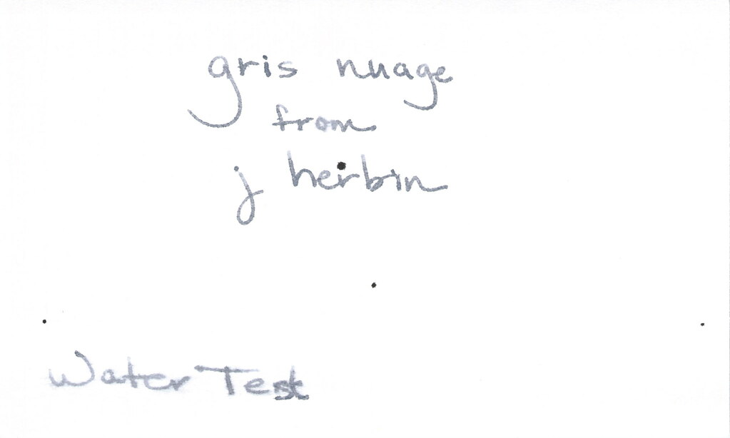
The above swab was done with a q-tip and then the name of the ink written with a glass pen. In my experience, there's a lot of feathering with glass pens and this was no exception. (It also doesn't help things that it's written on a cheap-o index card.) (Again, I ask, are there are any nice index cards out there? Starting to think there aren't.)

Anyway....Gris Nuage (Gray Cloud - how pretty!) is one of my very most favorite gray (grey, if you insist) inks.

It's light - just like a cloud. It's prettttttty. Leans more toward blue than red, but is definitely one of those pure colors that I adore.  

And, holy crappoli (it's a word), it writes like a dream. Check it out....


Pretty, yes?  Some lovely shading going on there, too. And no smearing, no feathering, no ghosting, or bleeding. What more could a girl want in a gray ink?


Oh, yes, it does well with water!  Nice!!!  This is totally one of my gray inks. It makes me swoon!

OK..so see those black specks on the water test?  No, it's not Gris Nuage gone crazy - that's collateral damage from my Invincible Black spatter. Haha!

Do you have a favorite gray? Mr. Pentulant was using Montblanc Oyster Grey for awhile in his fancy new Boheme, but he wasn't loving it.

Monday, November 12, 2012

INK REVIEW: Private Reserve - Gray Flannel


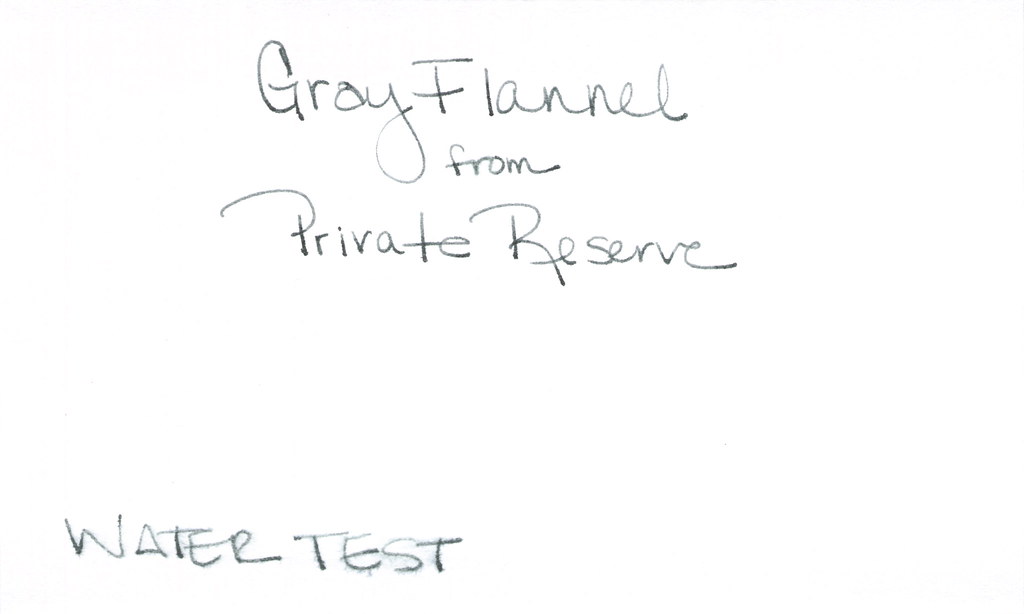
First impression?  It's a little...green. We all know from other posts that I'm a bit of a purist when it comes to my ink colors. Not meaning that I only like blues and blacks - meaning that I like to look at a color and be able to say, "That's gray!" (or, "That's grey!" depending on from where you are in the world.) So..that's definitely a strike against Gray Flannel from Private Reserve for me. A big strike, but let's look at it more closely . . .


It passes the water test. I put a droplet of water where I've written "from" and that seems to have survived quite well. Where "Water Test" is written, I dragged a water-soaked Q-Tip. So. Yeah - not bad.

How does it write?


It's fine. It really is, but I cannot get past that color. Look at how it compares to the J Herbin Gris Nuage. Nuage is a bit on the blue side, but the side-by-side comparison really shows who green the Gray Flannel is.

But..I digress...it writes well. Great flow, no smearing. I've been loving broad nib pens lately, but this performed really well in my vintage Parker (not sure of the model) with a fine nib.

So...it's probably easy to see that I'm not all wound up excited about this ink. I'm not. With so many shades of green gray out there, I'm going to keep looking for the ones I swoon over.

I've asked before - but what are your thoughts about color? Purist like I am? Or mix-n-match is ok with you?