Pages

Showing posts with label noodler's. Show all posts

Monday, November 10, 2014

Seven Orange Inks

A photo posted by Christine Darling (@pentulant) on

I've been on an orange kick. It all started innocently enough back in May, and then over the last few days, I've inked seven pens with seven different orange inks.  CrAzY!
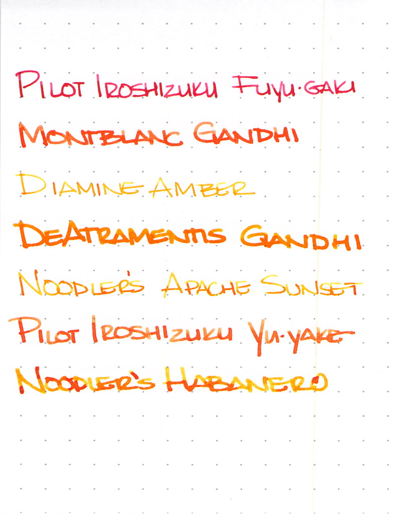


I won't have room to go into great detail on each ink here, but let's explore a little, shall we?
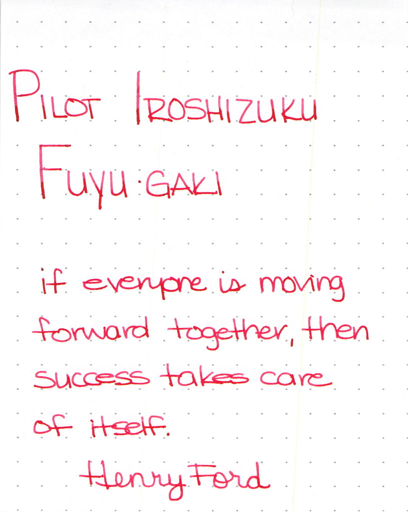
Pilot Iroshizuku Fuyu-gaki Writing Sample

Pilot Iroshizuku's Fuyu-gaki runs a bit toward the red side of orange. It writes wonderfully, doesn't display much shading, and is an all-around nice ink.
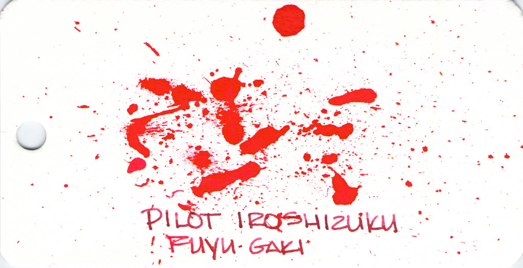


Fun with ink splatters. I did these on Word Cards that I got from Jet Pens. The paper is more like a thin watercolor paper than writing paper.

Moving on . . .
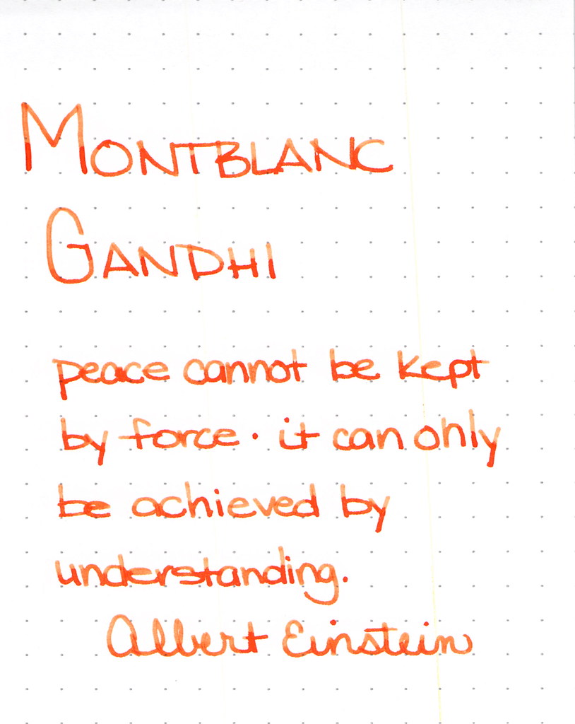

Montblanc Gandhi Writing Sample

Montblanc Gandhi fountain pen ink is no longer available. It can be found on eBay (I've been thinking about selling my spare bottle, but I'm not sure I want to let it go, you know?)

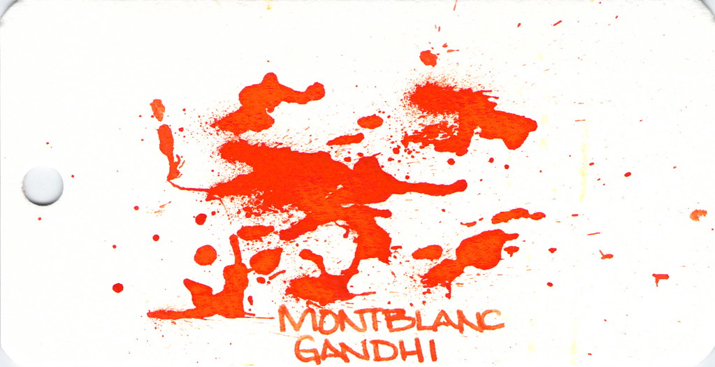
The ink is such a pretty pretty orange, lots of good shading, and is definitely one to try if you can find it.

Spatters, anyone?


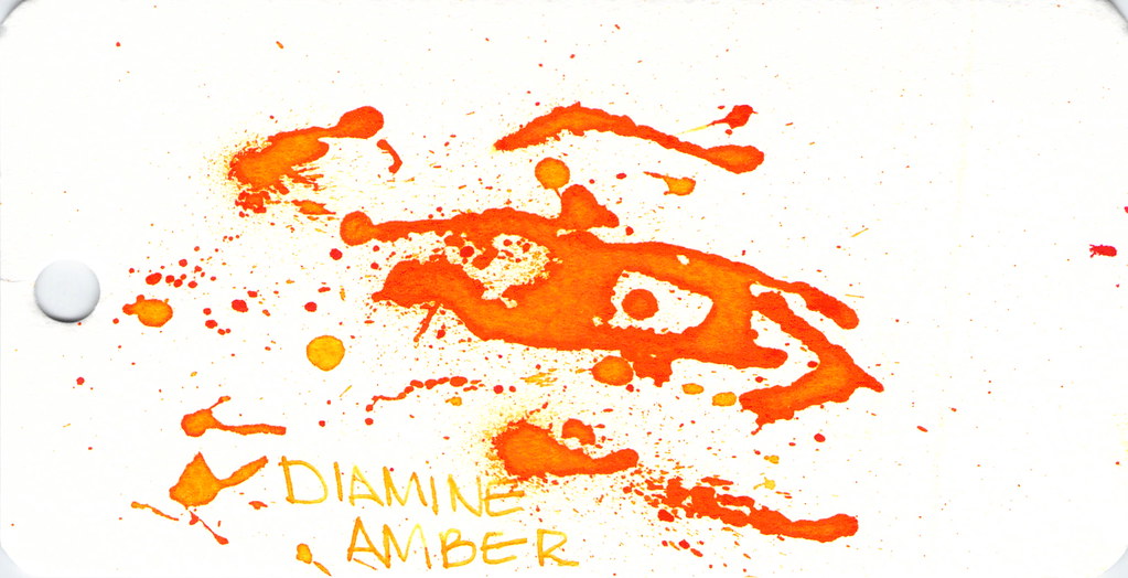
Diamine Amber is next on our hit list . . .
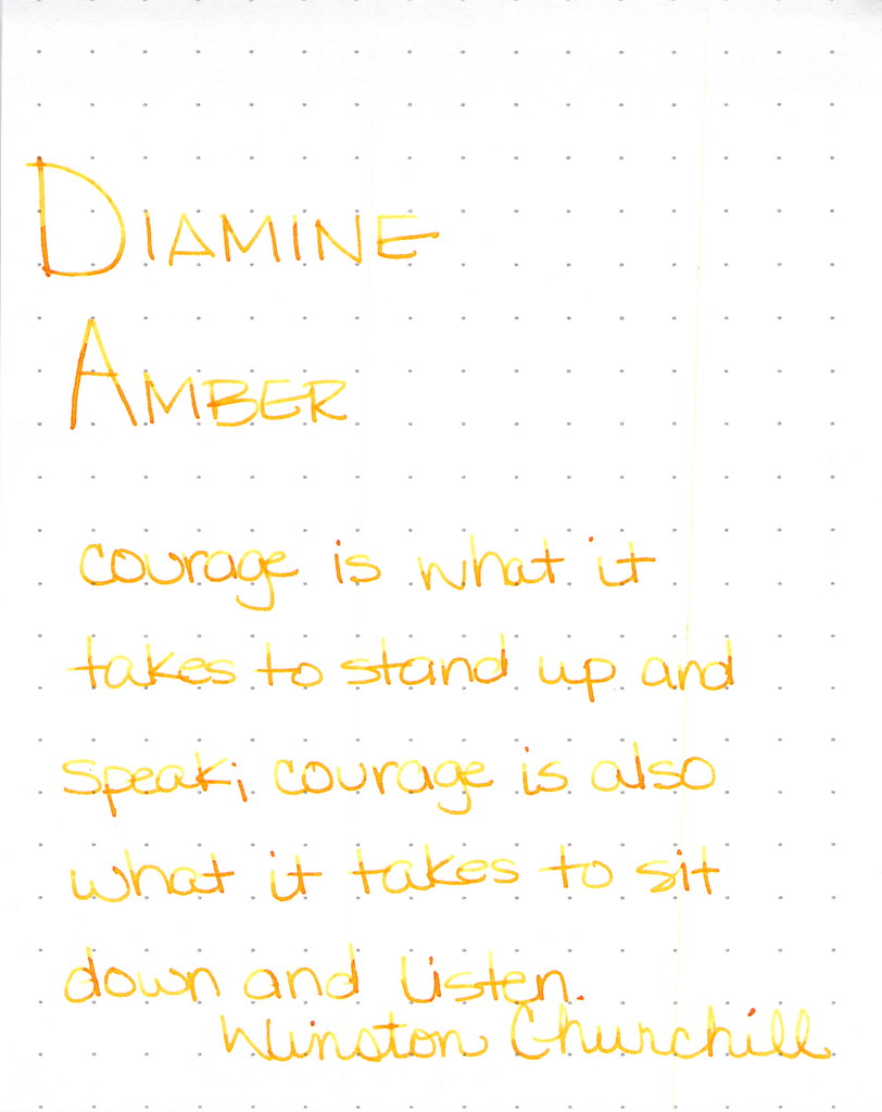
Diamine Amber Writing Sample

Diamine Amber is just so light and feels a bit dry. This ink is in a Lamy with extra-fine nib and that may be part of the issue, but I've had other orange inks in the same pen and they've not been this light. I like inks that work in all of my pens (makes life easier, you know?) and with so many orange options available, I'm not so keen on this one. Others seem to like it.

And look at the spatters - good saturation there, friends.


Montblanc Gandhi isn't the only game in town . . .
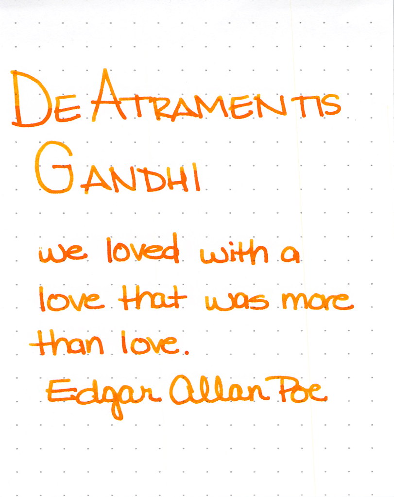
De Atramentis Gandhi Writing Sample

This was my first time using this ink and for some strange reason, I didn't have high expectations. Silly me - it's a perfectly fine ink. Some shading, writes quite well. No reason to be concerned. It's really not like Montblanc Gandhi - not that it matters, I think it would be a little silly to compare the two just because they share a name.  I like it.

I also think I did a pretty good job on the spatters here . . .


Next up . . .

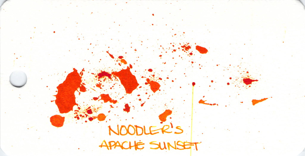
Noodler's Apache Sunset Writing Sample

People are generally coco-crazy for Noodler's Apache Sunset.  Even using an extra-fine nib, I can see the potential here. Absolutely insane shading. The color is very orange. People who don't like this ink seem to say that there is no practical application for it - I'm not sure I understand. Maybe they feel that way about all orange inks?

So . . . check out the spatter. See the streak? Please know that I waited a full 24 hours after creating the spatters before scanning. THE INK WAS STILL WET!  Insanity.  (Even more insane - you can see this streak on other images, too...arrrgh. I need to figure out how to clean my scanner.)


Anyway . . .

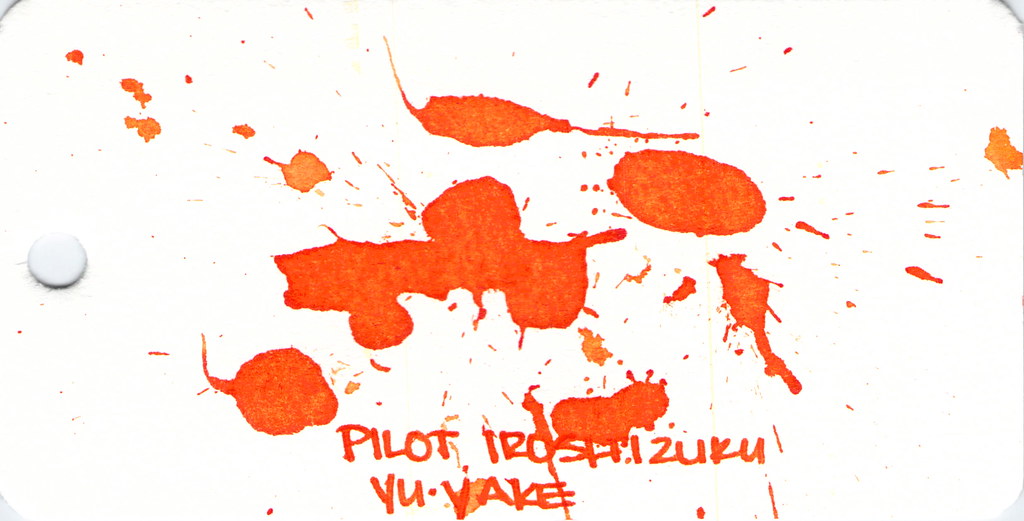
Dude. Check out Pilot Iroshizuku Yu-yake . . .


Pilot Iroshizuku Yu-yake Writing Sample


Shading, saturation, great orange color - maybe a little red in there. Yu-yake is bright and cheerful. Writes like a dream. A new favorite of mine.

I've had good experiences with all Pilot Iroshizuku inks. They are a bit more expensive than other brands, but they are incomparable in terms of overall brand quality.


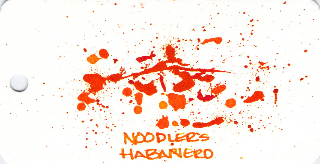
Last, and certainly not least:  Noodler's Habanero.


Noodler's Hanbaero Writing Sample

It's been awhile since I've had Noodler's Habanero in a pen. I'm not sure why. I fall in love with it every time. The beautiful shading, the gorgeous orange that reminds me of autumn.  Yum.

The only issue is that it seems to stay wet forever. Though, apparently, not as long as Noodler's Apache Sunset.


That's it!


Which are your favorites?

xoxo

Friday, October 17, 2014

FOUND AROUND FRIDAY - Noodler's Fountain Pens Edition


The above photo started a discussion about flex pens and that started a discussion about Noodler's fountain pens and how I don't have a single Noodler's fountain pen that works like I'd hoped.


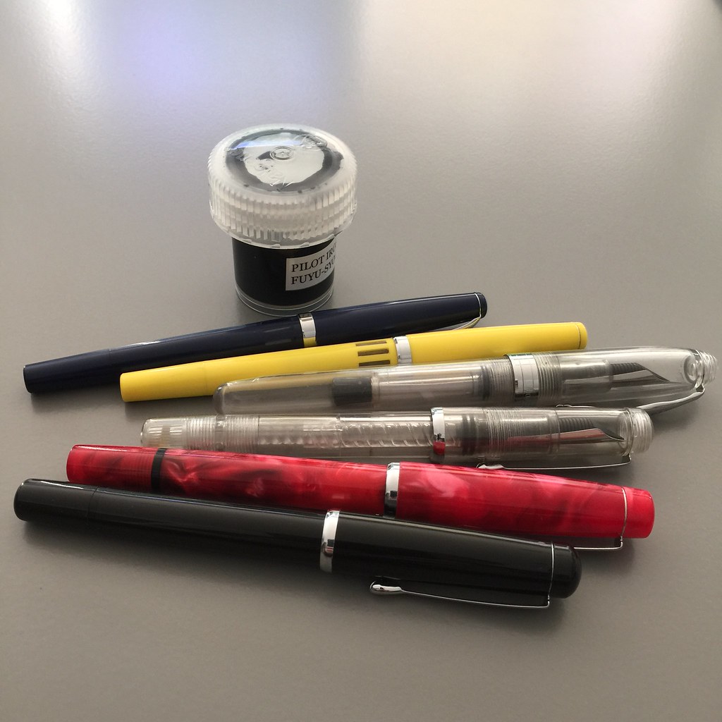
Feeling inspired, I found all of my Noodler's fountain pens and a container of one of my most reliable inks - Pilot Iroshizuku's Fuyu-syogun.

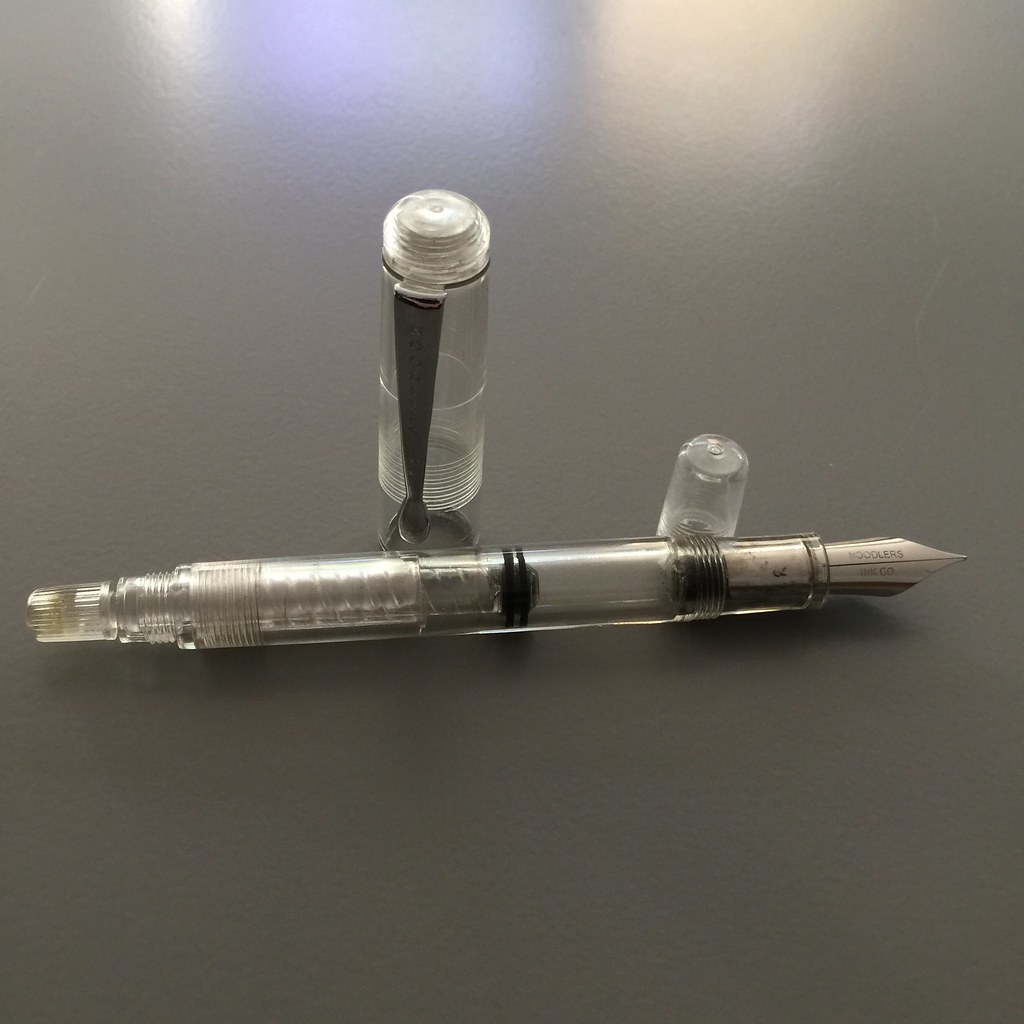
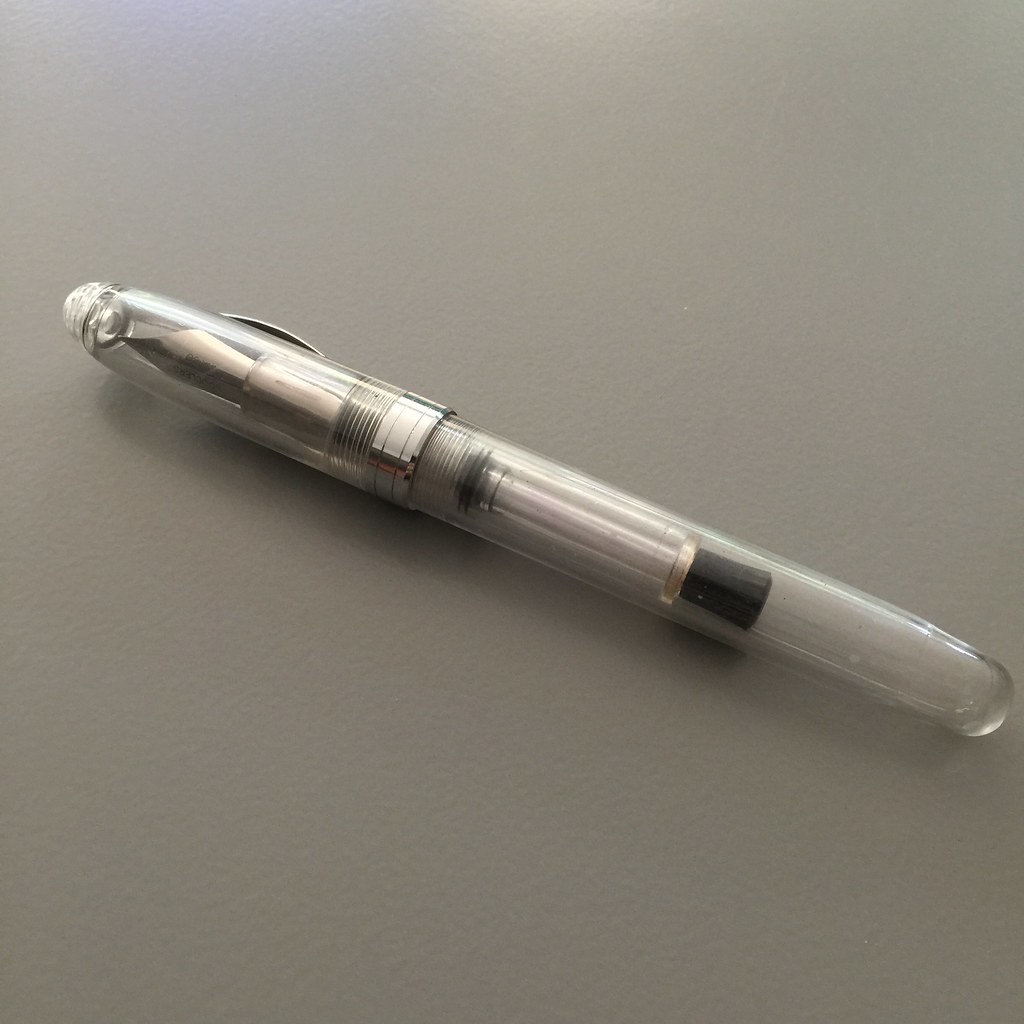
Noodler's Konrad Flex Fountain Pen - Clear

This one accepted the ink easily. I love the blind cap covering the twisty thing for the piston. If you've ever accidentally twisted a twisty thing and gotten ink all over the place, you know what I'm talking about here.

How'd it write?

Noodler's Konrad Flex - Writing Sample

Yeah. No.

I tried. I did a little scribbling, a little shaking. I gave the piston a little twist. I looked at the alignment of the thing to the other thing.  Yeah. No.

Moving right along . . .


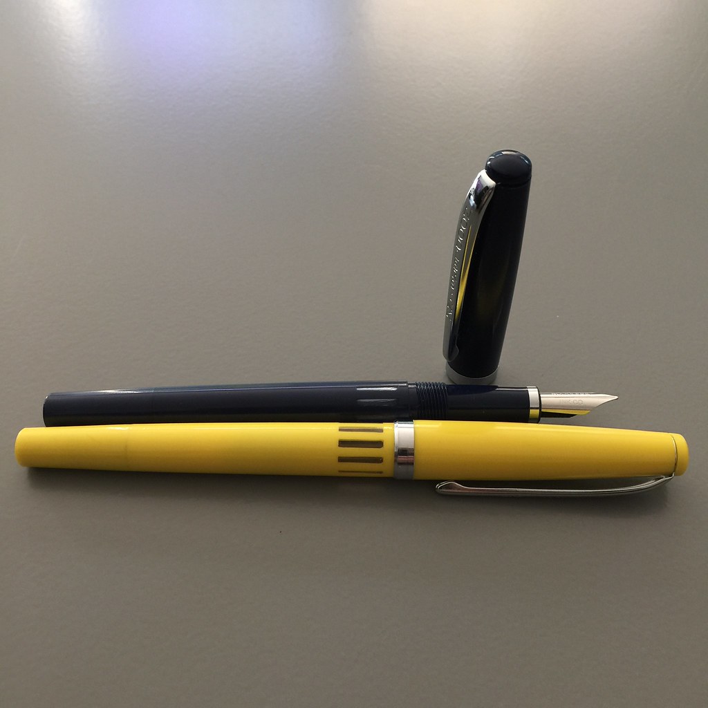
Noodler's Nib Creaper Flex Fountain Pen - Yellow and Blue

The Nib Creaper is super-slim and has a great ink window - stylish and functional. I love the way they look.

How do they write?

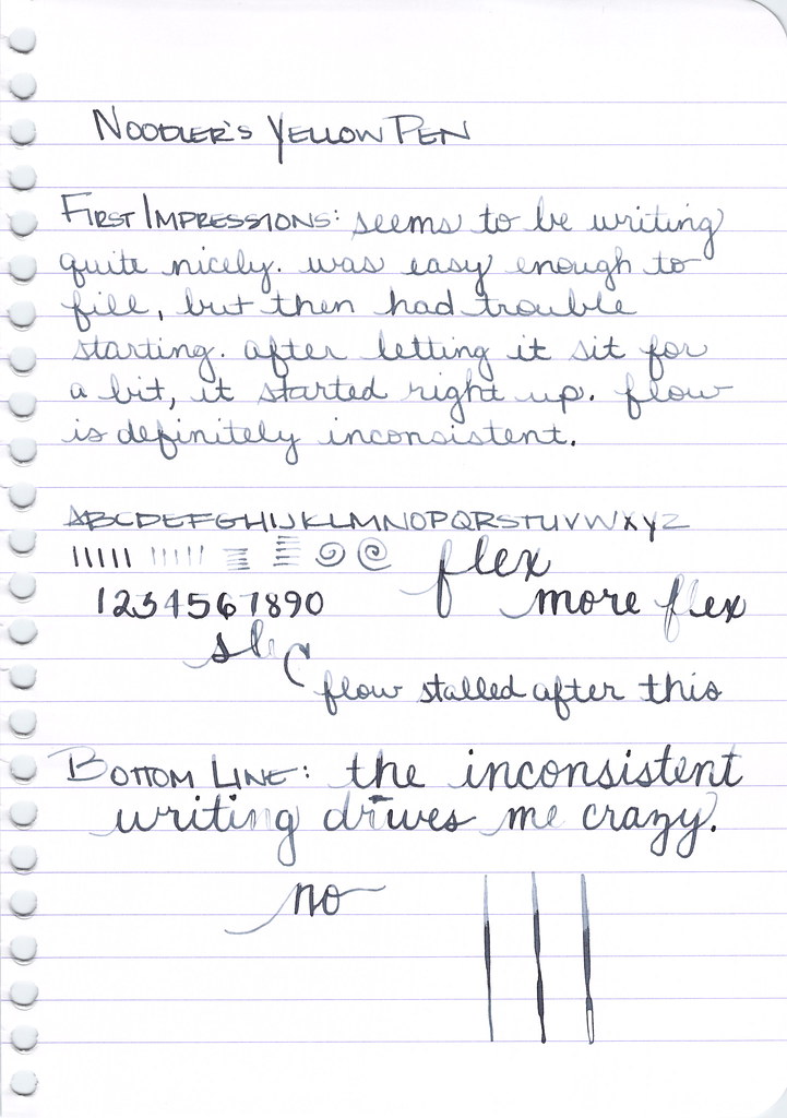
Yellow first . . .

Noodler's Nib Creaper Flex - Writing Sample

It started out so well, but quickly became inconsistent. In the image above, it's easy to see that the writing is darker at the top of the page and lighter as I near the end of the top paragraph.  There were also some hard starts. The flow just wasn't right.

You know what makes me crazy? Inconsistent fountain pens. Work or don't work, darn you!

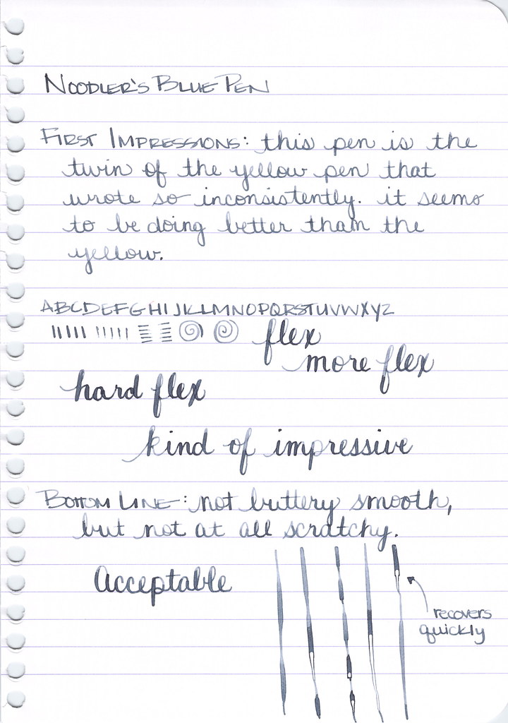
Let's look at the blue version . . .

Noodler's Nib Creaper Flex - Writing Sample

OK! Alrighty! The blue Noodler's Nib Creaper (why is it named that??) is kind of nice! It writes, it's fairly smooth a bit of happy feedback. It flexes! And it recovers quickly from railroading - very nice!

I'm going to call this one a win. For those keeping score, that is one win out of three pens.

Let's keep going . . .


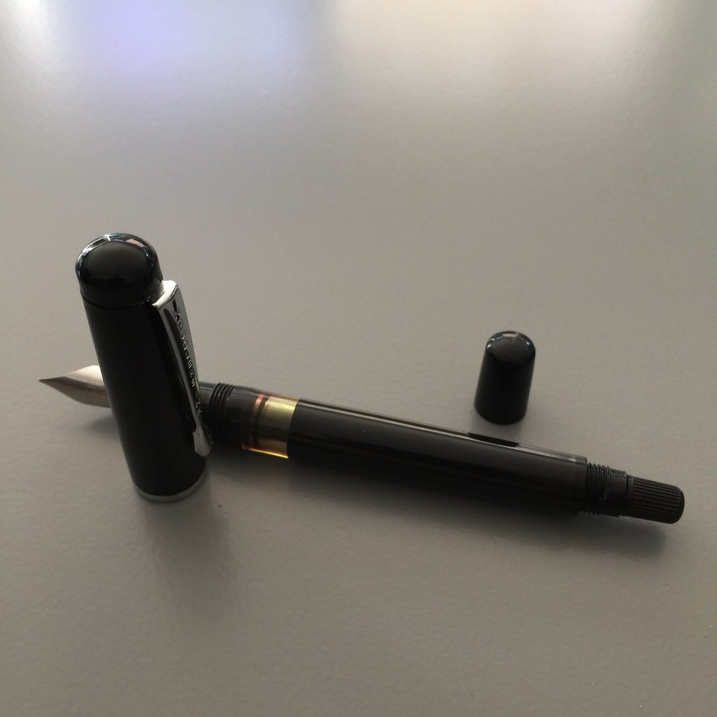
Noodler's Konrad Flex Fountain Pen

A black version of the Konrad Flex. Love that big ink window and, again, a blind cap protecting the piston's twisty thing.

How's it write?

Noodler's Konrad Flex - Writing Sample
Wait. What?

This pen wouldn't take up the ink. I tried several times, several different ways. I took the thing out of the other thing, adjusted it a bit, and tried again.  No go.

I don't know.

Fail.

What's next?

Noodler's Ahab Flex Fountain Pen - Clear Demonstrator
Pretty sure the Ahab is the biggest of the Noodler's pens. It fills with a plunger mechanism (fancy!) and looks like it could easily be converted to an eyedropper (but don't quote me on that).

This is a pen I've reviewed in the past.

The ink sucked right up into the pen and I was feeling hopeful.

Noodler's Ahab Flex - Writing Sample

The Ahab wrote decently - until I started flexing the nib.

Does it work as I'd hoped?  No.

What's the score now? Is anyone keeping track?

Argh.

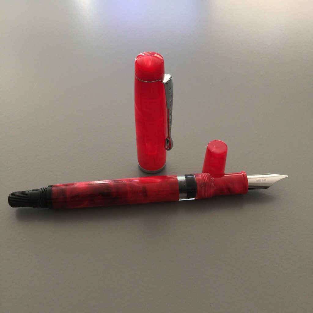
Noodler's Konrad Flex Fountain Pen - Red

This pen is pretttttty. I really really wanted it to write well.

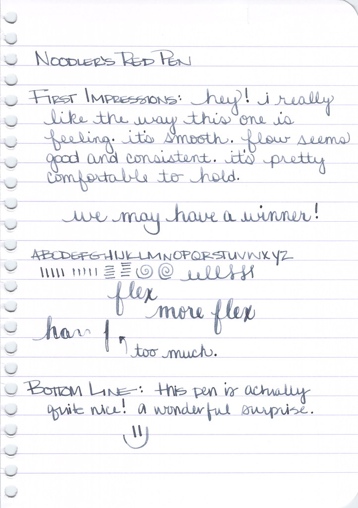
Noodler's Konrad Flex - Writing Sample


Score!!

It wrote fine! Passed all but the hardest of the hard flexes. Seems like it recovered well from the over-flex.  I like it! Thank goodness because it really is a looker.  In fact, when Mr. Pentulant saw it, he asked, "Are you sure that's a Noodler's?" Ha!


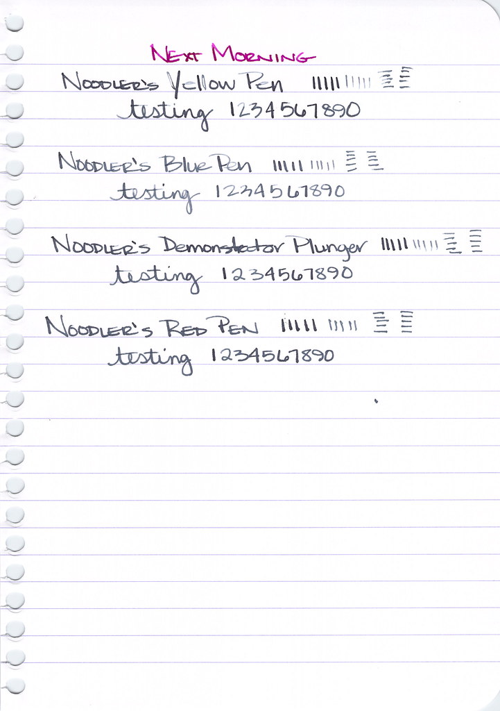
I set all of the pens aside overnight and came back to them the next morning. How'd they do?


You'll notice that the two pens that didn't write the night before, didn't write the next morning. No surprise there (especially since one of them didn't have ink..ha).

That's that.  

Here's the final score:

Win - 2
Lose - 4

Seriously. 

To the defense of Noodler's for a moment . . . These pens are made to be tinkered with. If you're a fiddler and you want to fiddle, maybe you'll have more success than I have had.

I watched Brian Goulet's video. I tried. I freakin' tried (and then blamed myself? no.).  I have come to the conclusion that I'm willing to tinker a little, but I mostly just want my pens to write when I pick them up. You know?

I've also concluded that Noodler's pens are inconsistent as a whole. I wouldn't be at all surprised if I went out to the living room, picked up the blue one, and it didn't lay down a single line of ink. Likewise, that plunger-fill pen might just work today.

And it's that inconsistency that I cannot stand.  Noodler's pens are not for me.  Noodler's inks are a different story!

OK, what do you think?  Noodler's pens - love 'em or hate 'em?


Wednesday, October 1, 2014

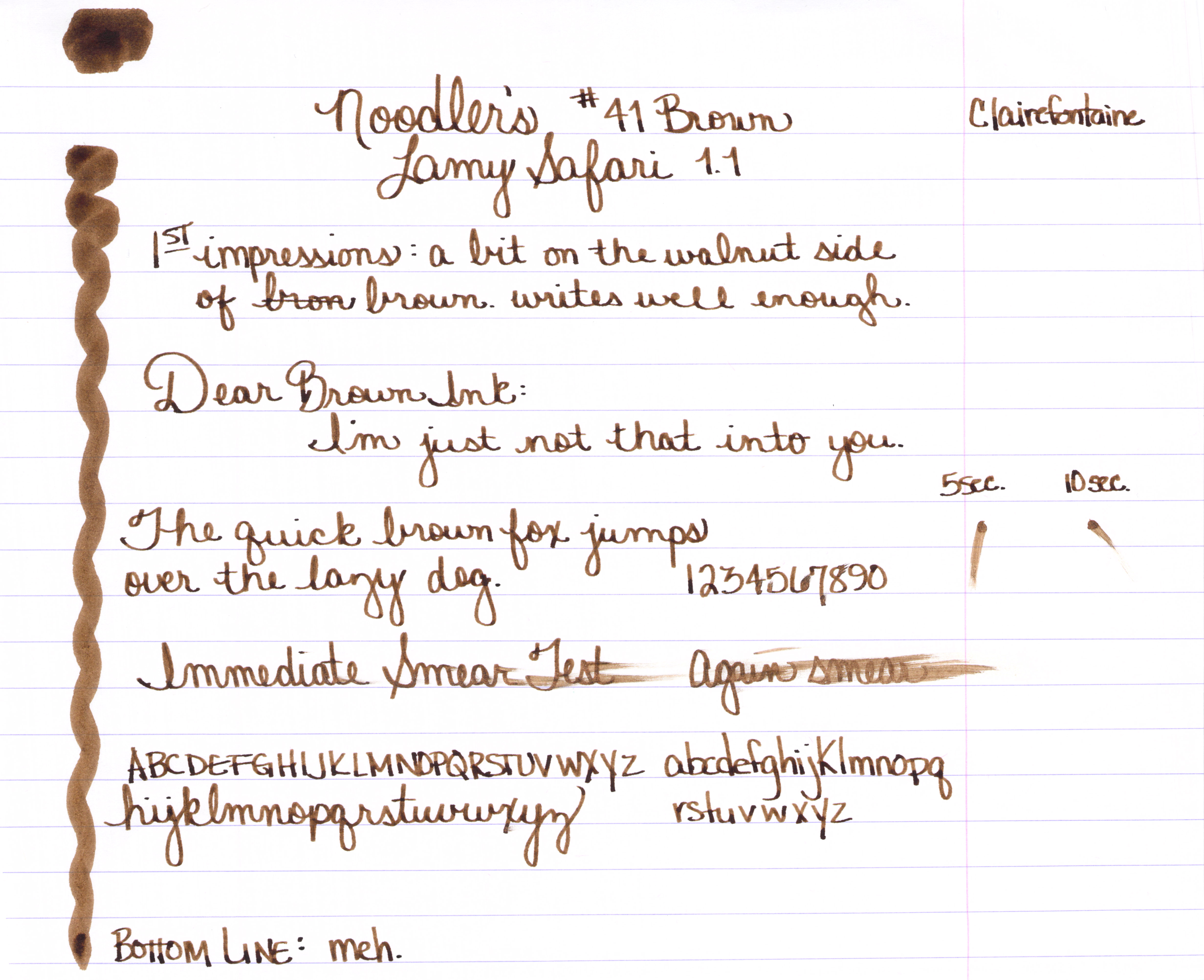
ALMOST WORDLESS WEDNESDAY: Noodler's #41 Brown

Noodler's #41 Brown Ink Review


Well, hello, #41.


I'm just going to say it:


It's not terrible and there's nothing special about it.


Instagram friends may know that I actually have fallen in love with a brown ink. More on that another day.  Do you have a favorite brown? Which is it?

Monday, September 22, 2014

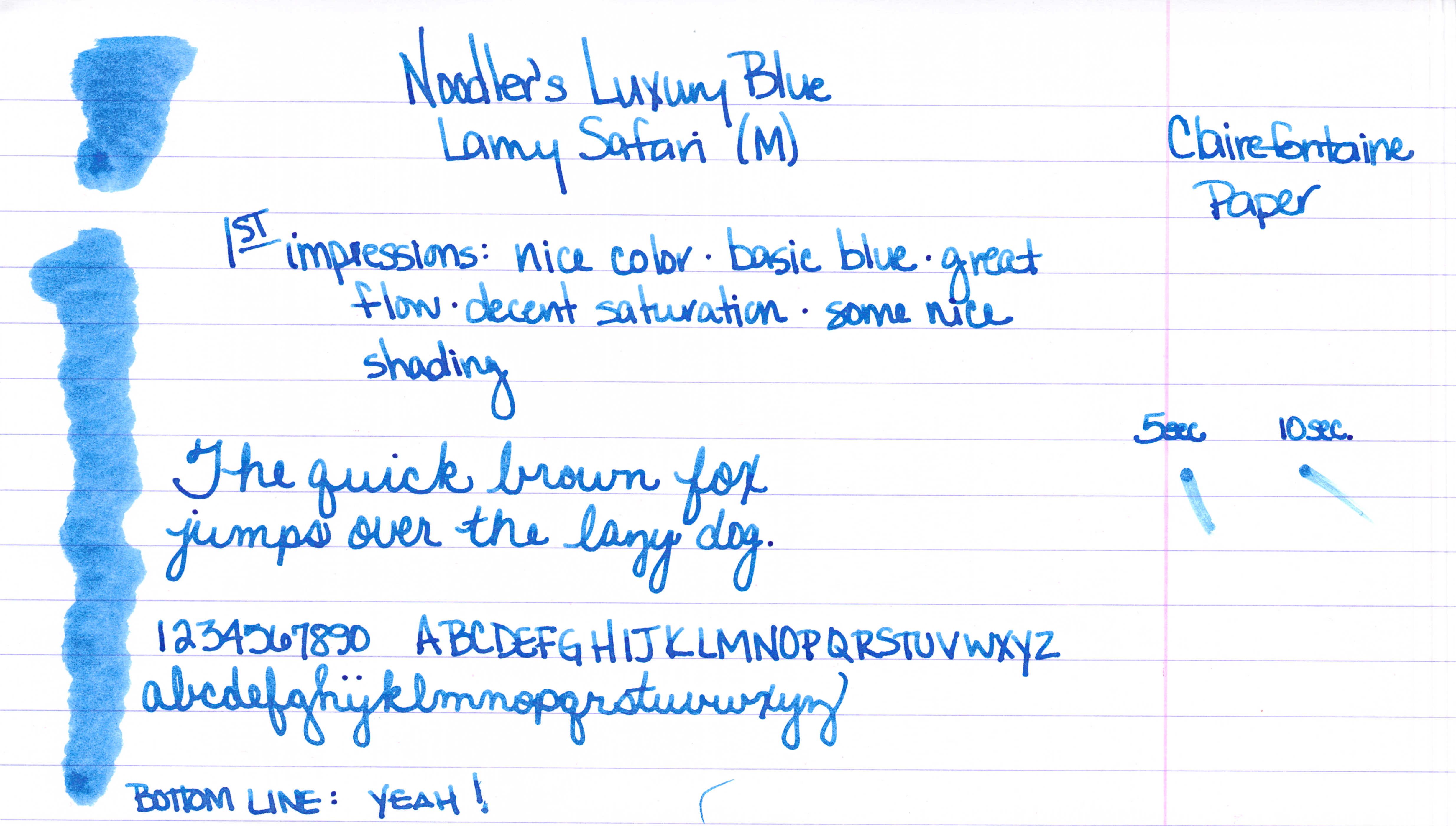
INK REVIEW: Noodler's Luxury Blue


A handwritten review of Noodler's Luxury Blue fountain pen ink.


Noodler's Luxury Blue is from the line of Noodler's Eternal Inks. That is, they are meant to be water, light, and (yes, folks) even bleach-proof. These forever inks are sometimes referred to as bulletproof and fraud-resistant.

While I won't take the time to list them all here, here's a link to the bulletproof inks that Goulet Pens carries.


Let's dive in . . .


A good medium blue with some nice shading.


No flow issue or other complaints from me.


Some reviewers have published pictures and statements that indicate that the ink is more dusky/chalky than I have shown here.  This is a little surprising to me because while the ink is not super-saturated, the color is definitely clear and bright.

Noodler's Luxury Blue is an expensive ink. As of this writing, it is $13.50 for one ounce at Goulet Pens. Meanwhile, another bulletproof ink (Bad Belted Kingfisher) is $12.50 for three ounces.

Bottom line:  I like it, I don't love it.

Have you tried this ink? I'd love to hear your thoughts.


Tuesday, June 17, 2014

INK REVIEW: FOUR FABULOUS BLUE INKS (Part 2)


Last week, I took a really close look at four fabulous blue inks.

Some of these inks are not easy to find. Let's take a look and see if we can figure this thing out...


Sailor Bung Box Sapphire


After a little searching, I've found some sources for Bung Box inks . . . 

Rumor has it Cool-Japan had them over on eBay at one time. As of this writing, there are no Bung Box inks listed, I've bought ink from Cool Japan in the past and had a great experience.

The bottles and packaging look amazing and I've definitely enjoyed using the sample Gerald sent me. 

Here's the trouble: money.  The Bung Box inks are not cheap - add in some shipping (from Japan!) charges, and you're at right around $45-50 per bottle. Yikes.

Parker Penman Sapphire would also be a good substitute for Bung Box Sapphire. Because the Penman ink is no longer available, I've listed some good replacements in that section.  Zoom down to see.

Bottom Line:  If $ isn't a concern, go for it. It's a great-looking and well-performing ink - you wouldn't be disappointed. If $ is a concern, DC Supershow Blue is a fine alternative.


Noodler's Liberty's Elysium


Noodler's Liberty's Elysium is only available from Goulet Pens. The good news is that Goulet Pens has a fantastic reputation in the fountain pen community for excellent customer service. They will also ship overseas.

I shop at Goulet Pens regularly and mention them frequently. I'm not related to the Goulet's, I receive no discounts, free product, special treatment, or anything else from them. Unfortunately, in our relationship - the money only flows in the one direction ;)


PW Akkerman #5 Shocking Blue


I got mine direct from the Netherlands. Shipping was fast, seemed reasonable (though I was buying multiple bottles), and everything arrived in good condition.

Vanness Pen Shop also carries Akkerman inks. You'll have to call or email them for specifics.

It's expensive. The Akkerman bottles are super-fancy and they've come a long distance. If you don't want to put out the money, my strong recommendation is Diamine Majestic Blue (see image below).


Parker Penman Sapphire


No longer available, there are some inky recipes out there for replacing Penman Sapphire. A quick search turned up these two links for you . . . 

Another Parker Penman Sapphire Replacement

The difficulty here is that while I think it is possible to get the color right (or at least close enough), I'm feeling pretty certain that it's quite impossible to get the feel of Parker Penman right on target. That is to say this: the color is only part of what makes an ink so special. The feel of the sample I had is wonderfully different from all of the other blues here and I seriously doubt that mixing 6.5 drops of ink #1 with 3.75 drops of ink #2 is going to result in that same feel* - and without that, well, there are plenty of off the shelf colors that come close enough.  Have a look . . .


Some of the above ink swabs are showing the sheen - and maybe you're thinking Penman Sapphire doesn't have much sheen here or in my review from last week, but look at this review over on FPN - crazy sheen.

Sailor Bung Box Sapphire also looks like a good sub for Parker Penman Sapphire, but there are difficulties in obtaining that ink, too. (See the above section for those details.)

Bottom Line - DC Supershow Blue is the color I would choose if I was trying to match the color of Parker Penman Sapphire.

Of course, you could search eBay for it, but there are rumors that it was discontinued because it may contain metallic bits (hello, sheen) in it and it causes pens to clog. I've not had trouble with it in my Pilot Metorpolitan, however.


* Did you know that mixing inks can be an invitation for Major Trouble? Some inks don't play well with others and you could end up with a blobby globby mess - in your pen. Some mixtures will take some time to form the blobby globby mess and by the time it does, you may have already loaded it into your pen. Be careful.

Annnnnd...that's that!  Four Fabulous Blue Inks. This has been a fun fun project and I really have to thank Gerald again for sending me samples of some of these inks. If you're not following me and Gerald on Instagram, you simply must.

You tell me . . . Are you going shopping for one of these? Or maybe you have another favorite blue ink?