Pages

Showing posts with label pilot iroshizuku. Show all posts

Monday, November 10, 2014

Seven Orange Inks

A photo posted by Christine Darling (@pentulant) on

I've been on an orange kick. It all started innocently enough back in May, and then over the last few days, I've inked seven pens with seven different orange inks.  CrAzY!
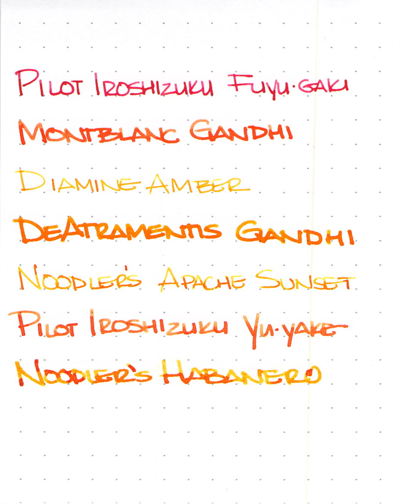


I won't have room to go into great detail on each ink here, but let's explore a little, shall we?
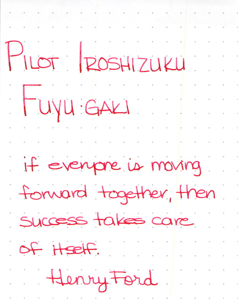
Pilot Iroshizuku Fuyu-gaki Writing Sample

Pilot Iroshizuku's Fuyu-gaki runs a bit toward the red side of orange. It writes wonderfully, doesn't display much shading, and is an all-around nice ink.
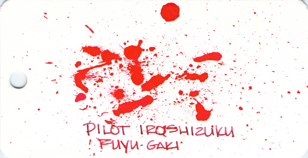


Fun with ink splatters. I did these on Word Cards that I got from Jet Pens. The paper is more like a thin watercolor paper than writing paper.

Moving on . . .
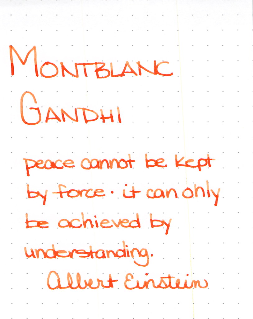

Montblanc Gandhi Writing Sample

Montblanc Gandhi fountain pen ink is no longer available. It can be found on eBay (I've been thinking about selling my spare bottle, but I'm not sure I want to let it go, you know?)

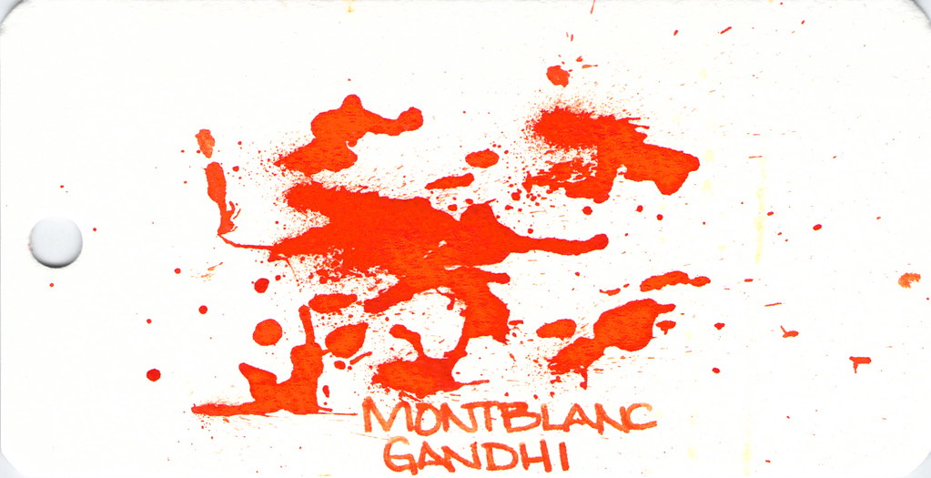
The ink is such a pretty pretty orange, lots of good shading, and is definitely one to try if you can find it.

Spatters, anyone?


Diamine Amber is next on our hit list . . .
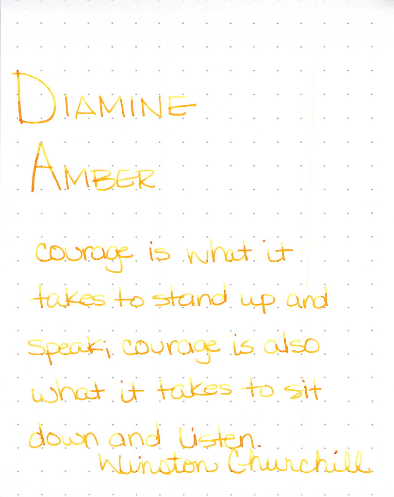
Diamine Amber Writing Sample

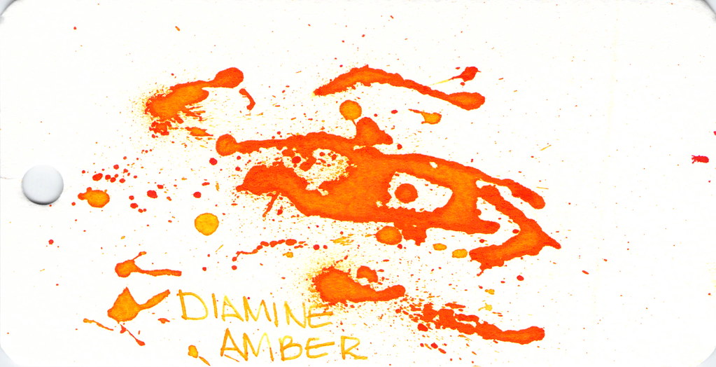
Diamine Amber is just so light and feels a bit dry. This ink is in a Lamy with extra-fine nib and that may be part of the issue, but I've had other orange inks in the same pen and they've not been this light. I like inks that work in all of my pens (makes life easier, you know?) and with so many orange options available, I'm not so keen on this one. Others seem to like it.

And look at the spatters - good saturation there, friends.


Montblanc Gandhi isn't the only game in town . . .
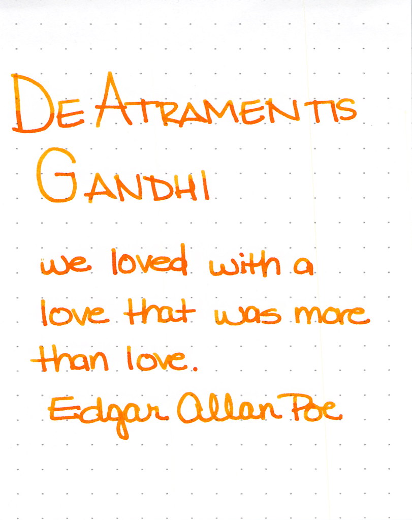
De Atramentis Gandhi Writing Sample

This was my first time using this ink and for some strange reason, I didn't have high expectations. Silly me - it's a perfectly fine ink. Some shading, writes quite well. No reason to be concerned. It's really not like Montblanc Gandhi - not that it matters, I think it would be a little silly to compare the two just because they share a name.  I like it.

I also think I did a pretty good job on the spatters here . . .


Next up . . .

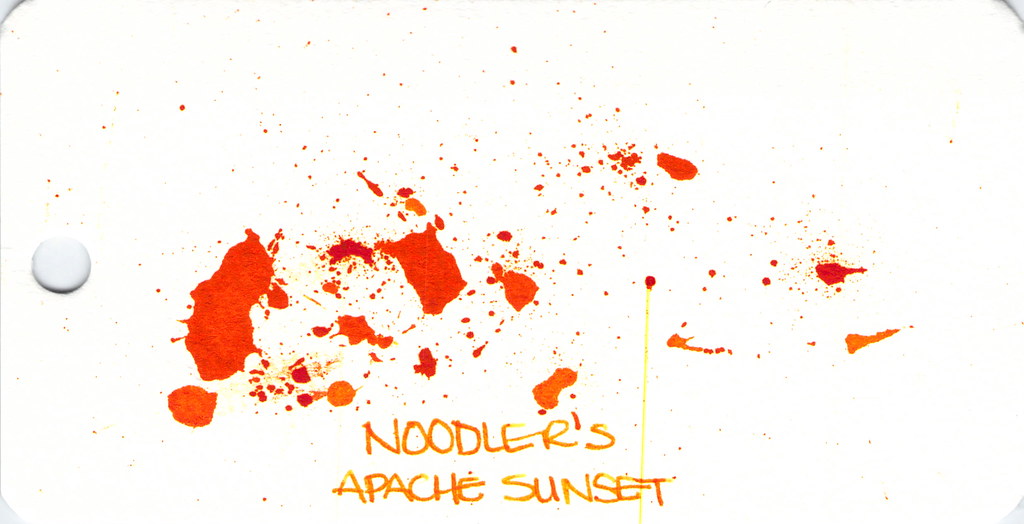
Noodler's Apache Sunset Writing Sample

People are generally coco-crazy for Noodler's Apache Sunset.  Even using an extra-fine nib, I can see the potential here. Absolutely insane shading. The color is very orange. People who don't like this ink seem to say that there is no practical application for it - I'm not sure I understand. Maybe they feel that way about all orange inks?

So . . . check out the spatter. See the streak? Please know that I waited a full 24 hours after creating the spatters before scanning. THE INK WAS STILL WET!  Insanity.  (Even more insane - you can see this streak on other images, too...arrrgh. I need to figure out how to clean my scanner.)


Anyway . . .

Dude. Check out Pilot Iroshizuku Yu-yake . . .


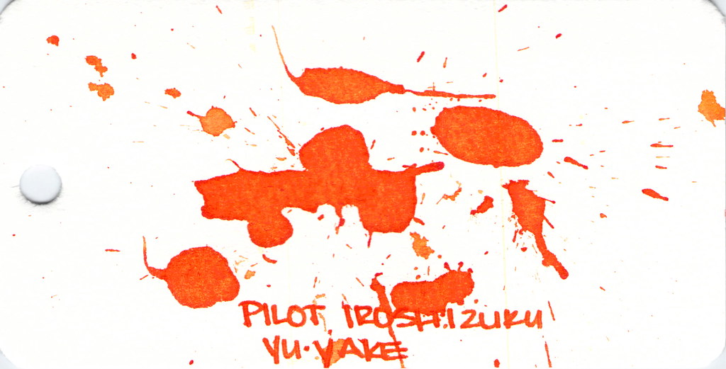
Pilot Iroshizuku Yu-yake Writing Sample


Shading, saturation, great orange color - maybe a little red in there. Yu-yake is bright and cheerful. Writes like a dream. A new favorite of mine.

I've had good experiences with all Pilot Iroshizuku inks. They are a bit more expensive than other brands, but they are incomparable in terms of overall brand quality.


Last, and certainly not least:  Noodler's Habanero.


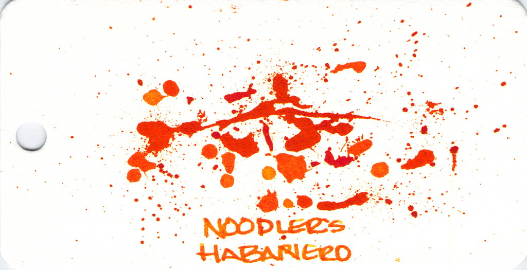
Noodler's Hanbaero Writing Sample

It's been awhile since I've had Noodler's Habanero in a pen. I'm not sure why. I fall in love with it every time. The beautiful shading, the gorgeous orange that reminds me of autumn.  Yum.

The only issue is that it seems to stay wet forever. Though, apparently, not as long as Noodler's Apache Sunset.


That's it!


Which are your favorites?

xoxo

Tuesday, August 12, 2014

THIS OR THAT: Yama-dori or Ku-jaku


This or that? Top or bottom?  Which do you love?

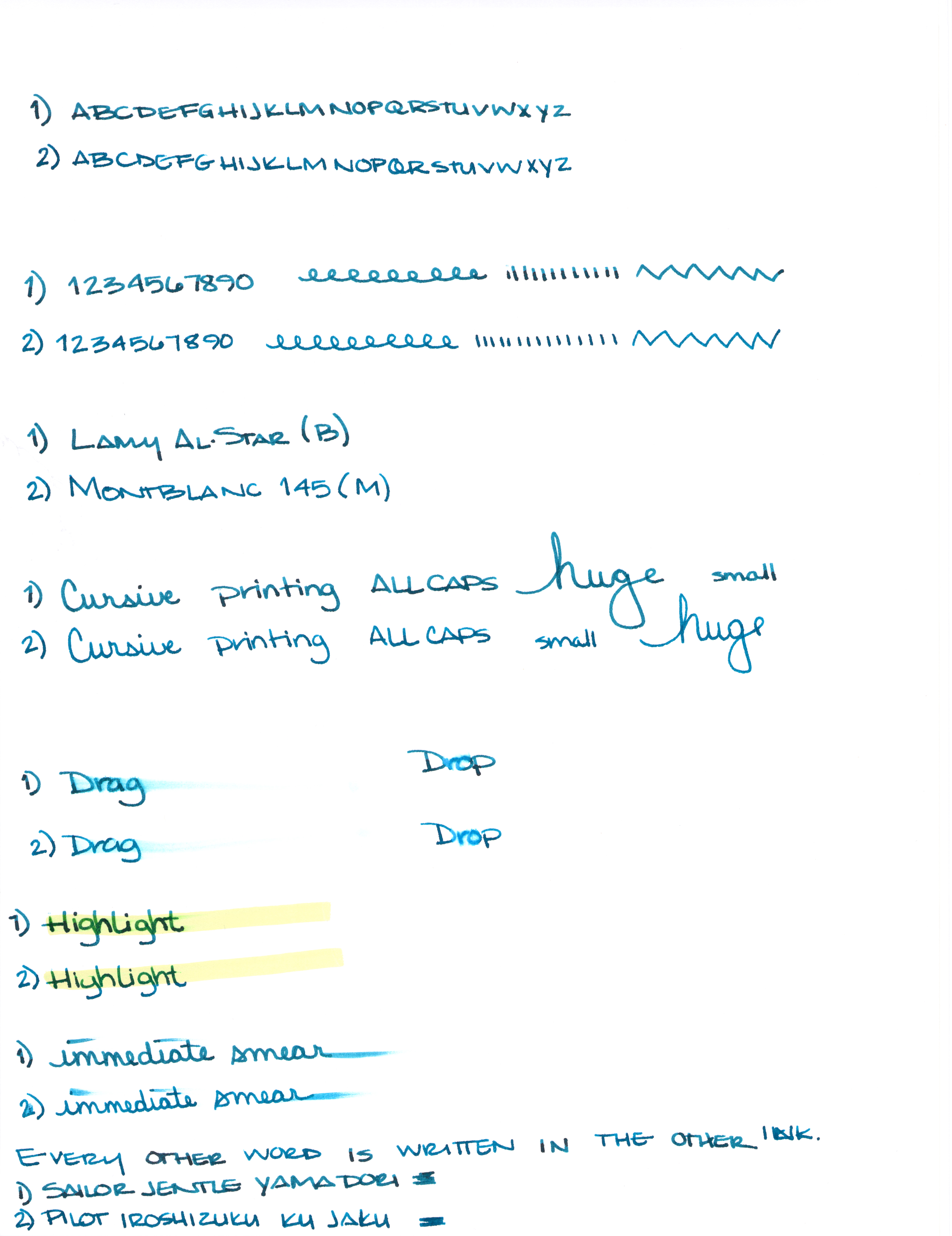
Can you see the differences between these two inks?  One color is always on top. The other is always on the bottom.

Let's take a closer look . . .


One of these is Pilot Iroshizuku Ku-jaku.  The other is Sailor Jentle Yama-dori.


Color is quite similar.


I see a definite difference here.


Not much difference here.


Which ink is this?  Hint:  it's both!


Alrighty, which do you like? Both? Neither?  They are pretty close, yes? I would choose the top color - but not by much. It's the shading that made the difference for me. I think I could be happy with either (even though teal isn't my most favorite color).

Scroll down for the spoiler . . .


The top shade is Sailor Jentle Yama-dori. 
The bottom is Pilot Iroshizuku Ku-jaku.   


What is so interesting to me about this is that Yama-dori is legendary. Ku-jaku gets favorable reviews, but it's not a Big Deal. The differences are subtle and if they weren't side-by-side, I wonder if you or I could tell them apart.

Like I said yesterday, Yama-dori is my E.T. ink. You can read all about that right here.

What do you think? Am I crazy and there's a huge difference that I'm not appreciating here?


Wednesday, April 30, 2014

INK REVIEW and COMPARISON: Yama-budo -vs- Black Swan in Australian Roses


-vs-


Back in January, I did a quickie review of Noodler's Black Swan in Australian Roses (BSIAR) - I didn't love it. I didn't hate it.  A week or so ago, I received a larger sample of it along with a sample of Pilot Iroshizuku Yama-budo.

I'd heard so many wonderful things about about Yama-budo that I didn't wait too long to ink my Pelikan M320 and take it for a spin.


And because I was inking pens, I inked a Lamy Al-Star with BSIAR and decided to compare and contrast it with Yama-budo.

In each of my pairs of writing, Yama-budo will be on top.
The color of each reminds me of grapes. I'd originally said that BSIAR was bordeaux in color and my first thought about Yama-budo was that it reminded me of melty grape sorbet. In looking at the colors right next to each other, I'm confident with each of those descriptions. Yama-budo looks fresh and BSIAR has a more aged look to it. Yama-budo is a bit brighter while BSIAR has a little muddiness to its darker color.

Shading? They both shade, but there seems to be more variation with Yama-budo. Yama-budo goes from an almost bright pink to a deeper purple color while BSIAR seems to remain various shades of the same color.

Saturation is about equal (and very good) with both inks.


I experienced no trouble writing with either ink. Flow was good, neither was excessively wet nor dry. Each is a good quality ink.

There's no feathering, or bleed through with either. Yama-budo did have some ghosting on Clairefontaine paper, but just when dotting the letter i in a couple of places - so minor that I almost didn't mention it.

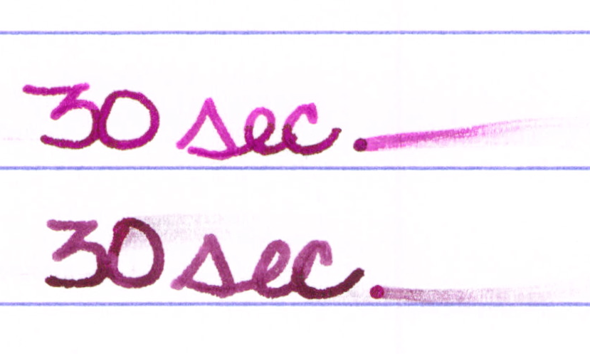
Yama-budo was more likely to smear right out of the gate, but by the time 30 seconds had passed, things were just about even.

Again, Yama-budo on top and BSIAR under . . .


I regularly write in all caps...


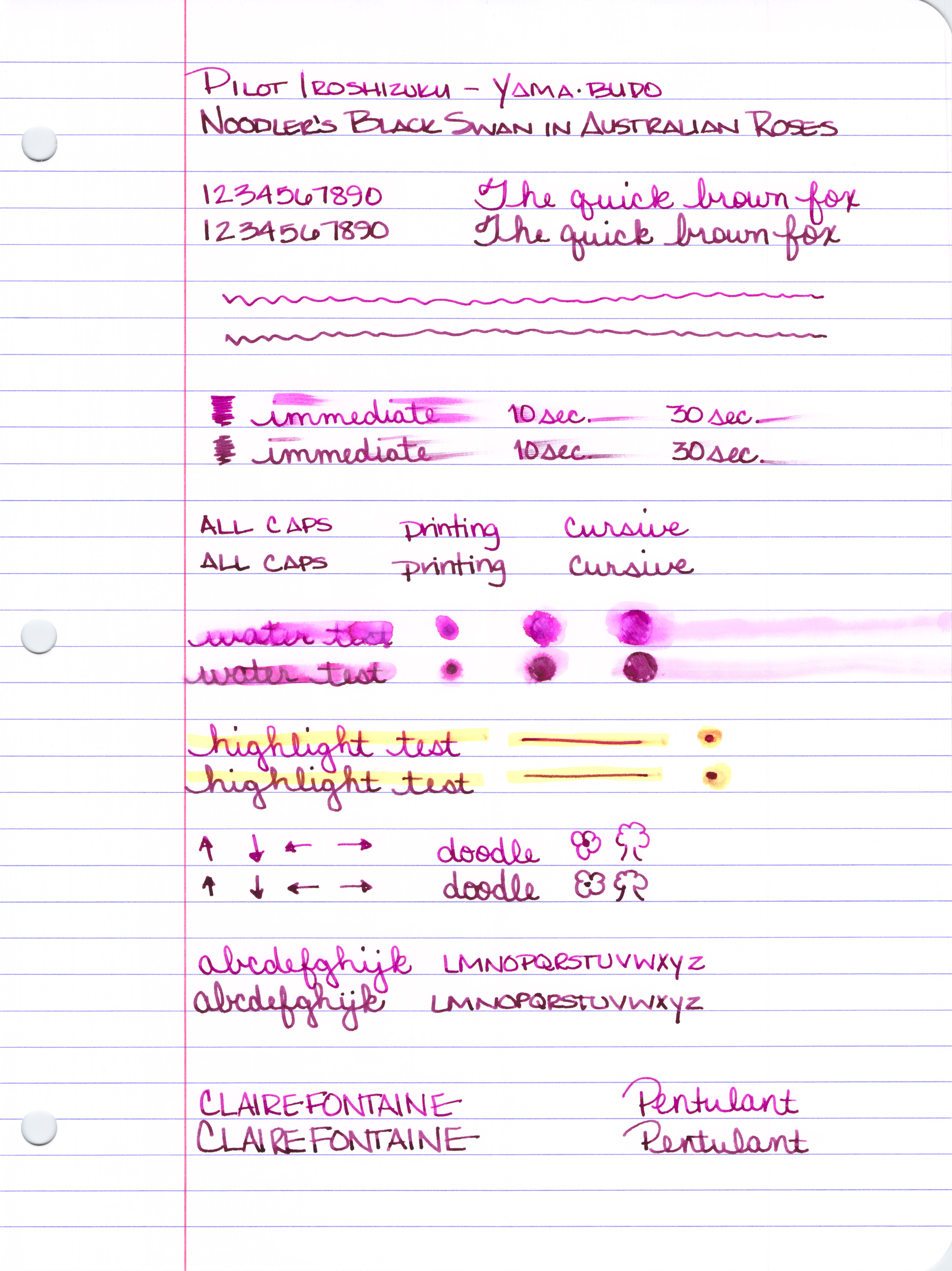
Here's the entire review sheet . . .


Click Here to see it full size (it's huge).

So, what's my bottom line?  I've ordered a full-sized bottle of Yama-budo. While the color difference isn't huge, the brightness and amount of shading made all of the difference for me.

There are so many ink choices out there that it is the subtle things that make all of the difference between "just ok," and "love it!"

Having said that, if you like the color of each of these inks and the brightness doesn't matter that much to you (or maybe you even prefer the darker color?), save yourself the bucks and go with Black Swan in Australian Roses. Goulet Pens (no association except I spend so much of my paycheck there) sells BSIAR for less than half of what Yama-budo goes for.  ($12.50 -vs- $28, respectively)

What do you think?  Black Swan in Australian Roses or Yama-budo?  Neither? Both?


Monday, February 10, 2014

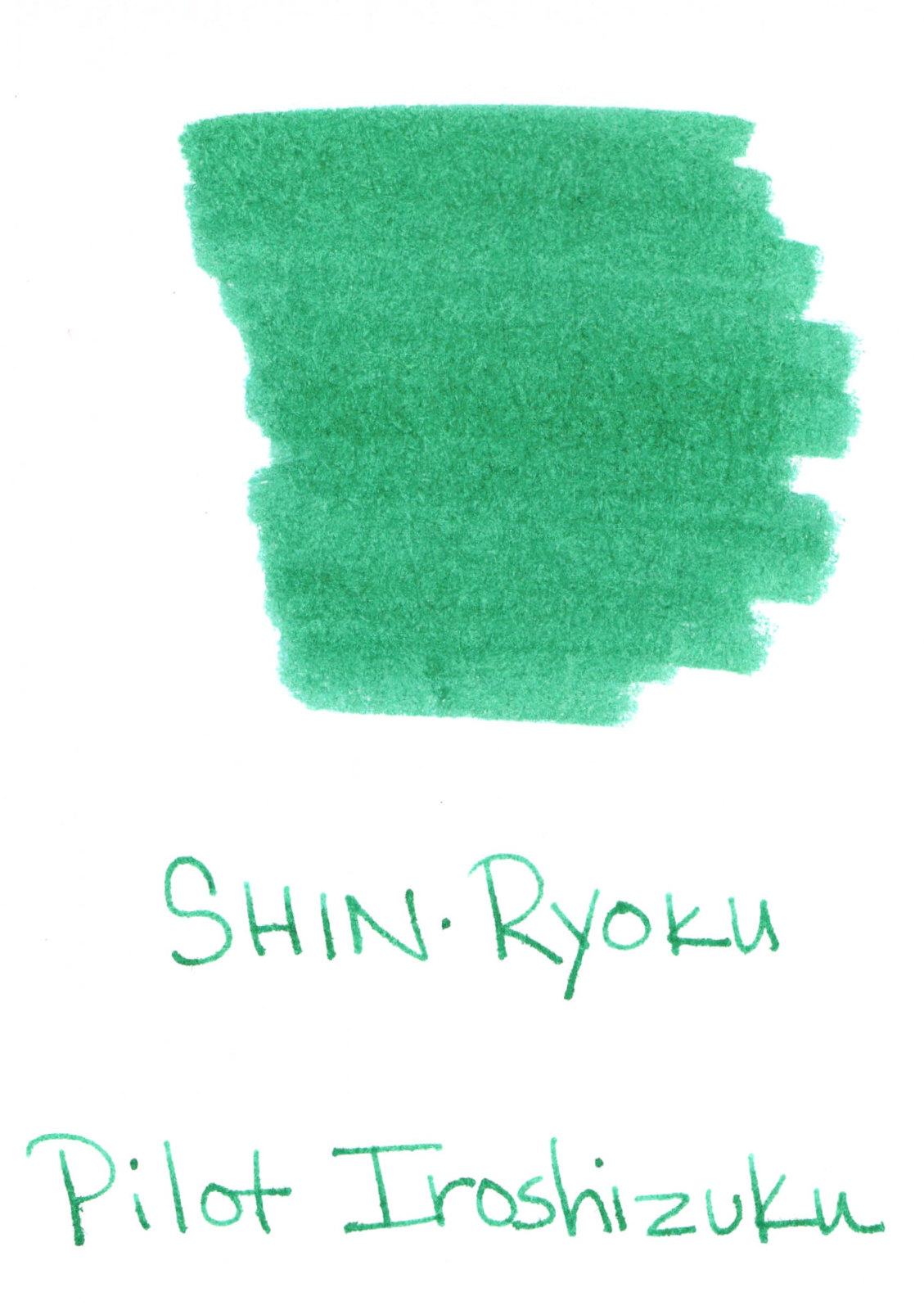
GIVE AWAY: Pilot Iroshizuku Shin-Ryoku


It's true!  I'm giving away a mostly unused bottle of Pilot Iroshizuku Shin-ryoku.

Bottom Line:  Leave a comment below to be entered to win. Do it before next Thursday, February 20. And, omg, please please leave a way for me to contact you - you know, in case you win.


Details: About 100 years ago (more like May of last year), when I was on my honeymoon, I was shocked to see the Paradise Pens in Las Vegas was closing. They had a deal on inks and I bought a few - mostly on speculation - including this one.

Got it home, inked a pen (I never ever dip right into the bottle, no contamination here) and realized that, omg, I don't like this ink. I stuffed it into my ink cabinet and haven't bothered with it since then.

In fact, how funny is it that my very first ink giveaway (implies there are more to come, hm?) also happens to be the very first ink I ever reviewed?  (That review was from a sample.)

I don't have the box or the fancy hang tag, but the bottle and its contents are in good shape. There are maybe 3 ml missing from the bottle, but probably not even that much.

So! If you'd like to enter to win, just leave a comment below before next Thursday (the 20th) and I'll announce a winner (chosen randomly, of course).  Hopefully, I'll get my act together enough to ship the ink pretty quickly after that.

Fun, right?

No enter to win! Do it!


Monday, September 23, 2013

INK REVIEW: Pilot Iroshizuku Tsukushi

Ink Swab - Pilot Iroshizuku Tsukushi


With the start of autumn, I thought it would be fun to review a fall color. I reached into my bag of brown inks and pulled Pilot Iroshizuku's Tsukushi.

I'll start by saying - it writes wonderfully.

Pilot Iroshizuku Tsukushi Writing Sample


I'm just not a huge fan of brown inks.  And brown inks with red undertones? Not for me, thank you.


Tsukushi is not a super-saturated ink


Tsukushi - does it shade well? Yes, it does!


It's really a terrific ink in many regards.


Bottom Line: If you like the color, you can't go wrong with this ink. It's fabulous in all regards.

Oh, and in case you want to see it next to Diamine Chocolate Brown, here you go and here's another look at some brown inks.

Wednesday, August 7, 2013

QUICK LOOK WEDNESDAY - Six Pretty Colors


Sometimes, I want to play with my pens, inks, and papers, but can think of nothing to write.

The first step is to write the name of the ink and the name of the pen (see above). I just noticed that each ink is from a different manufacturer - nice.

Apparently, the last resort is to write things that I overhear from the television (see below).


It was actually quite a bit of fun - watching and scribbling, changing pens and writing a bit more. I love the way the entire sheet of paper looks - each color is pretty amazing on its own, yes?

Let's take a closer look . . .


Above - DeAtramentis Alexander Hamilton. I love this purple. It's so rich and deep in color - nice saturation. I don't see this ink discussed much on the various forums, but I think this is a purple that could be used anywhere.  (more on that another day)


Below - Private Reserve Spearmint. One of my favorite green inks. It looks a bit dark here to my eye, but it is usually quite cheery.


Do you have a guess as to which show I was watching at the time?

Below - Montblanc Hitchcock. A gorgeous blood red ink if I ever did see one. Some really pretty shading in there, too. I have to confess, I have a quite a lot of this in my cabinet. Shall I keep it forever? Use it as if I'll never run out? Or maybe even sell some?


Below - Noodler's Habanero. A favorite. That shading. The brightness of the color. Need I say more? Mm..wait, I already did right here.
 

By the way, the above quote is the one that seems like the one that would tell the secret of what I was watching. Have you guessed it yet?


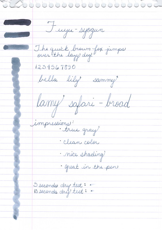
Above - Pilot Iroshizuku Fuyu-syogun. I wonder if I only could have one ink, if this would be it. Check out my big review here. It is crazy CrAzY to think that I, lover of bright and beautiful colors, would be so taken with a gray ink, but there you go.


Above - Diamine Majestic Blue.  Easy to see why it's one of my favorites, yes?  So pretty.

And, so, there we have it - six pretty colors. All so different from one another and yet all so wonderful.

Which show was I watching?  Downton Abbey, of course!  Have you seen it? Highly recommended.

Monday, August 5, 2013

INK REVIEW: Pilot Iroshizuku Fuyu-syogun


Oh. Goodness.

Gracious. Me.

Oh. My.

Pilot Iroshizuku Fuyu-syogun Swabs (3, 2, 1)


Have mercy.


Fuyu-syogun Shading


Not too light.

Not too dark.

Nothing but gray. No icky red or green undertones.

Gorgeous shading. 

Decent dry time.

Writes beautifully.

I'm in love.  In love. Head over heels.

If this ink isn't in your collection, it certainly should be. Certainly.


Have a look at my other grey/gray ink reviews and then run out and get this one.

Seriously, I have nothing negative to say about this ink.