Pages

Showing posts with label quick look. Show all posts

Friday, September 6, 2013

FRIDAY FOLLOW: Instagram


If you're not on Instagram, you're really missing something.  

In no particular order, here are some of my more recent Instagram images . . . 


The Waterman Edson Twins (they are not identical)


VW swag for Baby O (because, really, how cute is this?)


An inky project I'm working on


Love #inkinthesink

Right?


My TWSBI Collection makes me swoon just a bit.


Strawberry Ice Cream

Doesn't everyone meal plan with a #wetnoodle?

My beloved Montblanc Boheme collection.

I opened Mr. Pentulant's textbook, took this picture, and then promptly closed the book.  


And here's a listing of just some of the people I follow...

Gourmet Pens

Ed Jelley

Ellina

Pablo Garcia Melnick

Gerald Taylor - aka MyCofeePot

Chrissy Sparks

PenAddict

What I love about Instagram is that most of the people I follow post more than just pens. It's a real glimpse into the person and what is important in his/her life.

Here's my Instagram link.  Where is yours?


Wednesday, August 7, 2013

QUICK LOOK WEDNESDAY - Six Pretty Colors


Sometimes, I want to play with my pens, inks, and papers, but can think of nothing to write.

The first step is to write the name of the ink and the name of the pen (see above). I just noticed that each ink is from a different manufacturer - nice.

Apparently, the last resort is to write things that I overhear from the television (see below).


It was actually quite a bit of fun - watching and scribbling, changing pens and writing a bit more. I love the way the entire sheet of paper looks - each color is pretty amazing on its own, yes?

Let's take a closer look . . .


Above - DeAtramentis Alexander Hamilton. I love this purple. It's so rich and deep in color - nice saturation. I don't see this ink discussed much on the various forums, but I think this is a purple that could be used anywhere.  (more on that another day)


Below - Private Reserve Spearmint. One of my favorite green inks. It looks a bit dark here to my eye, but it is usually quite cheery.


Do you have a guess as to which show I was watching at the time?

Below - Montblanc Hitchcock. A gorgeous blood red ink if I ever did see one. Some really pretty shading in there, too. I have to confess, I have a quite a lot of this in my cabinet. Shall I keep it forever? Use it as if I'll never run out? Or maybe even sell some?


Below - Noodler's Habanero. A favorite. That shading. The brightness of the color. Need I say more? Mm..wait, I already did right here.
 

By the way, the above quote is the one that seems like the one that would tell the secret of what I was watching. Have you guessed it yet?


Above - Pilot Iroshizuku Fuyu-syogun. I wonder if I only could have one ink, if this would be it. Check out my big review here. It is crazy CrAzY to think that I, lover of bright and beautiful colors, would be so taken with a gray ink, but there you go.


Above - Diamine Majestic Blue.  Easy to see why it's one of my favorites, yes?  So pretty.

And, so, there we have it - six pretty colors. All so different from one another and yet all so wonderful.

Which show was I watching?  Downton Abbey, of course!  Have you seen it? Highly recommended.

Wednesday, July 24, 2013

QUICK LOOK WEDNESDAY: Four Fab Blues


Time for this week's Quick Look Wednesday!

I like all of these inks for different reasons.

De Atramentis Indigo Blue - a straight-forward blue that could be used in any setting

Diamine Eau de Nil - (does this mean River Water?) a bit of green, but not quite enough to call it turquoise

Private Reserve Ebony Blue - maybe my least favorite because it looks more like a green-black in my swabs. Have any of you tried writing with this one?

Noodler's Ottman Azure - boom! Pure blue saturation with this one.

So, yeah, each of these are so different from the others and I like them all.  Which is your pick?

Wednesday, July 17, 2013

QUICK LOOK WEDNESDAY: You call that red?


Time for another Quick Look Wednesday!

What do all of these inks have in common?  They are all samples from my bag of red inks.

Red?

 Private Reserve - Vampire Red

 Diamine - Maroon

 Pelikan Edelstein - Ruby

 Sailor Jentle - Grenade


So, yes, I sort my ink samples by color. I have so many that there has to be a system - I'll take pictures and show you sometime soon. 

I first look at the name of the ink and sometimes it's obvious where the ink belongs.  Delta Brown?  Not a big decision. Frankly, Pelikan Edelstein Ruby didn't seem like a big decision either. Ruby - Red, right? Not so much. Yikes.

When the name doesn't make it obvious, I open the sample, have a peek, and make a best guess. Sailor Jentle Grenade belongs with the purples. Oops.

I'm really liking Private Reserve Vampire Red. Perfect name for this color, yes? Can't wait to write with it!

Maroon from Diamine is ok - nothing special to me. It's one of those colors that isn't really a color. Haha.

What do you think?  Do the names of inks get you all bothered, too? Ruby - ha!

Wednesday, July 10, 2013

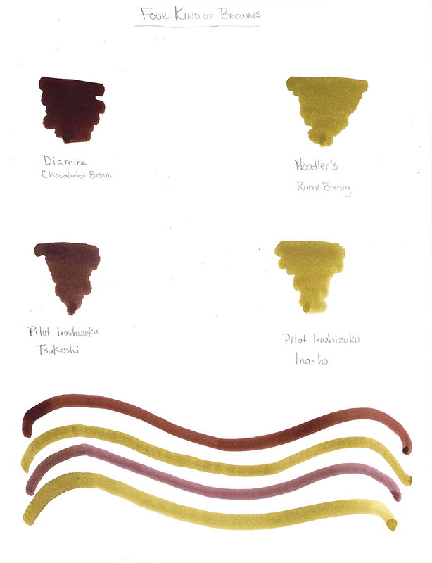
QUICK LOOK WEDNESDAY: Two Brown / Two Gold


Super-duper quick look today.

I love Diamine Chocolate Brown - the deep, rich saturation - yum. It seems to have less red in it than Private Reserve Chocolat and I like that.

I usually love Pilot Iroshizuku inks, but neither of these are doing it for me.

Which is your favorite from above?

Wednesday, July 3, 2013

QUICK LOOK WEDNESDAY: Four Green Inks


It's Quick Look Wednesday!  Today, we have four very different shades of green.

 De Atramentis Bamboo Green


 Private Reserve Sherwood Green


 De Atramentis Black Edition Green


 De Atramentis Patina Green


Do you have a favorite?  I'm digging Sherwood Green. Nice clear color.

My least favorite is De Atramentis Black Edition Green. It just looks too muddied to me. But check out the review here.  It looks much better, yes?  The difference may be explained by the fact that my quick looks are just swabs and this is a handwritten review.

As for green inks? I love them. More than I thought I would. They are fun without being too loud (like some kind of crazy pink inks!)


Wednesday, June 26, 2013

QUICK LOOK WEDNESDAY: Three Inks I Love


All so different and I'm in love with each!


 Pilot Iroshizuku Fuyu-syogun A perfect gray. Lovely shading. Great color.

 Diamine Flamingo Boom-Boom Wow color!

 Diamine Majestic Blue True blue!


Which inks are you loving on lately?


Wednesday, June 19, 2013

QUICK LOOK WEDNESDAY: Four Blues from Diamine


A quick look at four blue inks from Diamine.

 Diamine Midnight  (strange that this image is bigger than the others, right?)

  Diamine Presidential Blue

  Diamine Registrar's Blue Black

  Diamine Denim


Which do you love?

I'm not sure that I have a favorite, but I definitely have a least favorite - Diamine Registrar's Blue Black. It's not very well saturated - looks more like a gray/grey - and I just don't like it. Not one little bit.