 |
| Click Images to Enlarge |
A quick look at Diamine Grey..
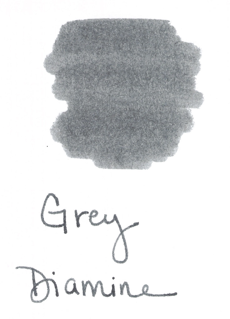
This color is a true gray (grey, for those of you who insist). Stately and professional as I said in my Fifty Shades of Grey post last month.
It's a bit darker than I like. If I'm going to get that close to black, I may as well go black.
It smeared a bit on my Hammermill Premium paper, but it's tolerable. Some shading is nice. Tiny bit of feathering - even on the index cards below.
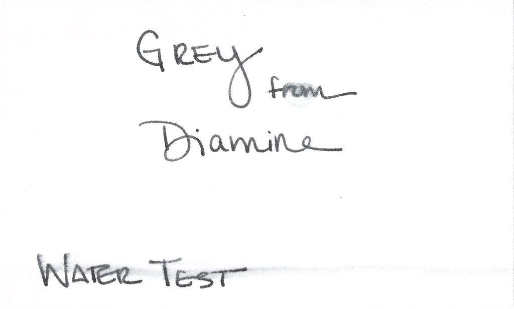
The water test is a fail - not so much from the Q-Tip across "Water Test," but more from the standing test in the word "from" below.
But..it is a true gray (ok, grey!) and I do appreciate that.
I'm not going to buy a full bottle of this ink (testing was done from a sample as usual). There's just nothing that special about it.
Tyler Dahl LOVED this ink. A true sign that YMMV.
Have you tried it? What do you think? Wonderful or just meh?
UPDATE: For some odd reason, this post received a whole big mess of spammy posts. I've closed comments on this post, but please contact me if you have something to add to the conversation! xo


This comment has been removed by a blog administrator.
ReplyDeleteThis comment has been removed by a blog administrator.
ReplyDelete